Visual storytelling: techniques, science, and application
Learn how visual storytelling works, its core mechanics, principles, and real-world applications to help creators and marketers build more effective content.

TL;DR:
- The human brain processes visuals 60,000 times faster than text, making visual storytelling essential.
- Effective visual stories use narrative structure, hierarchy, emotion, and principles like authenticity and relevancy.
- Prioritize clarity, simplicity, and audience testing to create memorable, engaging visual content.
The brain processes visuals 60,000x faster than text. That single fact changes how you should think about every piece of content you create. Visual storytelling is not a design trend or a social media tactic. It is a fundamental way human brains absorb, retain, and act on information. This article breaks down what visual storytelling is, how its core mechanics work, the principles that make it effective, and how you can apply it practically to your next campaign, drop, or creative release. Whether you are an artist, marketer, or content creator, understanding this discipline will sharpen every visual decision you make.
Table of Contents
- What is visual storytelling?
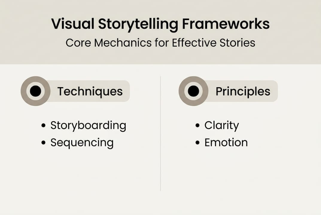
- How visual stories work: Key mechanics and frameworks
- Core principles: What great visual storytelling requires
- Visual storytelling in action: Real-world applications and best practices
- A fresh perspective: Why most visual stories fall flat and what to do instead
- Take the next step: Visual storytelling with Orias AI
- Frequently asked questions
Key Takeaways
| Point | Details |
|---|---|
| Visuals drive retention | People remember 80 percent of visuals versus only 20 percent of text. |
| Structure matters | A clear narrative framework transforms visuals into memorable stories. |
| Principles underpin success | Authenticity, sensory appeal, relatability, and cultural relevance make visual stories effective. |
| Best practices boost impact | Storyboarding, simplifying, and testing your visuals lead to significantly higher engagement. |
What is visual storytelling?
At its core, visual storytelling is the practice of communicating narratives and emotions through visual elements rather than relying solely on words. It is not decoration. A beautiful image with no narrative thread is just aesthetics. Visual storytelling gives visuals a job: to move someone from not knowing to understanding, or from indifferent to emotionally engaged.
According to a working definition used across the industry, visual storytelling uses images, videos, typography, color, layout, and more to convey meaning, narrative, and emotion. The discipline sits at the intersection of visual communication, storytelling frameworks, cognitive psychology, and design principles. That is a wide territory, which is exactly why it is so powerful.
For creators, artists, and marketers, the payoff is measurable. Visuals drive far greater recall and emotional impact than text alone. Research consistently shows that people remember about 80% of what they see compared to only 20% of what they read. That gap is not a coincidence. It reflects how the human brain is wired to prioritize visual input.
“People remember approximately 80% of what they see, but only 20% of what they read. Visuals are not just supporting content. They are the primary channel for memory and meaning.”
The building blocks of effective visual storytelling include:
- Images and photography: Establish mood, context, and emotional tone instantly
- Video and animation: Carry narrative sequences and sustain attention over time
- Color: Signals emotion, brand identity, and urgency without a single word
- Typography: Communicates tone, hierarchy, and brand voice beyond the words themselves
- Layout and composition: Guides the eye and controls what gets noticed first
- Data visualization: Turns abstract numbers into relatable, memorable insights
For creators building a visual identity for releases, each of these elements is a tool in your kit. Learning to use them together is what separates content that lands from content that gets scrolled past. If you are just starting to develop your approach, exploring storytelling ideas for artists can help spark a direction before you even open a design tool.
How visual stories work: Key mechanics and frameworks
Knowing what visual storytelling is gets you started. Understanding how it works gives you repeatable results. The core mechanics include narrative structure, visual hierarchy, emotional resonance, message clarity, simplification, and iterative testing. Each one serves a specific function.

| Mechanic | What it does | Why it matters |
|---|---|---|
| Narrative structure | Organizes visuals into beginning, middle, end | Creates meaning and payoff |
| Visual hierarchy | Uses scale, contrast, and placement | Guides attention deliberately |
| Pacing | Controls how quickly a story unfolds | Sustains engagement |
| Emotion | Connects visuals to feeling states | Builds memorability and trust |
| Message clarity | Keeps one core idea front and center | Reduces confusion and drop-off |
| Testing | Checks if the story lands with real audiences | Validates assumptions before launch |
The three-act structure is the most reliable narrative framework you can apply to visual content. The beginning establishes context and raises a question or tension. The middle builds complexity and deepens the emotional stakes. The end resolves the tension and delivers the payoff. This applies whether you are producing a 30-second social video, a campaign landing page, or a product launch sequence.
Guiding attention is where design skill meets storytelling intent. You can direct the viewer’s eye using contrast (light vs. dark), color (warm pops against neutral backgrounds), and scale (larger elements claim focus first). These are not decorative decisions. They are navigation tools. If a viewer does not know where to look, they stop looking entirely.
Here is a practical process for building a visual story from scratch:
- Define your single message before touching any design tool
- Choose your medium based on where your audience actually pays attention
- Simplify ruthlessly by removing anything that does not serve the core message
- Guide attention through hierarchy, contrast, and intentional composition
- Test for clarity with someone who has no prior context for the project
Pro Tip: Before jumping into production, storyboard your visual sequence even roughly. A simple sketch of three to five frames helps you spot narrative gaps before they become expensive revisions.
For creators using AI-generated visuals in their work, these mechanics apply just as much to AI-assisted output as they do to traditional design. The tool changes. The structure does not.
Core principles: What great visual storytelling requires
Mechanics explain how visual storytelling works. Principles explain why some stories resonate while others disappear. There are four foundational principles that consistently separate effective visual stories from forgettable ones.
| Principle | Visual storytelling | Plain visual design |
|---|---|---|
| Authenticity | True to brand voice and lived experience | May prioritize aesthetics over truth |
| Sensory appeal | Triggers emotional and sensory responses | Focuses on visual clarity only |
| Archetype use | Features relatable characters or roles | Rarely considers audience identification |
| Relevancy | Connects to current culture and context | May be timeless but contextually flat |
As Shopify’s research outlines, the four guiding principles are authenticity, sensory appeal, archetype relatability, and relevancy to culture. Here is what each one means in practice:
- Authenticity: Your visual story should reflect something true about your brand or perspective. Audiences detect inauthenticity quickly, and once they do, trust erodes. Use real references, genuine creative direction, and avoid borrowing a look that does not belong to you.
- Sensory appeal: Great visual stories activate more than just sight. Color temperature, texture in photography, rhythm in video editing — these elements create a felt experience, not just a seen one.
- Archetype relatability: Stories need characters or roles the audience can see themselves in. This does not require literal characters. A visual journey through a creative process, for example, positions the viewer as the protagonist.
- Relevancy: The most technically perfect visual story will underperform if it feels out of step with what your audience cares about right now. Cultural sensitivity and timing are not optional extras.
A quick note on stereotypes: leaning on clichéd visual archetypes or demographic shortcuts is both creatively lazy and a real engagement risk. Audiences have seen those patterns before and they signal low effort. Specificity is almost always more powerful than generality.
Building these principles into your visual identity from the start makes every subsequent creative decision faster and more consistent.
Visual storytelling in action: Real-world applications and best practices
Theory becomes valuable when you apply it. Visual storytelling shows up across every channel and format creators and marketers use regularly.
Social media thrives on sequential visual stories: a carousel that walks through a process, a Reel that builds tension and resolves it in under 30 seconds, a Story series tied to a product drop. Infographics translate data and complexity into scannable, shareable formats. Brand videos carry full narrative arcs and are ideal for emotional hooks. Data visualizations make abstract metrics feel real and personal to your audience.
The numbers support investing in these formats. Infographics are shared three times more than other content types. Combined with the 80% visual recall statistic, the case for prioritizing strong visual storytelling over text-heavy alternatives is clear.
Here are five best practices worth building into every project:
- Anchor to one message. Complexity is the enemy of retention. Every element should serve the core idea.
- Simplify the visual field. Remove background noise, competing colors, and elements that create ambiguity.
- Use emotion as a hook. Lead with a visual that triggers curiosity, recognition, or aspiration before delivering the informational payload.
- Build in accessibility. Captions, contrast ratios, and clear typography are not just inclusive practices. They also expand your effective reach significantly.
- Test before you scale. Share early versions with a small audience before committing to a full launch.
Pro Tip: Test your visual content across at least two device sizes and two different audience segments before finalizing. What reads clearly on a desktop may lose critical detail on a phone screen, and empirical testing consistently outperforms assumptions.
For creators managing content pipelines, an efficient creative process prevents visual storytelling from becoming a bottleneck. And if your campaigns include social content, understanding how captions support visual stories can meaningfully extend your reach.
A fresh perspective: Why most visual stories fall flat and what to do instead
Here is something worth saying plainly: not every visual tells a story. A polished image, a clean layout, a beautiful color palette — these are ingredients, not stories. Without narrative structure, they are atmosphere at best. This distinction matters because many creators invest heavily in visual quality while leaving the narrative architecture out entirely.
The second common mistake is believing that more visuals means better storytelling. It does not. Overloading a campaign with imagery fragments attention rather than directing it. The most effective visual stories are often the most restrained ones. Clarity wins over volume.
As iterative testing confirms, structure and testing matter more than novelty. Chasing the latest visual trend without a coherent narrative underneath produces content that feels current for about a week and is forgotten by the next one. Consistency, creativity, and genuine audience relevance are the factors that build lasting recognition.
The real work of visual storytelling is not in production. It is in the decisions made before production begins: what is the single message, who is the audience, what do you want them to feel, and how does each visual element serve that outcome. Get those right and even simple visuals will outperform elaborate ones that lack direction. Explore advanced storytelling ideas when you are ready to push further.
Take the next step: Visual storytelling with Orias AI
You now have the framework, the principles, and the best practices. The next challenge is execution without losing momentum. That is exactly where a structured creative workspace makes the difference.
Orias AI is built for creators who want to move from concept to publish-ready visual assets without the friction of scattered tools and unclear creative direction. From storyboarding sequences to generating promo visuals and refining your brand’s look across formats, the platform keeps your process focused and your output consistent. If you want to go deeper on execution, the promo visuals guide covers practical strategies for turning visual storytelling principles into campaign-ready assets.
Frequently asked questions
What are examples of visual storytelling?
Examples include infographics, brand videos, comic strips, sequential social media stories, and interactive data visualizations. Visual storytelling spans every format from single images to full multimedia campaigns.
How does visual storytelling affect marketing?
It boosts engagement, drives shares, and significantly improves information retention. Infographics are shared three times more than other content types, making them one of the highest-return formats available.
What is the difference between visual storytelling and visual design?
Visual storytelling focuses on conveying a narrative or message, while visual design may only organize or decorate information. Narrative vs. decoration is the key distinction between the two disciplines.
What are the best practices for visual storytelling?
Focus on a single clear message, use visual hierarchy and emotion to guide attention, simplify your visual field, and test with real audiences before scaling your content.