Brand World Bible: Building a Coherent Visual Universe with AI
Build a coherent brand world bible with AI for stronger visuals, clearer creative direction, and consistent campaign assets.

TL;DR:
- A brand world bible defines the visual logic of your brand: mood, symbols, materials, formats, references, rules, and examples.
- AI can help creators explore and organize a visual universe faster, but consistency comes from human direction, not random prompting.
- The strongest practical takeaway is to build a repeatable system that guides every image, video, release visual, thumbnail, campaign asset, and social post.
Many creators do not have a visual identity problem because they lack ideas. They have a visual identity problem because every idea starts from zero. One post looks cinematic, the next looks minimal, the next looks like a different artist entirely. The work may be good, but the world around it feels disconnected.
That disconnect becomes more obvious when AI enters the workflow. AI can generate dozens of polished options quickly, but polish is not the same as identity. Without a clear creative system, every prompt becomes a gamble. You may get beautiful images, but they may not belong to the same universe.
A brand world bible solves that problem. It gives your creative output a shared internal logic. For musicians, that might mean album artwork, Spotify Canvas visuals, tour posters, vertical teasers, YouTube thumbnails, and social posts all feel like they came from the same emotional place. For digital creators, it means your content does not depend on one template, but still feels recognizable across platforms.
This guide shows how to build a brand world bible with AI in a way that protects your voice, improves consistency, and turns scattered inspiration into a usable visual universe.
Table of Contents
- Key Takeaways
- What a Brand World Bible Actually Controls
- Start with the Emotional Weather of the Brand
- Build the Visual Laws Before Generating Assets
- Use AI to Stress-Test the Universe
- Translate the World into Platform-Ready Assets
- Create a Review System So the World Does Not Drift
- Keep the Bible Alive After the First Campaign
- How Orias AI Fits Into a Brand World Workflow
- Frequently Asked Questions
- Sources Used
Key Takeaways
| Point | Details |
|---|---|
| A brand world bible is bigger than a style guide | It includes mood, narrative logic, symbols, references, scene rules, visual exclusions, and asset examples. |
| AI needs direction before generation | Clear constraints help AI produce variations that feel related instead of random. |
| Consistency is not sameness | A coherent brand world can adapt across thumbnails, release visuals, vertical videos, posters, and campaign assets without looking copied. |
| Human judgment remains central | AI can expand options, but creators must decide what fits the brand, what feels original, and what should be rejected. |
| The bible should evolve | Treat it as a living system that improves after each release, campaign, or content cycle. |
What a Brand World Bible Actually Controls
A traditional brand guide often focuses on logos, fonts, colors, and tone of voice. That is useful, but creators working with AI need something deeper: a system that explains what belongs inside the brand universe and what does not.
A brand world bible defines the creative logic behind your output. It answers questions like:
- What emotional state should the visuals create?
- What kind of light, space, texture, and movement belongs to the brand?
- Which symbols repeat across campaigns?
- What should never appear, even if the AI output looks impressive?
- How should the world adapt across a teaser, release visual, story frame, thumbnail, and long-form campaign asset?
For example, a musician building a dark electronic release campaign might define the world as “late-night architecture, reflective surfaces, distant human presence, cold light, analog distortion, and controlled emptiness.” That gives much stronger direction than “make it futuristic.”
A visual storyteller might define a softer universe: “sun-faded rooms, handmade objects, imperfect framing, quiet gestures, documentary intimacy, and warm natural grain.” Again, the goal is not to lock every asset into one layout. The goal is to create a shared atmosphere.
What to include in the bible
A practical brand world bible should include:
- Core concept
- Emotional tone
- Visual references
- Color behavior
- Lighting rules
- Materials and textures
- Symbol system
- Composition rules
- Character or subject treatment
- Motion principles
- Typography direction
- Platform adaptations
- Prompt patterns
- Rejected directions
- Review checklist
The “rejected directions” section is especially important. Many creators only document what they like. But AI workflows need negative boundaries too. If your world is intimate, tactile, and human, you may need to reject glossy sci-fi interfaces, exaggerated neon, plastic skin, generic luxury lighting, or fake cinematic drama.
Start with the Emotional Weather of the Brand
Before choosing colors or generating images, define the emotional weather of the brand. This is the feeling that should stay present even when the format changes.
A creator’s emotional weather might be:
- Restless and nocturnal
- Soft and devotional
- Playful but precise
- Melancholic and cinematic
- Raw, fast, and street-level
- Surreal but calm
- Minimal, spacious, and disciplined
This matters because AI often responds strongly to surface-level instructions. If you prompt only for objects and styles, you may get technically accurate assets that feel emotionally wrong. A brand world bible should tell AI what the work is supposed to feel like before it tells AI what the work should contain.
Try this exercise
Write three short statements:
- “Our world feels like…”
- “Our world never feels like…”
- “When people see our visuals, they should sense…”
For example:
“Our world feels like a quiet city after rain, when everything is reflective, empty, and charged with memory.”
“Our world never feels like loud cyberpunk, glossy tech advertising, or generic nightlife.”
“When people see our visuals, they should sense distance, longing, restraint, and motion that has already happened.”
That is already the beginning of a useful AI prompt system. It gives creative direction instead of asking the tool to invent taste on your behalf.
Build the Visual Laws Before Generating Assets
A coherent brand world needs laws. Not rigid rules that kill creativity, but repeatable principles that keep the universe recognizable.
Think of these laws as the physics of your brand. If your visual world were a film, a game, a magazine, or an album campaign, what would always be true?
Law 1: Light
Define where light comes from and how it behaves.
- Backlit silhouettes, never flat front lighting
- Natural window light with soft falloff
- Harsh flash, direct shadows, documentary energy
- Monitor glow, dark rooms, reflective surfaces
- Golden-hour warmth, dust, and haze
Mistake to avoid: using “cinematic lighting” as a catch-all phrase. It is too broad. Say what kind of cinematic lighting fits your world.
Law 2: Space
Define the environments that belong.
- Empty urban corners
- Rehearsal rooms
- Hotel corridors
- Desert roads
- Minimal studio interiors
- Domestic spaces with handmade objects
- Abstract spaces with no literal location
Mistake to avoid: letting AI introduce random backgrounds because they look attractive. If the world is supposed to feel intimate, a dramatic city skyline may weaken it.
Law 3: Materials
Materials make a brand world tactile.
- Glass, chrome, wet asphalt, smoke
- Paper, tape, fabric, pencil, dust
- Stone, concrete, rust, worn metal
- Velvet, skin, candle wax, wood
- Plastic, acrylic, synthetic gradients
Materials help AI maintain consistency because they give it recurring physical cues. A campaign can change format while still feeling connected through the same material language.
Law 4: Symbols
Symbols are recurring visual ideas that carry meaning.
A musician might use:
- A locked door
- A red thread
- A repeated shadow
- A broken mirror
- A glowing window
- A single empty chair
A creator might use:
- A hand-drawn circle
- A desk lamp
- A recurring object
- A specific crop of the face
- A recurring background texture
The symbol should not appear in every asset. Overuse makes it feel forced. Instead, treat it like a motif that can return in different forms.
Law 5: Exclusions
A strong world also knows what it refuses.
Create a “not in this universe” list:
- No readable fake text
- No random logos
- No over-polished stock-photo smiles
- No generic neon cityscapes
- No fantasy armor
- No fake UI unless the campaign is explicitly about interfaces
- No recognizable public figures or living artists’ direct styles
- No visuals that imply endorsement, likeness, or ownership you do not have
This protects quality and reduces cleanup later.

Use AI to Stress-Test the Universe
Once the brand world bible has a first draft, use AI to test whether the system actually works. Do not start by generating final assets. Start by asking the system difficult creative questions.
Can the world survive a vertical teaser? A square release visual? A YouTube thumbnail? A tour poster? A carousel? A low-budget phone-shot content format? If the answer is no, the bible may be too narrow.
Generate controlled variations
Instead of asking for “more ideas,” generate variations around one variable at a time.
Test:
- Same world, different lighting
- Same world, different format
- Same world, different emotional intensity
- Same world, different subject distance
- Same world, different platform crop
- Same world, different campaign phase
This helps you understand which rules are essential and which are flexible.
For example, a release campaign could include:
| Asset | Role | How the world adapts |
|---|---|---|
| Cover visual | Core identity | Most distilled version of the world |
| Spotify Canvas | Motion atmosphere | Simple loop, safe central action, no overcutting |
| Instagram Reel teaser | Discovery asset | Stronger hook, vertical composition, platform-safe framing |
| YouTube thumbnail | Recognition asset | Clear focal point, simplified contrast, consistent color behavior |
| Poster | Memory asset | More spacious composition, symbolic emphasis |
| Carousel | Explanation asset | More structured layout, still using the same materials and tone |
The point is not to make every asset identical. It is to make each asset feel like a different window into the same world.
Pro Tip: When reviewing AI outputs, do not only ask, “Is this good?” Ask, “Could this only belong to us?” If the answer is no, the image may be attractive but not strategic.
Translate the World into Platform-Ready Assets
A brand world bible is only useful if it can survive real publishing conditions. Social platforms crop, compress, overlay, and contextualize your work differently. A beautiful visual can fail if the subject is hidden under interface elements or the layout does not fit the format.
Build format rules into the bible
Document practical rules for:
- 9:16 vertical video
- 1:1 square posts
- 4:5 feed posts
- 16:9 YouTube videos
- YouTube thumbnails
- Spotify Canvas loops
- Website hero images
- Email headers
- Posters and print assets
For each format, define:
- Main focal area
- Safe zones
- Text behavior
- Motion rules
- Crop strategy
- Export notes
- What must stay consistent
- What can change
This is especially useful for musicians and creators who repurpose one campaign across many surfaces. A track release may need a cover, Canvas, teaser, lyric snippet, story announcement, press image, YouTube visualizer thumbnail, and post-release recap. Without format rules, the campaign becomes a pile of disconnected assets.
Avoid one-prompt publishing
AI output should rarely go straight from generation to publishing. A more reliable workflow is:
- Generate rough directions.
- Select the strongest world-fit options.
- Refine composition and details.
- Adapt to each platform.
- Check rights, likeness, text, and brand fit.
- Export format-specific versions.
- Review after publishing.
This protects the brand from common AI mistakes: strange hands, distorted text, accidental logos, inconsistent faces, confusing layouts, or visuals that imitate a known artist too closely.
Create a Review System So the World Does Not Drift
Visual drift happens when every new asset stretches the brand slightly until the identity no longer holds. It is common in AI workflows because the tool can produce endless novelty. Novelty feels productive, but it can quietly weaken recognition.
A review system keeps the brand world intact.
Use a five-question review pass
Before publishing, ask:
- Does this asset match the emotional weather?
- Does it follow the visual laws?
- Does it avoid the exclusion list?
- Does it work in the intended platform format?
- Does it add something useful, or is it just another variation?
If an asset fails one question, it may need revision. If it fails several, reject it.
Create approval categories
Use simple labels:
- Approved world asset
- Strong but needs refinement
- Good image, wrong world
- Useful reference, not publishable
- Rejected direction
- Archive for future campaign
“Good image, wrong world” is a powerful category. It helps creators avoid the trap of publishing something just because it looks impressive.
Review for originality and rights
AI-assisted creative work still needs human review. Avoid prompting for living artists’ exact styles, recognizable private people, copyrighted characters, or brand marks you do not own. Check whether generated visuals include accidental logos, text fragments, or likeness issues. For commercial campaigns, consider legal review when the asset will be used in paid promotion, merchandise, packaging, or high-visibility brand work.
The safer creative habit is to describe your own direction: materials, lighting, mood, era, camera behavior, and composition. That gives you more control and reduces dependence on imitating someone else’s signature.
Keep the Bible Alive After the First Campaign
A brand world bible should not be a static PDF that gets forgotten. It should become a working creative operating system.
After each campaign, update it with what you learned.
Add:
- Best-performing assets
- Audience reactions
- Strongest prompts
- Failed prompts
- New symbols
- Retired symbols
- Platform-specific issues
- Notes from collaborators
- Updated exclusions
This is how the brand becomes more precise over time. You are not just collecting assets. You are building memory.
A simple maintenance rhythm
After each release, campaign, or content cycle, review:
- Which visuals felt most unmistakably on-brand?
- Which assets were easiest to adapt?
- Which outputs looked generic?
- Which prompt patterns created the strongest results?
- Which rules were too vague?
- Which new rules should be added?
For solo creators, this can be a one-hour review. For teams, it can become a formal creative retrospective. The goal is the same: keep the world coherent without freezing it.
How Orias AI Fits Into a Brand World Workflow
Orias AI is designed for creators, artists, musicians, and visual storytellers who need more than isolated image generation. A brand world bible gives the creative system its rules; Orias AI helps turn rough ideas, references, moods, and campaign directions into clearer visual packs and publish-ready creative assets.
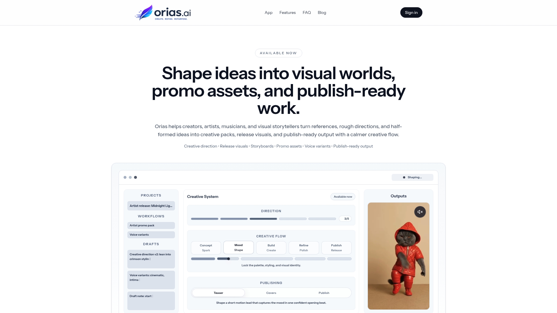
For an independent artist, that might mean developing the visual universe for a single release before generating cover directions, teaser frames, Canvas concepts, and announcement assets. For a digital creator, it might mean turning a loose aesthetic into repeatable social content variations. For a creative team, it can help organize campaign thinking before production pressure begins.
The strongest workflow is not “let AI decide the brand.” It is “define the world, then use AI to explore it with discipline.” That is where a brand world bible becomes valuable: it gives every AI-assisted output something to answer to.
Orias AI helps creators move from loose ideas to clearer creative packs, release visuals, promo assets, and publish-ready output without losing the original artistic direction.
Frequently Asked Questions
What is a brand world bible?
A brand world bible is a structured creative guide that defines the visual universe of a brand, artist, creator, or campaign. It usually includes mood, references, symbols, visual rules, materials, composition guidance, platform adaptations, prompt patterns, and rejection criteria.
How is a brand world bible different from a brand style guide?
A style guide often focuses on logos, fonts, colors, and basic brand usage. A brand world bible goes deeper into atmosphere, storytelling, visual logic, scene rules, emotional tone, and how the brand should appear across different types of creative assets.
Can AI build a brand world bible for me?
AI can help organize ideas, generate directions, create variations, and turn rough references into a clearer structure. But the final decisions should come from human judgment. Your taste, story, audience, ethics, and creative goals determine what belongs in the world.
What should musicians include in a brand world bible?
Musicians should include release mood, cover art direction, color behavior, recurring symbols, Canvas ideas, teaser formats, press image direction, lyric visual style, poster rules, and examples of what does not fit the project.
How do I keep AI-generated visuals consistent?
Start with a clear creative direction before prompting. Use recurring rules for light, space, materials, symbols, composition, and exclusions. Generate variations around controlled variables, then review every output against the same brand world checklist.
Should every asset look the same?
No. Consistency does not mean repetition. A strong brand world can adapt across platforms while keeping the same emotional tone, visual logic, and symbolic language. The goal is recognition, not duplication.
What is the biggest mistake creators make with AI visual branding?
The biggest mistake is treating AI generation as the strategy. AI can produce options, but it cannot automatically know what is meaningful for your brand. Without a clear world bible, creators often publish polished but disconnected visuals.