How to Build a Visual Metaphor System for Your Brand with AI
Develop a visual metaphor system with AI to turn brand ideas into consistent visuals, campaign assets, release imagery and social content.

TL;DR:
- A visual metaphor system turns your brand idea into a repeatable set of symbols, environments, textures, movements, and image rules.
- AI can help you explore and scale those visuals, but the system only works when you define the metaphor clearly before generating assets.
- The practical goal is not one beautiful image; it is a visual language that adapts across releases, campaigns, social posts, thumbnails, motion loops, and promo materials.
Many creators know what their brand feels like before they know what it should look like. A musician might describe a new era as “cold but intimate.” A visual storyteller might want their work to feel “ritualistic, fragile, and futuristic.” A creator building a personal brand may know they stand for discipline, experimentation, or emotional honesty, but still struggle to translate that into consistent imagery.
That gap is where visual metaphors become useful. Instead of treating brand visuals as a random mix of colors, fonts, and nice-looking references, a visual metaphor gives the brand a symbolic engine. It turns an abstract idea into something people can recognize: a glass house, a signal tower, a cracked mirror, a ritual table, a night train, a weather system, a glowing archive.
AI makes this easier and more dangerous at the same time. It can quickly produce dozens of directions, but it can also pull a brand toward generic “cool visuals” with no internal logic. The difference is the system behind the prompts.
This guide shows you how to build a visual metaphor system with AI: how to define the metaphor, translate it into visual rules, generate useful variations, adapt it across formats, and review the results before publishing.
Table of Contents
- Key Takeaways
- Find the Brand Tension Before Choosing the Metaphor
- Build a Metaphor Map, Not a Mood Board Dump
- Turn the Metaphor into AI-Ready Visual Rules
- Generate Visual Families Instead of One-Off Images
- Adapt the Metaphor Across Real Campaign Assets
- Protect the System from Drift, Cliché, and Overproduction
- Turn the Final Direction into a Living Creative Pack
- How Orias AI Fits into This Workflow
- Frequently Asked Questions
- Sources Used
Key Takeaways
| Point | Details |
|---|---|
| A metaphor is a creative operating system | It gives your brand a symbolic world that can repeat across visuals without looking identical every time. |
| AI works best after direction is defined | Random prompting produces random style. A metaphor map gives AI constraints, language, and visual logic. |
| Strong metaphors have rules | Define symbols, materials, lighting, camera behavior, motion, color, and what should never appear. |
| Consistency requires variation | A system should create related assets for social posts, release visuals, thumbnails, motion loops, and campaign materials. |
| Human review is non-negotiable | AI output still needs checks for taste, originality, platform fit, rights, likeness, and brand alignment. |
| The system should evolve | Store approved prompts, rejected directions, image rules, and asset examples so the brand can mature over time. |
Find the Brand Tension Before Choosing the Metaphor
A visual metaphor system starts with tension, not decoration. If the metaphor is only aesthetic, it will quickly become shallow. If it comes from a real brand conflict, it can generate stronger creative decisions.
For example, “growth” is too broad. “Growth under pressure” is better. “A plant growing inside a machine” is a usable metaphor because it contains contrast: organic versus industrial, softness versus control, life versus structure.
For a musician, the tension might be:
- vulnerability versus performance
- nostalgia versus reinvention
- intimacy versus scale
- chaos versus discipline
- romance versus isolation
For a digital creator, it might be:
- personal voice versus algorithm pressure
- craft versus speed
- education versus entertainment
- polish versus authenticity
For a visual brand, it might be:
- luxury versus rawness
- optimism versus uncertainty
- minimalism versus emotional depth
- technology versus human touch
The mistake to avoid is choosing a metaphor because it looks trendy. A chrome butterfly, melting face, burning flower, or neon portal may look interesting once, but if it does not express the brand’s core tension, it will not hold a campaign together.
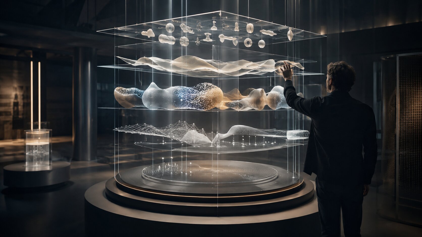
A good starting formula is:
Brand belief + emotional tension + symbolic container = visual metaphor.
Example:
- Brand belief: Creativity needs structure.
- Emotional tension: Freedom can become chaos.
- Symbolic container: A wild garden inside a precise glass grid.
- Visual metaphor: Controlled wilderness.
That metaphor can now produce image rules, motion ideas, campaign visuals, and social assets.
Build a Metaphor Map, Not a Mood Board Dump
A mood board collects references. A metaphor map explains how the visual world works.
This matters because AI tools respond better to structured creative direction than to vague taste language. Instead of saying “make it cinematic, futuristic, and emotional,” define the metaphor’s components.
A practical metaphor map includes five layers.
1. Core metaphor
Write one sentence that explains the visual idea.
Example: The brand is a signal tower in fog: clear, calm, and useful in a noisy environment.
This gives you a symbolic anchor. It also prevents the system from expanding into unrelated visuals.
2. Symbol library
List recurring objects or forms.
For the “signal tower in fog” metaphor, the symbol library might include:
- towers
- soft beams of light
- fog layers
- radio waves
- quiet landscapes
- control panels
- horizon lines
- distant silhouettes
The symbols should be flexible. A tower can become a vertical composition, a light beam, an abstract column, or a motion loop.
3. Material language
Define textures and surfaces.
- frosted glass
- matte metal
- paper grain
- wet pavement
- soft fabric
- analog screen glow
- dust in light
- translucent plastic
Material choices make AI visuals feel more specific. They also help prevent the “generic digital art” look.
4. Emotional temperature
Name the mood precisely.
Avoid broad words like “cool” or “premium” by themselves. Use combinations:
- calm but alert
- intimate but cinematic
- strange but warm
- polished but handmade
- futuristic but not sterile
- nostalgic but not retro
5. Exclusion rules
A strong visual system says no.
- no literal microphones
- no floating generic UI screens
- no readable text
- no celebrity likeness
- no horror imagery
- no over-saturated neon
- no cliché cyberpunk city
- no fake logos
Exclusion rules are especially important in AI workflows because image models often reach for familiar visual shortcuts.
Turn the Metaphor into AI-Ready Visual Rules
Once the metaphor map is clear, translate it into promptable rules. Think like a creative director, not just a prompt writer.
A useful AI-ready system includes rules for composition, lighting, color, subject, motion, and format.
Visual rule example
For a brand metaphor such as “an archive of future memories,” the rules might look like this:
| Rule Type | Direction |
|---|---|
| Composition | Centered objects, negative space, quiet symmetry, occasional close-up crops |
| Lighting | Soft directional light, subtle glow, low contrast shadows |
| Color | Warm neutrals, faded silver, muted blue, aged paper tones |
| Symbols | Transparent folders, glass boxes, analog devices, memory fragments |
| Materials | Paper, dust, frosted acrylic, brushed metal, soft screen light |
| Avoid | Sci-fi clichés, hologram overload, readable documents, obvious nostalgia props |
This kind of structure gives AI enough specificity to produce related variations without making every image identical.
Prompt structure for metaphor systems
Use this format:
Brand metaphor + scene type + symbolic elements + material language + mood + composition + format + exclusions.
Example:
A cinematic editorial visual based on the brand metaphor “an archive of future memories,” showing translucent archive boxes, soft screen glow, paper fragments, and brushed metal surfaces in a quiet modern studio. The mood is intimate, reflective, and slightly futuristic. Centered composition, soft directional lighting, muted warm neutrals and faded blue, high detail, no readable text, no logos, no famous faces, no cyberpunk city, no clutter.
The point is not to create one perfect prompt. The point is to create a reusable prompt grammar.

Generate Visual Families Instead of One-Off Images
The biggest mistake creators make with AI visuals is judging each image alone. Brand systems need families.
A visual family is a set of related outputs that share the same metaphor but serve different roles. For example:
- hero image
- vertical social post
- square carousel cover
- YouTube thumbnail background
- Spotify Canvas direction
- release announcement visual
- behind-the-scenes story frame
- email header
- website section image
- motion loop concept
This matters because platforms reward different formats, contexts, and viewing behaviors. TikTok creative guidance emphasizes TikTok-first production basics such as vertical 9:16 orientation, high-resolution footage, and keeping key content visible within safe zones. Meta’s Reels guidance also recommends vertical 9:16 video for mobile viewing.
For musicians, Spotify Canvas is another useful example: Spotify describes Canvas as a short looping visual added to tracks, and its support documentation identifies it as a 3–8 second vertical loop in the Now Playing view. Spotify’s Canvas guidelines also recommend avoiding rapid cuts or intense flashing graphics and considering how phone screens may crop edges.
A metaphor system helps you adapt without starting over. The “signal tower in fog” can become:
- a vertical Reels background with a moving light beam
- a square release teaser with a small tower silhouette
- a Spotify Canvas loop with fog slowly passing through light
- a YouTube thumbnail environment with a clean focal point
- a campaign header with horizon lines and soft signal waves
The metaphor stays consistent. The asset changes for the platform.
Adapt the Metaphor Across Real Campaign Assets
A metaphor becomes valuable when it survives production pressure. The system should help you make decisions quickly when you need assets for a launch, release, announcement, or content series.
Use this workflow.
Step 1: Define the campaign moment
Ask what the asset needs to do:
- introduce a new era
- tease a release
- explain a concept
- invite people to listen
- announce a date
- recap a project
- create anticipation
- deepen the story after launch
The metaphor should bend toward the purpose.
Step 2: Choose the asset role
Do not use the same visual intensity everywhere.
A campaign usually needs:
| Asset Role | Visual Function |
|---|---|
| Hero asset | Defines the world |
| Teaser asset | Creates curiosity |
| Detail asset | Shows texture, object, or symbol |
| Social variation | Adapts the idea to feed behavior |
| Motion asset | Adds rhythm, loop, or atmosphere |
| Utility asset | Supports announcements, dates, or calls to action |
Step 3: Scale from world to detail
A strong metaphor system works at multiple distances.
For example, if the metaphor is “a weather system for emotional change,” the campaign can include:
- wide landscape with storm light
- close-up condensation on glass
- abstract pressure-map lines
- portrait with wind movement
- motion loop of clouds shifting
- minimal announcement image with mist texture
This creates variety without losing the world.
Step 4: Prepare platform-specific crops
AI images often look good in one ratio but fail in another. Plan crops early:
- vertical 9:16 for Reels, TikTok, Shorts, and Stories
- square 1:1 for feed and carousel covers
- 4:5 for Instagram feed presence
- 16:9 for YouTube, website heroes, and widescreen campaign assets
- 3–8 second vertical loop direction for Spotify Canvas when relevant
YouTube allows creators to add custom thumbnails through YouTube Studio, which makes thumbnail design an important visual touchpoint for video-led creators. For AI-assisted video workflows, YouTube also requires disclosure when realistic content is meaningfully altered or synthetically generated.
Protect the System from Drift, Cliché, and Overproduction
AI can expand a visual metaphor quickly, but speed creates drift. Drift happens when each new asset moves slightly away from the original idea until the brand becomes inconsistent.
Common drift patterns include:
- the color palette slowly becomes more saturated
- symbols multiply until the image feels cluttered
- the metaphor becomes too literal
- every asset uses the same composition
- the outputs start imitating popular AI aesthetics
- the visuals look impressive but say nothing specific
Use a review pass before publishing.
The metaphor review checklist
Ask these questions:
- Does this asset express the core metaphor without needing an explanation?
- Does it still match the emotional temperature?
- Are the materials, symbols, and lighting consistent?
- Is the image useful in its intended format?
- Does it avoid forbidden symbols or clichés?
- Are there any rights, likeness, or disclosure issues?
- Would this still feel like the same brand if the logo were removed?
- Is the asset strong enough to publish, or only interesting as exploration?
Human judgment matters here. AI is useful for ideation, variation, and speed, but it cannot fully replace taste, context, ethics, or brand responsibility.
For transparency, creators should also understand provenance and disclosure tools. Adobe describes Content Credentials as metadata that can show how content was made, including whether it was generated by AI or edited in tools such as Photoshop. C2PA describes its standard as a way for publishers, creators, and consumers to establish the origin and edits of digital content.
These systems do not remove the need for editorial review. They simply support a more transparent creative process.
Turn the Final Direction into a Living Creative Pack
A visual metaphor system should not live only in scattered prompts. Store it as a creative pack that can be reused.
Your creative pack should include:
- metaphor statement
- brand tension
- symbol library
- material language
- color palette
- lighting rules
- composition rules
- motion rules
- prompt templates
- approved image examples
- rejected image examples
- platform crop notes
- disclosure and rights checklist
- update notes after each campaign
This is similar to how brand systems centralize identity elements. Canva describes a Brand Kit as a place to store brand fonts, colors, logos, imagery, graphics, and templates so teams can maintain consistency across touchpoints. Canva’s help documentation also frames Brand Kit as a visual identity hub for essential brand elements such as logos, fonts, colors, and templates.
For AI-assisted brands, the creative pack needs one extra layer: generation logic. It should not only show what the brand looks like. It should explain how new assets should be created.
Approved versus rejected examples
Do not only save the best outputs. Save rejected outputs with short reasons.
Example:
| Output | Decision | Reason |
|---|---|---|
| Fog tower with soft beam | Approved | Clear metaphor, strong negative space, usable crop |
| Neon tower in cyberpunk city | Rejected | Too generic, wrong emotional tone |
| Abstract signal waves on paper | Approved | Good detail asset for carousel or email |
| Literal radio antenna with logo | Rejected | Too obvious, too promotional |
This helps you avoid repeating mistakes when you return to the system later.
How Orias AI Fits into This Workflow
Orias AI is designed for creators who need to move from rough creative ideas into clearer visual worlds, campaign materials, release visuals, promo assets, and publish-ready creative packs.
For a visual metaphor system, that means using AI less like a random image generator and more like a structured creative partner. You can start with a loose concept, define the metaphor, explore directions, generate asset families, compare variations, and refine the final system before publishing.
The strongest use case is not replacing your artistic voice. It is making your voice easier to translate across formats, campaigns, and content cycles without rebuilding the brand from scratch every time.
Frequently Asked Questions
What is a visual metaphor system?
A visual metaphor system is a repeatable creative framework that turns an abstract brand idea into recognizable symbols, materials, moods, compositions, and asset rules. Instead of making disconnected visuals, you build a world that can adapt across many formats.
How can AI help create brand metaphors?
AI can help brainstorm symbolic directions, generate visual variations, test different moods, and adapt one metaphor into multiple campaign assets. It works best when you give it a clear metaphor map instead of vague style prompts.
What makes a visual metaphor strong?
A strong metaphor connects to the brand’s real tension or belief. It should be specific enough to guide visuals but flexible enough to produce variation. “Transformation” is weak by itself; “a paper body becoming light” is more useful.
Can musicians use visual metaphor systems for releases?
Yes. Musicians can use a metaphor system to connect cover art, Spotify Canvas ideas, teaser visuals, lyric clips, social posts, merch direction, and release campaign imagery. The result is a more coherent era around the music.
How do I keep AI-generated brand visuals consistent?
Use a documented creative pack with approved symbols, color rules, lighting rules, composition rules, prompt templates, and rejected examples. Consistency comes from clear direction and review, not from repeating the same prompt forever.
Do I need to disclose AI-generated visuals?
It depends on the platform, context, and how realistic or meaningfully altered the content is. YouTube, for example, requires disclosure when realistic content is meaningfully altered or synthetically generated. Always check the rules for the platform where you publish.
What is the biggest mistake to avoid?
The biggest mistake is treating the metaphor as decoration. A visual metaphor should guide the whole creative system: what appears, what does not appear, how the world feels, how assets adapt, and how people recognize the brand over time.