By Orias AI
AI Icon Generator: How to Create Consistent SVG Icon Sets From Text
AI icon generators can draft editable SVG paths from text. Set a shared grid, viewBox, palette, and QA process before generating a full library.
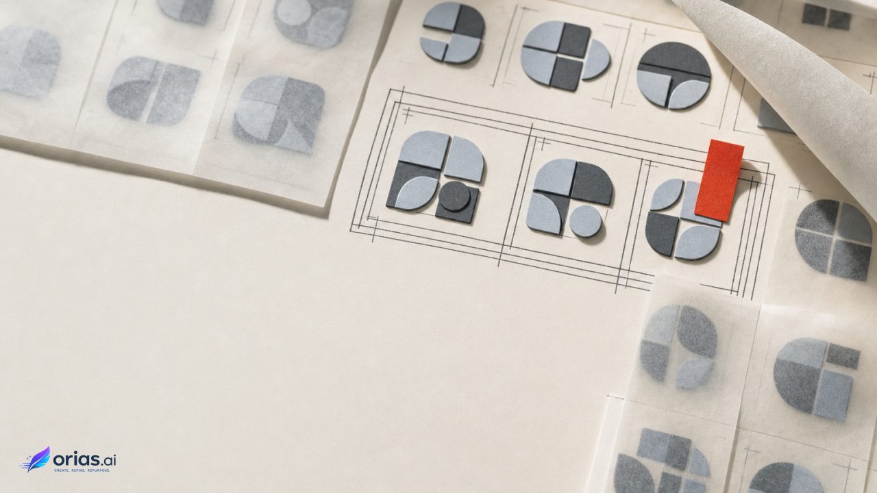
An AI icon generator is a text-conditioned system that drafts icon artwork as vector instructions—often ordered SVG paths or related vector commands—rather than producing only a flat, pixel-based image. The useful output is an editable SVG that a designer can inspect, adjust, and place into an interface or campaign system. SVG is resolution-independent: its geometric elements and paths can scale across interface sizes without becoming pixelated, which is why it is an appropriate delivery format for icons rather than merely a convenient export option. Research on text-guided vector icon synthesis describes this path-based approach, while MDN’s SVG documentation explains the format’s path foundation.
That does not make a text prompt a finished icon library. A library works when its symbols share proportion, optical weight, placement, color treatment, and behavior at the sizes where people will actually see them. Treat generation as a constrained vector-drafting step, then subject the files to the same design review and production cleanup as any other supplied asset.
What an AI icon generator produces
An AI icon generator can produce a conventional image with pixels, ambiguous edges, and proportions that vary from prompt to prompt, or it can produce editable vector output. In a text-to-vector workflow, the icon is expressed as SVG geometry—paths, shapes, fills, strokes, and their ordering—so a team can revise a corner radius, gap, or badge position without redrawing neighboring elements.
For a concept such as “calendar,” the useful handoff is the SVG source, not a screenshot or raster preview. Its geometry should be manageable and use a shared coordinate system such as a viewBox, alongside consistent proportions, placement, color treatment, and behavior across the collection. That matters when the same mark appears in a compact product control, help panel, onboarding screen, or launch graphic: vector scaling prevents resolution loss across those uses.
Build the icon system first
Before anyone writes individual object prompts, define the rules that every icon must obey. Established icon guidance emphasizes consistent size and color use, and icon collections also need consistent placement and appearance across their intended display environments. Those are system decisions, not decoration added after generation. Google’s Material Icons guidance is one useful reference for the relationship between common sizing, color treatment, and a shared design language; ETSI’s icon guidance similarly stresses display conditions and consistency across environments.
- Canvas and safe area: Choose the icon canvas and reserve consistent interior space. Record where artwork may reach the edge and where it must not.
- Coordinate system: Set one SVG
viewBoxfor the collection. The attribute establishes the coordinate system and dimensions mapped into the rendered viewport, making it a practical anchor for common sizing and alignment. - Visual language: Specify filled, outlined, or mixed treatment; permitted stroke behavior; corner character; intended visual weight; and the amount of detail appropriate to the smallest use.
- Color policy: State whether assets are monochrome, use a limited palette, or inherit color from their host context. Do not let each generated icon improvise its own accents.
- Composition rules: Decide how centered objects sit, how secondary marks such as plus signs or notifications attach, and how much empty space comparable concepts receive.
A shared viewBox does not automatically make shapes consistent, but it gives reviewers a common coordinate frame in which to compare them. MDN notes that the SVG viewBox controls this mapping. Without that foundation, “make it the same size” is usually an imprecise request passed between prompt writer, designer, and engineer.
Turn rules into a prompt brief
The prompt for a library should have two layers: the variable concept and the fixed system brief. Keep the fixed brief in one source-controlled document or template. Changing it casually from icon to icon is a fast way to produce a collection that has matching labels but conflicting visual grammar.
Create an editable SVG icon for: [OBJECT].
Use the collection’s shared viewBox: [VALUE].
Follow the approved [filled/outlined] visual language, palette,
interior safe area, proportions, and placement rules.
Keep the silhouette clear at the target interface size.
Use only the approved secondary symbol treatment, if needed.
Return separable vector components suitable for later editing.
The bracketed values are deliberately not universal. A team should fill them with its own approved rules rather than assume that a generic canvas or style will suit every product. The object description should name the semantic distinction that matters. “Folder with upload indicator” is a more testable request than “modern cloud folder,” because the reviewer can inspect whether the indicator reads, where it sits, and whether it disturbs the silhouette.
Start with a small pilot, not the full backlog. Generate a handful of concepts that exercise different forms: a simple rounded object, a directional control, an object with an internal cutout, and an icon with a secondary status mark. Compare their mismatches, revise the fixed brief, and only then use that brief for remaining concepts. Text-conditioned vector generation can produce editable path sequences, but the system rules are what turn separate outputs into a set.
Pilot and review at target sizes
Reviewing a generated calendar by itself is not enough. Put the pilot icons side by side in the actual shared viewBox, then render them where they will be used. The relevant comparison is relational: does one icon look denser, sit higher, occupy more of its safe area, or require more effort to recognize than its neighbors?
- Inspect the silhouette without relying on internal detail. Distinct concepts should remain distinguishable as simplified forms.
- Check bounds and alignment against the shared coordinate system. Look for inconsistent centering, uneven margins, and secondary symbols that drift outside the established composition.
- Compare visual weight across the row. A solid, highly occupied icon can feel louder than a sparse outlined one even when both use the same nominal dimensions.
- Render at each intended interface condition and inspect the result in context. Fine cuts, close parallel lines, and small interior gaps may not survive the target presentation.
- Record corrections as rules where possible. “Status badge uses this placement relationship” is a system update; manually nudging one file is only a local fix.
This sequence separates two decisions that are often confused. The first is whether an icon communicates its intended concept. The second is whether it belongs visually to the collection. A mark can pass the first and still fail the second because its proportions, empty space, or treatment depart from the established language.
Edit SVGs as production assets
Research on editable text-to-vector representations identifies post-generation modifiability as a practical concern. Treat generation as the start of production: layered, editable SVG representations let the team modify individual shapes and components instead of re-prompting for every correction. Simplify unnecessarily complex geometry, align elements to the collection’s intended placement, and correct proportions that break the system. Keep meaningful elements such as a notification dot, arrow, container, or inner glyph separable so they can be repositioned, removed, or reused when a campaign needs a variant without a status mark or a product team uses the same base icon in another context.
Use the SVG source as the review artifact. VectorFusion research notes that a preview can conceal awkward path construction or components that cannot be safely adjusted later. Review the source against the agreed coordinate system and visual language. The goal is an editable asset, not preservation of every generated decision.
Where text-to-vector breaks down
Direct text-to-vector generation remains limited in quality, diversity, flexibility, and geometric precision. VectorFusion also warns that raster-first conversion can leave jagged paths and other artifacts, so an icon-shaped preview is not proof of clean production vector art. The paper’s discussion of these limits is a useful corrective to over-trusting the output.
One-shot generation can make a plausible icon without maintaining consistent geometry or visual treatment across the set. Even when the vector is editable, its paths may be inefficient or rough.
Approve the asset through visual comparison, target-size rendering, and source-file inspection—not merely because “the prompt returned SVG.” Use AI for early drafts and options, while a designer or production owner remains responsible for the set-wide constraints, final paths, and operating conditions.
Frequently Asked Questions
Is an AI icon generator the same as an image generator?
Not necessarily. An image generator may produce raster artwork, while a text-to-vector icon generator is designed to produce editable vector instructions such as SVG paths. Confirm the export and inspect the source rather than assuming a preview is vector-native.
Why do all icons need the same viewBox?
A common viewBox gives every asset the same coordinate frame for scaling and placement. It makes systematic comparison and alignment much more reliable, although designers still need to control optical balance and safe-area use.
Can I generate each icon with a different prompt?
The object description should change, but the system brief should remain stable. Run a pilot set first, update the shared rules in response to observed mismatches, then apply that approved brief across the collection.
What should I check before exporting generated SVGs?
Check the source geometry, shared viewBox, bounds, component alignment, visual weight, and rendering at the intended display sizes. Ensure that secondary components remain editable if a variant will be needed later.
Can AI-generated SVG icons skip designer review?
No. Current text-to-vector approaches can struggle with precision and output quality, and vectorized raster workflows can carry artifacts. Human review remains necessary to enforce the icon system and prepare final production assets.