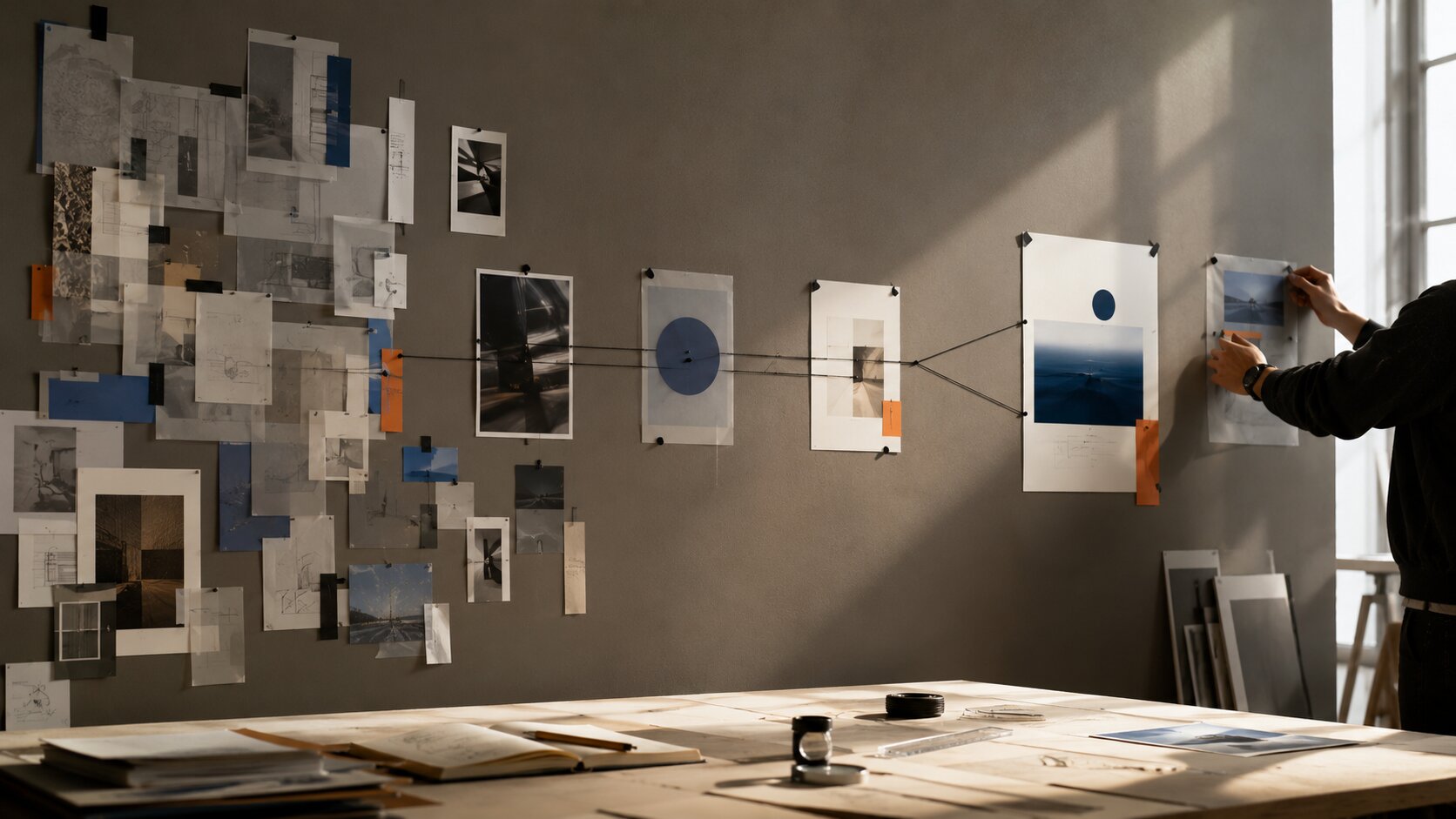
Prompt-to-Prototype: Using AI Visuals to Test Product Concepts Before Design
Use AI visual prototyping to test product concepts, compare creative directions, gather useful feedback and make better decisions before detailed design begins.

TL;DR:
- Use AI visuals to make an early product idea concrete enough to question before investing in detailed UX or UI design.
- Generate genuinely different concept directions rather than polishing one attractive mockup too early.
- Carry the insights, constraints, and validated assumptions into real design. The AI prototype itself should remain disposable.
A product idea can sound completely convincing in a document and become strangely vague the second somebody asks, "Okay, but what would this actually look like?"
That is a useful moment.
You might have a feature concept, a new creator tool, an app workflow, a marketplace idea, or a service that still exists mostly as notes and conversations.
Traditionally, someone eventually has to open a design tool and start translating all of that into screens.
By then, though, the team may already be attached to the idea.
AI visuals create another option.
You can make the concept visible earlier, before anyone spends days perfecting grids, components, copy, edge cases, and interactions around an assumption that may not survive its first real test.
The goal is not to generate a beautiful fake product.
It is to make the idea concrete enough to inspect.
A useful AI prototype gives people something they can react to, misunderstand, compare, reject, or improve while changing direction is still cheap.
Table of Contents
- Key Takeaways
- Treat the First Visual as a Question, Not an Answer
- Prototype the Idea Before You Prototype the Interface
- Build Three Versions That Test Different Assumptions
- Make the Prototype Just Real Enough to Judge
- Put It in Front of People and Watch Where They Hesitate
- Turn Feedback Into Design Constraints, Not Random Edits
- Move From Visual Experiment to Actual Design
- Where Orias AI Fits in a Prompt-to-Prototype Workflow
- Frequently Asked Questions
- Sources Used
Key Takeaways
| Point | Details |
|---|---|
| Start with a question | Decide exactly what you need to learn before generating a product visual. |
| Test concepts before details | Early visuals should test the product idea, workflow, hierarchy, or behavior before typography and component polish. |
| Compare competing directions | One convincing mockup can create false confidence. Generate several directions based on different assumptions. |
| Match fidelity to the decision | Add only the amount of realism needed to answer the question you are testing. |
| Observe understanding | Watch what people understand, expect, ignore, and misunderstand instead of asking only whether they like the visual. |
| Keep the learning, not the mockup | Validated assumptions and design constraints should survive into production. The early AI prototype does not have to. |
Treat the First Visual as a Question, Not an Answer
The easiest mistake with AI prototyping is also the most seductive one.
You type a prompt.
A moment later, you are looking at a polished product screen with neat cards, tasteful gradients, beautiful photography, and suspiciously perfect spacing.
Everyone likes it.
Now you are designing that product.
The problem is that almost nothing has actually been tested.
Before generating a visual, write down the question the visual is supposed to answer.
- Can someone understand the core value of this product without an explanation?
- Does this feature feel like part of the existing product or like a separate tool?
- Should the experience begin with creation, browsing, or guided setup?
- Does the concept feel simple enough for someone seeing it for the first time?
- Would users expect this action to happen during creation or after an asset is generated?
The question determines what needs to appear in the prototype.
If you are testing where a new feature belongs, you do not need realistic profile pictures, perfect typography, or ten completed screens.
You need enough surrounding context to understand the feature's place in the workflow.
If you are testing whether a creator understands the value of a new AI workflow, the interface may matter less than showing what goes in, what happens, and what comes out.
Pro Tip: Keep the main research question visible while generating concepts. If you start adding elements that do not help answer that question, the prototype is probably becoming more polished than useful.
Prototype the Idea Before You Prototype the Interface
You do not always need to begin with UI.
Sometimes the bigger uncertainty sits one level above it.
Imagine you are exploring a product that turns a musician's release concept into a coordinated set of cover ideas, social visuals, video frames, and promotional copy.
You could immediately generate a dashboard.
But the more useful question may be what kind of experience the product should feel like.
- A conversation that develops the project through questions
- A visual canvas where ideas and references are arranged freely
- A guided project builder that moves through a clear sequence
- A creative library that gradually fills with related outputs
Those are four different product concepts.
They are not simply four interface styles.
Before designing detailed screens, visualize the experience itself.
| Frame | What Happens |
|---|---|
| 1. Starting point | The creator arrives with a rough idea and a few visual references. |
| 2. Interpretation | The product turns that material into several possible creative directions. |
| 3. Selection | The creator chooses one direction worth developing. |
| 4. Expansion | Related visual and promotional assets begin to appear from the same creative source. |
| 5. Refinement | The creator adjusts, replaces, approves, and prepares the strongest outputs. |
A simple sequence like this can expose important questions before detailed interface work begins.
What is automatic?
Where does the creator need to make a decision?
Should the system propose a direction before the user chooses a format?
Does the product generate individual assets or a coordinated visual system?
AI imagery is useful here because it allows you to explore an experience before every interaction has been formally specified.
Build Three Versions That Test Different Assumptions
Testing one early concept often turns into a discussion about details.
Testing several concepts makes it easier to discuss the idea itself.
Create three directions that deliberately make different assumptions about how the product should work.
| Direction | Core Assumption | What You Can Learn |
|---|---|---|
| Guided | Users want clear steps and visible progression. | Whether structure makes the concept easier to understand and complete. |
| Open canvas | Users want freedom to explore before committing to a sequence. | Whether a flexible visual workspace feels more natural for creative exploration. |
| AI-led | Users want the system to create a useful starting point immediately. | Whether immediate output creates confidence or makes the experience feel less controllable. |
Keep the underlying product goal consistent.
Change the interaction model or product assumption you are testing.
This prevents a common prompt-to-prototype failure where five generated screens look different but behave exactly the same way.
Changing a sidebar color is not concept exploration.
Moving a button is not a new product direction.
Replacing rows with cards may change presentation while leaving the underlying idea untouched.
Early prototyping becomes more useful when each direction contains a different answer to an important product question.
Keep the Visual Treatment Controlled
If one version is elegant and minimal while another accidentally looks dated or cluttered, people may react to styling instead of the product model.
Hold as much as possible constant across the concepts.
- General color direction
- Typography mood
- Image treatment
- Device or screen context
- Approximate content density
- Level of visual polish
Then let the actual product assumption become the major difference.
Make the Prototype Just Real Enough to Judge
Prototype fidelity creates an interesting problem.
If the visual is too rough, people may struggle to imagine the experience.
If it is too polished, they may assume important decisions have already been made.
The useful point is somewhere in the middle.
An early AI prototype might need realistic hierarchy, believable content density, representative imagery, approximate product language, and a few meaningful states.
It probably does not need the entire product.
| Usually Worth Showing | Usually Safe to Delay |
|---|---|
| Main hierarchy and primary action | Complete component libraries |
| Believable content and imagery | Every empty and error state |
| Key product states | Perfect responsive behavior |
| Enough context to understand the workflow | Full settings and account management |
| Consistent visual rules | Production-ready copy for every screen |
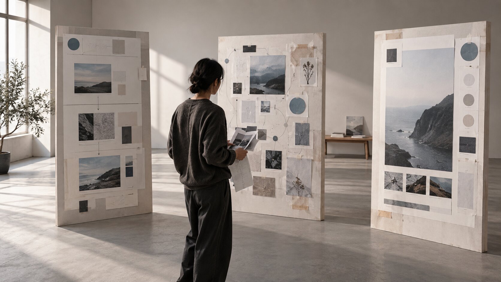
The important distinction is between looking believable and being finished.
AI can make an unfinished concept look surprisingly complete.
That visual confidence should not be mistaken for product validation.
The prototype only needs enough detail to make the uncertainty visible.
Use References to Reduce Random Variation
References become especially important when you are comparing concepts.
A shared visual language keeps the comparison focused.
Use the same mood references, brand materials, screenshots, image treatments, or composition rules across several generated directions.
Then change only the part of the concept you actually want to test.
Reference-driven generation can help control structure and style, but human review is still needed.
An output can look consistent while still communicating the wrong product behavior.
Put It in Front of People and Watch Where They Hesitate
Once the prototype makes sense to you, stop explaining it.
Show it to someone who was not involved in creating it.
Then ask something simple.
What do you think this product does?
Or:
What would you do next?
The first answer is often more useful than a long design critique.
Maybe your creative direction generator looks like an image search tool.
Maybe the primary action you thought was obvious is barely noticed.
Maybe people assume an automatically generated result is something they need to configure manually.
Those are useful findings.
They are also much cheaper to discover now than after the real product has been designed and built.
Watch Four Types of Reaction
| Reaction | What It Can Tell You |
|---|---|
| Immediate understanding | The strongest parts of the hierarchy or product explanation are probably working. |
| Confident misunderstanding | The prototype may be communicating the wrong product model very clearly. |
| Expected next action | Reveals the interaction model people naturally assume from the visual. |
| Ignored elements | Features or messages the team considers important may not have meaningful visual weight. |
Avoid relying on "Do you like it?"
People can like the colors while misunderstanding the product.
Ask them what they believe is happening.
Understanding is the more useful signal.
Turn Feedback Into Design Constraints, Not Random Edits
After testing, it is tempting to return to the prompt and immediately fix everything people mentioned.
That can create an endless series of local edits without improving the underlying product idea.
Instead, translate repeated feedback into a design constraint.
Imagine several people say:
I did not realize those assets belonged to the same project.
A weak response would be:
Make the cards look more connected.
A more useful conclusion is:
The product needs a persistent project-level context so generated outputs are understood as parts of one creative system rather than unrelated files.
Now you have a principle that can survive beyond the prototype.
The final solution might involve grouping, navigation, visual identity, naming, hierarchy, or something else entirely.
You have preserved the learning without prematurely locking the implementation.
Another example:
If users repeatedly say they do not know what to type into the first input, the important conclusion is not simply "add better placeholder text."
The deeper constraint may be that the first interaction needs to demonstrate what kind of input produces a useful result.
That could eventually become examples, reference uploads, structured fields, guided onboarding, starter prompts, or another solution.
Move From Visual Experiment to Actual Design
Eventually, exploration has to stop.
A useful AI prototype should leave you with fewer important questions than you started with.
Before moving into detailed UX and UI work, create a short handoff that captures what the prototype actually taught you.
| Capture | Question to Answer |
|---|---|
| Chosen concept | Which product or experience model survived testing? |
| Validated assumptions | What did people consistently understand, expect, or prefer? |
| Rejected directions | Which promising ideas failed when someone actually tried to interpret them? |
| Design constraints | What now needs to remain true as the product becomes more detailed? |
| Remaining unknowns | What still requires research, technical validation, content work, or another focused prototype? |
Then rebuild the product properly.
Do not assume the generated image itself needs to become the final interface.
If starting again inside your real design system creates cleaner structure and better interaction logic, start again.
The prototype has already done its job.
It made an invisible idea visible early enough to argue with.
Where Orias AI Fits in a Prompt-to-Prototype Workflow
The hardest part of early product exploration is often not producing a polished interface.
It is turning scattered notes, references, moods, product ideas, and competing assumptions into a visual direction that can actually be discussed.
Orias AI can support that earlier stage of the workflow by giving creators and teams a place to develop rough ideas into clearer visual concepts before formal design begins.
You might begin with a written product idea, screenshots from existing workflows, mood references, a rough storyboard, or examples of the problem you are trying to solve.
From there, you can explore several interpretations of the same concept, create visual directions, compare alternatives, refine the brief, and develop stronger concepts into supporting creative material.
Instead of asking for:
Create a beautiful dashboard for an AI creative platform.
Start with the uncertainty you need to resolve:
Explore three ways a creator could move from a rough campaign idea and visual references to a coordinated set of release assets. One should feel guided, one should feel open and visual, and one should begin with an AI-generated direction.
That prompt is not asking AI to finish the product.
It is using AI to expose alternatives.
Once one direction survives comparison and feedback, it can move into a dedicated design workflow where real components, accessibility, responsiveness, interaction states, technical constraints, and product logic are handled properly.
AI helps widen the option space.
Human judgment still decides what deserves to become a product.
Frequently Asked Questions
What Is AI Visual Prototyping?
AI visual prototyping is the use of generative AI to create early visual representations of a product idea before the final design is developed.
These prototypes can include interface concepts, product states, storyboards, workflows, visual systems, packaging directions, or simple simulations of how an experience might feel.
Should AI Prototypes Replace Wireframes?
Not necessarily.
AI visuals are especially useful when you need to make an abstract concept tangible quickly.
Traditional wireframes can be better when information architecture, interaction logic, hierarchy, or precise screen relationships are the main questions.
Many workflows benefit from using both at different stages.
How Detailed Should an Early AI Prototype Be?
It should be detailed enough to answer the question you are testing and no more.
If you are comparing product models, keep the visual relatively broad.
If you are testing whether someone understands a particular interaction, you may need more realistic states and content.
How Many Product Concept Variations Should You Create?
Three genuinely different directions are often more useful than dozens of small variations.
The goal is not maximum output.
It is meaningful comparison between different assumptions about how the product could work.
Can AI-Generated Product Mockups Be Shown to Users?
Yes, when they are clearly treated as concepts rather than finished or available functionality.
Avoid presenting generated features, pricing, claims, or capabilities in a way that could make someone believe they already exist in the product.
What Should You Test First?
Start with the largest uncertainty.
That might be whether the idea is understandable, whether the workflow feels natural, whether a feature belongs in the product, or whether users interpret the value the way you expected.
Do not spend time testing visual details while a more fundamental product question is still unresolved.
When Should You Stop Prototyping and Start Designing?
Move forward when another early prototype is unlikely to change the core product concept.
You should have a reasonably clear experience model, a set of validated assumptions, known design constraints, and a short list of remaining questions that can be addressed during detailed UX, UI, technical validation, and implementation.
Sources Used
- Google for Developers, Design Thinking Process
- Google for Developers, Build Your Prototype
- Google Design, Simulating Intelligence: AI Prototyping
- Figma Help Center, Use First Draft with Figma AI
- Figma, Build With More Context and Control in Figma Make
- Adobe Firefly, Structure Image Reference
- Orias AI