The Look-Alike Trap: Making Generated Content Distinct in a Crowded Category
Make AI-generated content feel original, recognizable, and connected to your creative voice through clearer direction, controlled variation and deliberate editing.
TL;DR:
- Generated content starts looking generic when creators rely on the same references, prompt language, visual trends, and first-round outputs as everyone else.
- The solution is not simply writing a longer prompt. It is creating a clear set of visual, material, compositional, and language decisions that belong to your project.
- Generate genuinely different concept branches, then use human selection, editing, and platform-specific recomposition to turn the strongest direction into recognizable work.
You generate an image, caption, campaign concept, or release visual.
It looks polished. Nothing is obviously wrong with it.
Still, it feels familiar.
Maybe it has the same glossy lighting as every other AI campaign. The same dramatic wording. The same soft gradients, floating objects, cinematic haze, perfect symmetry, or vaguely futuristic mood.
It works at first glance, but it could belong to almost anyone.
That is the look-alike trap.
AI tools make competent output easier to produce, which means competence alone no longer creates much separation. Google’s guidance makes a similar point from a search perspective: useful content should offer real value rather than becoming another interchangeable page produced mainly for volume.
For artists, musicians, creators, and creative teams, the practical challenge is learning how to use generation without letting the tool’s defaults become your identity.
This guide explains how to identify the parts of your direction that are genuinely yours, turn them into usable constraints, generate meaningful alternatives, and edit the final work until it carries recognizable human intent.
Table of Contents
- Key Takeaways
- The Category Average Is Your Invisible Starting Point
- Choose the Decisions Only You Would Make
- Build a Creative Fingerprint Before You Prompt
- Use References as Constraints, Not Costumes
- Generate Branches, Not Near-Duplicates
- Edit Until the Work Shows Human Intent
- Keep the Identity When the Format Changes
- Run the Recognition Test Before Publishing
- Build a More Distinct Workflow With Orias AI
- Frequently Asked Questions
- Sources Used
Key Takeaways
| Point | Details |
|---|---|
| Generic inputs create familiar outputs | Broad prompts such as “cinematic,” “premium,” or “futuristic” push the work toward common category patterns. |
| Originality begins before generation | Decide what the work should emphasize, avoid, repeat, and leave unresolved before opening the tool. |
| References need interpretation | Extract specific qualities from references instead of asking a model to imitate their overall appearance. |
| Variation should change the idea | Generate different visual arguments rather than ten slightly altered versions of one composition. |
| Editing is part of authorship | Selection, arrangement, rewriting, compositing, and refinement are where personal judgment becomes visible. |
| Recognition matters more than polish | A strong asset should feel connected to your wider body of work even without a logo or name attached. |
The Category Average Is Your Invisible Starting Point
Every creative category develops a shared visual language.
Electronic music releases drift toward chrome, liquid forms, dark gradients, and sharp condensed type.
Wellness content leans on pale interiors, warm daylight, plants, and calm neutral palettes.
AI product campaigns often use glowing interfaces, floating glass objects, electric blue accents, and immaculate studio lighting.
These choices are not automatically bad.
The problem appears when they are used without a reason.
A generation model has seen countless examples of popular category imagery. When you give it a broad request, it tends to assemble a plausible answer from familiar patterns.
The output may look finished because the model understands the category. That does not mean it understands you.
A useful first step is to describe the category average before making anything.
| Category Default | More Deliberate Alternative |
|---|---|
| Dark futuristic studio | A worn rehearsal space at noon |
| Perfect central symmetry | An awkward crop with deliberate empty space |
| Smooth chrome surfaces | Scratched enamel, cloth, paper, or unfinished wood |
| Dramatic inspirational copy | A precise observation from a real situation |
| Generic cinematic lighting | Flat flash, overcast daylight, or sodium streetlight |
| Abstract innovation imagery | A visible task, object, or physical consequence |
You do not need to reject every convention.
Pick the ones that help, then remove or replace the ones that make the work anonymous.
Choose the Decisions Only You Would Make
Distinct work usually contains a few choices that another creator would not make in quite the same way.
Those choices might come from your environment, taste, personal history, working habits, sense of humor, or the specific world around a project.
They do not need to be dramatic.
Small concrete details often feel more original than a huge abstract concept.
Imagine two musicians creating visuals for a tense, stripped-back single.
One asks for “a dark cinematic portrait with red lighting.”
The other starts with a real memory: the green light from a broken vending machine in an empty station, damp concrete, a coat sleeve caught in the wind, and the uncomfortable pause after missing the last train.
The second direction already has a world.
The first has a genre.
Identify the Specific Trigger
Before prompting, ask what actually triggered the idea.
It could be a place, object, conversation, sound, mistake, memory, material, or physical texture.
A real trigger gives the creative direction something to organize itself around.
Name the First Thing the Audience Should Notice
Do not answer with a general mood.
Name the actual focal point.
It might be the pressure visible in an object, an unusual expression, a damaged surface, a specific physical action, or a gap where something should have been.
Remove One Obvious Category Choice
Decide which expected choice should be absent.
Perhaps there should be no neon, no glamorous portrait, no perfect typography, no floating objects, or no dramatic wide shot.
Removing one expected convention can create more distinction than adding five unusual details.
Leave Some Tension Unresolved
Distinct work often leaves a little friction instead of explaining everything.
An object may remain partly hidden. A sentence may stop before the expected conclusion. A visual relationship may feel slightly uncomfortable.
That unresolved space gives the audience something to enter.
Pro Tip: Replace one abstract adjective with one observable detail. “Melancholic” might become “condensation collecting inside a bus shelter after midnight.”
Build a Creative Fingerprint Before You Prompt
A creative fingerprint is a small set of repeatable decisions that helps your work remain recognizable.
It is not a rigid brand manual.
It is closer to a working note you can actually use while generating, editing, or briefing someone else.
Visual Behavior
Define how the image tends to behave.
- Subjects are pushed toward the edge.
- Empty space is allowed to dominate.
- Surfaces show wear and contact.
- Lighting feels observed rather than staged.
- One element interrupts an otherwise quiet frame.
Material World
Choose materials that belong naturally to your projects.
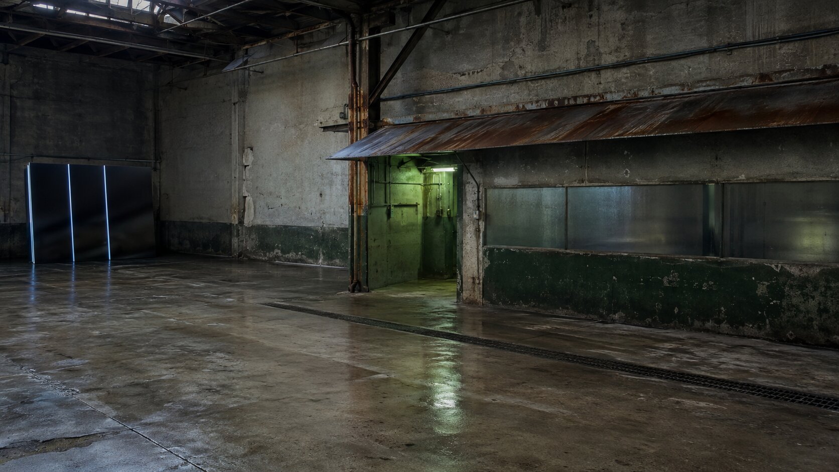
A musician might repeatedly use fogged glass, faded upholstery, oxidized metal, and cheap printed paper.
A digital artist might work with translucent resin, scan noise, stretched fabric, and hard directional shadows.
Material consistency can connect very different subjects without making every asset identical.
Color Logic
Do not just save five color codes.
Decide how color behaves.
Perhaps most scenes are nearly colorless, with one dirty orange detail.
Maybe warm colors only appear on objects that represent memory.
Maybe promotional assets avoid pure black and use deep brown instead.
That logic is more flexible than a fixed palette.
Language Habits
Writing develops look-alike patterns too.
Decide what your voice refuses to do.
You might avoid grand promises, rhetorical questions, dramatic one-line hooks, or phrases such as “unlock your potential.”
You may prefer specific verbs, dry humor, unfinished thoughts, or plain descriptions of what happened.
Productive Imperfections
Choose which flaws are allowed to remain.
A slightly crooked frame, an uneven texture, a blunt sentence, a clipped object, or an unexpected pause can help the work feel made rather than assembled.
The goal is not artificial messiness.
It is avoiding the automatic cleanup that removes every trace of character.
Use References as Constraints, Not Costumes
Reference images are useful, but they can easily pull your work toward imitation.
Tools such as Adobe Firefly let creators guide both visual style and image composition with references.
Composition controls can follow structural qualities such as outline, depth, and arrangement, while style references influence the overall appearance.
That makes references powerful for consistency.
It does not make them a substitute for direction.
Break References Into Usable Parts
Instead of uploading a collection of finished images and asking for “this vibe,” break each reference into specific qualities.
- What is the camera distance?
- Where is the visual weight?
- How much empty space is present?
- Which materials create the mood?
- Is the light hard, flat, diffused, or indirect?
- What feels controlled?
- What feels accidental?
- Which feature should not be copied?
Combine Qualities From Unrelated Sources
A useful creative direction might combine:
- The flat lighting of a passport photograph
- The surface wear of old industrial equipment
- The spacing of a minimalist book cover
- The color behavior of faded supermarket packaging
- A subject taken from your own release story
Now the references are helping you build rules.
They are not giving you a costume to borrow.
You should also check that you have permission to use uploaded references.
A tool accepting an image does not automatically settle the rights around that image or its later use.
Generate Branches, Not Near-Duplicates
A common workflow looks like this:
Generate four images. Choose the least bad one. Change two words. Generate four more. Repeat until tired.
That may produce polish, but it rarely produces a better idea.
A stronger approach is to generate separate branches.
Each branch should express the same underlying message through a different visual decision.
Suppose the concept is about an artist losing control of a release campaign.
You could explore:
- Object branch: One damaged mechanical object failing under pressure
- Environment branch: A physical space where every surface has been covered by competing material
- Process branch: A believable transformation where disorder becomes controlled
- Absence branch: An almost empty scene showing what was removed
- Consequence branch: The visible result of a decision rather than the decision itself
These are genuinely different routes.
Changing the lens, color, or aspect ratio is not.
Generate a small number of options within each route, then compare the routes before refining one.
This keeps you from becoming attached to the first plausible composition.
Score Directions Before Refining Them
| Question | Score |
|---|---|
| Does the idea make sense without explanation? | 1–5 |
| Does it avoid the obvious category solution? | 1–5 |
| Does it connect to the actual project? | 1–5 |
| Could another creator easily publish the same thing? | 1–5, reversed |
| Can it expand into several useful assets? | 1–5 |
The winner should not simply be the prettiest image.
It should be the direction with the strongest identity and enough range to support the wider campaign.
Edit Until the Work Shows Human Intent
Generation is starting material.
The first output often contains extra detail, weak hierarchy, safe wording, or visual decisions you never consciously made.
Publishing it untouched means accepting all of those decisions by default.
Human input becomes visible through actions such as:
- Removing attractive details that compete with the idea
- Rewriting generic sentences using real language from the project
- Combining parts from different generations
- Rebuilding the composition around a clearer focal point
- Adding original photography, scans, drawings, textures, or lettering
- Correcting objects that do not behave physically
- Adjusting rhythm, sequence, scale, and negative space
- Rejecting technically impressive work that does not fit
This matters creatively, and it can matter legally.
The U.S. Copyright Office has stated that prompts alone do not generally establish sufficient human authorship.
It points instead to human-created expressive elements, arrangements, and modifications when evaluating copyrightability under U.S. law.
That is not a universal legal rule for every country or situation.
Still, it reinforces a sensible creative principle: the more meaningful decisions you make, the more the final work becomes yours rather than merely something you requested.
Keep the Identity When the Format Changes
Distinctiveness can disappear during repurposing.
A strong square artwork gets cropped into a vertical Story.
The unusual empty space vanishes. The focal object moves into the center. The quiet composition becomes crowded with text.
By the end, the platform version looks like any other social asset.
Do not protect the exact layout.
Protect the underlying decisions.
Identify What Must Survive
For every new format, identify:
- The element that must remain recognizable
- The relationship that creates the meaning
- The color or material behavior that carries identity
- The detail that can be removed
- The new focal order required by the format
Meta’s creative guidance encourages using a range of formats and placements rather than relying on one fixed asset everywhere.
YouTube similarly recommends clear, readable thumbnails that avoid unnecessary complexity and are evaluated against audience response.
Adaptation is necessary.
But adaptation should be recomposition, not careless resizing.
Adjust the Composition, Not the Identity
A vertical teaser may need a closer crop and slower reveal.
A thumbnail may need one stronger shape.
A release page can hold more quiet space.
An email image may need to leave room for live copy outside the artwork.
Different format.
Same creative fingerprint.
Run the Recognition Test Before Publishing
Before approving an AI-assisted asset, hide the logo, account name, artist name, and product title.
Then ask:
- Would someone familiar with the project connect this to us?
- Which visible decision makes that connection possible?
- Is that decision present by design or by accident?
- Does the asset contain anything we kept only because it looked impressive?
- Could three competitors publish this tomorrow without changing it?
- Does the final version reveal something specific about the subject?
- Has every generated detail been reviewed?
You can also test the asset beside five pieces from the same category.
Do not ask whether yours is louder.
Ask whether it follows a different internal logic.
A bright orange object in a grey feed may attract attention, but that alone is not identity.
A repeatable way of framing subjects, using materials, withholding information, or describing experiences is much harder to copy.
That is the real goal.
Not novelty for one post, but a body of work with recognizable judgment behind it.
Build a More Distinct Workflow With Orias AI
Orias AI brings text, image, and video models into one creative workspace, along with file references, generation history, and a gallery for created assets.
For this kind of work, the useful part is not simply generating more options.
It is keeping the full decision trail together.
You can start with a rough memory or concept, compare interpretations across models, add references, test several visual branches, refine the language, and develop related campaign assets around the same creative fingerprint.
A practical workflow could look like this:
- Describe the category defaults you want to avoid.
- Identify the real trigger, subject, and tension behind the project.
- Define a small creative fingerprint covering composition, materials, color, and language.
- Break references into specific usable qualities.
- Generate several genuinely different concept branches.
- Select the strongest direction based on identity rather than polish alone.
- Edit, combine, rewrite, and refine the selected output.
- Recompose the direction for each publishing format.
- Run the recognition test before publishing.
This makes it easier to spot when a new output belongs to the project and when it has slipped back toward the category average.
Frequently Asked Questions
Why Does So Much AI-Generated Content Look the Same?
Many creators use similar models, popular prompt phrases, trend-based references, and default styles.
When the input does not contain specific creative constraints, the model tends to produce a familiar category solution.
Can Better Prompts Make AI Content Original?
Better prompts help, but originality does not come from prompt length.
It comes from the decisions behind the prompt: the specific subject, viewpoint, tension, materials, exclusions, and relationship to the real project.
Should I Avoid Popular AI Styles Completely?
No.
A familiar style can still be useful when it supports the idea.
The problem is relying on it as the entire idea.
Keep the conventions that serve the project and replace the ones that make it interchangeable.
How Many Variations Should I Generate?
There is no universal number.
Start with a few genuinely different concept branches, then create limited variations within the strongest branch.
Twenty near-identical images are usually less useful than three clearly different directions.
How Do I Keep AI Visuals Consistent Without Making Them Repetitive?
Repeat the underlying logic rather than the exact composition.
Keep certain materials, color behaviors, framing habits, emotional tensions, or symbols consistent while changing the subject, scale, setting, and format.
Does Editing AI-Generated Content Make It More Original?
Editing can make the work more specific and more reflective of human judgment.
Meaningful selection, arrangement, compositing, rewriting, and modification are more valuable than minor cosmetic changes.
What Is the Biggest Mistake Creators Make With Generated Content?
Publishing the first technically polished result.
A polished image can still contain generic choices, irrelevant details, physical mistakes, or a style that has nothing to do with the project.