AI Product Marketing Visuals: Turning Features into Benefits
Turn technical product features into clear AI marketing visuals that show customers what becomes easier, faster or better.
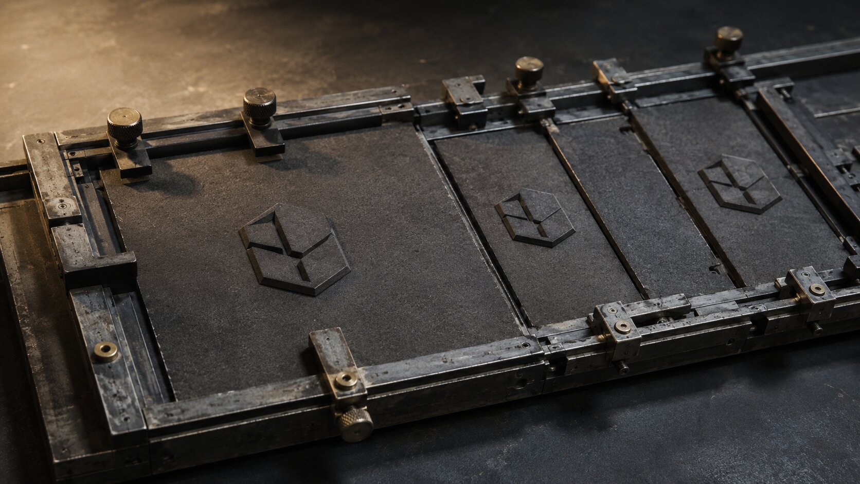
TL;DR:
- A feature explains what a product contains or does. A benefit shows what becomes easier, faster, clearer, safer, or more enjoyable for the customer.
- Strong AI product visuals show the product causing a visible change through action, context, comparison, or a believable transformation.
- Use AI to explore creative directions and asset variations, but review every result for product accuracy, brand fit, visual logic, rights, and platform requirements.
Product teams usually know their features inside out.
They can explain the faster processor, the automatic export option, the improved material, the shared asset library, or the extra layer of customisation.
The trouble starts when those details have to become an image, a launch post, a short video, or a campaign.
A polished product render might look impressive. It may even look expensive. But the viewer can still be left wondering what the product actually changes for them.
That is the gap benefit-led visuals are meant to close.
The goal is not to hide the feature. It is to translate it. You take something technical or functional and show the practical difference it creates in a customer’s day.
AI can make that process faster by helping you explore situations, compositions, visual metaphors, and asset variations. It cannot decide what customers genuinely care about, though. That part still needs product knowledge, taste, and honest human judgement.
This guide explains how to move from a feature list to a useful visual system without ending up with generic AI product images that look polished but say very little.
Table of Contents
- Key Takeaways
- A Feature Is Not Yet a Visual Idea
- Find the Change Behind the Feature
- Choose a Visual Structure That Proves the Benefit
- Write AI Prompts Around Situations, Not Adjectives
- Build One Benefit Into Several Campaign Assets
- Keep the Image Believable Enough to Earn Trust
- Review the Visual by What It Communicates
- Turn Rough Product Ideas Into a Clearer Creative Pack
- Frequently Asked Questions
- Sources Used
Key Takeaways
| Point | Details |
|---|---|
| Translate features into change | Ask what becomes easier, faster, safer, clearer, or more enjoyable for the customer. |
| Show the product doing something | Use action, context, sequence, or visible cause and effect instead of relying only on a passive beauty shot. |
| Keep one benefit per asset | One clear promise is normally easier to understand than several competing messages in the same visual. |
| Prompt with physical evidence | Describe movement, pressure, scale, transformation, environment, and outcome instead of vague adjectives. |
| Adapt the idea to each platform | Keep the benefit stable while changing framing, pacing, crop, and composition for each placement. |
| Review AI output carefully | Check product accuracy, visual logic, brand fit, rights, platform requirements, and misleading details before publishing. |
A Feature Is Not Yet a Visual Idea
Imagine you are marketing a creative platform with an automatic resizing feature.
“Automatic resizing” is accurate. It explains what the software does.
But it does not immediately show why a musician, designer, independent artist, or content team should care.
The actual benefit might be:
- One approved visual can be prepared for several platforms.
- The creator spends less time rebuilding the same layout.
- The campaign feels more consistent.
- Fewer important details are accidentally cropped.
- A small team can prepare campaign assets faster.
Each benefit suggests a different visual.
You could show one central campaign image fitting cleanly into several physical frames. You could show a single visual structure extending into vertical, square, and horizontal spaces without losing its main subject. Or you could show a mismatched group of assets becoming one ordered set.
The feature stays the same. The story changes depending on which customer benefit you choose.
That is the first important decision. Do not ask how to illustrate automatic resizing. Ask which useful change the customer should notice first.
Use a Simple Translation Chain
A practical way to move from product language to a visual concept is:
Feature → Functional effect → Human benefit → Visible evidence
| Feature | Functional Effect | Human Benefit | Visible Evidence |
|---|---|---|---|
| Automatic background removal | Separates a subject quickly | Less repetitive editing | One clean subject moving into several finished layouts |
| Shared asset library | Keeps approved files together | Fewer missing or outdated assets | One organised source feeding multiple campaign outputs |
| Voice variation | Produces alternate readings | More options without restarting production | One script becoming several clearly distinct performances |
| Visual reference controls | Guides generated style | More consistent campaign imagery | A stable visual language across changing scenes |
| Batch export | Produces several files together | Faster publishing preparation | One completed source splitting into an orderly delivery set |
This translation chain prevents the creative concept from stopping at the product interface.
Find the Change Behind the Feature
Benefits become easier to visualise when they contain a before-and-after state.
That does not mean every campaign needs a literal split-screen. It means the creative direction should make some kind of change understandable.
Ask four questions:
- What was difficult before?
- What does the product practically change?
- What does the improved state look like?
- Which visual detail proves that the improvement happened?
Suppose a tool helps creative teams keep visual references organised.
The weak version is a stylish image of digital folders floating inside a bright studio.
The stronger version shows the actual problem being solved. Several conflicting material samples might pass through a precise sorting mechanism and emerge as one coherent visual family. A scattered production path might become a clearly routed sequence.
The second idea contains tension and resolution. Something changes because the product exists.
Focus on a Specific Customer Moment
Broad claims such as “work smarter” or “unlock creativity” are difficult to make visible because they could mean almost anything.
A real moment is easier:
- A musician preparing release artwork the night before distribution.
- A social team adapting one campaign image for several channels.
- An independent creator trying to keep five posts visually connected.
- A photographer turning one shoot into a complete launch set.
- A designer comparing three creative directions before production begins.
Specific moments give the visual a job. They also prevent the concept from becoming a decorative scene that looks impressive but does not explain the product.
Pro Tip: Write the benefit as a sentence beginning with “Now the customer can...” If the ending still feels vague, the visual concept probably will too.
Choose a Visual Structure That Proves the Benefit
Different benefits need different kinds of evidence.
You do not need to show every product benefit with a software screen, a smiling customer, or an isolated product render.
The Product in Active Use
This is often the clearest option for physical products.
A clamp tightening a joint communicates control better than a clamp resting on a table. A waterproof jacket in active rain communicates protection better than a perfectly folded jacket. A portable light illuminating a difficult location communicates usefulness better than a studio pack shot.
The action should make the feature’s practical effect visible.

The Environment After the Product Has Helped
Sometimes the product itself does not need to dominate the frame.
A scheduling feature could be represented by an orderly production space with a clear route through each stage. A noise-reduction product might be shown through the calm environment it creates. A campaign planning tool could appear indirectly through several coordinated assets arriving at the right destinations.
This approach works well when the benefit is mainly about organisation, confidence, atmosphere, or reduced friction.
A Controlled Transformation
Transformation visuals work especially well for software and creative platforms.
The scene can move from:
- Scattered to aligned
- Cloudy to clear
- Fragmented to connected
- Overloaded to focused
- Inconsistent to coherent
- Unfinished to publish-ready
The materials still need believable physical behaviour. If a liquid separates, the viewer should understand what causes it. If objects align, there should be a visible guide, force, channel, or mechanism.
Without that logic, the image may look like attractive AI abstraction with no readable message.
A Comparison With One Controlled Variable
Comparison is useful when the feature improves quality, speed, consistency, or clarity.
Keep most of the scene stable and change the one thing the product affects. You might show the same campaign system with and without a consistent visual guide. You might show the same physical product displayed passively and then performing its actual job.
The comparison should remain fair. Do not make the “before” version deliberately ugly just to exaggerate the improvement.
Write AI Prompts Around Situations, Not Adjectives
A lot of generic AI marketing imagery begins with generic prompting.
Words such as premium, powerful, innovative, modern, and game-changing describe the intended impression. They do not describe a scene.
Weak Direction: Futuristic premium visual showing powerful automated content creation.
A stronger prompt explains what is happening:
Stronger Direction: A single approved album artwork passes through a precise mechanical framing system and emerges as three finished compositions: vertical, square, and horizontal. The artist’s central symbol remains the same size and position in each version, while the surrounding layout adapts cleanly to the new frame.
The second prompt gives the model a main subject, a process, a constraint, a visible result, and a detail that proves consistency.
A Practical Prompt Structure
Use this sequence:
Customer situation + main subject + active change + evidence of benefit + composition + materials + lighting + restrictions
For example:
Realistic editorial macro photograph of one heavily used steel clamp pulling two uneven hardwood sections into precise alignment while glue cures between them. Visible pressure in the screw, a narrow line of excess glue, and shallow compression marks beneath the pads show that the tool is actively improving the joint. Three-quarter close angle, natural workshop light, scratched steel, worn dark wood, shallow depth of field, no people, no text, no decorative product staging.
The product is not merely present. It is doing the job.
Generate Different Concepts, Not Tiny Variations
Changing the background from blue to green is not meaningful exploration.
For one product benefit, test genuinely different structures:
- A literal use-case scene.
- A physical environment shaped by the benefit.
- An abstract but realistic transformation.
- A controlled before-and-after comparison.
This gives you useful information. You can learn whether the audience responds more clearly to demonstration, atmosphere, transformation, or contrast.
Build One Benefit Into Several Campaign Assets
One strong concept should not be treated as one finished image.
It should become a small visual system.
Suppose the central benefit is:
Create a consistent release campaign from one rough visual idea.
That benefit could become:
- A wide hero image showing one visual source expanding into a connected campaign world.
- A vertical short-form sequence showing the transformation step by step.
- A square social post focused on the finished asset family.
- A close-up detail showing the mechanism that keeps the identity stable.
- A simple comparison showing unrelated outputs beside one coherent direction.
- A thumbnail with one bold, readable symbol.
The promise stays the same. The framing changes.
Platform adjustments are not minor export details. They affect whether the benefit survives inside the real feed, thumbnail, story, advertisement, or product page.
Build a Benefit Matrix Before Generating
A small planning table can prevent a lot of wasted generation.
| Asset | Audience Moment | Benefit to Show | Visual Method |
|---|---|---|---|
| Website hero | First introduction | Understand the main outcome | One clear transformation |
| Product page image | Comparing options | See how the feature works | Active use or sequence |
| Social post | Fast discovery | Recognise one useful result | Bold symbolic scene |
| Short video | Evaluating relevance | Watch the change happen | Before, process, and after |
| Retargeting creative | Existing interest | Remove one objection | Proof, detail, or comparison |
| Thumbnail | Choosing what to open | Grasp the promise quickly | One readable subject |
This also stops the campaign from cramming every feature into every asset.
Keep the Image Believable Enough to Earn Trust
AI makes it easy to create a convincing mood. Product truth is harder.
A beautiful image can still damage confidence when:
- The product is shown doing something it cannot do.
- A physical mechanism makes no sense.
- A software result is presented as instant when it requires several steps.
- Important limitations are hidden.
- The generated product shape changes between assets.
- Text, labels, ports, buttons, or packaging appear incorrectly.
- The visual implies a guarantee the company cannot support.
The more specific the product is, the more carefully the generated visual needs to be reviewed.
Separate Concept Imagery From Product Evidence
Concept imagery can communicate the feeling or broad benefit of a product.
Evidence shows the actual result.
Both are useful, but they should not be confused.
A symbolic image of several strands becoming one coherent weave might communicate visual consistency. It does not prove exactly how a platform’s consistency controls work.
That proof belongs in a real demonstration, walkthrough, documented example, product capture, or clearly explained case study.
Use the conceptual visual to create interest. Use accurate product material to support the claim.
Review the Visual by What It Communicates
Creative reviews often get stuck on taste.
Someone likes the orange version. Someone else prefers the darker background. Another person wants the product larger.
Those opinions may matter, but first ask whether the visual communicates the benefit.
Five-Second Reading
Show the asset briefly, then hide it.
Ask:
- What was the main object?
- What was happening?
- What improved?
- What do you think the product helps with?
If people remember the style but not the change, the image probably is not doing enough marketing work.
Product Truth
Check whether the asset:
- Matches the real product.
- Shows a plausible use.
- Avoids unsupported outcomes.
- Separates metaphor from proof.
- Includes the context needed to prevent misunderstanding.
Brand Fit
Look beyond matching colours.
Does the image feel like the same brand world as the rest of the campaign? Are the materials, mood, pacing, scale, framing, and level of polish consistent? Does the creative direction suit the audience?
Placement Fit
Inspect the actual crop at feed size.
A detailed benefit may disappear when the image is reduced. Do not approve only the large desktop version. Approve the real asset inside the real placement.

Decision Value
Finally, ask what the asset helps the viewer decide.
Does it help them understand the product? Compare it? Imagine using it? Trust it? Remember it? Take the next step?
If the image does not help with any decision, it may be decorative rather than useful.
Turn Rough Product Ideas Into a Clearer Creative Pack
Orias AI helps creators and creative teams move from rough ideas, moods, references, and product concepts towards a clearer visual direction.
For benefit-led product marketing, that means starting with the feature, defining the customer change behind it, exploring several visual structures, and developing the strongest direction into a connected set of campaign assets.
A practical workflow looks like this:
- Choose one important product feature.
- Define the practical effect it creates.
- Translate that effect into a customer benefit.
- Identify the visible evidence of that benefit.
- Explore several different visual structures.
- Refine the strongest creative direction.
- Adapt the idea into the required campaign formats.
- Review the finished creative pack as one connected visual world.
The useful part is not producing endless images.
It is keeping the promise clear while the format changes, so the website hero, product image, promo post, release visual, and supporting assets still feel like parts of the same idea.
Frequently Asked Questions
What Is the Difference Between a Product Feature and a Benefit?
A feature is something the product contains or does. A benefit is the useful change that feature creates for the customer. “Automatic resizing” is a feature. “Prepare one approved design for several platforms without rebuilding every layout” is a benefit.
How Do You Show a Product Benefit Visually?
Show a situation where the product changes something. Use active demonstration, before-and-after contrast, environmental change, a realistic transformation, or a visible customer outcome. Include a detail that proves the improvement rather than relying only on mood.
Can AI Create Accurate Product Marketing Images?
AI can help with concepts, variations, backgrounds, storyboards, compositions, and campaign exploration. Accuracy still requires human review. Product proportions, functions, packaging, text, materials, and outcomes should be checked before anything is published.
Should Every Visual Show the Product Itself?
No. Some visuals can focus on the environment, process, or outcome created by the product. More abstract campaign imagery should still be supported by accurate product demonstrations when the viewer needs proof of how the feature works.
How Many Benefits Should One Product Image Communicate?
Usually one primary benefit. Supporting details are fine, but several competing claims can make the visual difficult to read. A campaign can contain multiple assets, with each one handling a different benefit or objection.
How Do You Keep AI Product Visuals Consistent?
Start with a defined creative direction covering the main promise, subject, materials, palette, lighting, composition rules, and exclusions. Reuse those stable decisions while changing only the scene or format. Consistency comes from controlled direction, not from repeating the same generic prompt.
What Should Be Checked Before Publishing an AI-Generated Product Visual?
Check product accuracy, misleading details, physical logic, brand fit, readability at the final size, platform crops, usage rights, required disclosures, and whether the visual supports a claim the product can genuinely deliver.