Trust Signals in AI Visual Content: Making Generated Assets Feel Credible
Make AI-generated visuals feel credible with stronger direction, human review, transparency and platform-ready workflows.
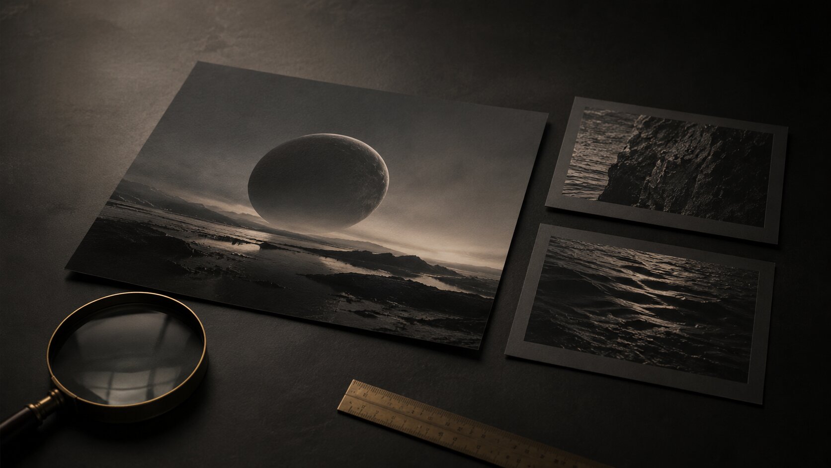
TL;DR:
- AI visuals feel credible when they look like they came from a real creative decision, not from a random prompt.
- The strongest trust signals are clear direction, consistent details, human review, platform fit, and honest transparency when AI meaningfully shapes the asset.
- The practical move is simple: build a small review system before publishing, so every image feels intentional, usable, and connected to your wider creative world.
A lot of AI-generated visuals look impressive for about three seconds.
Then something feels off.
Maybe the lighting does not make sense. Maybe the hands are strange. Maybe the image is beautiful but has no real point. Or maybe it just feels like every other polished AI image floating around the feed.
For artists, musicians, creators, and visual storytellers, that is a real problem. You are not just trying to make something “nice.” You are trying to make visuals that people believe in. A release cover should feel like it belongs to the song. A campaign image should feel like it came from a real world. A promo asset should feel intentional enough that someone stops, looks, and trusts the direction.
That is where trust signals matter.
In AI visual content, trust signals are the small cues that make an asset feel credible: coherent style, believable texture, human taste, clear context, proper disclosure, platform-native formatting, and enough imperfection to feel alive. This guide breaks down how to build those signals into your creative workflow before the asset goes public.
Table of Contents
- Key Takeaways
- Credibility Starts Before the First Prompt
- Make the Visual Feel Like It Belongs Somewhere
- Add Human Evidence Without Overexplaining It
- Use Transparency as a Creative Strength
- Check the Small Details That Break Trust Fast
- Shape Assets for the Platform, Not Just the Image Size
- Turn One Credible Visual Into a Trustworthy Asset Pack
- How Orias AI Helps Build More Credible Creative Packs
- Frequently Asked Questions
- Sources Used
Key Takeaways
| Point | Details |
|---|---|
| Trust starts with direction | AI assets feel more credible when they are based on a clear mood, purpose, audience, and visual world. |
| Consistency beats polish | A slightly imperfect but coherent asset often feels more believable than a flawless image with no creative logic. |
| Human review is not optional | Creators still need to check details, meaning, rights, platform fit, and whether the visual actually supports the work. |
| Transparency matters | When AI meaningfully alters or generates realistic content, disclosure and provenance can help protect audience trust. |
| Platform context changes credibility | A visual that works as cover art may not work as a Reel, thumbnail, teaser, or campaign banner without adjustment. |
| Asset packs need one visual logic | Repurposed AI visuals should share texture, mood, lighting, and composition rules, not just a vague “same style.” |
Credibility Starts Before the First Prompt
The biggest mistake is treating trust as something you fix after generation.
You cannot really “add credibility” at the end if the image was built from a weak idea. You can improve it, sure. You can retouch it. You can crop it better. But if the visual has no clear reason to exist, people feel that.
Before you prompt, define the creative job.
Ask:
- What is this asset supposed to make someone feel?
- Where will it appear?
- What should the viewer understand in one glance?
- What should feel real, even if the image is surreal?
- What parts of the artist, song, story, or brand need to come through?
This matters because AI tools are very good at producing surface. They can make cinematic lighting, expensive-looking objects, dreamy textures, and dramatic scenes. But credibility usually comes from intention. Google’s own guidance around AI-generated content is useful here: quality matters more than how the content was produced, and helpful, people-first material should show originality, trust, and clear value. Google Search Central
For visual creators, that translates into a basic rule:
Do not start with “make me a cool image.”
Start with something closer to:
“Create a release visual that feels quiet, nocturnal, and emotionally restrained. It should support an intimate electronic track, not look like a sci-fi poster. The final asset needs to work as cover art, a vertical teaser, and a wide banner.”
That kind of direction gives the AI less room to drift into generic beauty.
A simple pre-prompt trust brief
Before generating, write a short creative brief. Not a huge deck. Just enough to keep the work grounded.
| Brief Element | What to Define |
|---|---|
| Mood | Warm, cold, anxious, calm, raw, elegant, nostalgic, tense. |
| Context | Song release, artist announcement, campaign teaser, visual essay, product story. |
| Audience | Fans, collectors, clients, followers, playlist editors, collaborators. |
| Visual anchors | Materials, symbols, light, environment, recurring shapes. |
| Boundaries | No clichés, no fake text, no over-polished faces, no random glowing AI effects. |
| Output needs | Cover, Reel, thumbnail, story, banner, press image. |
This is where credibility begins. Not in the final export. Not in the caption. In the decision before the image exists.
Make the Visual Feel Like It Belongs Somewhere
Generic AI visuals often feel untrustworthy because they have no home.
They look like they were generated in a blank universe. Nice object. Nice light. Nice composition. But no culture, no scene, no lived-in detail, no connection to anything around it.
Credible visuals usually feel like they belong to a larger world.
For a musician, that might mean the release artwork, teaser clips, lyric visuals, and profile banners all share the same emotional weather. For a digital creator, it might mean the thumbnails, post covers, and campaign visuals feel connected without being identical. For a visual storyteller, it might mean the same symbolic language appears across scenes.
The asset should answer this quietly:
“What world did this come from?”
Not with lore. Not with a paragraph of explanation. Just through visual consistency.
What makes a generated image feel grounded
Look for these cues:
- Lighting that behaves consistently.
- Materials that make sense together.
- A clear focal point.
- A limited color logic.
- Background details that support the idea.
- Crops that feel chosen, not accidental.
- Texture that feels tactile rather than plastic.
- Visual references that are transformed, not copied.
The point is not realism only. A surreal AI image can feel credible if its world has rules. A fantasy image can feel believable if its textures, light, and composition stay disciplined.
The problem is when the image feels like ten unrelated aesthetics were blended together.
Mistake to avoid
Do not use “same style” as your only consistency instruction.
“Same style” is too loose. Instead, define repeatable visual rules:
- Same shadow direction.
- Same grain level.
- Same type of negative space.
- Same emotional temperature.
- Same material family.
- Same symbolic motif.
- Same level of detail.
That is how you make a visual identity instead of a folder of pretty accidents.
Add Human Evidence Without Overexplaining It
Audiences are getting better at sensing when something is too smooth.
That does not mean every asset needs to look rough. It means people trust signs of choice. A small amount of human evidence can make AI-assisted visuals feel more believable.
This can be subtle.
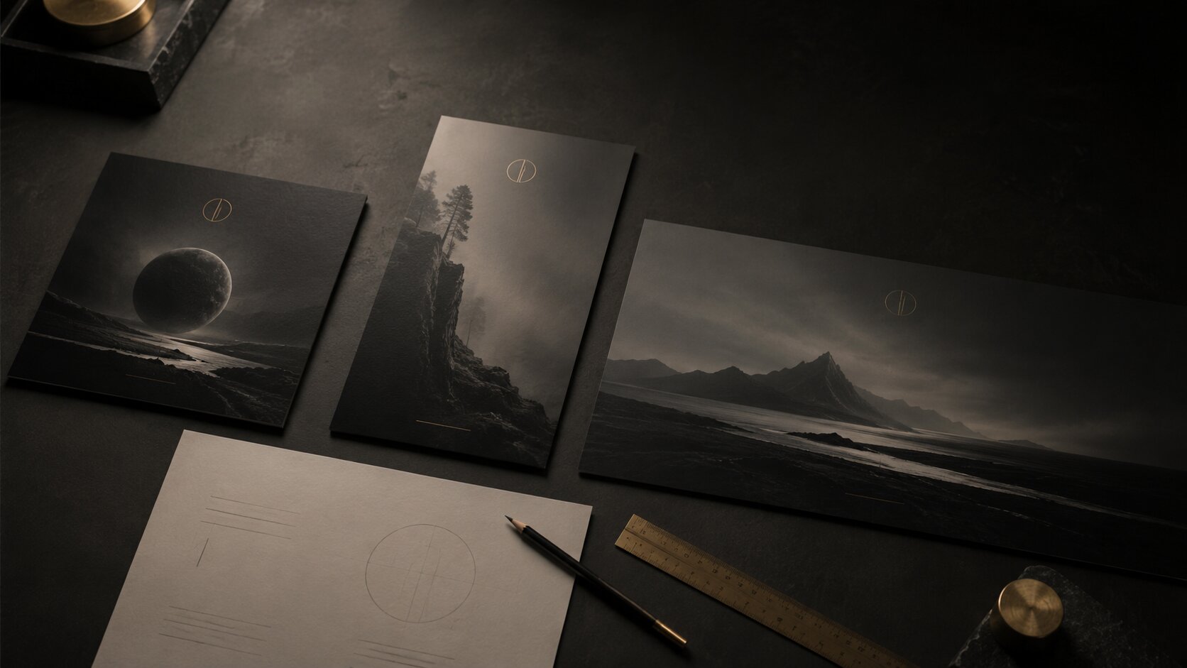
A pencil mark on a photographed layout. A behind-the-scenes crop. A work-in-progress post. A caption that explains the creative direction. A small note about the moodboard. A carousel that shows how the final image connects to sketches, references, or release themes.
TikTok’s own creative guidance leans toward content that feels native to the platform, including less overly polished styles and visible people such as creators, employees, or customers. It also recommends designing specifically for TikTok, including vertical 9:16 formatting and safe-zone awareness. TikTok Business Help Center
That is useful beyond ads. It points to a larger truth: people often trust content that feels made by someone, not simply output by something.
Human signals that help AI visuals feel more credible
Use these when they fit the project:
- Show a crop decision before the final version.
- Share the original mood words behind the image.
- Include a behind-the-scenes note in the caption.
- Post a carousel with concept, close-up, and final asset.
- Keep one imperfect tactile detail instead of cleaning everything.
- Let the artist’s own language guide the visual caption.
- Use real release context, not vague “new era” phrasing.
For musicians, this could be as simple as:
“Built the visual around the feeling of walking home after the club, when everything sounds far away.”
That one sentence does more for trust than a polished caption full of empty words.
Pro Tip: If a visual needs a long explanation to make sense, the direction may not be clear enough yet. Try simplifying the image before writing a bigger caption.
Use Transparency as a Creative Strength
Transparency does not have to kill the magic.
Some creators worry that mentioning AI makes the work feel less valuable. Sometimes that fear makes sense, especially in communities where process and authorship matter deeply. But hiding AI use can create bigger problems if the content is realistic, commercial, sponsored, or built around a person’s likeness.
YouTube requires creators to disclose when they use AI to meaningfully alter or generate realistic content that viewers could mistake for real. The platform frames this around viewer understanding, especially when content looks or sounds realistic. YouTube Help
For creators working with branded content, sponsorships, or product visuals, disclosure also matters in a broader sense. The FTC’s endorsement guidance says that if a creator has a material connection to a brand, such as payment or free products with an expectation of promotion, that relationship may need to be disclosed. Federal Trade Commission
AI disclosure and sponsorship disclosure are not the same thing, but they share a basic principle:
Do not make the audience guess about something that could change how they understand the content.
Where transparency helps most
Be extra careful when the visual includes:
- A realistic person who does not exist.
- A real person’s likeness.
- A fake event, fake place, or fake product result.
- Before-and-after claims.
- Sponsored or affiliate content.
- Political, health, finance, or news-related material.
- Documentary-style imagery.
- Testimonials or implied customer experiences.
For artistic cover art, abstract visuals, or obviously stylized campaign worlds, disclosure may be more about creative honesty than formal platform requirement. Still, when in doubt, simple language is better than hiding.
You do not need to write:
“This asset was generated through a multimodal synthetic content production workflow.”
Please do not.
Write something human:
“AI-assisted visual direction, edited and finalized by the artist.”
Or:
“Created with AI as part of the visual development process.”
Clear. Calm. No drama.
Content Credentials and provenance
There is also a technical side to trust. Adobe describes Content Credentials as an industry-standard metadata type that can show details about how content was made, including whether it was captured, generated by AI, or edited in tools like Photoshop. Adobe Content Credentials
C2PA, the Coalition for Content Provenance and Authenticity, provides an open technical standard for showing the origin and edits of digital content. C2PA
That does not mean metadata solves everything. Platforms may strip metadata. Viewers may never check it. Some workflows still break provenance. But for creators who care about attribution, transparency, and long-term trust, Content Credentials are worth understanding.
Check the Small Details That Break Trust Fast
AI images often fail in tiny places.
Not the big composition. Not the mood. The small stuff.
A strange reflection. A fake word in the background. A hand with the wrong number of fingers. A guitar that cannot physically be played. A record sleeve with warped edges. A face that looks almost real but not quite. A room where the light source makes no sense.
People may not consciously notice every error, but they feel the instability.
Before publishing, zoom in.
Really zoom in.
The credibility review checklist
Use this before posting, exporting, or building a campaign around an AI visual.
| Check | What to Look For |
|---|---|
| Anatomy | Hands, eyes, teeth, posture, body proportions, repeated faces. |
| Text | Fake letters, broken signage, unreadable logos, accidental words. |
| Objects | Instruments, cameras, clothes, props, tools, cables, product shapes. |
| Light | Shadows, reflections, highlights, direction, impossible glow. |
| Brand fit | Does it match your existing visual world or does it feel random? |
| Rights risk | Does it resemble a known person, logo, artwork, album cover, or brand asset? |
| Platform crop | Does the focal point survive vertical, square, and thumbnail formats? |
| Emotional fit | Does the asset actually match the song, story, or campaign mood? |
This is boring work.
It is also where a lot of credibility is saved.
The “almost real” problem
Photorealistic AI can be risky because the viewer expects reality-level accuracy. If the image is meant to look like a real backstage photo, real fan moment, real product shot, or real artist portrait, the trust standard is much higher.
In those cases, you need stricter review.
Ask:
- Could someone mistake this for a real event?
- Does the image imply the artist was somewhere they were not?
- Does it show a product result that never happened?
- Does it create a fake collaboration or endorsement?
- Does it use a face, body, or style too close to a real person?
If the answer is yes, slow down. Credibility is not worth risking for one asset.
Shape Assets for the Platform, Not Just the Image Size
A visual can be credible in one format and weak in another.
A release cover can be quiet and atmospheric. A TikTok teaser needs a faster read. A YouTube thumbnail needs one strong focal idea. A wide website banner needs negative space. A Spotify Canvas-style loop needs motion logic, not just a still image with movement added later.
This is where many AI workflows fall apart. The creator generates one strong image, then crops it everywhere.
That rarely works.
Platform-native formatting affects trust because the audience reads each surface differently. TikTok advises creators and advertisers to make creative for the platform itself, use vertical orientation, respect safe zones, and prioritize the hook early. TikTok Business Help Center Meta’s Instagram video ad guidance also points toward native-feeling creative that blends with organic content rather than looking overly ad-like. Meta Business Help Center
So do not just resize.
Adapt.
One concept, different trust jobs
| Format | Trust Job |
|---|---|
| Square release visual | Make the project feel complete and ownable. |
| Vertical teaser | Communicate mood quickly in the scroll. |
| Thumbnail | Make one idea readable at small size. |
| Wide banner | Create atmosphere with room for copy or interface elements. |
| Story asset | Feel immediate, casual, and connected to the creator. |
| Press or promo image | Look polished enough for sharing without feeling fake. |
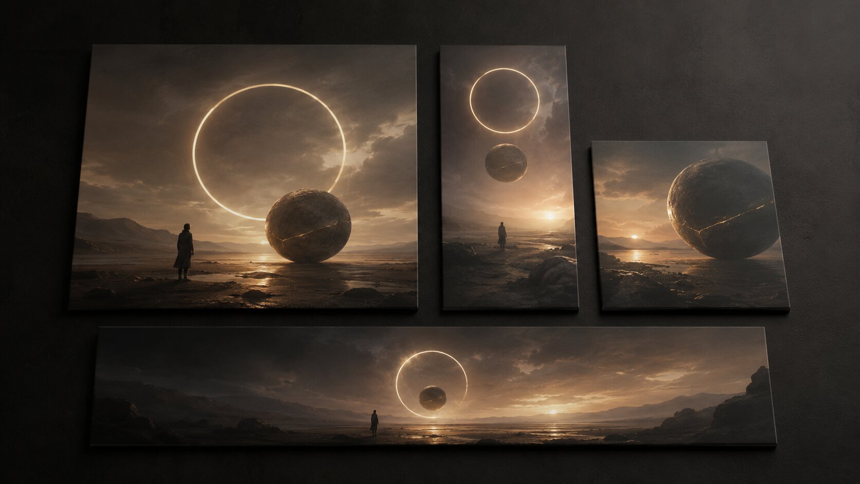
Each version should share the same creative world, but not the same composition.
A credible campaign system feels related. A lazy crop set feels automated.
Turn One Credible Visual Into a Trustworthy Asset Pack
Once you have one strong visual, do not stop there.
A single image can become a small creative system if you preserve the right signals.
Start by identifying what makes the approved image work. Is it the soft amber light? The cracked ceramic texture? The central symbol? The shadow shape? The quiet empty space? The feeling of late-night isolation?
Then build variations around those rules.
A practical asset pack workflow
1. Lock the core idea
Write one sentence that describes the visual world.
Example:
“A quiet, nocturnal visual world built around soft blue light, worn metal textures, and the feeling of distance after a long night.”
2. Extract the visual rules
Choose 4 to 6 rules:
- Blue-black palette.
- Soft edge lighting.
- Worn metal and glass.
- One central circular motif.
- Lots of negative space.
- No readable text inside generated images.
3. Generate controlled variations
Create versions for:
- Cover art.
- Vertical teaser.
- Square announcement post.
- Story background.
- Thumbnail.
- Wide banner.
- Press preview image.
4. Review them together
Do not approve assets one by one. Lay them out as a set.
Ask:
- Do they feel like the same release?
- Is one asset much more generic than the others?
- Does the thumbnail still work when small?
- Does the vertical version have a strong first impression?
- Does the wide banner leave usable space?
- Are any details creating legal, ethical, or trust issues?
5. Refine before publishing
This is the stage where you edit, crop, clean, remove fake text, fix details, adjust contrast, and make platform-specific exports.
AI gives you options. Credibility comes from curation.
Mistake to avoid
Do not publish every good-looking variation.
A visual pack should feel edited. Too many directions make the project look confused. Pick the strongest world, then build around it with discipline.
How Orias AI Helps Build More Credible Creative Packs
Orias AI is built around the part of the process where trust usually gets lost: turning a rough idea into a clear creative direction, then expanding that direction into usable assets.
Instead of treating AI visuals as one-off generations, Orias AI helps creators, artists, musicians, and visual storytellers shape moods, references, concepts, and campaign ideas into more coherent visual worlds. That matters because credible AI content usually does not come from a single lucky prompt. It comes from structure.
For a musician, that might mean developing a release visual, teaser direction, and promo pack from the same emotional idea. For a creator, it might mean turning a loose aesthetic into a repeatable content system. For a small creative team, it can help keep assets aligned before the campaign pressure hits.
The goal is not to remove human taste. The goal is to give it a clearer place to work.
Frequently Asked Questions
What are trust signals in AI visual content?
Trust signals are the details that make an AI-generated asset feel believable, intentional, and safe to publish. They include consistent style, clear creative context, accurate details, human review, platform fit, transparency, and a visual connection to the creator’s wider identity.
Why do some AI-generated visuals feel fake even when they look beautiful?
Because beauty is not the same as credibility. An image can have dramatic lighting and impressive detail but still feel fake if the concept is vague, the world is inconsistent, or small details break reality. Viewers often notice the feeling before they can explain the problem.
Should creators disclose that they used AI?
It depends on the content and platform. If AI meaningfully creates or alters realistic content, especially involving people, events, places, or claims, disclosure may be required or strongly recommended. For artistic or abstract work, disclosure may be less formal, but simple transparency can still help build trust.
How can musicians make AI release visuals feel more authentic?
Start from the sound and mood of the track, not from a random visual style. Define the emotional setting, choose a few repeatable visual rules, generate options, then curate them into a consistent release system across cover art, teasers, thumbnails, and banners.
What is the biggest mistake creators make with AI promo assets?
The biggest mistake is publishing the first impressive output without review. AI visuals still need checking for strange details, fake text, rights issues, emotional fit, platform crops, and whether the asset actually supports the campaign.
Do Content Credentials make AI visuals more trustworthy?
They can help, especially for attribution and transparency. Content Credentials can show information about how a file was made or edited, but they are not a complete solution. Creators should still use clear captions, ethical review, and platform-specific disclosure where needed.
How do you keep AI-generated assets consistent across platforms?
Use one creative direction and adapt it for each format. Keep shared rules like mood, lighting, texture, color, and symbolic motifs, but change the composition for each surface. A cover, vertical teaser, thumbnail, and banner should feel related, not copied and cropped.