Motion-Ready AI Assets: Designing Still Visuals That Can Become Video
Design AI still visuals that can later become video, motion loops, release assets, Reels, Shorts and promo content.
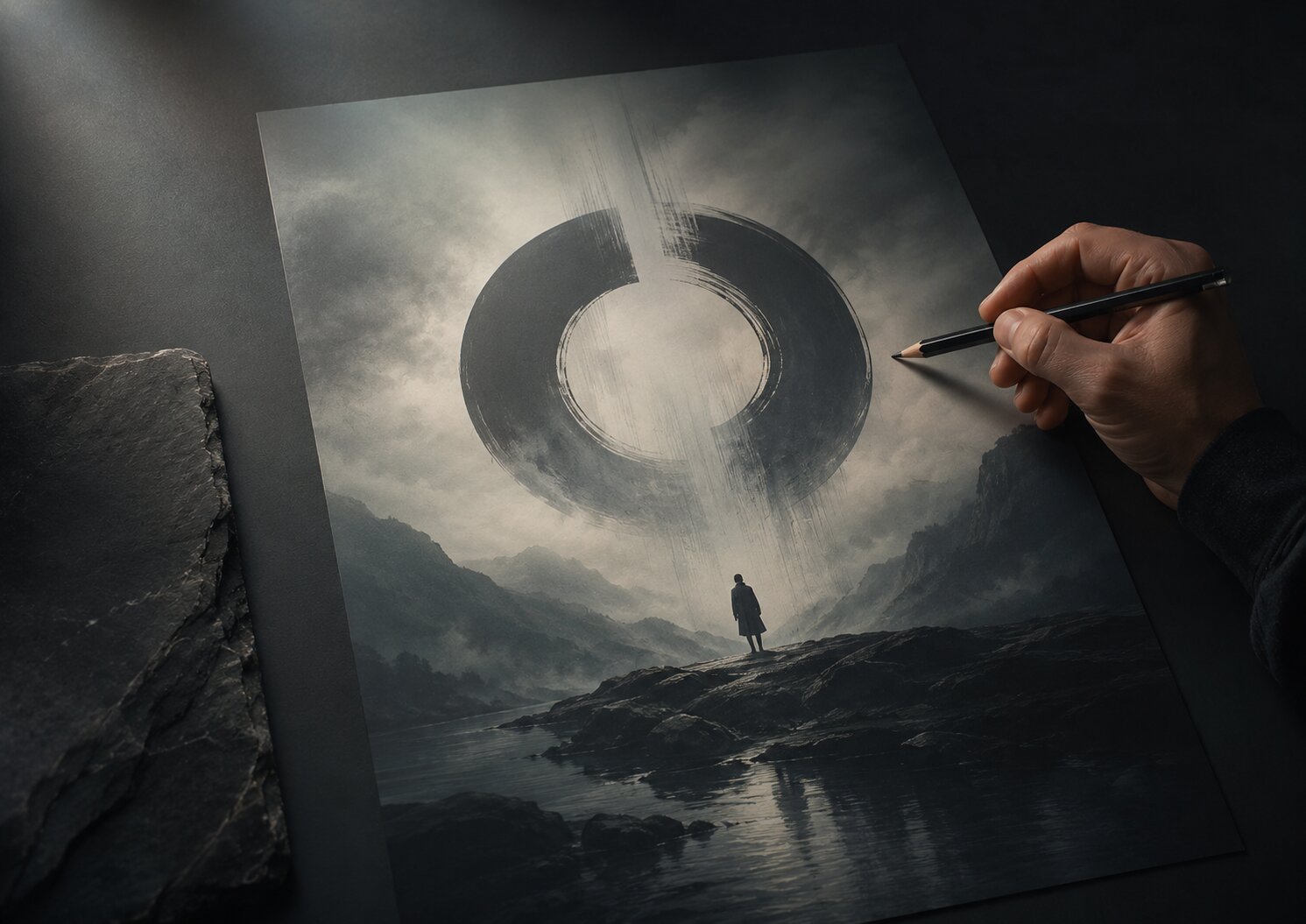
TL;DR:
- A motion-ready AI asset is a still visual designed with future movement in mind.
- That means clear layers, strong focal points, usable negative space, clean crops, and a visual idea that can survive animation without falling apart.
- The main move is simple: do not design a “final image” too early. Design a visual world that can breathe, loop, shift, reveal, and adapt.
A lot of AI visuals look great for about three seconds.
Then the problem shows up.
You want to turn that still image into a teaser video, a Spotify Canvas, a vertical Reel, a short looping background, or a campaign trailer. Suddenly the image that looked polished as a square post feels awkward in motion. The subject is too close to the edge. The background has no depth. The composition is too busy. The text is baked into the image. Nothing has room to move.
That is the real issue with many AI-generated visuals: they are made as endings, not starting points.
For artists, musicians, creators, and visual storytellers, this matters more now because creative work rarely lives in one format. A release visual might become a cover mockup, a teaser, a Canvas-style loop, a YouTube Short, a banner, a thumbnail, and a paid ad. Spotify Canvas, for example, uses short vertical visual loops in the Now Playing View, with Spotify listing 3 to 8 seconds and 9:16 vertical format as core requirements. YouTube also recommends vertical 9:16 video assets for Shorts ads, while Meta recommends 9:16 vertical video for Reels placements.
This guide is about designing AI stills that do not get stuck as stills. You will learn how to think about motion before animation, how to prompt for video-ready structure, how to keep your creative voice intact, and how to build assets that can later become loops, teasers, music visuals, and platform-native video content.
Table of Contents
- Key Takeaways
- Design the still like it already has a timeline
- Give the image parts that can move separately
- Build motion into the composition, not just the effect
- Think in loops before you think in videos
- Make platform crops part of the creative direction
- Use AI for exploration, then clean the asset for production
- Turn one still into a small motion asset system
- How Orias AI fits into a motion-ready workflow
- Frequently Asked Questions
- Sources Used
Key Takeaways
| Point | Details |
|---|---|
| Motion-ready starts before animation | The still image should already suggest direction, depth, timing, and visual rhythm. |
| Keep important elements editable | Avoid baking everything into one flat image if the asset may later become video. |
| Loops need calmer design than posters | A strong poster can be intense, but a loop must survive repeated viewing without feeling annoying. |
| Vertical-first matters for social and music formats | TikTok, Reels, Shorts, and Spotify Canvas all reward or require strong vertical thinking. |
| AI output still needs human cleanup | Rights checks, crop checks, consistency review, and editing are still part of the job. |
| One image can become a system | A motion-ready still can become a teaser, loop, thumbnail, banner, and campaign background. |
Design the still like it already has a timeline
Most people design a still image by asking, “Does this look good?”
That is fair. But for motion-ready assets, the better question is:
“What could happen next?”
A still visual that can become video should feel like a paused moment, not a locked poster. There should be some kind of implied movement in the frame. Maybe light is entering from one side. Maybe fabric, smoke, water, shadow, or grain could shift. Maybe the subject is looking toward empty space. Maybe the background has layers that can separate slightly in animation.
You are not trying to make the still look unfinished. You are trying to give it motion potential.
For example, a musician planning a dark electronic release might create a still visual with:
- one central figure or symbol
- a soft haze behind it
- a visible light source
- foreground texture
- enough empty space for vertical cropping
- no important detail trapped at the edge
That still can later become a slow push-in, a breathing loop, a Canvas-style vertical visual, or a short teaser with title copy added separately.
A bad motion-ready still usually has the opposite traits. It is too crowded. The subject fills the whole image. The background is decorative but flat. The lighting has no direction. Every detail competes for attention. It may look impressive as a generated image, but there is nowhere for motion to go.
A simple test
Before you approve an AI still, ask:
| Question | Good sign | Warning sign |
|---|---|---|
| What moves first? | There is an obvious element to animate | Nothing stands out |
| What stays still? | The image has a stable anchor | Everything feels equally busy |
| Where does the viewer look? | Attention moves naturally | The eye jumps everywhere |
| Can this loop? | Motion could repeat without feeling forced | The idea depends on one dramatic moment |
| Can it crop vertical? | Main subject survives 9:16 | Key details sit on the edges |
The goal is not to animate everything. Actually, that is usually the mistake. Good motion often comes from moving very little, but choosing the right little thing.
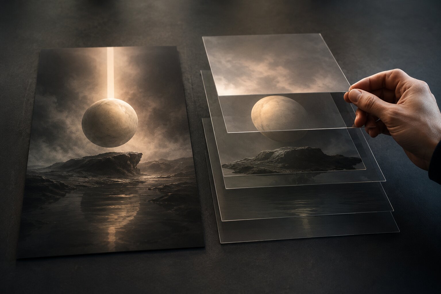
Give the image parts that can move separately
Motion-ready design needs separation.
Not always literal Photoshop layers at the first stage, but at least visual separation. Foreground, subject, background, light, texture, copy space. When those parts are clear, you can later animate them independently.
Adobe’s motion graphics guidance describes common motion techniques like moving objects through a scene, creating background effects, adding flicker or wiggle, introducing motion into existing video, and using effects like motion blur. Those moves become much easier when the original still has clear parts.
Think of your still as a small stage.
The subject is the performer. The background is the room. The light is the mood. Texture is the air. Copy is something you may add later, not something you should trap inside the image unless it is meant to be permanent.
What to ask for in an AI prompt
Instead of prompting only for style, include production structure.
For example:
Create a cinematic vertical release visual with a clear central subject, separated foreground texture, soft atmospheric background, directional side light, generous negative space in the upper third, no readable text, no logos, and enough depth for later parallax animation.
That kind of prompt gives you more than a pretty image. It gives you an asset that can be worked with.
For motion-ready stills, it helps to ask for:
- clear subject-background separation
- visible depth layers
- simple lighting direction
- clean edges around the focal point
- space for future title or CTA
- no baked-in typography
- no random tiny details in important areas
- no fake interface elements
- no logos unless you own and intend to use them
This is especially important when you are working with AI because generated images often look “finished” before they are actually usable. The surface polish can hide production problems.
Mistake to avoid
Do not accept a still just because it looks expensive.
Ask whether it can be edited, cropped, animated, and reused. A slightly simpler image with good structure is often more valuable than a chaotic one with dramatic detail.
Build motion into the composition, not just the effect
Motion is not only an animation layer added at the end. It starts with composition.
A static image can already create a sense of motion through diagonal lines, gaze direction, repeated shapes, light gradients, blur, perspective, and spacing. These give the viewer a path through the frame.
If the composition is dead still, motion effects can feel pasted on. You will see this a lot in AI-to-video experiments: the camera drifts, particles move, the background wobbles, but the idea itself does not become stronger.
A better approach is to decide the motion logic first.
Ask:
- Is the movement a reveal?
- Is it a slow drift?
- Is it a pulse?
- Is it a loop?
- Is it a transition from calm to tension?
- Is it tied to a beat, lyric, product moment, or campaign message?
For a music release, the motion could follow the emotional behavior of the track. A soft ambient track may need a slow breathing texture. A punk release might need rough cuts, shake, and high contrast. A dreamy pop single might use light leaks, fabric motion, or subtle camera float.
For a creator campaign, the motion might be more functional. A thumbnail still becomes a hook frame. A square visual becomes a swipe sequence. A hero image becomes a vertical teaser. The motion has a job.
Use a motion note with every approved still
When you save a still, write one short motion note beside it.
Example:
Motion note: slow inward camera move, background haze shifts left, symbol stays locked, light flickers once near the end, seamless 6-second loop.
That little note can save you later. It keeps the asset from becoming just another image in a folder.
Think in loops before you think in videos
A motion-ready still does not always need to become a full video.
Often, the most useful version is a loop.
Loops are everywhere in creative workflows: music visuals, story backgrounds, short teasers, landing page ambience, live show screens, pre-save campaigns, and social posts. Spotify Canvas is a clear example of how short visual loops can support a track in a mobile listening context. Spotify says Canvas replaces album art in the Now Playing View and can be added to tracks, including upcoming releases.
But loops are tricky.
A loop has to feel alive without becoming irritating. It needs enough movement to hold attention, but not so much that it fights the song, the message, or the viewer’s patience.
Good loop ideas for still visuals
| Still element | Possible loop |
|---|---|
| Smoke or haze | Slow drift across the frame |
| Light beam | Gentle pulse or flicker |
| Water reflection | Soft ripple |
| Fabric | Small wave movement |
| Shadow | Slow shift |
| Grain texture | Subtle animated noise |
| Background stars or particles | Minimal drift |
| Central symbol | Almost still, with tiny scale change |
The most reliable loop structure is often:
- Start in a clear composition.
- Move one or two atmospheric elements.
- Return invisibly to the first frame.
- Keep the focal point stable.
For AI-generated visuals, this is safer than asking for wild transformation. Big transformations can distort faces, hands, logos, typography, and symbols. Subtle loops usually protect the identity of the asset better.
Make platform crops part of the creative direction
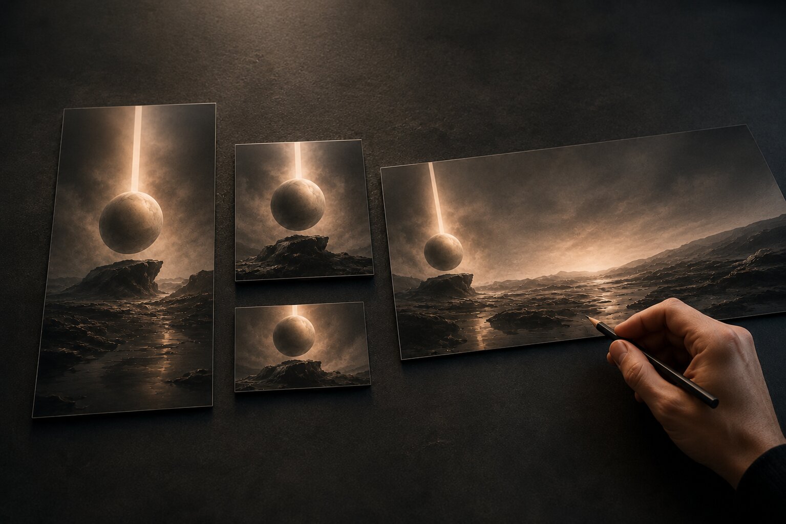
A still visual that only works in one ratio is not ready for a modern content system.
That does not mean every image must work everywhere. But if you know the asset might become vertical video, square social content, a wide banner, and a thumbnail, you should plan those crops early.
TikTok’s official ad specs recommend vertical 9:16 for in-feed ads, with minimum dimensions of 540 by 960 pixels for vertical video. Meta also advises keeping key creative elements away from the edges for 9:16 ads in Stories, Reels, Feed, and in-stream Reels because interface elements can cover parts of the frame.
That is the practical reason to design with safe areas. Not because rules are exciting. Because your best detail can disappear under a button, caption, username, progress bar, or crop.
Build a crop map
For each motion-ready still, make a simple crop plan:
| Format | Use | Design concern |
|---|---|---|
| 9:16 vertical | Reels, Shorts, TikTok, Canvas-style loops | Keep subject centered and edges clean |
| 1:1 square | Instagram post, profile grid, promo tile | Preserve focal symbol and mood |
| 4:5 vertical | Feed post, ad creative | Avoid placing text too low |
| 16:9 wide | YouTube, landing page, banner | Add horizontal breathing room |
| Thumbnail crop | Preview image, cover frame | Keep one readable focal idea |
You do not need to export all versions immediately. But you should know whether the asset can survive those versions.
Pro Tip
Create the first AI still slightly wider or taller than you need, then crop down. It is usually easier to remove space than invent clean space later.
Use AI for exploration, then clean the asset for production
AI is great for exploring visual direction. It can help you test moods, symbols, lighting styles, campaign worlds, and format variations quickly.
But “generated” is not the same as “ready.”
Before a still becomes a motion asset, run a production check.
Look for:
- distorted hands, faces, instruments, or objects
- accidental text
- fake logos
- messy edges around the subject
- strange background details
- objects that may warp badly in video
- unclear focal point
- inconsistent style compared with your other assets
- details that create rights or likeness concerns
Apple’s motion artwork guidance frames motion artwork as a way to deepen the listener’s connection through movement, emotion, and atmosphere, but it also points creators toward specific formatting and policy guidance for approval and product fit. That is a useful reminder: creative mood and delivery rules both matter.
The human review step is where taste comes back in.
AI might give you twenty options. Your job is to pick the one that fits the project, clean it up, adapt it, and reject the ones that only look impressive at first glance.
A production-ready review checklist
Before you animate or hand off the still, check:
- Does the asset match the mood of the song, story, brand, or campaign?
- Can it crop to vertical without losing the idea?
- Can the subject be separated from the background if needed?
- Is there a clear motion note?
- Are there any accidental marks, fake words, or unwanted symbols?
- Is the file high enough quality for editing?
- Are there any platform rules you need to confirm before export?
- Does it still feel like you, not just like an AI image?
That last question matters. A motion-ready asset should not only be technically flexible. It should still carry your taste.
Turn one still into a small motion asset system
The best motion-ready stills can become more than one output.
Here is a realistic example for an independent musician releasing a single.
You start with one approved visual world: a lonely silver object on a dark blue floor, soft fog, one sharp side light, no text, lots of negative space.
From that, you create:
| Asset | Motion use |
|---|---|
| Vertical loop | 6-second atmospheric Canvas-style visual |
| Teaser video | 10-second Reel with title added separately |
| Story background | Slow haze movement with release date overlay |
| Thumbnail | Static crop with strong object silhouette |
| Wide banner | Extended background for YouTube or landing page |
| Lyric snippet | Same visual world with subtle light pulse |
Now the campaign feels connected without repeating the exact same post over and over.
That is the difference between a one-off AI image and a creative pack. A one-off image solves one immediate need. A creative pack gives you options for the whole release or campaign.
Keep a small asset log
You do not need a huge system. A simple note is enough:
| Field | Example |
|---|---|
| Core idea | Isolated silver object in fog |
| Mood | Cold, intimate, late-night, fragile |
| Motion behavior | Slow push-in, haze drift, tiny light flicker |
| Safe crops | 9:16, 1:1, 16:9 |
| Do not use | Heavy glitch, bright neon, readable text |
| Best use | Release teaser, Canvas-style loop, story background |
This is boring in the best way. It keeps you from rebuilding the same idea from scratch every time.
How Orias AI fits into a motion-ready workflow
Orias AI is useful when you do not want your creative process to stop at one nice image. The platform helps creators work with rough ideas, references, moods, concepts, and creative directions, then shape them into clearer visual worlds, release visuals, promo assets, campaign materials, and publish-ready creative packs.
For motion-ready assets, that matters because the workflow is connected.
You can start with a rough idea, shape the mood, explore references, create a visual direction, generate still concepts, test variations, and then think about what each still could become: a loop, a teaser, a campaign asset, a thumbnail, or a video background.
The real value is not “make something fast.” Fast is nice, but it is not enough.
The better goal is to build a visual world that can move. One that can become a release pack, a promo system, or a set of platform-native assets without losing the original feeling.
Use Orias AI as a place to develop the concept before you overcommit to production. Get the still right. Get the mood right. Get the motion note right. Then turn it into formats that actually fit where people will see it.
Frequently Asked Questions
What is a motion-ready AI asset?
A motion-ready AI asset is a still image designed so it can later become video, animation, a loop, or a moving promo asset. It usually has clear layers, a strong focal point, enough negative space, and visual elements that can move without breaking the composition.
Can any AI image be turned into video?
Technically, many still images can be animated, but not all of them will work well. Images with crowded detail, messy edges, distorted subjects, baked-in text, or unclear depth often produce weaker motion results. It is better to design for motion from the beginning.
Should I create still assets or video assets first?
Start with the creative direction, then stills, then motion. Still visuals are easier to review for mood, composition, identity, and consistency. Once the still works, you can decide whether it should become a loop, teaser, story background, or longer video.
What is the best format for motion-ready social assets?
For short-form platforms, vertical 9:16 is usually the safest starting point because it fits TikTok, Instagram Reels, YouTube Shorts, Stories, and Canvas-style music visuals. Still, you should also plan square, 4:5, wide, and thumbnail crops if the campaign will appear in multiple places.
How do I keep AI motion assets from looking generic?
Use specific creative direction before generation. Define the mood, subject, lighting, texture, motion behavior, and things to avoid. Then curate hard. Do not publish the first impressive output. Refine it until it feels connected to your actual project.
Do motion-ready assets need text inside the image?
Usually, no. Keep text separate when possible. That makes the visual easier to crop, translate, animate, reuse, and adapt for different platforms. Baked-in text can become blurry, distorted, or badly positioned once the asset moves.
What should musicians prepare before making motion visuals?
Musicians should prepare the track mood, release story, visual references, key colors or textures, platform needs, and a list of required assets. For example: cover visual, vertical loop, teaser, story background, lyric snippet, and thumbnail. This makes the AI workflow much cleaner.
Sources Used
- Spotify for Artists, Canvas Guidelines
- Spotify for Artists, Adding a Canvas to Spotify
- Apple Music, Album Motion Guidelines
- Apple Music for Artists, Create Motion Artwork
- TikTok Business Help Center, Auction In-Feed Ads Specs
- Meta Business Help Center, Reels and Stories Creative Guidance
- Google Ads Help, YouTube Shorts Ads Asset Specs and Best Practices
- Adobe, Motion Graphics and Animation Principles
- Orias AI Website and Blog