AI Color Grading: How to Match Color, Lighting and Mood Across Generated Images
AI color grading separates palette transfer from lighting harmonization, helping creative teams keep generated image series coherent without flattening scenes.
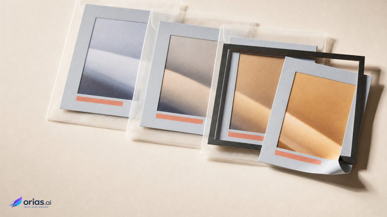
AI color grading for generated images gives a series a shared color language while preserving scene-specific light. It separates palette transfer, which establishes the overall look from a reference image, from localized harmonization, which adjusts a subject, foreground element, or other area to fit its background. Adobe describes those functions as Color Transfer and Harmonization: the first applies a reference palette, and the second changes foreground color and lighting for a better blend.
This makes the method useful for a launch carousel, editorial sequence, or campaign board. An amber-and-teal direction can unify the work without forcing the highlights of a cool window-lit interior to behave like those of a sunset. The result is continuity in art direction, not an identical filter.
For the palette stage, Adobe’s Color Transfer controls cover brightness, saturation, luminance, color, and effect strength. A reference may set warm shadows, restrained greens, bright cream highlights, or a more muted density across separate images rather than serving only as a source of swatches.
Palette transfer and lighting harmonization solve different matching problems
Palette transfer uses a reference image to move a target toward a shared overall color relationship. Adobe’s Color Transfer includes controls for brightness, saturation, luminance, color, and effect strength, so a reference can establish a broad visual look—such as warm shadows, restrained greens, bright cream highlights, or muted density—rather than simply supply swatches. Adobe distinguishes this image-level palette matching from harmonization, which corrects the local compositing relationship between a foreground element and its background.
Harmonization addresses mismatches in apparent lighting and color between foreground and background. Diffusion-based harmonization research describes it as conditional image editing for visually consistent composites. When several campaign images feel unrelated, inspect the shared palette first; when a person looks pasted into an otherwise aligned image, inspect the local light, color cast, and tonal relationship around that person.
Choose a reference image for the look, not just its colors
Choose a hero reference that already expresses the intended finish under usable conditions. Its brightness, saturation, luminance distribution, and color cast will influence the transfer, so exposure and lighting character are part of the decision. A poorly exposed reference is a weak foundation for an automated match; Adobe lists poor exposure among conditions that can undermine color-transfer and colorization results.
For an editorial team, the reference should answer a small set of art-direction questions before anyone starts adjusting images: Are shadows neutral, cool, or warm? Are skin-adjacent tones restrained or vivid? Do highlights feel soft and creamy, bright and clean, or colored by the scene? Is the desired mood carried by saturation, by the contrast between warm and cool areas, or by the relative darkness of the frame?
Avoid selecting a reference only because it contains an attractive dominant color. A heavily orange image can be warm because of its palette, its exposure, its sunset illumination, or a combination of all three. If that image is used indiscriminately as a transfer source, a cool indoor scene may inherit a palette that supports the series but a brightness relationship that does not support the scene. Use effect strength as an art-direction control, not an all-or-nothing switch. Adobe documents these adjustable properties in its Neural Filters documentation.
Match the whole frame only when the scene has one lighting condition
Whole-frame matching is appropriate when the image reads as one coherent lighting environment and the primary need is to bring its overall color statistics closer to the reference. Automated matching can adjust luminance, color intensity, color cast, and fade using information from the source and target. This is a sensible first pass for three images generated from different prompts but intended to sit together in one release.
It is not the right scope for every correction. Adobe’s traditional matching workflow can calculate a match from an entire image, a layer, or a selected region. That choice is operationally important: a window area, a face under a practical light, or a composited product can require a separate adjustment because its illumination differs from the rest of the frame.
- Whole image: establish the broad palette, density, and color cast of a scene that is already internally coherent.
- Layer: harmonize a foreground object or subject that was added, regenerated, or treated separately from the background.
- Selected region: correct one area with distinct light while preserving the rest of the established grade.
This staged approach prevents a familiar failure: forcing a bright foreground to match a darker background by darkening the entire image, then trying to restore the image with a second global adjustment. Start broad, identify the exception, and work locally. The underlying options for image-, layer-, and selection-based calculation are documented in Adobe’s Match Color guidance.
Use masks and focal controls to protect subjects, boundaries, and texture
Use a mask, focal control, or localized selection when a correction has a clear owner. That keeps the adjustment from reaching unrelated regions and gives the review a defined area to inspect.
The need for that control is not merely procedural. Adobe documents complex boundaries, ambiguous regions, inaccurate automatic color guesses, and imprecise manual region targeting as limitations of Neural Filters.
After applying the correction, inspect it at the working scale and at the intended delivery size. Look for subject–scene mismatch, oversaturation, lost tonal separation, and color in areas that should remain neutral; broad changes can also affect edges, reflections, or fine texture on export. Adobe lists oversaturation among its known limitations, so reduce the effect strength or narrow the affected region when necessary.
A three-image sequence: one palette, three scene-specific grades
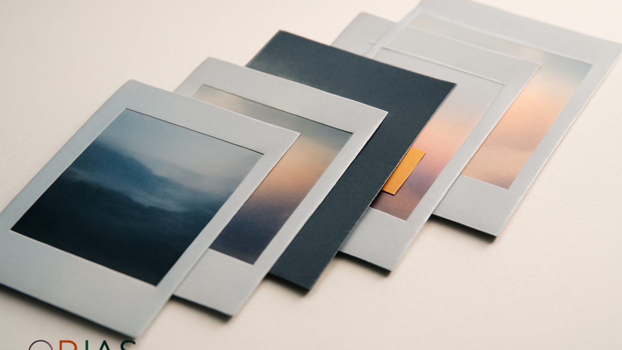
Consider a release sequence with three generated portraits: a warm exterior at late day, a cool interior beside a window, and a subject against a colored studio backdrop. The team wants the images to feel like one story, but each environment has a different source of light. Pick the strongest finished frame as the hero reference because it already resolves the intended balance of brightness, saturation, luminance, and color.
- Apply the hero reference as a restrained palette transfer to the other two images. Compare the three images side by side, checking whether their shadows, neutrals, and accent colors now suggest the same visual world.
- Keep the late-day exterior broadly intact if its lighting already makes sense. Its need may be limited to the series-level palette adjustment.
- On the window-lit portrait, isolate the face or foreground layer if it feels too warm or too bright for the cool background. Harmonize that local relationship rather than turning the full interior warm.
- On the studio image, judge the subject against the colored backdrop and correct the subject or the immediate boundary if it reads as separately lit. Preserve the backdrop’s role in the palette unless it is the actual mismatch.
- Lower effect strength or revise the mask where saturation climbs, edges drift, or material texture begins to look implausible.
The review question is not “Do these files have identical settings?” It is “Do they make the same art-direction promise while each still explains its own light?” A palette transfer can create the first condition. Harmonization and localized matching handle the second.
Color control can compete with texture and structural fidelity
In diffusion-based workflows, palette control can condition generation on a target palette while preserving texture or structure, but it does not guarantee that those qualities will remain untouched. Research on diffusion color transfer identifies different trade-offs among luminance, gradients, and thresholded gradients: each offers a different balance between color control and texture preservation.
That makes color control a review priority rather than a promise about a particular tool. Stronger steering may help when a sequence is visually fragmented, while a lighter hand may suit imagery whose surface detail or structural cues carry the story. After the color pass, check textiles, skin-adjacent detail, foliage, product surfaces, and edges. The diffusion color-transfer research does not establish one setting that resolves these trade-offs for every image.
Frequently Asked Questions
Does palette matching fix lighting?
Not reliably. Palette transfer can align an image with a reference look, while harmonization is the more relevant task when a foreground element must appear lit by its specific background.
When should I use regional adjustments?
Use them when one part of the image has a different lighting condition or needs separate treatment, such as a subject by a window, an inserted object, or a localized reflection. Matching can be calculated from an image, layer, or selected region.
Why do identical settings fail across generated images?
The images may differ in exposure, luminance structure, dominant color cast, and apparent light source. Although a shared palette can be useful, each frame still requires a scene-level judgment about where to apply it and how strongly.
How do I avoid oversaturation?
Compare the corrected area with nearby neutrals and highlights as you reduce effect strength and narrow the mask; oversaturation is a documented limitation of automated color work, so inspect the delivered image rather than trusting a preview alone.
Does color transfer preserve texture?
It can, but preservation is not absolute in diffusion-based color transfer. Research identifies trade-offs between color control and texture preservation, which makes material and edge review necessary after a strong grade.