The Broken Workflow Visual: Showing the Moment Where Creative Production Falls Apart
Design a broken workflow visual that reveals the exact handoff, bottleneck or production mistake causing creative work to fall apart.
TL;DR:
- A strong broken workflow visual does not show random creative chaos. It identifies the exact handoff, approval stage, production tool, or missing decision where the process stops working.
- Use one continuous material, pattern, color, or shape so the viewer can follow the original creative idea before, during, and after the failure.
- Make the failure physically believable and show its downstream effect. The viewer should understand what broke, why it broke, and what the process produced as a result.
Creative production rarely collapses all at once.
A campaign may begin with a solid idea, a useful mood board, and a clear key visual.
Then something happens.
The social versions feel disconnected. The editor uses an outdated file. Feedback arrives in three separate message threads. Someone changes the color treatment without knowing why it was chosen.
By the time the work is ready to publish, the original direction is barely visible.
Calling the process messy does not help much.
You need to find the moment where the mess began.
That is what a broken workflow visual should do. It turns an invisible production problem into a scene people can understand quickly.
Instead of showing a pile of files, tangled arrows, or a dramatic explosion, it shows a functioning creative system reaching one specific point of failure.
For artists, musicians, content creators, and creative teams, this kind of visual can do more than illustrate an article. It can expose a real weakness in the way work moves from an early idea to a finished asset.
This guide explains how to identify that weakness, translate it into a believable physical scene, and design a visual that makes both the cause and the consequence clear.
Table of Contents
- Key Takeaways
- Find the Exact Handoff Where the Work Breaks
- Show the Pressure Building Before the Failure
- Give the Breakdown a Believable Physical Cause
- Keep One Creative Signal Alive Across the Scene
- Compose the Visual as Cause, Break, and Consequence
- Test Whether the Image Explains the Real Problem
- Repair the Creative Workflow With Orias AI
- Frequently Asked Questions
- Sources Used
Key Takeaways
| Point | Details |
|---|---|
| Show one failure point | Choose the exact handoff, approval stage, tool, or production step where the process stops working correctly. |
| Preserve continuity | Keep one recognizable material, pattern, color, or form moving through the full production scene. |
| Make the failure causal | The viewer should understand what physically caused the breakdown and how it changed every later output. |
| Avoid generic chaos | Tangled wires, floating files, and random explosions suggest disorder but rarely explain the real workflow problem. |
| Show the downstream cost | Make the damaged, delayed, inconsistent, or incomplete outputs visible after the failure point. |
| Connect the image to a repair | A useful visual should reveal the missing owner, reference, rule, capacity, or quality-control stage. |
Find the Exact Handoff Where the Work Breaks
Before designing anything, write down the creative process as it actually happens.
Not the clean version from a planning document.
The real version.
For a music release, the workflow might look like this:
- The artist chooses the emotional direction.
- References are collected.
- A cover concept is developed.
- The main visual is approved.
- The visual is handed to someone creating social assets.
- Video, Story, banner, thumbnail, and email versions are produced.
- The final files are reviewed and published.
Where does the work begin to drift?
Perhaps the person creating social assets receives only the final cover file. The mood board, campaign idea, visual priorities, and reason behind the composition remain somewhere else.
The individual file is technically correct.
The context has disappeared.
Every later format becomes a guess.
That is the break.
Process mapping is useful because it makes stages, handoffs, delays, queues, and ownership changes visible. In a creative workflow, the important question is not simply which task was difficult. It is where information or control stopped moving with the work.
Common Creative Breakpoints
A workflow often fails when:
- A vague brief enters production.
- References are separated from the working files.
- An asset moves to another person without its creative context.
- Several people believe they have final approval.
- Feedback arrives through unrelated channels.
- A new version is created from an outdated export.
- Platform adaptation begins before the key visual is settled.
- AI variations are generated without a fixed creative direction.
- Nobody owns the final quality check.
Choose one.
Combining every possible problem usually weakens the image.
A broken workflow visual is more convincing when the viewer can say, “The third guide roller is pulling the material off course,” rather than, “Something complicated seems to be going wrong.”
Show the Pressure Building Before the Failure
The broken moment needs preparation.
If the scene jumps straight to damaged material, the viewer sees the result but not the process.
A better image shows that the system was under strain before it failed.
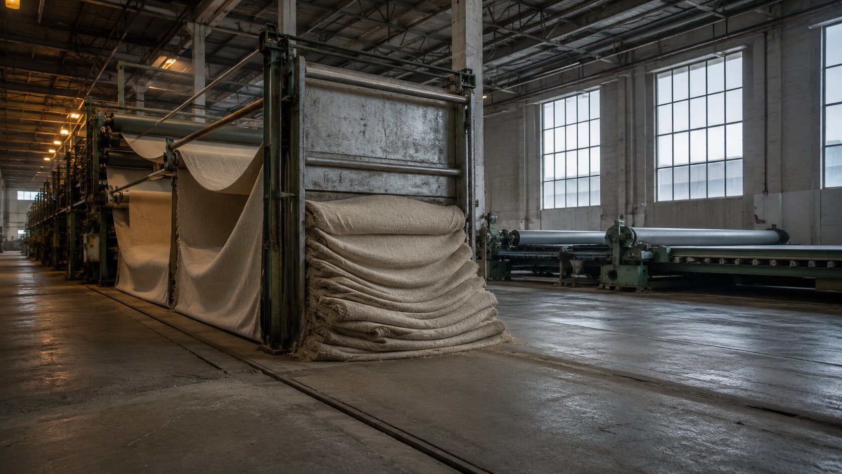
Imagine a continuous sheet of handmade paper moving through several production stations.
At first, it stays flat and centered.
Then one approval gate holds the material in place while more paper continues arriving from behind.
The sheet begins to fold, compress, and buckle.
Eventually it tears.
The tear is not random. It is the physical result of unresolved work building up at one stage.
Real bottlenecks behave in a similar way. Work does not always stop completely. It often collects behind a stage with limited capacity, slow approval, unclear ownership, or missing information.
Visual Signs of Growing Pressure
You can communicate strain through:
- Material beginning to bunch before a narrow opening
- Increasing tension in a cord, thread, sheet, or membrane
- Several finished pieces waiting behind one occupied station
- A roller continuing to turn while the next mechanism remains locked
- Repeated layers entering faster than they can leave
- Fine cracks appearing before a complete split
- A guide slowly pulling material away from its intended path
The important part is progression.
The pressure should become more visible as the eye moves toward the failure point.
Pro Tip: Do not make the upstream part of the scene perfectly clean. Small signs of growing tension make the eventual failure feel earned rather than decorative.
Give the Breakdown a Believable Physical Cause
Creative workflow problems are abstract.
Your visual needs to turn one of them into believable material behavior.
Start by matching the production problem to a physical action.
| Workflow Problem | Possible Physical Metaphor |
|---|---|
| Missing context during handoff | A guide passes material forward but strips away its alignment marks. |
| Conflicting feedback | Two mechanisms pull the same sheet in different directions. |
| Unclear ownership | A component stops between two stations, with neither mechanism engaging it. |
| Version confusion | Two slightly different layers enter one assembly and no longer register. |
| Approval bottleneck | Finished material gathers behind a locked gate. |
| Brand drift | A repeated pattern gradually shifts after passing through a worn guide. |
| Too many asset requests | One narrow output station receives several incoming streams. |
| Late strategic change | A cutting guide moves after most of the material has already passed. |
The mechanism must make sense.
A steel roller can compress paper. A tension frame can stretch fabric. A cutting guide can divide a sheet. A worn eyelet can pull thread off course. A registration pin can misalign printed layers.
What it should not do is behave like magic.
If a solid metal plate suddenly melts because the workflow is broken, the metaphor becomes harder to trust.
Physical realism matters because it helps the viewer understand cause and effect without needing labels.
Damage Is Not Always the Best Choice
Sometimes the strongest failure is not a dramatic break.
A workflow may continue producing assets, but every output is slightly wrong.
In that case, gradual drift may be more accurate than destruction.
For example, one continuous woven stripe could pass through a damaged tension guide.
Before the guide, the stripe is straight.
Immediately after it, the stripe moves a few millimeters off center.
By the final output, it has been cropped from the most important publishing formats.
Nothing explodes.
Production continues.
That is exactly why the problem is dangerous.
Keep One Creative Signal Alive Across the Scene
The viewer needs something stable to follow.
It could be:
- One colored thread
- A raised ridge in metal
- A mineral seam running through stone
- A repeated embossed mark
- A narrow band of light
- A distinctive cut-out shape
- One recognizable surface pattern
This element represents the original creative idea.
At the beginning of the workflow, it should be clear and correctly placed.
It then travels through each production stage.
At the point of failure, something happens to it. It may shift, split, disappear, become duplicated, or lose alignment.
Without that continuous signal, the image may show damaged machinery, but it will not explain what was lost.
Example: A Release Campaign Losing Its Identity
Suppose an independent musician develops a release concept built around a narrow burgundy stripe crossing a dark, rough paper texture.
In the broken workflow visual:
- The stripe enters the production system in the correct position.
- It passes through the cover-art stage intact.
- The creative handoff removes the alignment guide.
- The square social version keeps only part of the stripe.
- The vertical Story version pushes it against the edge.
- The wide banner crops it out completely.
Now the viewer can see the practical consequence.
The campaign has not simply become inconsistent.
Its defining visual relationship was lost during adaptation.
This is also why version history, comparison tools, and shared review systems matter in real creative production. They help teams inspect what changed instead of relying on disconnected exports, memory, or filenames such as “final-final-v3.”
Compose the Visual as Cause, Break, and Consequence
A useful broken workflow scene usually has three readable zones.
1. The Process Is Working
The incoming side establishes normal behavior.
The material is aligned. The main visual signal is clear. The machinery is under control.
This area does not need to look sterile, but it should feel stable.
2. The Workflow Fails
The center contains the decisive event.
A guide is missing. A roller is worn. Two paths collide. An approval gate is locked. A layer enters at the wrong angle.
Make this area the visual focus through the camera position, material pressure, contrast, or directional light.
3. The Damage Travels Downstream
The final area shows the cost.
Outputs may be:
- Misaligned
- Incomplete
- Repeated unnecessarily
- Visually inconsistent
- Waiting in a queue
- Cut to the wrong proportion
- Detached from the original pattern
The viewer should be able to trace each consequence back to the central failure.
Choose the Camera Angle Around the Break
A low side angle works well for tension, compression, queues, and material buildup.
A top-down view is better for alignment errors, branching paths, missing components, and competing directions.
A close three-quarter macro view suits a single worn component, such as a damaged guide, bent pin, blocked aperture, or loose tension wheel.
Avoid pulling the camera so far back that the failure becomes one tiny detail inside a large decorative machine.
The broken moment is the subject.
Test Whether the Image Explains the Real Problem
Before finalizing the visual, describe it in one sentence without using words such as chaos, failure, broken, or messy.
A continuous printed sheet passes through four aligned registration rollers, but the third roller is mounted slightly off center, causing every later color layer to drift further from the original mark.
That sentence works because it contains:
- A stable input
- A visible sequence
- A specific defect
- A downstream effect
Now compare it with this:
A futuristic creative machine explodes while files and ideas fly everywhere.
The second version may look dramatic, but it does not identify a workflow problem.
A Practical Review Checklist
Ask these questions:
- Can the viewer find the exact failure point?
- Is there a clear reason the failure occurs?
- Can they see what the process looked like before it failed?
- Does one recognizable element continue through the image?
- Are the downstream consequences connected to the break?
- Is the scene understandable without text labels?
- Does the metaphor match a real creative production issue?
- Could one unnecessary object be removed?
Also check whether your proposed fix would repair the visual.
If the problem is unclear ownership, the repair might be one clearly engaged mechanism between stages.
If the problem is missing context, the repair might preserve alignment marks, references, or embedded guidance through the handoff.
That connection matters.
The image should not only dramatize the failure. It should reveal the missing production rule.
Review systems built around one shared asset, visible comments, clear approval stages, and current versions are designed to reduce the file shuffling and version drift that appear when feedback is scattered across unrelated tools.
Repair the Creative Workflow With Orias AI
Orias AI gives creators a shared space for moving between rough ideas, references, generated assets, text, images, video, and campaign outputs without rebuilding the project context at every step.
That becomes useful after you have identified where the process breaks.
You can keep the original concept and references close to the work, compare different directions, refine copy, generate visual variations, and organize related campaign assets around one continuing creative thread.
For a musician, that might mean developing the release direction, cover concepts, social visuals, video ideas, and promotional copy around the same mood and visual priorities.
For a visual storyteller, it could mean keeping concept frames, prompts, references, and final asset decisions connected as the project develops.
A practical repair workflow could look like this:
- Map the real production process.
- Identify the exact stage where context, ownership, or visual identity is lost.
- Define what must remain consistent through every handoff.
- Keep references, prompts, decisions, and generated assets together.
- Generate controlled variations instead of unrelated outputs.
- Review the work against the original creative direction.
- Recompose assets for each platform without losing the central idea.
- Record what changed before beginning the next production cycle.
AI can help with exploration, structure, variation, and production speed.
It cannot decide which visual relationship defines your identity or whether a final asset genuinely fits the project.
That still needs human judgment, careful review, and a workflow that carries creative intent from the first idea to the final published asset.
Frequently Asked Questions
What Is a Broken Workflow Visual?
A broken workflow visual is an image that shows the exact stage where a process stops working correctly.
In creative production, it might represent a failed handoff, unclear approval, lost reference, outdated version, overloaded team member, or inconsistent adaptation process.
How Is a Broken Workflow Visual Different From a Workflow Diagram?
A workflow diagram documents stages, responsibilities, and decisions.
A broken workflow visual is usually more editorial and metaphorical. It uses materials, movement, alignment, pressure, or machinery to make one production failure immediately understandable.
What Is the Best Metaphor for a Creative Bottleneck?
Use a narrow or blocked production stage where material begins to accumulate.
A locked gate, occupied press, jammed roller, or restricted output channel can work well when the incoming work and downstream delay remain visible.
Should the Visual Show a Completely Destroyed Process?
Usually not.
Many creative workflows continue operating while producing inconsistent or incorrect results.
Gradual misalignment, duplication, lost detail, growing pressure, or repeated rework may communicate the problem more accurately than a dramatic collapse.
How Can AI Help Create a Broken Workflow Visual?
AI can help explore materials, mechanisms, camera angles, compositions, and metaphor variations.
Start with a clearly defined workflow problem, then generate a small number of controlled directions. Review the physical logic carefully and refine the strongest concept rather than publishing the first result.

What Makes an AI-Generated Workflow Image Feel Generic?
Generic images often rely on glowing interfaces, random gears, tangled wires, floating icons, or unexplained explosions.
A stronger image uses one specific material, one believable mechanism, and one visible cause-and-effect relationship.
How Can a Creative Team Use the Finished Visual?
The image can support an article, presentation, workflow review, campaign retrospective, process guide, or internal production discussion.
It can also help a team agree on the exact stage that needs repair before choosing new tools, assigning new roles, or adding more production steps.
Sources Used
- Orias AI
- Atlassian, How to Identify and Manage Workflow Bottlenecks
- Asana, How to Identify and Overcome Project Bottlenecks
- Adobe, Unified Review and Approval for Content Workflows
- Frame.io, Comparison Viewer
- Figma, View a File’s Version History
- Adobe Creative Cloud, Revert to an Earlier File Version