Visual Hierarchy in AI Content: Guiding Attention Before Adding More Detail
Learn how to use visual hierarchy in AI content so every image, video, campaign asset, and promo creative guides attention clearly.
TL;DR:
- Visual hierarchy helps AI-assisted content communicate one clear idea before it becomes visually crowded.
- Creators should decide what the viewer should notice first, second, and third before asking AI to add more detail, texture, effects, captions, or format variations.
- Strong hierarchy makes release visuals, promo assets, thumbnails, campaign banners, and creative packs feel intentional instead of overproduced.
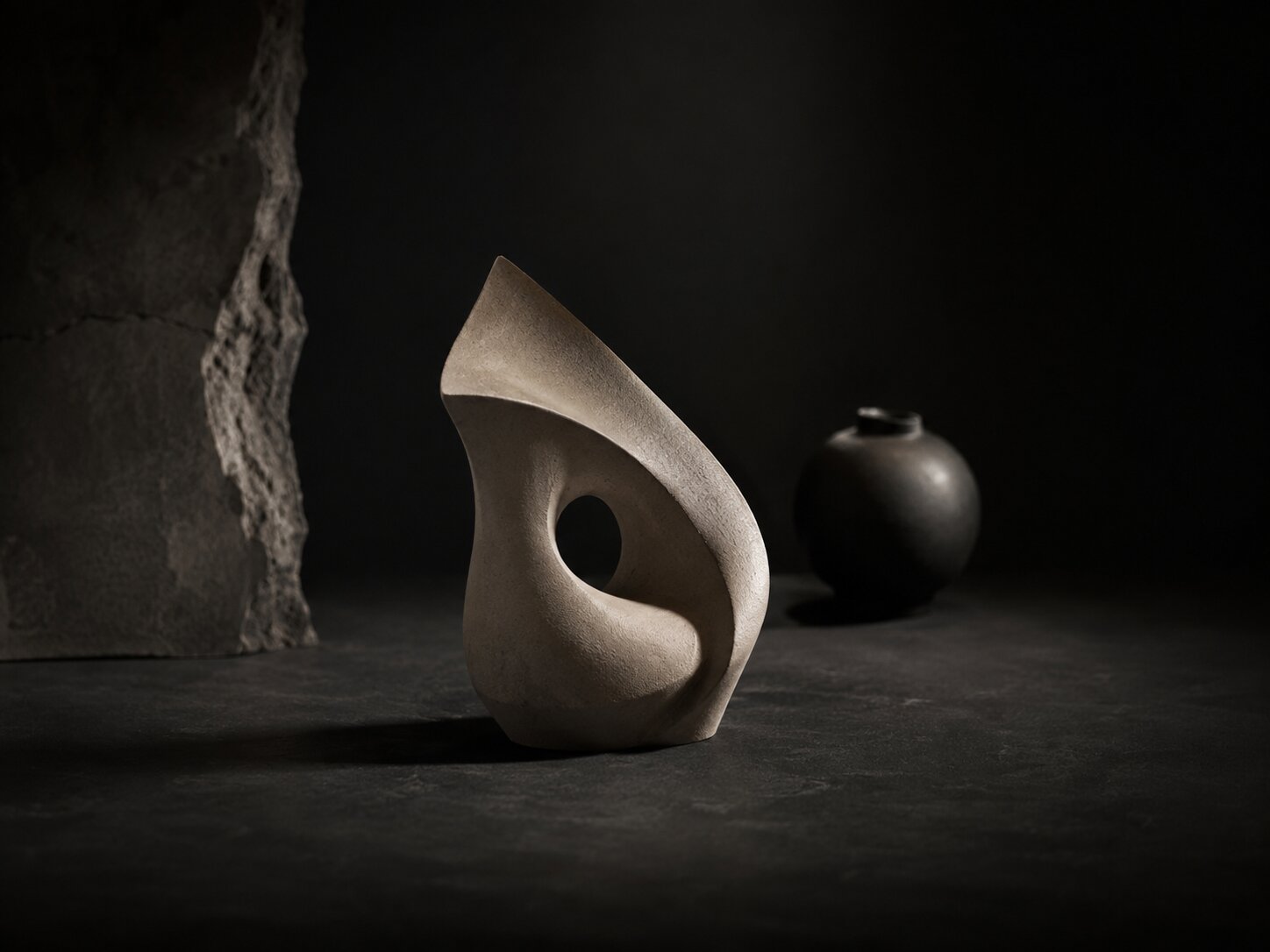
AI makes it easy to generate more: more versions, more textures, more background detail, more caption ideas, more campaign assets, more visual styles. That speed is useful, but it also creates a new creative problem. A piece of content can look “rich” and still fail because the viewer does not know where to look.
For artists, musicians, creators, and visual storytellers, attention is not just a design issue. It shapes whether someone understands the mood of a release, notices the title of a campaign, recognizes the artist identity, or pauses long enough to feel something. Visual hierarchy is the craft of arranging elements by importance so the eye moves through the work in the intended order.
This guide explains how to use visual hierarchy inside AI content workflows. You will learn how to define the focal point before prompting, how to structure image and video assets, how to avoid visual clutter, and how to turn one clear concept into a stronger creative system.
Table of Contents
- Key Takeaways
- Hierarchy Begins Before the Prompt
- Choose the Viewer’s First Stop
- Use Contrast as a Decision Tool, Not Decoration
- Control Detail So the Asset Still Breathes
- Translate Hierarchy Across Formats
- Use AI for Variations, Then Edit Like a Creative Director
- A Practical Hierarchy Checklist for AI Content
- How Orias AI Fits Into This Workflow
- Frequently Asked Questions
- Sources Used
Key Takeaways
| Point | Details |
|---|---|
| Hierarchy should come before detail | Decide what matters most before asking AI to add atmosphere, objects, effects, typography, or platform variations. |
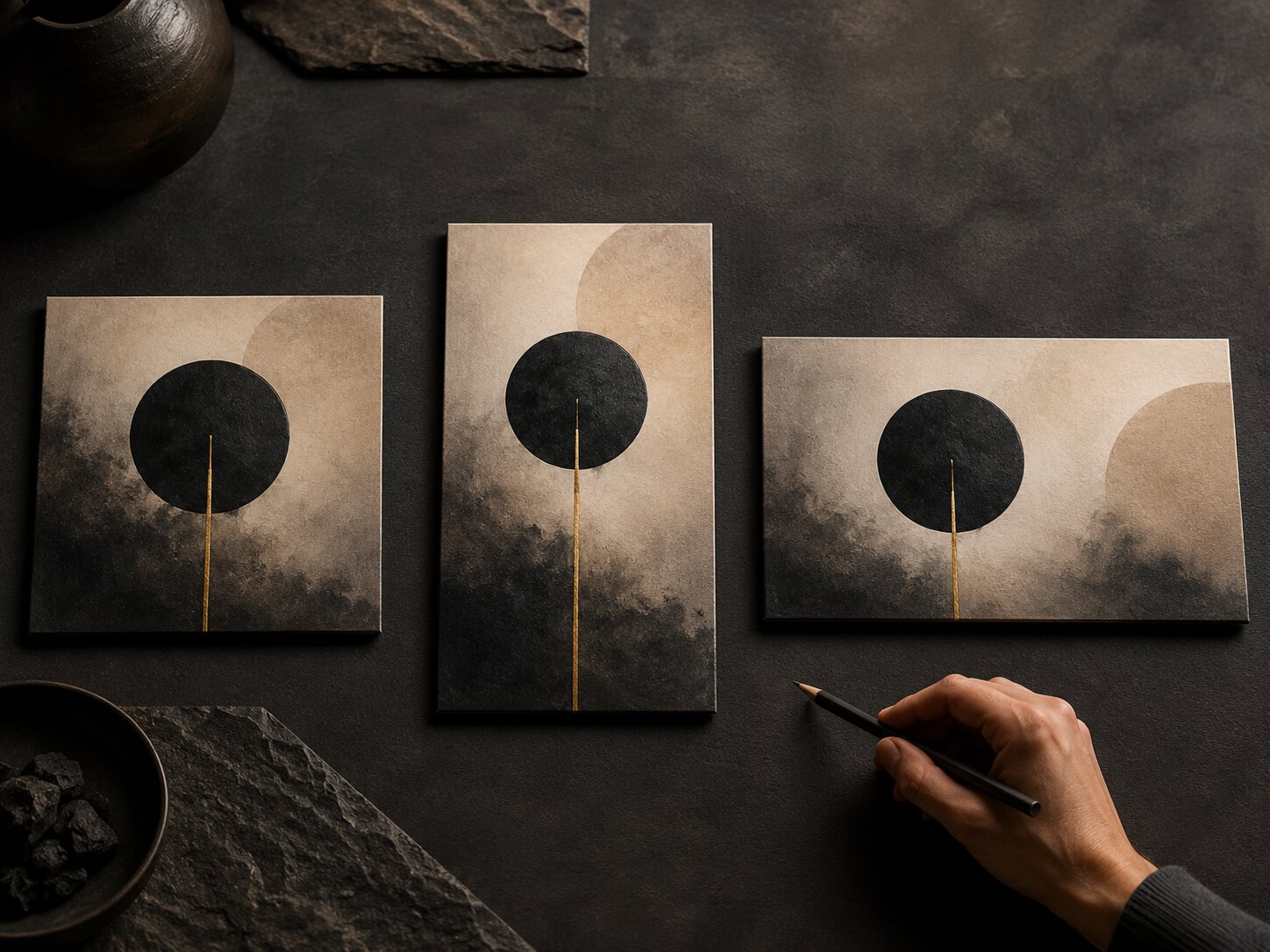
| One asset needs one dominant idea | A release visual, thumbnail, poster, reel cover, or campaign banner should have a clear first read. |
| Contrast is strategic | Scale, light, color, spacing, and sharpness should guide attention, not simply make the image feel busier. |
| AI outputs need human selection | AI can generate options quickly, but creators still need to choose based on mood, brand fit, ethics, clarity, and platform context. |
| Hierarchy changes by format | A square cover, vertical story, YouTube thumbnail, and Spotify Canvas cannot use the exact same composition without adjustment. |
Hierarchy Begins Before the Prompt
Many creators treat visual hierarchy as something to fix after the AI output appears. That is usually too late. If the prompt asks for a cinematic room, neon lighting, symbolic objects, typography, a dramatic character, multiple campaign formats, and “lots of detail,” the model may produce an image with energy but no priority.
A better workflow starts with a hierarchy brief.
Before generating anything, write three short lines:
- Primary attention: What should the viewer notice first?
- Secondary context: What should they understand next?
- Supporting atmosphere: What should they feel in the background?
For example, a musician planning release visuals for a melancholic single might define:
- Primary attention: a solitary figure under soft blue light
- Secondary context: empty urban space suggesting distance
- Supporting atmosphere: subtle rain texture, quiet reflection, minimal visual noise
That is more useful than asking for “a beautiful cinematic sad music cover with lots of details.” It gives the AI a creative order.
What this changes in practice
When hierarchy is defined first, your prompts become more intentional. You stop asking AI to impress you with complexity and start asking it to support a viewing path.
A practical prompt fragment might look like this:
Create a cinematic release visual where the viewer’s attention goes first to the central silhouette, then to the empty space around them, then to subtle rain texture and distant city light. Keep background details soft and secondary.
This kind of instruction tells the system not only what to include, but how important each element should be.
Mistake to avoid
Do not confuse mood with hierarchy. “Dark, dreamy, nostalgic, cinematic” describes atmosphere, but it does not explain where the eye should go. A strong AI creative direction needs both.
Choose the Viewer’s First Stop
Every strong visual gives the viewer a first stop. It might be a face, object, title, gesture, product, symbolic prop, or empty space. Without that first stop, the viewer scans randomly.
In AI content, this problem appears often because generated assets can contain too many equally interesting elements. A background character, glowing object, dramatic sky, text area, logo placement, and texture field may all compete for attention.
Visual hierarchy solves this by creating a clear order of importance. Canva’s guidance on visual hierarchy emphasizes scale, color, and contrast as ways to guide viewers through a design.
Common first-stop choices for creators
| Asset Type | Best First Stop |
|---|---|
| Music release artwork | Artist, symbolic object, title area, or emotional scene |
| Reel cover | Face, motion cue, bold visual hook, or readable short phrase |
| YouTube thumbnail | Human expression, object of curiosity, or strong contrast area |
| Campaign banner | Core message, product or artist image, or focal composition |
| Promo poster | Event name, artist name, central visual, or date hierarchy |
| Brand world image | Signature object, lighting style, or recurring visual cue |
The right choice depends on the viewer’s job. Are they supposed to recognize the artist? Understand the story? Click the video? Feel the mood? Read the title? Save the post?
Pro Tip: For every asset, ask: “If someone sees this for one second, what should remain in their mind?” That answer should become the dominant element.

Use Contrast as a Decision Tool, Not Decoration
Contrast is one of the strongest tools for hierarchy, but it is often misused in AI content. Many generated visuals contain high contrast everywhere: glowing edges, sharp textures, saturated backgrounds, dramatic lighting, bright text, reflective surfaces, and detailed props. The result may look intense, but the eye has no resting point.
Good contrast is selective.
You can create hierarchy through:
- Size contrast: one element is clearly larger
- Light contrast: the focal point is brighter or darker than its surroundings
- Color contrast: one hue carries more attention
- Sharpness contrast: the main subject is crisp while the background is softer
- Spacing contrast: important elements have room around them
- Motion contrast: in video, one movement dominates the frame
- Typographic contrast: title, subtitle, and details are visibly different
Figma lists hierarchy, contrast, alignment, white space, proportion, repetition, rhythm, emphasis, proximity, and unity among core graphic design principles. That matters because hierarchy rarely works alone. It usually depends on several design decisions working together.
Example: release poster hierarchy
A weak AI prompt might say:
Create a futuristic music release poster with neon lighting, a city, a singer, large title text, abstract shapes, smoke, reflections, and cinematic effects.
A stronger hierarchy-led prompt:
Create a futuristic music release poster where the artist silhouette is the dominant focal point. Use one bright vertical light source behind the figure. Keep the city background soft and low-detail. Leave clean upper space for a short release title. Use abstract shapes only as subtle framing elements.
The second version does not reduce creativity. It protects the viewer’s attention.
Mistake to avoid
Do not add contrast to every layer. If everything is bright, sharp, large, and saturated, nothing feels important.
Control Detail So the Asset Still Breathes
AI-generated content often becomes crowded because detail feels like value. More fabric texture, more props, more background characters, more particles, more symbolic objects, more UI shapes. But in visual storytelling, detail should support meaning.
A good creative asset needs breathing room. This does not mean it has to be minimal. It means the viewer can separate the main idea from the surrounding atmosphere.
White space, negative space, soft areas, blur, darkness, and simple backgrounds all help hierarchy. They give the focal point a stage.
Detail should have a job
| Detail Type | Useful When It… | Remove It When It… |
|---|---|---|
| Texture | Reinforces mood or material quality | Competes with the subject |
| Props | Adds story or identity | Feels random or decorative |
| Background | Gives context | Pulls attention from the message |
| Text | Clarifies the asset | Repeats what the platform already shows |
| Effects | Supports emotion or motion | Makes the asset harder to read |
This is especially important for music visuals. Spotify’s Canvas guidance advises artists to avoid rapid cuts or intense flashing graphics, consider phone screen cropping, and avoid adding song or artist names when the app already displays that information. That is hierarchy thinking: avoid adding information that does not need to carry attention.
Practical editing move
After generating an image, create a “remove list.” Identify three things that could be simplified. This might include extra lights, background objects, duplicate symbols, small text, or unnecessary decorative patterns.
AI can help with this too. You can ask:
Review this concept for visual hierarchy. What elements compete with the focal point, and what should be reduced before publishing?
The final decision should still be human. The AI can point out possible clutter, but your taste and brand context determine what stays.
Translate Hierarchy Across Formats
One of the biggest mistakes in AI content workflows is assuming one composition can simply be resized for every platform. A square artwork, vertical story, horizontal banner, and short-form video frame all need different hierarchy decisions.
The focal point may stay the same, but its position, scale, spacing, and supporting details must adapt.
Format changes attention
A vertical video often needs faster recognition. A square cover can hold a more atmospheric composition. A wide banner may need stronger horizontal movement. A thumbnail may need fewer elements and more immediate contrast.
Platform guidance often reflects this reality. Meta’s Reels best practices recommend grabbing attention with a hook, using text overlays, experimenting with audio, and establishing a unique voice. TikTok’s creative guidance also emphasizes platform-native creative and creative strategy.
For creators, the lesson is not to blindly follow every trend. It is to make hierarchy fit the environment where the asset will be seen.
Cross-format hierarchy map
| Format | Primary Hierarchy Question |
|---|---|
| Instagram Reel cover | Can the main idea be understood in a fast scroll? |
| TikTok video frame | Is there a visual hook before extra context appears? |
| YouTube thumbnail | Is the curiosity point readable at small size? |
| Spotify Canvas | Does the motion feel clear without overwhelming the listener? |
| Apple Music artist image | Is the artist/profile identity clear and platform-safe? |
| Website hero | Does the visual support the message rather than overpower it? |
Apple Music for Artists specifies image requirements such as preferred 2400 × 2400 pixels or greater, JPG or PNG format, and avoiding upscaled images for artist profile pictures. These technical requirements matter, but hierarchy still matters within them: the image must remain clear, recognizable, and appropriate after cropping and platform display.
Mistake to avoid
Do not use the same AI-generated image everywhere without checking crops. Edges may be cut off, text may become too small, and the focal point may shift into an awkward position.
Use AI for Variations, Then Edit Like a Creative Director
AI is excellent for exploration. It can help you test different compositions, moods, crops, color directions, symbolic objects, and format ideas. But hierarchy depends on judgment. The best result is not always the most detailed or surprising version.
A strong workflow separates generation from selection.
Stage 1: Generate around one hierarchy idea
Instead of generating random options, hold the hierarchy constant:
Create five variations where the viewer first notices the central red door, then the empty hallway, then the soft light on the floor.
Now the variations explore style, mood, and composition without losing the core viewing path.
Stage 2: Compare by attention order
Do not ask only, “Which one looks best?” Ask:
- Which version has the clearest first read?
- Which version supports the emotional mood?
- Which version leaves space for text or platform UI?
- Which version feels most original to the artist or brand?
- Which version has unnecessary detail?
- Which version can become a full asset system?
Stage 3: Refine with constraints
Once you select a direction, refine it with specific hierarchy instructions:
Reduce background detail by 30%. Keep the subject dominant. Make the light source softer. Preserve empty space on the right for campaign copy. Avoid adding new objects.
This is where creators often get better results. The prompt becomes less about asking for more and more about protecting the structure.
Human judgment still matters
AI can accelerate ideation, variation, and asset production. It cannot fully replace taste, lived context, cultural sensitivity, rights review, platform judgment, or the final creative decision. Publishing AI output without review can lead to generic visuals, inconsistent branding, unclear messages, or assets that do not fit the campaign.
A Practical Hierarchy Checklist for AI Content
Use this checklist before publishing AI-assisted visuals, videos, release assets, or campaign materials.
1. First-read test
Look at the asset for one second. What do you notice first?
If the answer is not the intended focal point, adjust scale, contrast, spacing, or background detail.
2. Three-level hierarchy test
Can you define:
- First: main subject or message
- Second: context or supporting story
- Third: atmosphere or detail
If you cannot explain the order, the viewer probably cannot feel it.
3. Small-size test
Shrink the asset. Does it still work as a thumbnail, feed preview, or mobile crop?
This is essential for creators publishing across social platforms, streaming platforms, and campaign pages.
4. Text conflict test
If the asset includes text, is the typography competing with the image? If the platform already displays the artist name, song title, or video title, you may not need to repeat everything inside the visual.
Spotify’s Canvas guidance specifically notes that song and artist names already appear in the Now Playing view, which is a useful reminder to avoid redundant information in certain contexts.
5. Brand memory test
Does the asset reinforce something recognizable about your creative world?
This could be a recurring color mood, lighting behavior, symbolic object, composition style, texture, or emotional tone.
6. Platform interference test
Check where interface elements appear: captions, buttons, profile icons, progress bars, titles, badges, and safe areas. A beautiful image can fail if the focal point sits under platform UI.
7. Detail discipline test
Remove or reduce anything that does not support the primary idea. Detail should deepen the story, not compete with it.
How Orias AI Fits Into This Workflow
Orias AI is built for creators who need more than isolated outputs. A strong visual hierarchy workflow requires moving from rough ideas to clearer creative direction, then into release visuals, promo assets, campaign materials, voice variants, and publish-ready creative packs.
That is where a structured AI creative system becomes useful. Instead of prompting randomly for one image at a time, creators can use Orias AI to clarify mood, organize references, explore visual directions, generate asset variations, and refine a campaign system around a consistent focal idea.
The goal is not to let AI decide your taste. The goal is to give your ideas a stronger structure so every asset knows what it is trying to communicate.
Frequently Asked Questions
What is visual hierarchy in AI content?
Visual hierarchy in AI content is the intentional ordering of visual elements so the viewer knows what to notice first, second, and third. In an AI workflow, it means giving the model clear priorities before generating or refining an asset.
Why do AI-generated images often feel cluttered?
They often feel cluttered because the prompt asks for too many elements without defining importance. When every object, light source, texture, and effect has equal visual weight, the viewer has no clear path through the image.
How do I improve hierarchy in an AI prompt?
State the focal point clearly, describe what should be secondary, and tell the model what should stay subtle. Use instructions such as “dominant subject,” “soft background,” “clear negative space,” “minimal supporting details,” or “leave room for text.”
Is visual hierarchy different for video and still images?
Yes. Video hierarchy also includes timing, motion, cuts, pacing, captions, and sound cues. A still image guides the eye through composition; a video guides attention through sequence and movement.
How can musicians use visual hierarchy for release campaigns?
Musicians can use hierarchy to make release artwork, Canvas visuals, teaser clips, posters, and social assets feel connected. The key is to define the emotional focal point of the release before creating multiple formats.
Should I add text to every AI-generated promo asset?
No. Text should only be added when it improves clarity. Some platforms already display titles, artist names, captions, or buttons, so repeating information inside the visual can create clutter.
What is the biggest visual hierarchy mistake creators make with AI?
The biggest mistake is adding more detail before deciding what matters. Strong AI content usually starts with a clear attention path, then adds detail only where it supports the main idea.