Signature Visual Details: Building Recognizable Brand Cues with AI
Creators can use AI to define signature visual details, build recognizable brand cues, and keep visuals consistent across platforms.

TL;DR:
- Signature visual details are the small repeatable cues that make your creative work recognizable before someone sees your name.
- AI can help you explore, test, and systemize those cues, but the strongest results come from clear creative direction and human curation.
- The practical goal is not to repeat the same image everywhere, but to build a visual language that can flex across release visuals, social posts, thumbnails, campaigns, and promo assets.
A recognizable visual identity is rarely built from one perfect logo, one color palette, or one viral post. More often, it comes from details that appear again and again: a specific lighting mood, a recurring object, a framing habit, a texture, a symbol, a border treatment, a type style, or the way a face is cropped in a thumbnail.
For creators, artists, musicians, and visual storytellers, these details matter because audiences move fast. Someone may see your work as a Spotify Canvas, a TikTok clip, an Instagram Reel, a YouTube thumbnail, a release poster, a tour announcement, or a profile image before they ever land on your main page. Spotify describes Canvas as a short looping visual that appears with a track, while Apple Music artist images appear across Apple Music, the iTunes Store, and Shazam, which makes consistent visual decisions part of the listener’s experience, not just decoration.
AI can speed up the process of finding these details. It can generate variations, organize references, test different moods, and turn loose ideas into structured creative packs. But AI can also make everything look smooth, over-polished, and interchangeable if the creator does not define what should stay consistent.
This guide explains how to build signature visual details with AI in a practical, repeatable way. You will learn how to identify your strongest brand cues, translate them into prompts and creative rules, adapt them across platforms, and review AI output with enough discipline to protect your artistic voice.
Table of Contents
- What Makes a Visual Detail “Signature”?
- Start by Auditing What People Already Recognize
- Turn Brand Cues into an AI-Ready Detail System
- Build Variation Without Diluting the Signal
- Adapt Cues Across Music, Social, and Campaign Assets
- Review AI Outputs Like a Creative Director
- How Orias AI Helps Shape Recognizable Visual Systems
- Frequently Asked Questions
- Sources Used
Key Takeaways
| Point | Details |
|---|---|
| Signature details are not random decoration | They are repeatable visual cues that help people recognize your creative world across formats. |
| AI needs constraints to produce consistency | Strong outputs come from defined rules for mood, light, objects, framing, texture, and exclusions. |
| Recognition depends on repetition with variation | Reusing one exact asset feels stale; repeating visual logic creates familiarity without fatigue. |
| Platform context changes the cue | A detail that works in album art may need simplification for thumbnails, vertical video, or mobile feeds. |
| Human review protects originality | AI can generate options, but creators must choose what fits the work, the audience, and the brand world. |
What Makes a Visual Detail “Signature”?
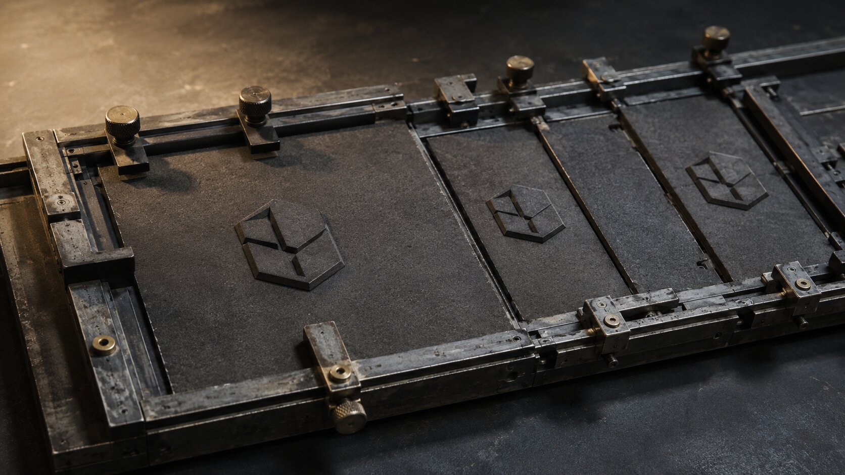
A signature visual detail is a small element that becomes associated with your creative identity through repeated, intentional use. It is not necessarily the loudest part of the image. In fact, many of the best brand cues are subtle.
For a musician, it might be a recurring chrome object, a low red side light, handwritten title placement, or a surreal sky texture used across release covers and social teasers. For a visual storyteller, it might be a specific lens feel, empty architectural space, soft motion blur, or a recurring symbolic prop. For a creator, it might be a thumbnail structure, a recognizable color contrast, or a recurring framing style.
The important test is simple: could someone recognize the work before seeing the name?
Strong signature details usually have four traits
| Trait | What it means | Example |
|---|---|---|
| Repeatable | It can appear across many assets | A recurring silver frame around campaign visuals |
| Flexible | It can change without disappearing | Same lighting mood, different scenes |
| Meaningful | It connects to the creator’s world | Ocean textures for a project about memory and distance |
| Distinctive | It does not feel like a default AI style | Unusual crop, object, texture, or visual rule |
A weak cue is purely aesthetic. A strong cue carries meaning and structure. “Blue neon” is a style preference. “Cold blue light leaking through domestic spaces to show emotional distance” is a creative rule.
That difference matters when using AI. If you only prompt for surface aesthetics, the system may produce attractive but generic images. If you define the logic behind the detail, you get outputs that feel connected.
Start by Auditing What People Already Recognize
Before inventing new brand cues, look at what already appears in your work. Many creators have a visual identity before they have language for it.
Collect 20–40 existing assets: cover art, social posts, behind-the-scenes photos, thumbnails, posters, website visuals, live visuals, merch mockups, and campaign graphics. Then look for repeated patterns.
Ask:
- What colors appear without me forcing them?
- What lighting moods keep returning?
- Do I use close-ups, empty space, wide scenes, or dense compositions?
- Are there recurring objects, symbols, materials, or environments?
- What details do fans, collaborators, or clients already mention?
- Which assets feel most “like me” even if they are imperfect?
This audit gives AI better source material. Instead of asking it to create a visual identity from nothing, you can ask it to extract patterns, organize them, and suggest repeatable rules.
Practical AI prompt for the audit
Use a prompt like:
Analyze these creative references and identify recurring visual details. Group them into categories: color behavior, lighting, composition, symbols, textures, typography, camera feel, emotional tone, and details to avoid. Do not create a new style yet. First describe the existing visual language.
The key phrase is “do not create a new style yet.” You want the AI to observe before it invents.
Mistake to avoid: Do not audit only your most polished assets. Include rough sketches, accidental behind-the-scenes images, unfinished experiments, and older work. Signature details often hide in the imperfect material because that is where your instincts show up most clearly.
Turn Brand Cues into an AI-Ready Detail System
Once you identify the details, turn them into a system AI can reuse. This is where many creators stop too early. They write a mood prompt, generate a few nice images, and then wonder why the next batch feels different.
A stronger approach is to document your cues like a mini creative direction bible.
Build your cue library
Create a simple table with five fields:
| Cue | Rule | Where it appears | Variation range | Avoid |
|---|---|---|---|---|
| Soft backlight | Subject should feel partially hidden, not fully exposed | Release art, portraits, teasers | Blue, white, or pale gold | Harsh nightclub lighting |
| Fragmented glass | Symbol of memory and distortion | Promo posters, video stills | Cracks, reflections, translucent overlays | Shattered horror aesthetic |
| Centered small figure | Shows scale and isolation | Campaign hero visuals | Wide rooms, landscapes, empty streets | Busy crowd scenes |
This type of structure helps you prompt with specificity. It also helps you reject outputs faster.
Canva’s Brand Kit concept is useful here because it organizes official logos, colors, fonts, and assets in one place. Adobe similarly describes a brand kit as a collection of assets, guidelines, and resources that define how a brand should appear and be used. For AI-assisted creative work, you can extend that idea beyond logos and fonts into mood, symbols, lighting, and recurring image behavior.
Separate fixed cues from flexible cues
Not every detail should be locked.
Fixed cues should stay consistent. These might include your logo placement, preferred type family, main color behavior, or a recurring symbol.
Flexible cues can evolve. These might include seasonal colors, background locations, campaign-specific props, or motion treatments.
For example, a musician might keep the same handwritten title treatment across a release cycle but change the environment from bedroom to desert to backstage hallway. The audience feels continuity because the cue remains stable, even though the content moves.
Pro Tip: Write your signature details as rules, not just keywords. “Use fog” is weak. “Use thin atmospheric haze to soften distance and make the subject feel half-remembered” gives AI a clearer creative function.
Build Variation Without Diluting the Signal
Recognition does not mean repetition of the same asset. In fact, repeating one image too often can make a campaign feel lazy. The goal is to repeat the underlying visual logic.
Think of signature details as ingredients. You do not need every ingredient in every asset. You need enough continuity for the audience to feel the same creative world.
Use the 3-cue rule
For each new asset, choose three recognizable cues from your library:
- One mood cue
- One composition cue
- One detail cue
Example for an independent artist launching a single:
- Mood cue: cold cinematic loneliness
- Composition cue: subject small in a wide frame
- Detail cue: reflective silver object near the foreground
Now generate variations for different formats: cover art, vertical teaser, square post, story background, lyric snippet, and short video frame. The outputs can look different, but they will still share a recognizable DNA.
Create controlled variation sets
Instead of prompting for 30 unrelated ideas, generate in batches:
| Batch | What changes | What stays fixed |
|---|---|---|
| Lighting test | Warm, cold, dusk, flash, silhouette | Same subject, framing, symbol |
| Object test | Mirror, glass, flower, cassette, fabric | Same mood and palette |
| Format test | Square, vertical, wide, thumbnail | Same cue system |
| Intensity test | Minimal, editorial, surreal, cinematic | Same core concept |
This is where AI is especially useful. It can help you explore options quickly without losing the campaign’s structure. But the creator still decides which options have taste, originality, and emotional accuracy.
Mistake to avoid: Avoid letting AI “beautify” every cue. Many recognizable details are strange, restrained, imperfect, or specific. If your work depends on grain, awkward flash, empty space, or off-center framing, do not let the system smooth everything into premium sameness.
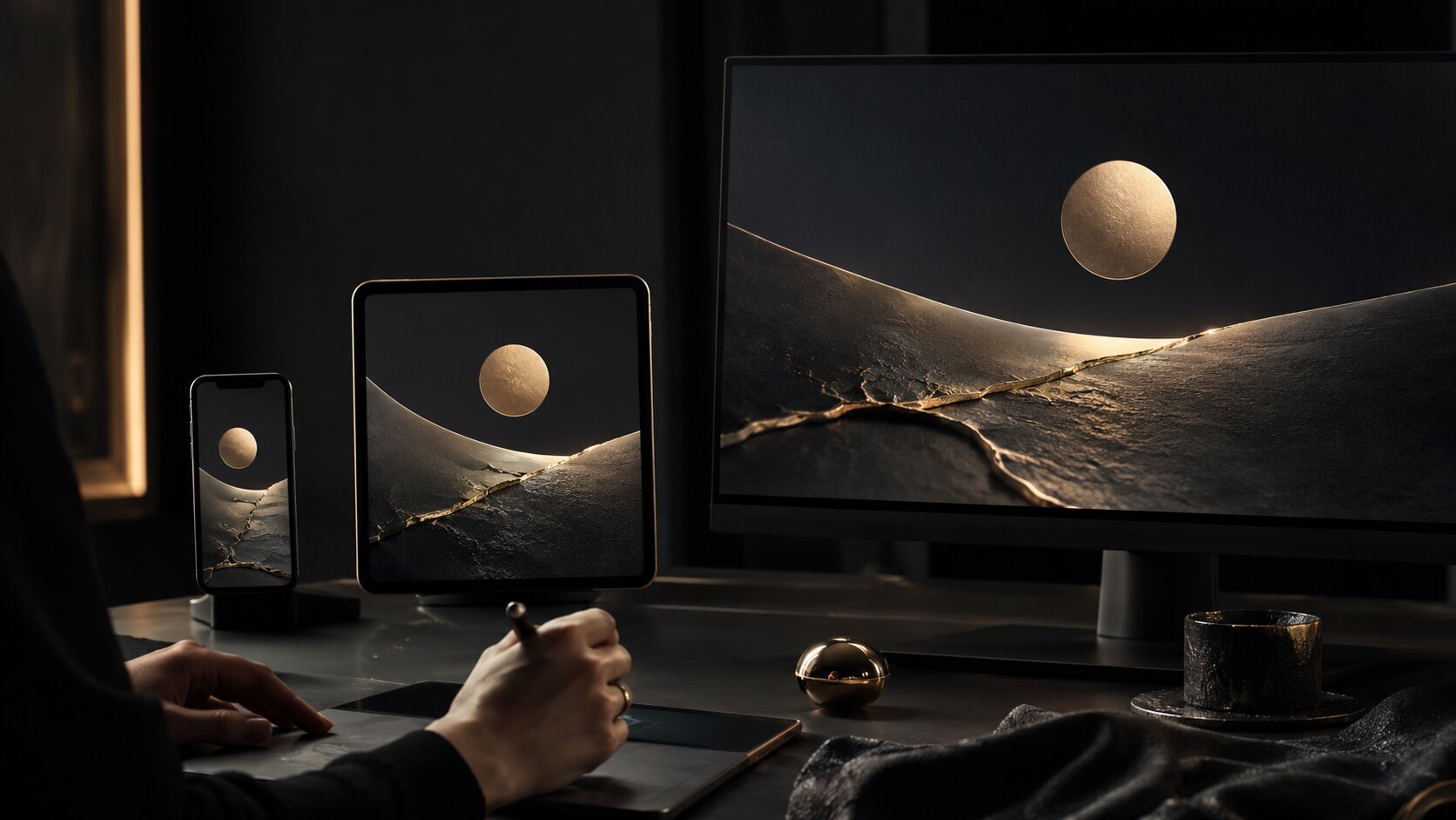
Adapt Cues Across Music, Social, and Campaign Assets
A signature detail has to survive format changes. A cue that looks beautiful on a large poster may disappear in a mobile feed. A texture that works on cover art may become visual noise in a small thumbnail.
Platform context matters. TikTok’s creative guidance emphasizes vertical production, high-resolution footage, and awareness of interface-safe space. Meta’s video ad guidance recommends showing the brand and key message early, especially in short-form creative.
That does not mean every creator should make aggressive ads. It means your visual details should be designed for the places they will actually appear.
For music release visuals
A release campaign might need:
- Cover art
- Spotify Canvas
- Apple Music artist image
- Vertical teaser
- Square announcement post
- Story background
- YouTube visualizer thumbnail
- Press image
- Tour or listening party poster
Spotify Canvas has technical and creative constraints, including a short 3–8 second vertical loop, so detailed storytelling may not translate well there. Spotify’s Canvas guidance also advises choosing footage without talking, singing, or rapping because the loop is not synced to lyrics.

For Apple Music artist images, Apple lists specific format expectations, including JPG or PNG and preferred images of 2400 x 2400 pixels or greater.
So your signature cue needs versions:
| Cue type | Large format | Small/mobile format |
|---|---|---|
| Texture | Layered background material | Simplified edge or overlay |
| Symbol | Full object in scene | Cropped object silhouette |
| Typography | Full title system | Short mark or recurring placement |
| Lighting | Complex cinematic setup | Clear contrast around subject |
| Color | Rich palette | One dominant recognizable color behavior |
For social content systems
Social platforms reward clarity. A recurring cue should help people understand the asset faster, not make it harder to read.
For short-form video, signature details might appear as:
- A recurring first-frame composition
- A consistent caption container
- A repeated transition style
- A recognizable intro object
- A specific background texture
- A recurring camera distance
- A stable color grade
The cue should not fight the content. If the video is educational, the detail should support readability. If the video is cinematic, the detail can carry more atmosphere. If the video is promotional, the cue should connect the asset to the larger campaign.
Review AI Outputs Like a Creative Director
The most important part of the workflow is not generation. It is selection.
AI can produce many options, but recognizable identity comes from saying no. A creator who publishes every decent output will end up with a scattered visual presence. A creator who reviews against a clear cue system can build consistency over time.
Use this review checklist before publishing:
| Question | Why it matters |
|---|---|
| Does this asset include at least two recognizable brand cues? | Prevents disconnected one-off visuals |
| Is the cue visible at mobile size? | Protects recognition in feeds |
| Does the image still fit the song, story, or campaign? | Avoids style overpowering meaning |
| Is anything too generic or over-polished? | Keeps the work from feeling like default AI output |
| Are there platform or rights issues to check? | Reduces publishing risk |
| Does this feel like something only we would make? | Tests distinctiveness |
AI-generated or AI-assisted assets may also need transparency and rights review. Adobe describes Content Credentials as metadata that can include how content was made, including whether it was generated by AI or edited with tools like Photoshop. Adobe’s generative AI user guidelines also state that Content Credentials may be attached to content created or modified with generative AI features.
That does not mean every creator needs a complex legal process for every social post. It does mean you should avoid using unclear references, copying living artists’ exact styles, publishing unreviewed generations, or assuming AI output is automatically safe for every commercial context.
The final human pass
Before publishing, do one pass without looking at the prompt. Ask only:
- Would I recognize this as part of the same creative world?
- Does it feel intentional?
- Is it too close to a reference?
- Is it emotionally right?
- Would I still like this if the AI novelty disappeared?
That last question is powerful. Strong signature details should outlive the tool used to produce them.
How Orias AI Helps Shape Recognizable Visual Systems
Orias AI is built for creators who do not just need isolated images, but clearer creative direction and publish-ready asset systems. For signature visual details, that means moving from rough references and loose moods into a more structured brand world.

A creator can use Orias AI to explore recurring symbols, define visual rules, generate release visuals, shape promo assets, test campaign variations, and assemble creative packs that feel connected. The useful part is not only speed. It is continuity: the ability to keep a mood, cue, or creative direction alive across multiple formats without starting from a blank prompt every time.
For independent artists, that can mean a more coherent release campaign. For digital creators, it can mean stronger recognition across thumbnails, Reels, Shorts, and social posts. For creative teams, it can mean fewer disconnected assets and a clearer review process.
AI should not replace taste. It should give taste more structure to work with.
Frequently Asked Questions
What are signature visual details?
Signature visual details are repeatable elements that help people recognize your creative work. They can include lighting, colors, textures, symbols, typography, framing, motion, props, or layout habits. The best ones are flexible enough to work across different assets while still feeling distinctive.
Can AI create a visual identity for me?
AI can help explore and organize a visual identity, but it should not be treated as the sole decision-maker. Strong identity comes from your references, taste, story, audience, and creative judgment. AI is most useful when you give it clear direction and use it to generate structured variations.
How many brand cues should I use in one asset?
A practical starting point is two or three. One cue may be too weak to create recognition. Too many can make the asset feel forced or cluttered. Choose the cues that best support the format and the message.
How do musicians use signature visual details for releases?
Musicians can repeat visual cues across cover art, Canvas loops, announcement posts, lyric clips, visualizers, profile images, and merch previews. For example, a release might use the same lighting mood, symbolic object, and type placement across the campaign while adapting each asset to its platform.
How do I avoid making AI visuals look generic?
Give AI specific rules instead of broad style words. Define your lighting logic, emotional tone, recurring symbols, composition habits, texture preferences, and exclusions. Then curate aggressively. Do not publish an output just because it looks polished.
Should every platform use the same visual style?
The identity should be consistent, but the execution should adapt. A YouTube thumbnail needs clarity at small sizes. A Spotify Canvas needs a simple vertical loop. A poster can hold more detail. Keep the cue system stable while changing the format logic.
Do AI-generated brand assets need rights checks?
Yes, especially for commercial campaigns, music releases, paid ads, merchandise, or work involving recognizable people, copyrighted references, or specific artist styles. Review each asset for originality, licensing, platform rules, and transparency requirements before publishing.
Sources Used
- Spotify for Artists — Canvas and visual identity guidance
- Spotify Support — Canvas guidelines
- Apple Music for Artists — Artist image guidelines
- TikTok Business — Creative best practices
- Meta Business Help — Instagram video ad creative best practices
- Canva Help Center — Brand Kit setup
- Adobe Express — Brand kit and brand consistency resources
- Figma — Design systems 101
- Adobe Creative Cloud — Content Credentials overview