Keeping One Brand Story Across Every Asset
Learn how to keep one brand story across visuals, social posts, release assets, videos and AI-generated creative packs.

TL;DR:
- Keeping one brand story across every asset starts before design, generation, or posting.
- Define the emotional idea, visual rules, message hierarchy, and platform-specific adaptations before creating the full asset set.
- AI can help you explore and scale variations, but consistency comes from human-led creative direction, review, and refinement.
A creator rarely publishes one asset anymore. A single release, campaign, launch, or visual concept may need a cover image, teaser video, vertical short, story frame, thumbnail, email header, artist profile update, caption set, landing page visual, and follow-up posts. The challenge is not simply making more content. The challenge is making every piece feel like it belongs to the same world.
This matters because audiences often meet your work in fragments. Someone may see a TikTok before they hear the song. Another person may discover your YouTube thumbnail before they understand the project. A fan may see your release artwork on Spotify, then notice your story post later. If each asset looks and sounds unrelated, the campaign feels scattered even when the idea is strong.
This guide shows how to keep one brand story across every asset without making everything identical. You will learn how to define the story spine, build a visual system, adapt assets by platform, use AI without losing taste, and review the final pack before publishing.
Table of Contents
- Key Takeaways
- Anchor the Story Before You Create the Asset List
- Build a Creative System, Not a Folder of Random Outputs
- Separate the Core Story From the Format
- Use AI for Variation Without Letting the Brand Drift
- Create Platform-Specific Assets Without Breaking the World
- Review the Full Asset Set Like an Editor
- Turn One Direction Into a Reusable Creative Pack
- How Orias AI Helps Keep the Creative World Together
- Frequently Asked Questions
- Sources Used
Key Takeaways
| Point | Details |
|---|---|
| One story needs many expressions | The same brand idea should adapt across covers, videos, thumbnails, posts, and promo assets without becoming repetitive. |
| Consistency starts with direction | Mood, message, visual cues, and audience promise should be defined before producing assets. |
| AI needs constraints | AI can generate options quickly, but clear references, rules, and human review prevent generic or inconsistent output. |
| Platforms change the presentation | A vertical video, streaming visual, thumbnail, and feed post may need different crops, pacing, and hierarchy. |
| Review assets as a set | Judge the full campaign together, not one image at a time, to catch drift in tone, color, message, and composition. |
| Reuse depends on structure | A strong creative pack makes future assets easier because the story, cues, and formats are already organized. |
Anchor the Story Before You Create the Asset List
A brand story is not a slogan. For creators, artists, and musicians, it is the repeated emotional signal people recognize across your work. It may be cinematic and lonely, playful and chaotic, minimal and intimate, surreal and theatrical, or raw and documentary.
Before producing assets, write a short story spine:
| Story Element | Question to Answer |
|---|---|
| Emotional promise | What should people feel within three seconds? |
| Creative world | What kind of place does this project seem to live in? |
| Visual tension | What contrast makes it interesting? Soft vs. sharp? Warm vs. cold? Human vs. mechanical? |
| Audience role | Is the viewer invited in, challenged, comforted, teased, or confronted? |
| Repeated cue | What symbol, color behavior, texture, gesture, or framing style keeps returning? |
For example, a musician releasing a late-night electronic single might define the story as: “A private city-after-midnight world where neon reflections, blurred motion, and restrained loneliness make the track feel intimate but cinematic.”
That sentence can guide a cover, Canvas-style loop, teaser clip, short-form video, caption, and release page. Without it, each asset may chase a different aesthetic.
Mistake to avoid: starting with “make me five promo images” before defining the world. That usually produces variety, not coherence.
Practical result: you will have fewer disconnected options and a clearer standard for choosing what belongs.
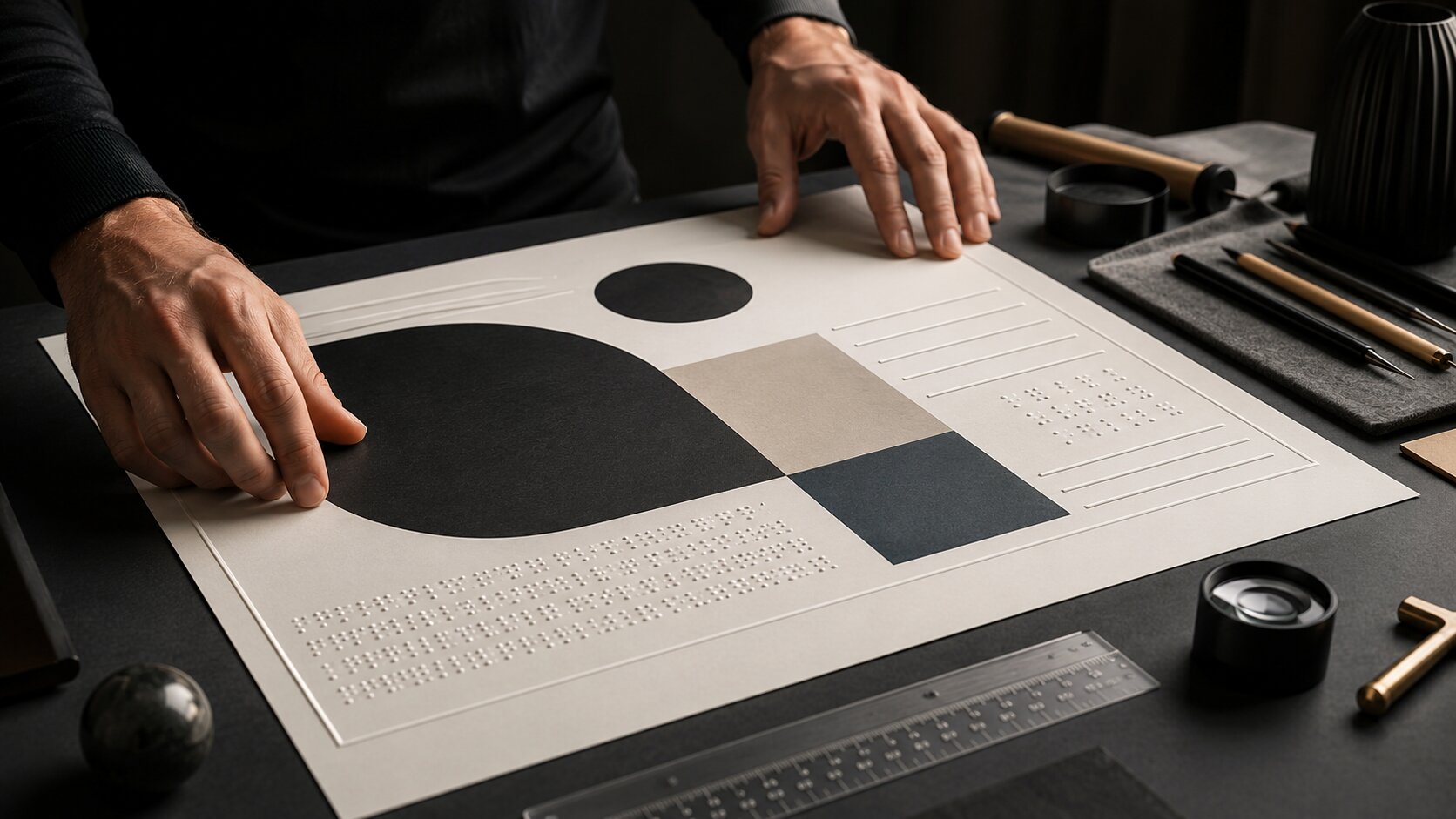
Build a Creative System, Not a Folder of Random Outputs
A folder of assets is not a system. A system explains why the assets belong together.
Design teams use systems because shared standards make work more consistent and scalable. Figma describes a design system as building blocks and standards that help keep the look and feel of experiences consistent, which is a useful model for creators too.
For a creator campaign, your system can be lightweight. You do not need a corporate brand book. You need enough structure to make repeatable decisions.
Your minimum brand story system
- Mood words: 3–5 words that define the atmosphere.
- Color behavior: not just colors, but how they behave. Muted? High contrast? Washed out? Neon accents?
- Texture language: grain, gloss, paper, chrome, blur, shadow, fabric, film, clean vector, rough collage.
- Composition rule: centered subject, empty space, close crops, diagonal movement, symmetrical stillness.
- Type/copy tone: direct, poetic, deadpan, cinematic, conversational, mysterious.
- Do-not-use list: styles, colors, effects, or phrases that weaken the identity.
Canva’s Brand Kit guidance focuses on organizing assets such as colors, fonts, logos, imagery, graphics, and templates so designs stay consistent across touchpoints. For independent creators, the same idea can be simplified into reusable visual rules and reference sets.
Pro Tip: Write the “do-not-use” list as carefully as the inspiration list. AI tools often drift toward generic polish unless you define what the work should reject.
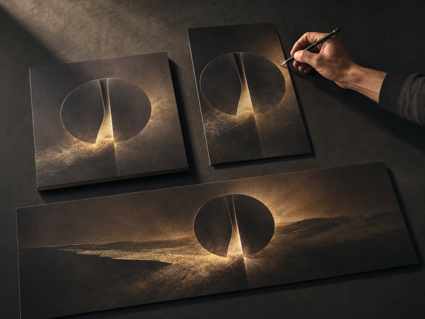
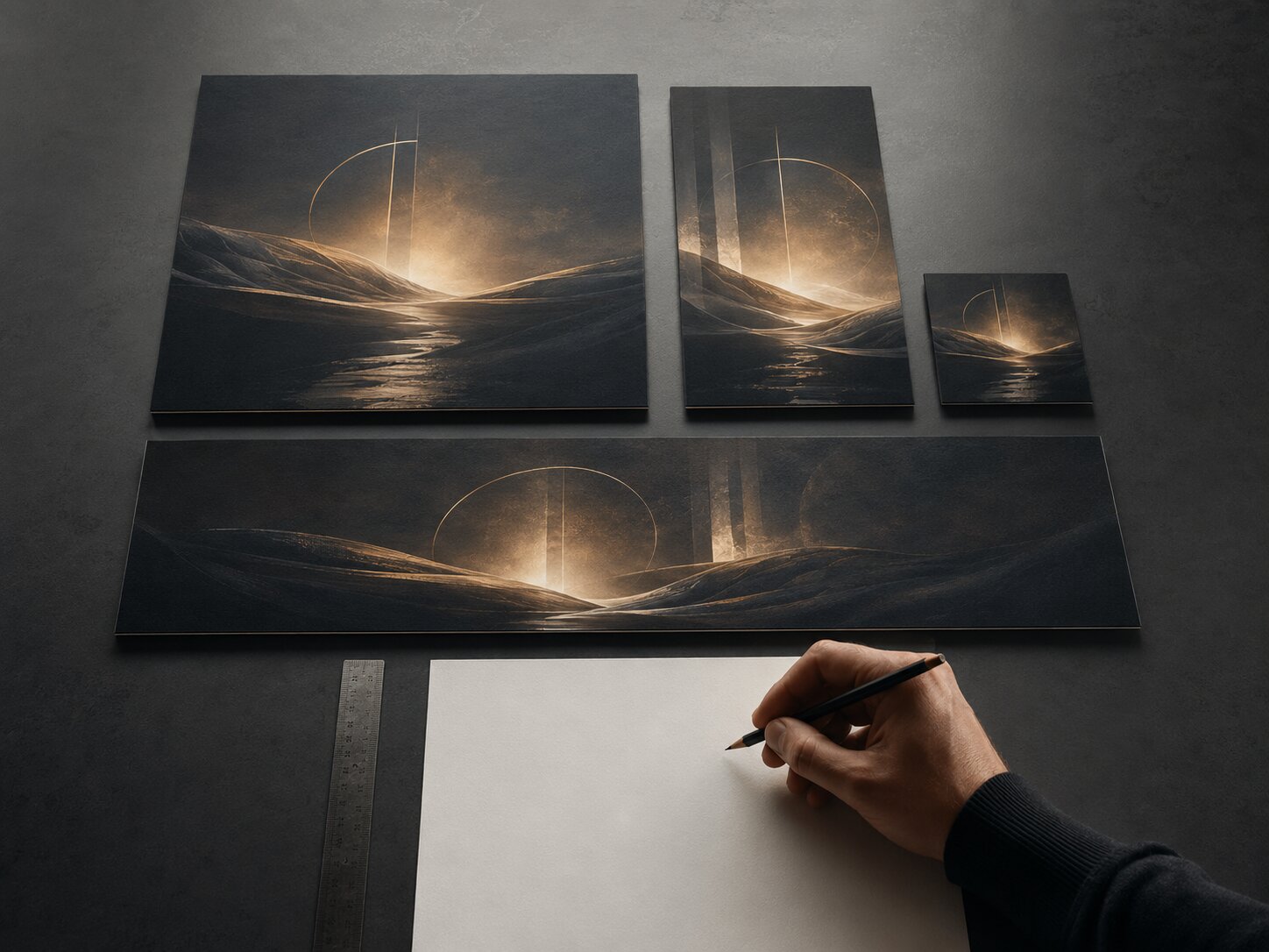
Separate the Core Story From the Format
A common mistake is trying to make every asset look exactly the same. Consistency does not mean duplication. A thumbnail, story post, release visual, and vertical short have different jobs.
Think in two layers:
| Layer | What Stays Consistent | What Can Change |
|---|---|---|
| Core story | Mood, theme, symbol, color logic, tone, identity. | Specific crop, pacing, CTA, text amount. |
| Format expression | Platform ratio, safe zones, hook, duration, layout. | Supporting details, scale, motion, framing. |
A release cover might be quiet and iconic. A TikTok teaser may use the same symbol but open with motion and a stronger first beat. A YouTube thumbnail may simplify the visual into a bolder composition because thumbnails need to read quickly. YouTube’s thumbnail guidance recommends considering the target viewer, using composition techniques such as the rule of thirds, and adding branding or readable text when appropriate.
For musicians, this distinction matters across streaming platforms too. Spotify describes Canvas as a short looping visual added to tracks in the Now Playing view, and its guidelines encourage connecting Canvas identity to album art, profile images, headers, playlists, or a narrative across a release.
Mistake to avoid: resizing the same square artwork everywhere and calling it a campaign. A crop may technically fit, but the story may not land in that format.
Use AI for Variation Without Letting the Brand Drift
AI is useful when you need directions, variations, prompts, copy angles, visual explorations, and format adaptations. It is less reliable when you ask it to “just make it on brand” without giving it a brand.
A better workflow is:
- Feed the direction: mood, references, story spine, audience, format, constraints.
- Generate controlled options: ask for variations around one idea, not unrelated ideas.
- Compare against rules: reject outputs that break tone, visual logic, or rights requirements.
- Refine selected assets: improve composition, text, crop, detail, and hierarchy.
- Document what worked: save prompts, references, visual cues, and final decisions.
Adobe’s generative AI user guidelines note that Content Credentials may be attached to AI-generated or AI-modified content to indicate its origin, which is a reminder that AI-assisted assets still need transparency and responsible handling.
A better AI prompt structure for brand story consistency
Create [asset type] for [project/campaign] using this story: [story spine]. Keep the visual world [mood words]. Use [color behavior], [texture], and [composition rule]. Avoid [do-not-use list]. Adapt for [platform/ratio/use case]. The asset should feel connected to [existing reference], but not copied.
This gives the tool a creative container. The result still needs review, but the output is more likely to belong to the same campaign.
Mistake to avoid: prompting each asset from scratch. That makes every output depend on the tool’s default taste instead of your direction.
Create Platform-Specific Assets Without Breaking the World
Every platform has its own viewing behavior. Keeping one brand story means adapting the same world to different environments.
Short-form vertical video
TikTok’s creative best practices emphasize platform-native vertical creative, sound or music, 9:16 orientation, at least 720p resolution, and keeping content visible within the UI safe zone. Meta also provides safe zone guidance for Stories and Reels ads so text and key elements are not covered by interface overlays.
For creators, the practical takeaway is simple: design vertical assets from the start. Do not place the face, title, hook, or CTA too close to the bottom or edges.
Streaming and release platforms
Spotify for Artists frames video and visual tools as ways to personalize an artist profile, build pre-release hype, and bring the story behind music to life. Apple Music for Artists also offers promotional assets for releases and milestones, including customizable share assets for social channels.
For musicians, this means your brand story should travel through:
- release artwork
- artist profile image
- short video snippets
- social announcement posts
- milestone graphics
- visualizers or looping motion
- tour or show promo assets
Social repurposing
Repurposing does not mean reposting the same thing everywhere. Buffer describes repurposing as keeping the core idea and adapting it for other social channels, such as turning a blog post into an Instagram carousel.
For visual creators, the equivalent is turning one concept into multiple expressions: a hero image, a vertical teaser, a carousel breakdown, a behind-the-scenes post, a thumbnail, and a story sequence.
Pro Tip: Build one “master vertical” and one “master square/wide” version of your visual world. Then adapt from those masters instead of exporting every format from the same flat artwork.
Review the Full Asset Set Like an Editor
The most important consistency check happens after generation and design. Review the assets together, not one by one.
Lay them out as a full campaign wall:
| Asset | Review Question |
|---|---|
| Cover / hero visual | Does this establish the world immediately? |
| Vertical teaser | Does the first moment carry the same mood? |
| Thumbnail | Is the story still recognizable when simplified? |
| Carousel / feed post | Does the visual rhythm match the campaign? |
| Caption set | Does the language sound like the same voice? |
| Profile or release page visual | Does it support the wider identity? |
| CTA asset | Does it feel connected, not bolted on? |
Look for drift in five areas:
- Color drift: one asset becomes too bright, too muted, or too unrelated.
- Tone drift: copy sounds corporate while visuals feel intimate.
- Symbol drift: repeated motifs change meaning or disappear.
- Format drift: platform constraints hide the main idea.
- AI drift: outputs become polished but generic.
A useful test: remove the logo or artist name. Would the assets still feel related? If not, the system is too dependent on surface branding.
Mistake to avoid: approving the strongest single image even if it does not fit the pack. A beautiful asset can weaken the campaign if it tells the wrong story.
Turn One Direction Into a Reusable Creative Pack
The final goal is not only one campaign. It is a repeatable way to create.
A strong creative pack should include:
- the story spine
- approved mood references
- final hero visual
- selected visual cues
- prompt patterns
- color and texture rules
- copy tone rules
- platform exports
- rejected examples with notes
- review checklist
This becomes a reference for the next release, video, drop, episode, campaign, or content series. The advantage is not that every future asset looks identical. The advantage is that every new asset starts from a clearer creative memory.
For independent artists, this reduces last-minute release pressure. For digital creators, it makes social content feel more recognizable. For teams, it helps collaborators make decisions without guessing. For beginners using AI, it creates guardrails so the tool supports the idea instead of replacing it.
How Orias AI Helps Keep the Creative World Together
Orias AI is built around the kind of workflow this article describes: moving from rough ideas, references, and emotional direction into clearer visual worlds, promo assets, release visuals, creative packs, and publish-ready output.
For creators, the useful part is not simply generating more assets. It is keeping the concept, copy, visuals, and refinements in one creative flow so the campaign does not splinter across disconnected tools. That makes Orias especially relevant for artists, musicians, and visual storytellers who need one idea to travel across many formats while still feeling intentional.
Frequently Asked Questions
What does it mean to keep one brand story across every asset?
It means every asset communicates the same emotional idea, visual world, and creative promise, even when the format changes. A vertical video, thumbnail, release cover, and caption do not need to look identical, but they should feel connected.
How do I make AI-generated assets look consistent?
Start with a written creative direction before prompting. Use the same mood words, references, color behavior, texture rules, composition logic, and negative constraints across prompts. Then review outputs manually and reject anything that breaks the system.
Should every asset use the same colors and fonts?
Not always. Colors and fonts help, but they are only part of consistency. Mood, framing, texture, pacing, language, and symbols often matter just as much. The goal is recognition without repetition.
What is the best workflow for a music release campaign?
Start with the song’s emotional world, then create a release visual, short-form teaser, Canvas or looping visual direction, profile update, social announcement assets, caption variants, and follow-up posts. Review everything as one release system before publishing.
How do I adapt one story for TikTok, Instagram, YouTube, and streaming platforms?
Keep the core idea stable, then adapt the format. TikTok and Reels need vertical-first composition and safe-zone awareness. YouTube thumbnails need fast readability. Streaming visuals should connect to the release identity and artist world.
What is the biggest mistake creators make with brand consistency?
They create assets one at a time without a shared direction. This often leads to a campaign where every post looks “good” individually but the overall story feels unclear.
Can a small creator build a brand system without a designer?
Yes. Start with a simple one-page guide: mood, color behavior, textures, composition rules, copy tone, references, and things to avoid. That is enough to make better decisions and guide AI tools more effectively.