Accessibility-First AI Content: Clear Visuals, Alt Text and Inclusive Design
Create inclusive AI-assisted visuals with stronger alt text, readable design, captions and accessibility review steps for every campaign asset.
TL;DR:
- Accessibility-first AI content means designing creative assets so more people can understand, navigate, and enjoy them.
- The strongest workflow starts with clear visual hierarchy, readable contrast, useful image descriptions, accurate captions, and human review before publishing.
- AI can help draft variations and organize checks, but the creator still needs to judge context, meaning, brand fit, and accessibility quality.
AI has made it easier for creators to generate campaign visuals, release artwork concepts, thumbnails, social posts, storyboards, and promotional assets at speed. But faster output can also create a new problem: more visuals to publish, more formats to adapt, and more opportunities to leave people out.
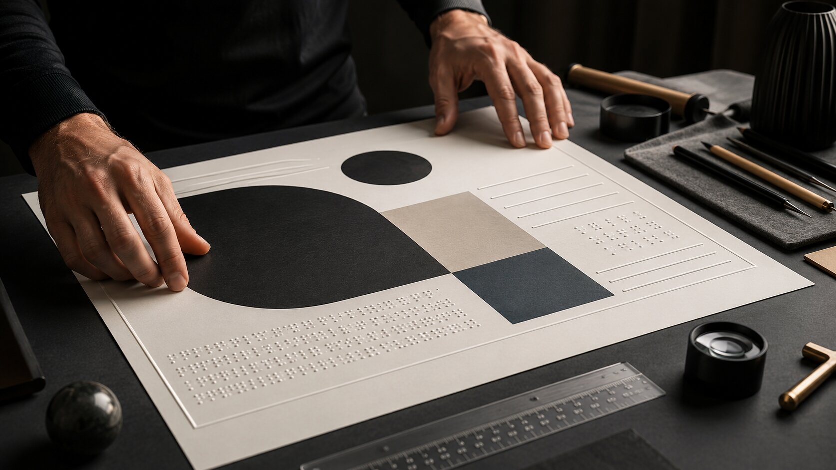
For artists, musicians, digital creators, and creative teams, accessibility is not only a technical requirement. It is part of communication. A poster with beautiful contrast in the studio may become unreadable on a phone. A cinematic image may mean very little to someone using a screen reader if the alt text says only “new campaign image.” A short-form video may lose its message when the captions are inaccurate, too small, or hidden behind platform controls.
This guide explains how to build accessibility into AI-assisted content from the beginning. You will learn how to plan clearer visuals, write better alt text, use AI without outsourcing judgment, prepare social assets for different formats, and create a repeatable accessibility review before publishing.
Table of Contents
- Key Takeaways
- Accessibility-first starts before the prompt
- Design visuals that still communicate under pressure
- Write alt text as part of the creative direction
- Make video, motion, and social assets easier to follow
- Use AI as an accessibility assistant, not the final reviewer
- Build an accessibility review into your publishing workflow
- How Orias AI supports inclusive creative systems
- Frequently asked questions
- Sources Used
Key Takeaways
| Point | Details |
|---|---|
| Accessibility is a creative quality issue | Clear visuals, readable text, and useful descriptions help more people understand the work without weakening the artistic direction. |
| Alt text depends on context | The same image may need different alt text in a music announcement, a portfolio page, or a campaign recap. |
| AI can speed up accessibility work | AI can draft alt text options, identify possible readability issues, and create checklists, but human review is still essential. |
| Contrast and captions need early planning | Text overlays, visual hierarchy, and captions should be considered before assets are resized for social platforms. |
| Publish-ready means reviewed | A strong creative pack includes final visuals, platform crops, captions, alt text, filenames, and accessibility notes. |
Accessibility-first starts before the prompt
Accessibility-first AI content does not begin when you upload a finished image and ask for alt text. It begins when you decide what the asset must communicate.
Before generating visuals, define the communication job of the content. Is the asset announcing a release date? Selling a mood? Explaining a product? Showing a transformation? Introducing a character? Promoting a live event? The clearer the purpose, the easier it becomes to make inclusive decisions.
A useful creative brief for accessible AI content should include:
- The main message of the asset
- The emotional tone
- The audience context
- The required text, if any
- The platforms where the asset will appear
- The accessibility requirements before publishing
- The alt text or captioning needs for each format
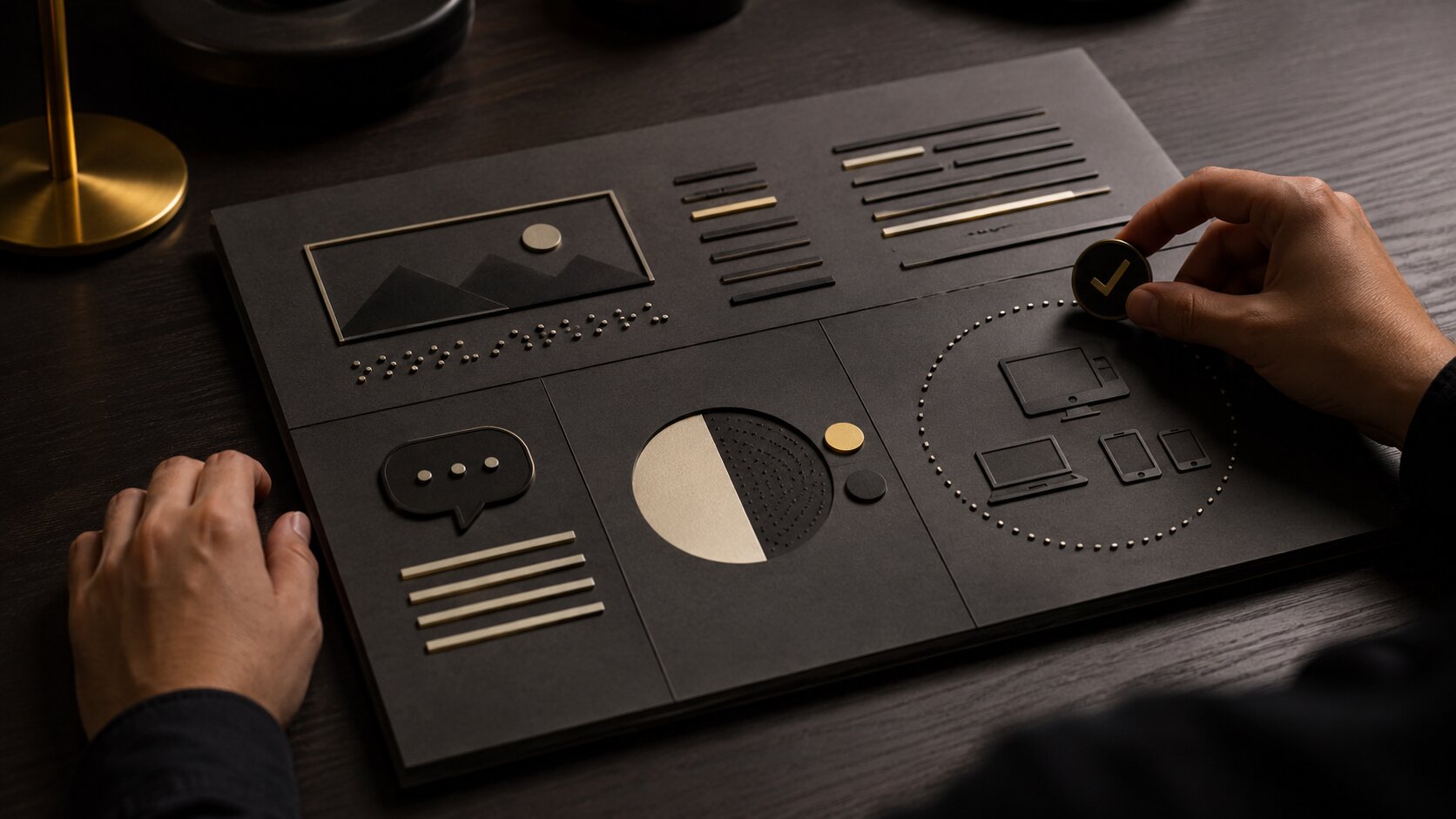
This matters because accessibility is contextual. W3C’s image guidance explains that text alternatives depend on the image’s usage, context, and content. Informative images need descriptions of essential information, decorative images may use empty alt text, functional images should describe the action, and complex images may need a fuller text equivalent.
For creators using AI, that means the prompt should not only describe style. It should describe clarity.
Instead of prompting:
“Create a dark cinematic poster for my new single.”
Try:
“Create a dark cinematic single-release poster concept with one clear focal point, generous negative space for readable title placement, strong contrast between subject and background, and no small text embedded in the image.”
The second prompt gives the AI a visual accessibility direction. It asks for a design that can survive resizing, cropping, and text overlay.
Mistake to avoid: generating a beautiful image first and trying to force the message into it later. That usually leads to tiny text, low contrast overlays, cluttered compositions, and weak alt text because the asset never had a clear communication role.
Design visuals that still communicate under pressure
Creative content rarely stays in one perfect format. A release visual may become a square feed post, a vertical story, a YouTube thumbnail, a website hero, a press image, and a banner crop. Accessibility-first design means the idea should remain understandable across those conditions.
Prioritize one visual message
Many AI-generated visuals fail because they contain too much: symbolic objects, dramatic lighting, textures, typography, characters, UI fragments, and background details competing at once. That can look impressive at full size but collapse on mobile.
A stronger approach is to identify one primary visual message:
- A musician framed by a single symbolic object
- A product shown through one clear use case
- A campaign world built around one color and one material cue
- A release concept represented by one scene, not ten references
- A social carousel where each slide answers one question
This makes the visual easier to scan and easier to describe.
Treat contrast as part of the art direction
Contrast is not just a compliance detail. It controls whether people can read, tap, recognize, and understand the asset. WCAG 2.2 Level AA requires a contrast ratio of at least 4.5:1 for normal text and 3:1 for large-scale text, with exceptions such as logotypes and incidental text.
For icons, charts, controls, and other meaningful non-text graphics, WCAG’s non-text contrast guidance focuses on whether the graphical object is required for understanding. If it is, it needs sufficient contrast against adjacent colors.
For creative teams, the practical takeaway is simple: do not wait until export to check contrast. Build it into the visual system.
Use prompts and review notes such as:
- “Readable text area with high contrast”
- “Clear separation between foreground subject and background”
- “No critical information communicated by color alone”
- “Simple shapes that remain legible at thumbnail size”
- “Avoid dark gray text on black background”
- “Avoid pale text over complex gradients”
Avoid relying on image-based text
AI tools often generate poster-like visuals with text embedded directly into the image. This is risky. Text inside images can be distorted, misspelled, hard to resize, difficult to translate, and inaccessible if not described properly.
W3C’s image tutorial recommends avoiding images of text when the image is not a logo. If images of text are used, the text alternative should include the same words. WCAG also treats using actual text rather than images of text as a Level AA success criterion when the technology can achieve the same presentation.
For AI-assisted creative packs, a better workflow is:
- Generate the visual background or concept without final text.
- Add real editable text in a design tool.
- Check contrast and safe areas.
- Export platform-specific versions.
- Write alt text that includes essential visual and textual meaning.
Pro Tip: For music release visuals, keep the title, artist name, release date, and call-to-action as editable text whenever possible. Your visual world can stay cinematic while the information stays readable.
Write alt text as part of the creative direction
Alt text is not a caption, not a keyword dump, and not a generic description of every pixel. It is a text alternative that helps someone understand the purpose of the image in its context.
Google’s image SEO documentation also recommends descriptive filenames, titles, and alt text, and says Google uses alt text along with computer vision and page content to understand an image. The same guidance warns against keyword stuffing because it creates a poor user experience and may look spammy.
That makes alt text both an accessibility practice and a content clarity practice.
A simple alt text decision framework
Before writing alt text, ask four questions:
| Question | What it helps decide |
|---|---|
| What is the image doing here? | Whether it is decorative, informative, functional, or complex. |
| What information would be lost if the image disappeared? | The essential meaning to include. |
| What does the surrounding text already say? | What not to repeat unnecessarily. |
| What does the reader need to know next? | Whether to describe mood, action, identity, text, or function. |
Examples for creators
Music release artwork
Weak alt text:
“Album cover.”
Better alt text:
“Single artwork showing a lone figure under blue stage light, matching the campaign’s nocturnal electronic mood.”
Why it works: it describes the relevant visual direction and emotional context without overloading the reader.
Artist announcement post
Weak alt text:
“New tour poster.”
Better alt text:
“Tour announcement poster for Luma Vale with dates listed in tall white type over a dark desert landscape.”
Why it works: it identifies the asset type, creator, key text purpose, and visual mood.
AI-generated campaign concept
Weak alt text:
“AI image for brand campaign.”
Better alt text:
“Concept image for a wellness campaign showing a calm morning workspace with soft natural light and minimal product placement.”
Why it works: it explains the campaign function and visual message.
When to use empty alt text
Not every image needs a full description. Decorative dividers, background textures, and purely atmospheric flourishes can create noise for screen reader users if described unnecessarily. W3C recommends null alt text for decorative images whose only purpose is visual decoration.
For a creator website, that might apply to:
- Abstract background gradients
- Decorative texture overlays
- Repeated ornamental icons
- Visual separators
- Non-informative background shapes
Mistake to avoid: writing alt text such as “blue gradient background decorative texture” for every design element. That can make the page harder to navigate, not more accessible.
Make video, motion, and social assets easier to follow
Accessibility-first content is not limited to still images. Reels, Shorts, TikToks, lyric videos, teasers, behind-the-scenes clips, and launch trailers all need attention.
Captions are part of the creative system
Captions support deaf and hard-of-hearing viewers, but they also help people watching without sound, people in noisy places, and people processing content in a second language. YouTube’s help documentation says subtitles and captions help creators share videos with a larger audience, including deaf or hard-of-hearing viewers and viewers who speak another language.
For creators, that means captions should be planned like typography, not treated as a platform afterthought.
Good caption practice includes:
- Accurate wording
- Speaker clarity when needed
- Timing that matches the speech
- Line breaks that are easy to read
- Placement that does not cover important visuals
- Contrast against the video background
- Review of auto-generated captions before publishing
YouTube Studio allows creators to add subtitles during upload or later, upload caption files, use auto-sync, or type captions manually. Auto tools can save time, but they still need checking, especially for artist names, lyrics, product names, accents, slang, and multilingual content.
Social platforms have accessibility tools, but they vary
Instagram allows creators to edit alternative text for posts, and its automatic alt text uses object recognition technology to provide visual descriptions for people with visual impairments. TikTok’s accessibility help includes alternative text for photo posts, with an “Add alternative text” option in the publishing flow.
These features are useful, but platform support can differ by content type, device, region, and update cycle. The safest workflow is to keep your own accessibility metadata in your creative pack before upload.
For each asset, store:
- Final caption copy
- Alt text
- Image filename
- Video transcript
- Caption file, if applicable
- Platform notes
- Thumbnail description
- Text overlay notes
- Any warnings about flashing, rapid motion, or sensitive content
Motion needs clarity too
AI-assisted motion visuals can become visually intense quickly. Glitch effects, rapid cuts, strobing transitions, tiny subtitles, and dense overlays may fit the aesthetic but reduce usability.
A more inclusive motion direction might specify:
- Slower transitions for key information
- No essential text during fast movement
- Captions placed in a consistent region
- Avoidance of unnecessary flashing
- Strong contrast between text and footage
- A clean thumbnail that communicates the topic without sound
For musicians, this is especially relevant when turning a release concept into teasers, lyric clips, visualizers, and launch-day social posts. The goal is not to remove style. The goal is to make sure the style does not block the message.
Use AI as an accessibility assistant, not the final reviewer
AI can be extremely useful in an accessibility-first workflow. It can help you generate alt text drafts, simplify descriptions, turn a visual concept into a checklist, compare caption options, and identify possible clarity issues.
But AI does not automatically understand your creative intent, audience, platform context, or rights situation. It may describe the wrong detail, miss the important message, invent visual information, or produce alt text that sounds polished but does not match the asset.
A balanced AI workflow looks like this:
- Generate or collect assets. Start with campaign visuals, references, drafts, and format needs.
- Ask AI for accessibility drafts. Generate alt text, caption checks, contrast concerns, and platform notes.
- Review against the actual asset. Confirm that descriptions match what is visible and relevant.
- Edit for context. Adjust tone, brand language, campaign meaning, and audience needs.
- Store with the asset. Keep alt text and captions in the same creative pack as the final visuals.
- Check after upload. Confirm that platform features preserved your intended descriptions and captions.
Useful AI prompts for accessibility review
Use prompts like these:
“Write three alt text options for this campaign image: one concise, one descriptive, and one optimized for a music release announcement. Do not invent details that are not visible.”
“Review this social carousel for accessibility risks: contrast, small text, reading order, image-based text, and unclear visual hierarchy.”
“Turn this video transcript into concise captions with readable line breaks. Keep artist names and song titles unchanged.”
“Create an accessibility checklist for a launch pack that includes square posts, vertical stories, YouTube thumbnails, and a website hero.”
Mistake to avoid: asking AI to “make this accessible” without defining the asset, audience, platform, and purpose. Accessibility is not a magic filter. It is a set of decisions.
Build an accessibility review into your publishing workflow
The most reliable way to create inclusive AI content is to add accessibility to your normal production process. Do not make it a separate emergency task after the campaign is approved.
Here is a practical workflow for creators and small teams.
Stage 1: Creative direction
Define the mood, message, audience, formats, and accessibility requirements.
Checklist:
- Is the main message clear?
- Does the concept depend on tiny details?
- Will the asset need text overlays?
- Are any colors essential to understanding?
- Will the asset work without sound?
Stage 2: Asset generation
Generate concepts with space for readability and adaptation.
Checklist:
- Does the composition have a clear focal point?
- Are text areas clean?
- Is there enough contrast for overlays?
- Are important subjects visible in mobile crops?
- Are there unnecessary AI artifacts?
Stage 3: Refinement
Edit for clarity, consistency, and platform needs.
Checklist:
- Replace image-based text with editable text where possible.
- Create square, vertical, wide, and thumbnail versions.
- Check text contrast.
- Avoid placing key details near platform UI zones.
- Simplify crowded layouts.
Stage 4: Accessibility metadata
Prepare descriptions and captions before upload.
Checklist:
- Write alt text for informative images.
- Use empty alt text only for decorative web images.
- Prepare transcripts for spoken video.
- Review auto-caption output.
- Use descriptive filenames for web assets.
- Store all metadata with the final asset pack.
Stage 5: Publishing review
Check the final post in the environment where people will experience it.
Checklist:
- Does the alt text display or save correctly?
- Are captions accurate and readable?
- Is the thumbnail understandable?
- Is the post still clear on mobile?
- Does the caption copy repeat essential information?
- Does the asset preserve the intended creative mood?
This workflow helps independent creators avoid last-minute fixes and helps teams maintain consistency across campaigns. It also makes accessibility easier to delegate because each asset has clear requirements.
How Orias AI supports inclusive creative systems
Orias AI is built for creators who need to turn rough ideas, references, moods, and concepts into clearer visual worlds and publish-ready creative packs. That makes it a natural fit for accessibility-first content planning.
Instead of treating every image, caption, and campaign asset as a separate task, creators can use Orias AI to shape a more structured creative direction: the mood, visual rules, campaign formats, voice variants, and review criteria can live together. That structure makes accessibility easier because alt text, captions, readable layouts, and platform-specific adaptations can be considered alongside the creative concept — not after it.
For a musician, that might mean developing a release world with cover art concepts, teaser visuals, caption directions, alt text notes, and social crops. For a visual storyteller, it might mean turning a campaign idea into a consistent set of images, descriptions, and publishing checks. For a creative team, it can help keep accessibility aligned with brand fit, quality review, and final human judgment.
The goal is not to make AI replace the creative lead. The goal is to give the creative lead a better system for producing content that is clearer, more consistent, and easier for more people to experience.
Frequently asked questions
What is accessibility-first AI content?
Accessibility-first AI content is content created with accessibility considered from the start of the workflow. It includes clear visual hierarchy, readable contrast, useful alt text, accurate captions, platform-specific formatting, and human review before publishing.
Can AI write good alt text?
AI can draft useful alt text, especially when given context about the image, audience, and platform. However, creators should always review the result because AI may miss the purpose of the image, overdescribe irrelevant details, or invent information.
Should alt text include keywords for SEO?
Alt text should describe the image in context first. Keywords can be included naturally when they are relevant, but keyword stuffing should be avoided. Google specifically recommends useful, information-rich alt text and warns against filling alt attributes with keywords.
Do decorative images need alt text?
Decorative images usually need empty alt text on websites so assistive technologies can ignore them. If the image does not add meaningful information, describing it may create unnecessary noise for screen reader users.
How can musicians make release visuals more accessible?
Musicians can keep release details as readable editable text, create high-contrast social crops, write alt text for cover art and announcement posts, provide captions for teasers, and check that titles, dates, and calls-to-action remain clear on mobile.
Are auto-captions enough for social video?
Auto-captions are a helpful starting point, but they should be reviewed. Artist names, lyrics, accents, slang, technical terms, and multilingual phrases often need correction. For important campaign videos, manual review is part of quality control.
Does accessibility limit creative style?
No. Accessibility does not require plain or generic visuals. It asks creators to make deliberate decisions about clarity, contrast, structure, description, and format so the creative idea can reach more people without losing its voice.
Sources Used
- W3C Web Accessibility Initiative: Images Tutorial
- W3C Web Content Accessibility Guidelines 2.2
- W3C Understanding Non-text Contrast
- Google Search Central: Image SEO Best Practices
- YouTube Help: Add Subtitles and Captions
- Instagram Help Center: Alternative Text and Accessibility
- TikTok Help Center: Accessibility for Videos and Photo Posts