Message-to-Visual Fit: Making Every AI Asset Support the Main Idea
Align AI-generated visuals with your main message, improve creative direction and build clearer campaign assets across every format.
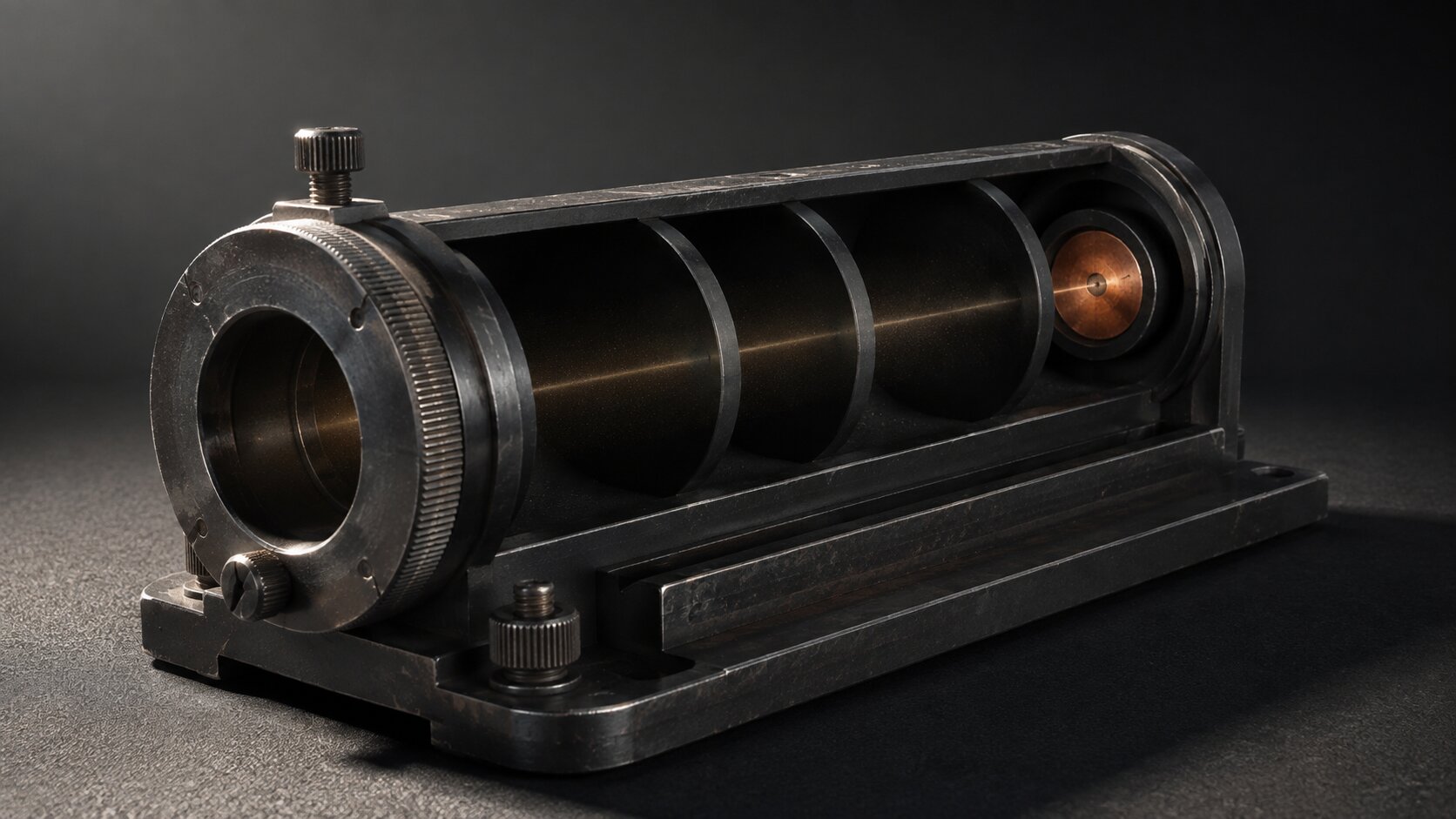
TL;DR:
- A strong AI asset does more than match a color palette or look impressive. It gives the viewer visual evidence of the main idea.
- Define the message before choosing a style, then translate that message into a visible action, contrast, transformation, or relationship.
- When adapting the concept to different formats, preserve the evidence that communicates the idea rather than simply preserving the original crop.
You can create a beautiful image that is completely wrong for the job.
It may have the right colors. The lighting might feel expensive. The composition may look polished enough to become an album cover, campaign header, or social post.
But when you place it beside the headline, something feels off.
The visual suggests one story while the words are trying to tell another.
That gap is a message-to-visual fit problem.
It happens often in AI-assisted workflows because image generation makes exploration so easy. A creator enters a few mood words, produces twenty striking options, and chooses the most impressive one.
The missing question is simple.
Does this image help the audience understand the actual point?
For musicians, artists, content creators, and visual storytellers, this matters across every part of a campaign. A release cover, vertical video, announcement post, thumbnail, and promotional banner can share the same visual world while performing very different communication jobs.
This guide explains how to move from a written message to visual evidence, test whether an asset belongs in the campaign, adapt the idea across formats, and use AI without letting visual novelty pull the project away from its purpose.
Table of Contents
- Key Takeaways
- Write the Sentence the Visual Must Support
- Turn an Abstract Message Into Visible Evidence
- Use the Four-Question Fit Test
- Keep the Idea Intact When the Format Changes
- Generate for Range, Then Edit for Meaning
- Build a Review Loop That Catches Visual Drift
- Move From Rough Ideas to a Connected Creative Pack
- Frequently Asked Questions
- Sources Used
Key Takeaways
| Point | Details |
|---|---|
| Start with one clear message | Define what the audience should understand before choosing an image style, visual reference, or AI prompt. |
| Show evidence, not decoration | The main subject, action, contrast, or transformation should make the central idea visible. |
| Separate mood from meaning | Atmosphere can support the message, but lighting, color, and texture cannot replace a clear concept. |
| Recompose for each format | A square post, vertical video, and wide banner may need different layouts while communicating the same idea. |
| Use AI for exploration | Generate several visual interpretations, then use human judgment to select and refine the strongest direction. |
| Review the whole system | Check visuals beside headlines, captions, calls to action, and neighboring campaign assets before publishing. |
Write the Sentence the Visual Must Support
Before opening an image generator, write one plain sentence:
After seeing this asset, the viewer should understand that...
Finish the sentence without describing the visual style.
For example:
- The new release feels intimate, tense, and slightly unstable.
- This product turns a scattered creative process into a controlled one.
- The artist is entering a more direct and confident chapter.
- The campaign shows how one small mistake creates problems later.
- The service helps creators adapt one idea without losing its identity.
These are communication goals.
“Dark cinematic image with red lighting” is not a communication goal. It is an aesthetic instruction.
That distinction matters because a mood can suit many unrelated messages. Dark lighting might suggest danger, luxury, grief, mystery, aggression, or simply poor exposure.
The image needs another layer that makes your particular meaning readable.
Find the Non-Negotiable Idea
Most creative briefs contain several messages competing for attention.
A music release might involve a new sound, a personal story, a date, a featured collaborator, and a visual rebrand.
Trying to show all of that in one image usually produces clutter.
Choose the idea that the asset must communicate even when the audience sees it for only a moment.
Then classify everything else:
- Primary: The idea the viewer must understand.
- Supporting: Details that strengthen the primary idea.
- Optional: Elements that can disappear without damaging the message.
This hierarchy should shape the visual hierarchy.
Adobe’s layout guidance recommends establishing a focal point, organizing content by importance, and using contrast, scale, alignment, and negative space to guide attention.
Do Not Ask One Asset to Do Every Job
An announcement post and an album cover may belong to the same visual world, but they have different responsibilities.
The cover may need to create intrigue. The announcement needs to make the release recognizable. A Story slide may need to communicate a date immediately.
A campaign banner might need enough open space for live copy and a button.
Message-to-visual fit is always connected to the job of the asset, not just the overall campaign theme.
Turn an Abstract Message Into Visible Evidence
AI prompts often stay at the level of mood:
Atmospheric, futuristic, bold, dreamlike, cinematic.
These words may influence appearance, but they do not tell the model what should happen in the scene.
A better prompt contains visible proof.
Imagine the message is: “A small weakness in the workflow affects every later output.”
A weak interpretation might show a person looking stressed beside several screens. It communicates frustration, but not the cause-and-effect idea.
A stronger interpretation could show one continuous material passing through several mechanical stages.
A slight misalignment begins at the second stage, then becomes increasingly visible in every later section.
The viewer can see the message happening.
Use One of Five Evidence Types
| Evidence Type | Best Used For | Visual Approach |
|---|---|---|
| Transformation | Improvement, growth, damage, repair, simplification, or creative evolution | Show a visible before-and-after change in one continuous subject. |
| Cause and effect | Workflow failures, consequences, accumulation, momentum, or prevention | Show one action creating a later result that can be traced back to its source. |
| Contrast | Clarity versus confusion, generic versus distinctive, or scattered versus organized | Place two clearly different conditions in a readable visual relationship. |
| Continuity | Consistency, adaptation, identity, repurposing, or campaign cohesion | Carry one recognizable element through several environments or formats. |
| Constraint | Platform limits, deadlines, pressure, production boundaries, or difficult trade-offs | Show an object responding to limited space, time, material, or structural pressure. |
The point is not to make every visual literal.
It is to give the viewer enough physical or narrative information to understand the idea without needing the caption to rescue it.
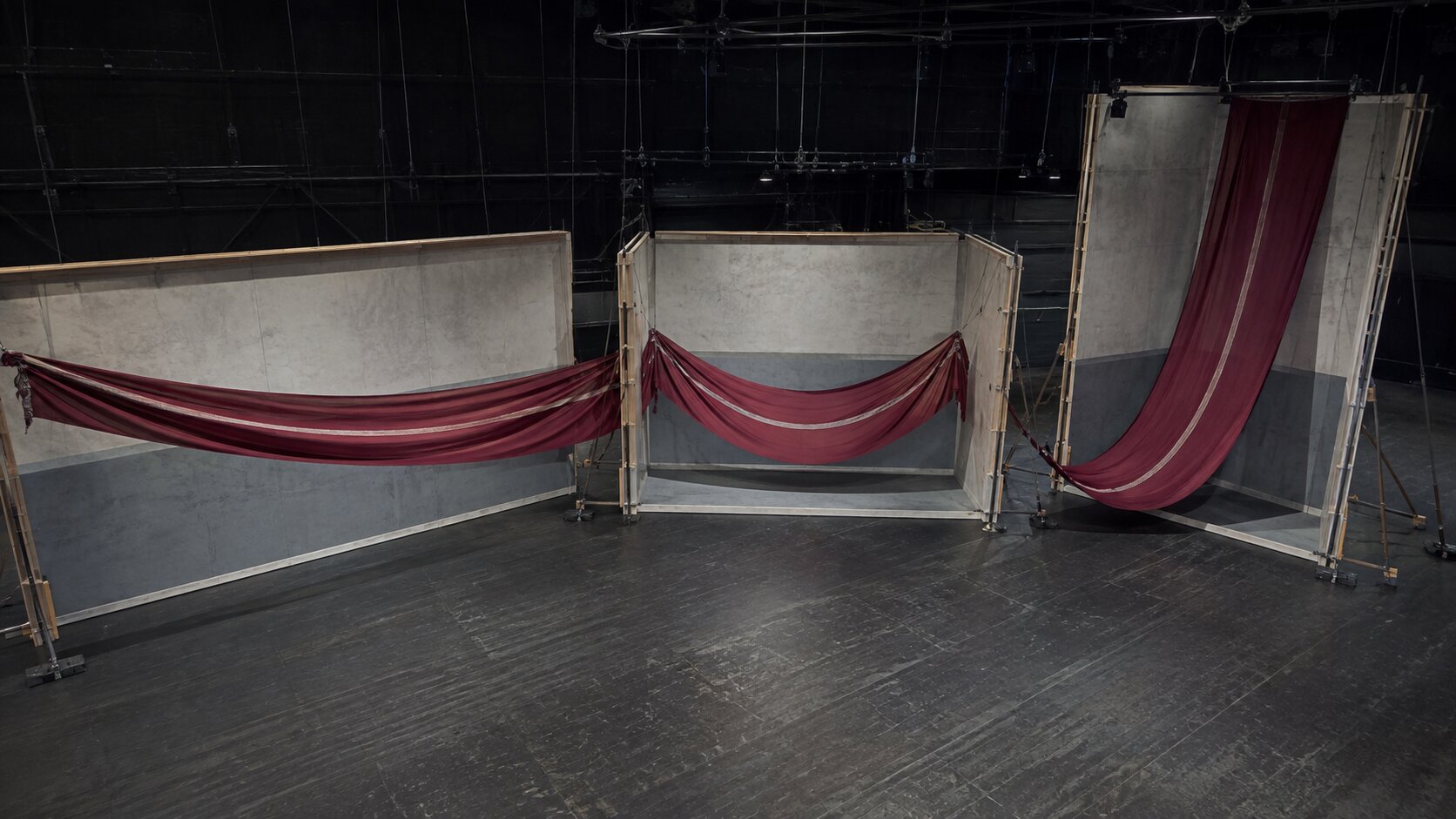
Build the Prompt Around Relationships
A useful visual prompt should explain:
- What the main subject is.
- What is happening to it.
- Which detail carries the message.
- What should remain secondary.
- How the final composition should direct attention.
Instead of requesting “a surreal image about consistency,” describe a continuous band of material being reshaped into wide, square, and vertical forms while one defining seam remains clearly visible.
Now the concept has structure.
The model has relationships to render, not just adjectives to imitate.
Use the Four-Question Fit Test
Once you have several options, stop judging them as standalone artwork.
Place each one beside the real headline, caption, release title, product claim, or campaign message.
Then ask four questions.
1. What Does the Image Appear to Say on Its Own?
Describe it without referring to your original brief.
Perhaps it appears to say isolation, speed, conflict, fragility, repetition, escape, or technical precision.
That first interpretation is valuable because it approximates what an unfamiliar viewer may notice.
2. Is That Interpretation Close to the Intended Message?
The match does not need to be literal, but it should not create a contradiction.
A campaign about creative control should not accidentally look chaotic unless the chaos is clearly the starting condition.
A release about emotional closeness may not benefit from a distant subject placed in an enormous empty landscape.
3. What Visual Detail Proves the Idea?
Point to the exact subject, gesture, material change, relationship, or contrast doing the communication work.
When the answer is “mostly the mood,” the fit is probably weak.
4. What Could Be Removed?
Remove decorative objects, dramatic particles, extra characters, secondary symbols, and background machinery in your head.
If the message becomes clearer, the asset is overbuilt.
Adobe describes negative space as an organizing tool that separates elements and gives important content room to breathe.
It also treats conceptual unity, where visual elements support a shared purpose, as part of an effective composition.
Pro Tip: Show the asset to someone who has not seen the brief. Ask what they think it communicates, but do not explain the idea first.
You are not looking for identical wording.
You are checking whether their interpretation lands in the same general area.
Keep the Idea Intact When the Format Changes
Creators often approve one strong image and then crop it into every required size.
This is efficient, but it can quietly destroy the message.
The subject may become too small in a wide banner. The defining action may disappear from a square crop. A vertical version may retain the colors while losing the relationship between the objects.
Platform guidance reflects this practical problem.
Google recommends using relevant images in multiple aspect ratios and keeping the central subject clear. YouTube advises creators to keep thumbnails readable, accurate, and simple across devices.
TikTok also recommends vertical production and attention to interface-safe areas instead of treating vertical output as a late crop.
Preserve the Evidence, Not the Coordinates
The important element does not need to remain in the exact same position.
Suppose the campaign idea is represented by a narrow copper seam running through pale stone.
- In a wide image, the seam may travel horizontally and create direction.
- In a square image, it may pass closer to the center.
- In a vertical image, it may climb through the frame and connect several sections.
The placement changes.
The evidence survives.
This is recomposition, not resizing.
Create a Small Format Map
Before generating final assets, note what each format must preserve.
| Format | Main Job | Visual Priority |
|---|---|---|
| Wide banner | Introduce the campaign world | Clear subject with enough open space for copy |
| Square post | Stop the scroll and establish identity | Strong focal point and a readable visual relationship |
| Vertical Story or short video | Communicate quickly on mobile | Early action, safe text space, and clear progression |
| Thumbnail | Set an accurate expectation | One simple idea that remains legible at a small size |
| Cover artwork | Hold attention beyond one campaign post | Distinctive identity and lasting visual tension |
Consistency does not mean identical layouts.
Canva’s brand guidance similarly separates consistent identity from rigid duplication, allowing content to adapt to different channels while keeping core visual and verbal elements aligned.
Generate for Range, Then Edit for Meaning
AI is especially useful early in the process, when you need to see several possible interpretations of an idea.
The mistake is treating the first technically impressive result as the answer.
Generate deliberate variations:
- One literal interpretation
- One material or mechanical metaphor
- One human scene
- One highly reduced composition
- One version built around contrast
- One version built around transformation
This creates meaningful range.
Asking for six nearly identical images with different lighting does not.
Compare Concepts Before Polishing Surfaces
During the first selection round, ignore small rendering flaws.
Judge the underlying visual logic.
- Does the concept communicate?
- Is the focal relationship clear?
- Can it be adapted to different formats?
- Does it feel specific to the project?
- Does it support the intended message without needing a long explanation?
Only then refine lighting, material, camera angle, color, texture, anatomy, typography, and export quality.
Otherwise, you may spend an hour repairing a visually polished idea that never supported the message.
Keep Human Judgment in the Final Seat
AI can produce options, rearrange scenes, suggest metaphors, and accelerate format variations.
It cannot decide what feels honest to an artist’s body of work or whether a symbolic choice creates the wrong cultural association.
Review generated assets for:
- Unintended symbols
- Generic visual clichés
- Misleading product behavior
- Incorrect text or logos
- Rights and usage concerns
- Details that conflict with the story
- Styles that imitate references too closely
- Platform-specific cropping or readability problems
Publishing untouched output may be fast, but speed is not the same as fit.
Build a Review Loop That Catches Visual Drift
Visual drift happens gradually.
The hero image fits the message. The second asset is slightly more decorative. The third follows the style of the second.
By the time the campaign reaches ten pieces, everything looks related, but very little still communicates the original idea.
A simple review loop prevents this.
Review in Three Passes
Pass One: Message
Does each asset support the primary sentence?
Pass Two: System
Do the assets share the intended materials, shapes, framing habits, contrast, typography, and emotional range?
Pass Three: Context
Does each asset work beside the real copy and inside the actual placement?
Do not combine these reviews too early.
A visual can be on-brand but off-message. It can fit the message but fail as a mobile Story.
Those are different problems.
Keep a Visual Evidence Sheet
For each approved asset, record:
- Asset purpose
- Main message
- Required visual evidence
- Elements that must remain visible
- Elements that may change
- Format and safe-area needs
- Final review status
For a solo creator, this can be a short page.
For a team, it becomes a shared reference that reduces vague feedback such as “make it stronger” or “it does not feel right.”
Feedback becomes more useful when it points to fit:
- “The broken connection is too small to explain the failure.”
- “The vertical crop removes the cause and only shows the result.”
- “The dramatic background competes with the product action.”
- “The second character suggests collaboration, but the message is about independence.”
Now revisions have a reason.

Move From Rough Ideas to a Connected Creative Pack
Orias AI helps creators work through the stage between an initial thought and a usable visual system.
A project may begin with a mood, a rough reference, a release story, or one visual metaphor.
The useful next step is not simply generating more isolated images.
It is clarifying the direction, identifying what each asset needs to communicate, and developing connected options for covers, promo visuals, campaign materials, voice variants, and publishing formats.
A practical message-to-visual workflow could look like this:
- Write the main message in one plain sentence.
- Collect references that support the idea rather than only the mood.
- Choose a visible action, contrast, transformation, or relationship.
- Generate several genuinely different interpretations.
- Select the concept with the clearest visual evidence.
- Refine the strongest direction through editing and human review.
- Recompose the idea for each publishing format.
- Review the complete creative pack against the original message.
This kind of structure helps the creator stay in control.
AI supports exploration and production, while the central idea and final selection remain grounded in human taste.
Frequently Asked Questions
What Is Message-to-Visual Fit?
Message-to-visual fit is the degree to which an image, video, or design helps communicate the main idea of the accompanying content.
A visually attractive asset can still have poor fit when it suggests an unrelated story or fails to show evidence of the claim.
Should an AI-Generated Visual Explain the Whole Message by Itself?
Not always.
The visual and copy can share the work. Still, the image should contribute meaningful information rather than functioning as unrelated decoration.
It should reinforce the message, create a useful emotional frame, or make an abstract idea easier to understand.
How Do I Know Whether a Visual Is Too Abstract?
Remove the caption and ask what the image appears to communicate.
When viewers can describe only its style, color, or mood, the concept may be too vague.
Add a clearer action, contrast, transformation, or relationship.
Can the Same Visual Work Across Every Platform?
The same core concept can, but the same composition often cannot.
Different ratios, interfaces, viewing sizes, and content behaviors may require new framing or a separate generation.
Preserve the defining visual evidence while adjusting scale, placement, motion, and copy space.
How Many AI Image Options Should I Generate?
There is no fixed number.
Generate enough options to compare genuinely different concepts rather than minor surface changes.
Five distinct interpretations are usually more useful than twenty versions of the same scene.
What Is the Biggest Mistake Creators Make When Selecting AI Visuals?
Choosing the most visually impressive option without checking what it communicates.
Novelty, detail, and dramatic lighting can distract from a weak connection to the headline or campaign idea.
How Can a Creative Team Maintain Visual Consistency Without Becoming Repetitive?
Define a small set of stable elements, such as materials, typography, color behavior, framing logic, and recurring symbols.
Let composition and format change according to each asset’s purpose.
Consistency should create recognition, not identical output.
Sources Used
- Orias AI
- Adobe Learn, What Makes a Great Layout?
- Adobe Learn, Understanding the Basic Principles of Graphic Design
- Canva, The Ultimate Guide to Visual Hierarchy
- Canva, Brand Consistency Guide
- Google Ads Help, About Image Assets for Search Campaigns
- YouTube Help, Thumbnail and Title Tips
- TikTok for Business, Creative Best Practices for TikTok Ads