Landing Page Visual Strategy: Using AI Assets to Support Product Messaging
Use AI-generated visual assets to support landing page messaging, improve clarity and build cohesive product campaigns.
TL;DR:
- A strong landing page visual strategy does not start with “make it look good.”
- It starts with deciding what each visual asset must help the visitor understand, feel, or do.
- AI can help creators explore visual directions faster, but the final landing page still needs human judgment, message alignment, brand consistency, performance checks, and platform-specific refinement.
A landing page is often the place where a creative idea becomes a decision. Someone clicks from a social post, music campaign, product teaser, ad, video description, newsletter, or creator profile, and suddenly the visual world has to do real work. It has to explain the offer, support the message, build trust, and make the next step feel obvious.
For artists, musicians, digital creators, and creative teams, this can be difficult. Your visuals may be strong in isolation, but the landing page asks for something more structured: hierarchy, clarity, format discipline, and consistency between the promise that brought someone in and the page they see after the click.
Google’s own ad guidance emphasizes that landing pages should closely match ad text and keyword themes, and should provide useful, original information about what is being promoted. Google Ads Help frames this as part of landing page relevance and quality.
AI can speed up this process, especially when you need hero visuals, supporting graphics, product mood scenes, release artwork adaptations, background textures, campaign banners, or social-to-page continuity. But AI does not automatically create a strategy. The strategy comes from deciding how every asset supports the product message.
This guide shows how to build a practical landing page visual workflow with AI assets, from product promise to final review.
Table of Contents
- Key Takeaways
- Give Every Landing Page Asset a Messaging Job
- Translate the Product Promise Into Visual Hierarchy
- Build the AI Asset Brief Before Generating Anything
- Create a Visual Bridge From Traffic Source to Landing Page
- Turn One Visual World Into Modular Page Assets
- Review AI Visuals for Trust, Rights, and Page Performance
- Use Orias AI to Shape Landing Page Creative Packs
- Frequently Asked Questions
- Sources Used
Key Takeaways
| Point | Details |
|---|---|
| Visuals should support the message | A landing page asset should clarify the offer, create emotional context, show transformation, reduce doubt, or guide the visitor toward the CTA. |
| AI needs direction, not just prompts | Better outputs come from a clear creative brief: audience, product promise, mood, hierarchy, usage context, and format requirements. |
| Consistency matters after the click | The ad, social post, video thumbnail, or campaign teaser should feel visually connected to the landing page. |
| Visual hierarchy protects clarity | Hero visuals, headlines, CTA areas, proof sections, and product examples should have a clear order of importance. |
| AI assets still need review | Check brand fit, accuracy, rights, readability, file weight, cropping, and mobile behavior before publishing. |
| One visual world can become a system | A strong concept can produce hero imagery, section dividers, product mockups, social assets, thumbnails, banners, and retargeting visuals. |
Give Every Landing Page Asset a Messaging Job
The biggest mistake in landing page visuals is treating them as decoration. A beautiful image can still weaken a page if it distracts from the offer, creates the wrong mood, or makes the product feel more complicated than it is.
Before generating or selecting any visual asset, assign it a job.
A landing page visual can:
- Introduce the product world
- Show the outcome the visitor wants
- Make an abstract offer feel tangible
- Explain a feature without adding more copy
- Support social proof or credibility
- Separate sections without visual clutter
- Reinforce the CTA
- Connect the page to a campaign, release, or launch concept
For a musician, that might mean using a landing page hero image that extends the mood of a new release rather than simply showing album art again. For a creator selling a digital product, it might mean using AI-assisted mockups that show the product in use. For a visual storyteller promoting a campaign, it might mean building a sequence of assets that moves from mood to concept to action.
A simple messaging map
Use this before producing visuals:
| Page Area | Visitor Question | Visual Job |
|---|---|---|
| Hero section | “What is this?” | Establish the core promise and mood quickly |
| Feature section | “How does it help me?” | Make benefits easier to understand |
| Proof section | “Can I trust this?” | Support credibility without overloading the page |
| CTA section | “What should I do next?” | Reduce friction and focus attention |
| Footer or final section | “Is this for me?” | Reinforce audience fit and brand memory |
AI becomes more useful when each asset has a role. Instead of asking for “a cool landing page image,” ask for a visual that supports a specific claim, emotion, or decision point.
Translate the Product Promise Into Visual Hierarchy
Visual hierarchy is the practice of arranging elements by importance so users can understand what to look at first, second, and third. Figma describes visual hierarchy as arranging elements in order of importance to direct attention toward useful content and actions.
On a landing page, hierarchy is not only a design concern. It is a messaging concern.
The page should answer, in order:
- What is being offered?
- Why should the visitor care?
- What makes it credible or different?
- What should they do next?
Your visual system should support that sequence.
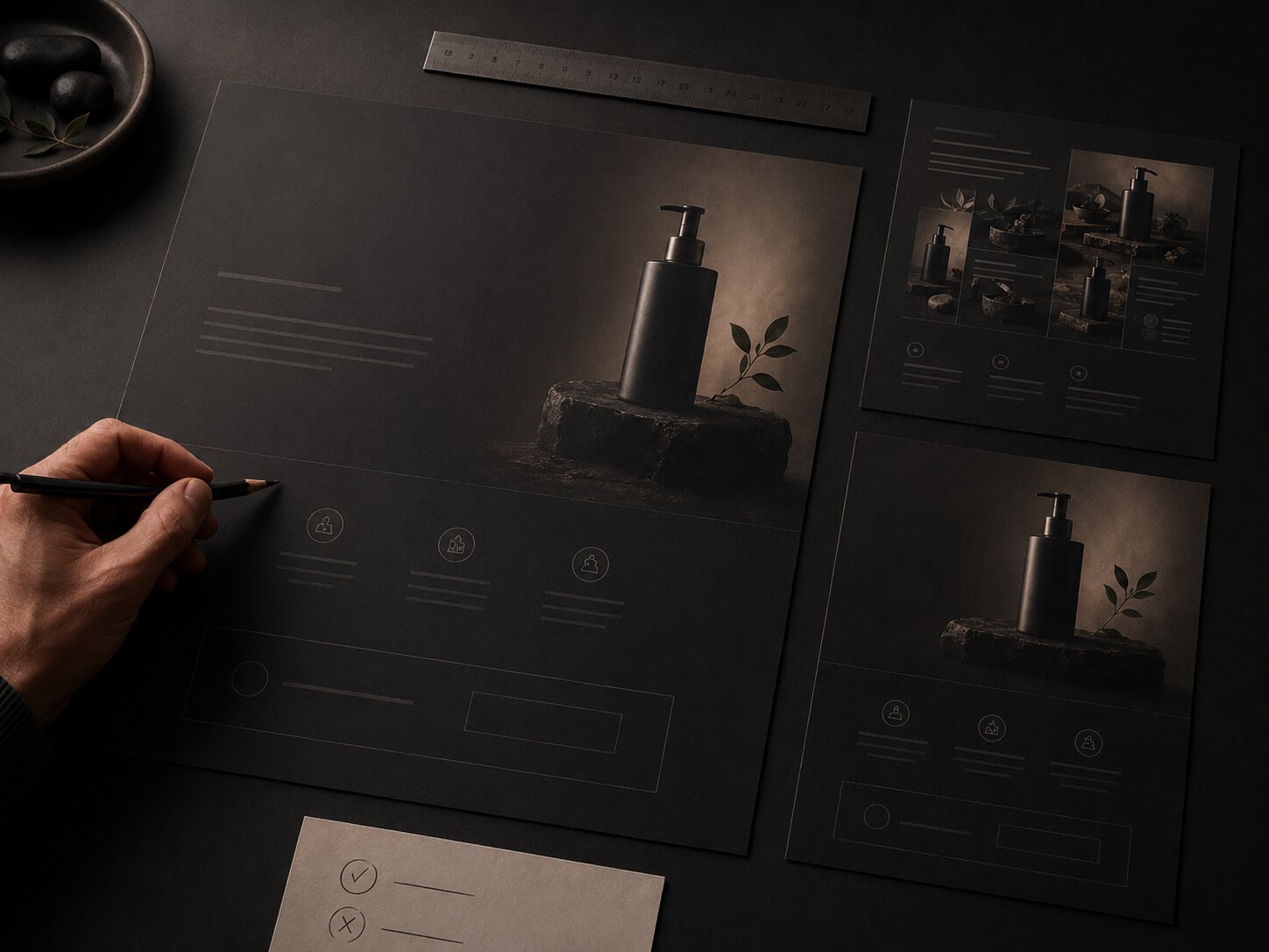
The hero visual should not compete with the headline
The hero area is where AI assets are most tempting. It is also where they can do the most damage. If the image has too many focal points, intense texture, unreadable embedded text, or unrelated symbolism, it may pull attention away from the headline and CTA.
A better hero asset usually has:
- One dominant visual idea
- Enough negative space for headline and CTA placement
- A mood that matches the product promise
- No unnecessary detail near the CTA
- A clear mobile crop
- No fake interface elements unless they accurately represent the product
For example, if the product message is “turn rough creative ideas into a cohesive promo pack,” the hero visual should suggest transformation, structure, and creative output. It should not look like a random futuristic AI dashboard.
Use supporting visuals to explain, not impress
Supporting visuals should make the page easier to scan. This is where AI assets can help produce section graphics, icon-style objects, abstract process visuals, product environment scenes, or before-and-after creative states.
A useful test: remove the visual and ask whether the section becomes harder to understand. If nothing changes, the visual may be decorative. If the section becomes less clear, the asset is doing real messaging work.
Build the AI Asset Brief Before Generating Anything
Most weak AI landing page visuals come from weak inputs. The prompt may be long, but the direction is vague. It describes style but not strategy.
A useful AI asset brief should define both the creative world and the landing page function.
Include these brief elements
| Brief Element | What to Define |
|---|---|
| Product promise | The main thing the landing page needs visitors to understand |
| Audience | Who the page is for and what they already care about |
| Emotional tone | Calm, premium, energetic, intimate, rebellious, editorial, playful, serious |
| Visual metaphor | The central image logic, such as transformation, release, craft, system, momentum, clarity |
| Asset role | Hero image, section visual, CTA background, product mockup, social bridge asset |
| Format needs | Desktop crop, mobile crop, square variant, vertical variant, wide banner |
| Constraints | No readable text, no logos, no fake UI, no clutter, no misleading product depiction |
| Review criteria | Brand fit, clarity, originality, rights, performance, accessibility |
This prevents AI from becoming a slot machine. You are not asking it to invent the strategy. You are using it to explore within a defined creative direction.
Example brief for a creator product landing page
Product message: “Build a complete campaign visual system from one rough idea.”
Visual direction: premium editorial studio, tactile creative materials, clear progression from sketch to finished asset, calm and focused mood.
Hero asset job: show transformation from idea to publish-ready visual system without using screens, logos, or readable text.
Asset requirements: wide hero crop, mobile-safe center composition, negative space on left side for headline, no fake interface, no excessive futuristic glow.
This kind of brief gives AI a job, a mood, and boundaries. The result is usually easier to refine into a usable landing page asset.
Create a Visual Bridge From Traffic Source to Landing Page
A landing page does not exist alone. Visitors arrive from somewhere: an Instagram Story, TikTok video, YouTube description, search ad, newsletter, artist bio, music release post, or product teaser.
That source creates expectations. If the landing page feels visually unrelated, visitors may hesitate. Google’s landing page guidance recommends choosing a page that closely matches the ad text and keyword themes, while TikTok’s ad policy materials emphasize quality, consistency, and clarity for ad formats and landing pages.
For creative campaigns, this means the landing page should feel like the next step in the same world.
Match the promise, not only the colors
Consistency is not just using the same palette. Match:
- The core message
- The emotional tone
- The visual symbol or motif
- The level of polish
- The product framing
- The CTA expectation
A music release teaser that feels dark, minimal, and cinematic should not click into a bright generic landing page with stock-style graphics. A creator tool ad promising “fast campaign assets” should not lead to a page where the visuals feel slow, abstract, or unrelated to production.
Build bridge assets
Bridge assets are visuals designed specifically to connect the campaign source to the landing page. Examples include:
- A landing page hero adapted from the same visual world as the ad
- A vertical teaser frame that shares the hero’s focal symbol
- A thumbnail version for YouTube or social previews
- A simple CTA visual using the same texture or light direction
- A retargeting image that repeats the page’s main product promise
Meta’s creative guidance also recommends keeping ad text concise and making the desired action clear at a glance, which is useful when adapting landing page ideas into paid social placements. Meta Business Help Center provides practical guidance for ad creative clarity.
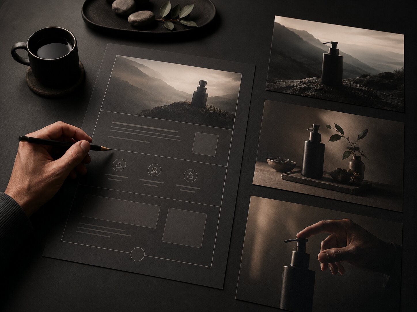
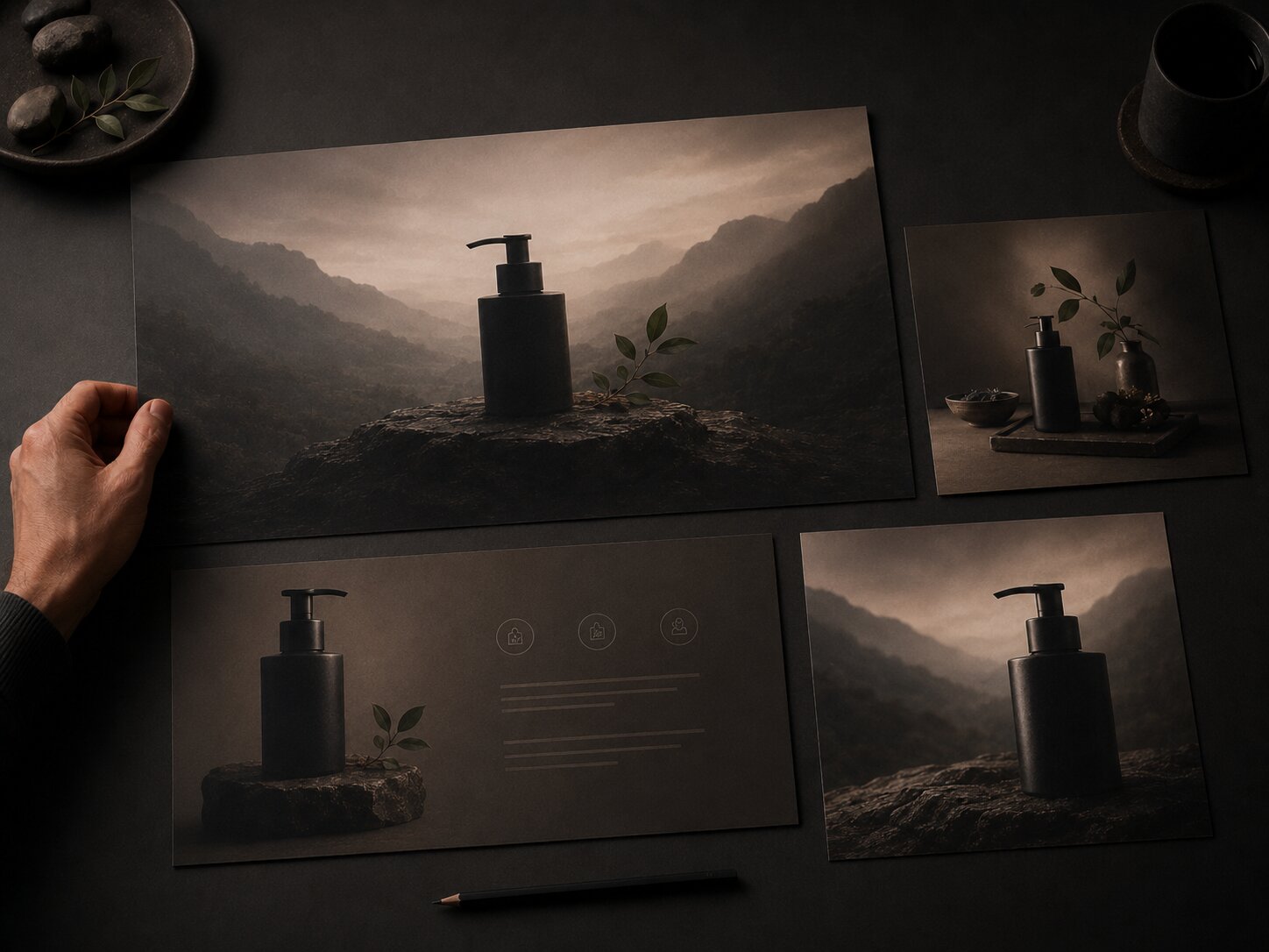
Turn One Visual World Into Modular Page Assets
The best AI-assisted landing page workflow does not produce one image. It produces a visual system.
A visual system gives you reusable parts:
- Hero image
- Section backgrounds
- Product mockup scenes
- Icon-like symbols
- CTA graphics
- Social teaser images
- Email header visuals
- Retargeting assets
- Thumbnail or preview images
This matters because landing pages rarely launch alone. A product, release, course, campaign, or creative pack usually needs supporting content across multiple channels.
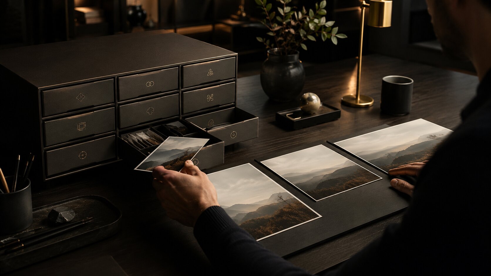
Start with a source concept
A source concept is the core visual idea that everything else grows from. It might be:
- A creator’s desk with physical campaign proofs
- A surreal object representing a product benefit
- A visual transformation from chaos to clarity
- A modular grid of creative outputs
- A cinematic world tied to a music release
- A tactile archive of reusable assets
Once the source concept is clear, AI can help generate variations while you preserve the same mood, texture, lighting, and composition logic.
Build by page function
Do not generate all assets at once with the same prompt. Generate by function.
For example:
| Asset | Direction |
|---|---|
| Hero visual | Strong focal point, negative space, immediate product mood |
| Feature visual | Clearer, more explanatory, less atmospheric |
| Process visual | Sequential, structured, easy to scan |
| Proof visual | Calm, trustworthy, restrained |
| CTA visual | Minimal, focused, no visual noise |
This creates a landing page that feels coherent without becoming repetitive.
Review AI Visuals for Trust, Rights, and Page Performance
AI-generated assets should not go directly from output to publication. They need review, especially when they represent a product, person, artist identity, or commercial offer.
Check truthfulness and product accuracy
A landing page visual should not imply features, results, endorsements, interface screens, partnerships, or physical products that do not exist. This is especially important for AI-generated UI mockups, product scenes, testimonials, and before-and-after visuals.
Google’s guidance for landing pages emphasizes being clear about the product or service and what it does. Google Ads Help includes this as part of destination and landing page quality.
Check copyright and usage risk
AI asset usage depends on the tool, inputs, licenses, jurisdiction, and human contribution. The U.S. Copyright Office’s AI materials address copyrightability of outputs created using generative AI, and creators should treat fully machine-generated outputs differently from works with substantial human creative authorship and editing. U.S. Copyright Office provides ongoing resources on copyright and artificial intelligence.
Practical review questions:
- Did you use copyrighted references too directly?
- Did the output resemble a living artist’s protected style too closely?
- Does the asset include recognizable people, brands, logos, or characters?
- Does your AI tool’s license allow the intended use?
- Did a human meaningfully select, edit, compose, and finalize the work?
- Do you need disclosure, attribution, or Content Credentials?
Adobe’s Content Credentials documentation frames provenance metadata as a way to improve transparency around how content was created and edited. Adobe Help Center explains how Content Credentials can provide context about creative work.
Check page speed and mobile behavior
Large visual assets can slow down a page. Google Search Central has treated page experience signals such as loading speed and mobile-friendliness as part of the broader search experience discussion, and Think with Google has repeatedly emphasized the importance of mobile site speed. Google Search Central explains page experience signals in search.
Before publishing:
- Compress images
- Export the right dimensions
- Avoid oversized background files
- Test mobile crops
- Check text contrast over images
- Keep important information out of unsafe crop zones
- Use alt text where appropriate
- Make sure the CTA remains visible and readable
AI can help you create the asset, but landing page performance depends on design implementation.
Use Orias AI to Shape Landing Page Creative Packs
Orias AI fits naturally into this workflow because landing page visuals rarely need one isolated image. They need a coherent creative pack: hero direction, product mood, section visuals, campaign adaptations, promo assets, and publish-ready variations.
A creator might start with a rough launch idea, a few references, a product description, or the mood of a release. From there, Orias AI can help shape clearer visual worlds and generate assets that stay connected to the product message instead of drifting into random styles.
For a musician, that could mean turning a release concept into a landing page hero, pre-save visuals, announcement graphics, and short-form promo frames. For a digital creator, it could mean building a visual system around a new template, course, newsletter, or creative offer. For a small creative team, it can help keep the campaign consistent while producing enough variations for testing and publishing.
The important point is not to let AI replace creative direction. Use it to accelerate exploration, then curate the strongest assets through the lens of message clarity, brand fit, and landing page purpose.
Frequently Asked Questions
What is a landing page visual strategy?
A landing page visual strategy is the plan for how images, graphics, layout, motion, product mockups, and creative assets support the page’s message. It connects the product promise to the visitor’s journey, instead of treating visuals as decoration.
How can AI help with landing page visuals?
AI can help generate hero concepts, product mood scenes, background textures, campaign adaptations, section graphics, and visual variations. It is most useful when guided by a clear brief that defines the audience, product promise, mood, asset role, and format constraints.
Should AI-generated images be used directly on a landing page?
Not without review. AI-generated images should be checked for accuracy, brand fit, originality, rights, accessibility, mobile cropping, and page performance. Many outputs also need editing, compression, resizing, or retouching before publication.
How do I keep landing page visuals consistent with ads or social posts?
Use shared visual cues: color behavior, texture, lighting, focal symbol, mood, composition style, and message angle. The landing page does not need to duplicate the ad, but it should feel like the next step in the same campaign.
What kind of AI assets work best for product messaging?
The strongest assets usually make the offer easier to understand. Examples include transformation visuals, product-in-context scenes, process graphics, modular creative systems, benefit-led section images, and CTA visuals that reduce distraction.
What mistakes make AI landing page visuals feel generic?
Common mistakes include vague prompting, too many visual styles, no clear hierarchy, fake UI, unreadable text inside images, overused futuristic effects, poor mobile crops, and visuals that do not match the product promise.
Do landing page visuals affect SEO or performance?
They can affect user experience indirectly through page speed, mobile usability, clarity, and engagement. Image size, layout stability, accessibility, and relevance all matter when building a page people can use easily.