The Cost-of-Inaction Visual: Showing What Happens When the Problem Is Ignored
Create a cost-of-inaction visual that makes an ignored problem feel real, specific and actionable without relying on exaggerated fear or empty warnings.

TL;DR:
- A cost-of-inaction visual shows the believable consequence of leaving one specific problem unresolved.
- The strongest concepts focus on one meaningful loss and make the progression from small problem to visible damage easy to follow.
- The goal is not to frighten or shame the viewer. It is to make an otherwise invisible risk easier to understand and give them a realistic way forward.
Creators often show the benefit of acting.
A cleaner campaign. A stronger release. A more polished visual identity. A faster workflow.
That approach makes sense, but it leaves out an important part of the decision: what happens when nothing changes?
Most problems do not remain frozen in place.
A small inconsistency spreads across more assets. A delayed campaign creates last-minute compromises. An unclear message gets repeated until it becomes part of the brand. A missing workflow keeps taking time from every future project.
That is where a cost-of-inaction visual becomes useful.
Instead of showing only the desirable future, it shows the direction the audience is already heading in if the problem is ignored.
Done well, this kind of visual creates recognition. Done badly, it becomes melodramatic, misleading, or strangely aggressive.
The difference usually comes down to specificity, credibility, and whether the viewer can see a genuine way forward.
This guide explains how to choose the right consequence, turn it into a clear visual progression, adapt it across campaign formats, and use AI without letting the concept drift into generic fear-based creative.
Table of Contents
- Key Takeaways
- The Viewer Needs to See a Future, Not a Warning
- Pick the Loss That Actually Changes the Decision
- Show the Problem Getting Worse in One Clear Sequence
- Pair Consequence With a Credible Way Out
- Translate One Idea Into Platform-Specific Assets
- Use AI for Variations, Then Apply Human Judgment
- Build a Clearer Cost-of-Inaction Workflow With Orias AI
- Frequently Asked Questions
- Sources Used
Key Takeaways
| Point | Details |
|---|---|
| Show a consequence, not a vague threat | The viewer should understand what gets worse, how it gets worse, and why the outcome matters. |
| Focus on one meaningful loss | Too many negative outcomes compete for attention and turn the visual into noise. |
| Make the progression believable | Show a clear physical or narrative connection between the ignored problem and the final consequence. |
| Leave room for action | A viewer who can see a practical response is more likely to engage than someone who feels trapped or blamed. |
| Adapt the composition by platform | Preserve the same consequence while changing the crop, sequence, pacing, and visual emphasis. |
| Review generated evidence carefully | AI-generated damage, metrics, comparisons, or outcomes must not imply that fictional evidence is real. |
The Viewer Needs to See a Future, Not a Warning
A cost-of-inaction visual is not simply a darker version of a benefit visual.
It has a different job.
A benefit visual says, “Here is what you could gain.”
A cost-of-inaction visual says, “Here is the direction this situation is already moving in.”
That distinction matters because people do not always evaluate gains and losses in the same way.
Research associated with prospect theory found that potential losses can produce a stronger response than corresponding gains.
That does not mean every campaign should lean on anxiety. It means a visible loss may help someone notice a problem they have been treating as harmless, distant, or temporary.
For a musician, the consequence might be a release campaign that never develops a recognizable visual world.
For a small creative team, it could be another launch assembled from unrelated assets because nobody established a direction early enough.
For a digital creator, it might be a strong idea disappearing inside inconsistent thumbnails, crops, captions, and promotional formats.
These are not disasters.
That is exactly why they work. They feel familiar.
A useful cost-of-inaction concept usually answers three questions without requiring a paragraph of explanation:
- What is being neglected?
- What gets worse because of that?
- What does the viewer eventually lose?
The last question is the important one.
“The files become disorganized” is a problem.
“The strongest campaign idea gets diluted across rushed, disconnected assets” is a consequence.
The second version gives the visual somewhere to go.
Pick the Loss That Actually Changes the Decision
One ignored problem can create several consequences.
Do not try to show all of them.
Suppose an independent artist starts building release visuals only a few days before launch.
The possible outcomes include inconsistent artwork, missing formats, rushed captions, weak platform adaptation, repeated revisions, and a campaign that never feels connected.
Putting all of that into one image would create clutter.
Instead, choose the loss that sits closest to the audience’s real priority.
If the artist cares most about identity, show the visual world breaking apart.
If the practical problem is time, show a manageable delay turning into a compressed production bottleneck.
If the issue is recognition, show a defining feature gradually disappearing across repeated adaptations.
| Possible Consequence | Strong Visual Angle | Weak Visual Angle |
|---|---|---|
| Lost consistency | One recognizable feature slowly changes across a series of assets | A random pile of mismatched graphics |
| Lost time | A manageable task accumulates into a blocked workflow | A generic clock with a warning symbol |
| Lost attention | The main subject becomes progressively buried beneath competing material | An unexplained downward arrow |
| Lost quality | Repeated shortcuts visibly degrade one asset or physical surface | A dramatic failure scene with no visible cause |
| Lost opportunity | A prepared space remains unused while a visible moment passes | Fake sales numbers or an invented empty venue |
The strongest angle is normally the one you can represent through physical cause and effect.
A seam is cut incorrectly and no longer aligns.
A surface is repeatedly patched until the original structure disappears.
One loose thread pulls several surrounding threads out of place.
A clear opening gets smaller each time another unnecessary layer is added.
These ideas work because the metaphor behaves logically.
The viewer does not need to decode a complicated symbol system.
Pro Tip: Write the consequence as a plain sentence before designing anything: “If this problem continues, the creator will lose ______ because ______.” When the sentence is fuzzy, the visual will probably be fuzzy too.
Show the Problem Getting Worse in One Clear Sequence
A cost-of-inaction visual becomes more convincing when the audience can follow the progression.
Start with the current friction, not the final catastrophe.
A practical sequence might look like this:
Small problem → repeated neglect → visible deterioration → meaningful loss
For example:
Unclear visual direction → unrelated assets are created → the campaign loses recognizable patterns → the release becomes harder to identify at a glance
That chain can become a single image, a carousel, or a short video.
Use a Single Symbolic Object
Use one object whose changing condition shows the consequence.
A wooden guide with a minor alignment error might produce a deeper groove every time material passes through it.
The object does not need labels.
The repeated wear tells the story.
This format works well for article covers, thumbnails, posters, and static social posts.
Let the Environment Show Accumulation
Show a space that has changed because a task kept being postponed.
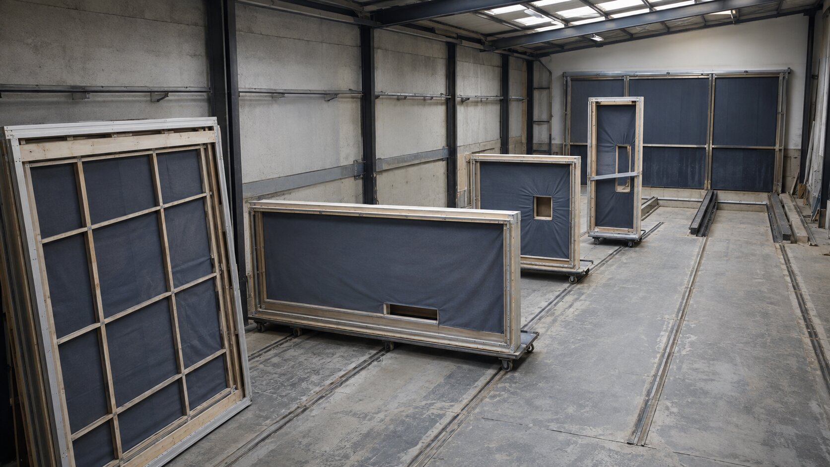
A small untreated leak might gradually stain and deform a carefully built studio wall.
A blocked production path might force unfinished materials into an increasingly narrow working area.
The environment helps communicate accumulation.
It is useful when the consequence is bigger than one isolated object.
Build a Controlled Progression
Show several stages of the same material, object, or subject.
The first stage is recoverable.
The second shows strain.
The final stage reveals what has been lost.
Keep the number of stages low.
Three is often enough to establish change without turning the creative into a technical diagram.
The viewer should be able to scan the image quickly.
YouTube’s thumbnail guidance recommends avoiding unnecessary complexity because too much visual information can overwhelm the viewer.
Pair Consequence With a Credible Way Out
Negative framing can attract attention, but attention alone is not the goal.
The viewer needs to believe two things:
- The consequence is relevant to their situation.
- Something can still be done about it.
Research reviewing fear-based messages found that they were more effective when the audience also believed the recommended response was useful and achievable.
In practical creative work, this means the visual should not end in hopelessness.
You do not necessarily need to place the solution inside the same image.
The next step can appear in the caption, landing-page copy, following carousel slide, or next scene in the video.
Still, the whole piece should feel like a warning with a purpose, not punishment.
| Framing | Example |
|---|---|
| Closed framing | Your campaign is falling apart because you failed to plan. |
| Actionable framing | Without a clear direction, each new asset creates another visual decision. Define the core system before the campaign expands. |
The second version names the consequence and points toward a manageable action.
It also keeps the work honest.
Google’s advertising policies prohibit false, misleading, or unrealistic claims and emphasize that people need accurate information to make informed decisions.
A fictional consequence must not be presented as documented proof.
A dramatic visual should not imply results you cannot support.
Avoid:
- Invented performance dashboards
- Fake customer losses
- Artificial damage presented as a real product defect
- Before-and-after comparisons that change unrelated conditions
- Extreme outcomes with no believable connection to the problem
- Visuals that shame the audience for not acting sooner
Urgency is useful.
Humiliation is not.
Translate One Idea Into Platform-Specific Assets
Once the concept works, do not simply resize the same composition for every channel.
The consequence must remain recognizable, but its delivery should change.
For a wide website hero, you might show the full progression from the manageable problem to the final loss.
A square social post may need to isolate the most revealing middle stage.
A vertical video can reveal the decline over time.
A thumbnail may work better with one close-up detail that implies the larger story.
| Format | Best Use of the Concept |
|---|---|
| Website hero | Show the full cause-and-effect relationship |
| Square social post | Focus on the clearest moment of deterioration |
| Vertical video | Reveal the consequence in stages |
| Carousel | Separate the problem, progression, consequence, and response |
| Thumbnail | Use one bold detail with immediate visual tension |
| Email visual | Show the consequence while leaving clear space for live copy |
TikTok’s Creative Center provides different storytelling patterns, examples, and creative guidance rather than treating every video as the same asset in another size.
That is a useful mindset even outside TikTok.
Keep the central idea, but rebuild its presentation around the viewing context.
Before publishing, check whether the essential evidence survives the crop.
If the visual depends on a small crack, missing thread, faded mark, or repeated misalignment, that detail must remain visible on a phone screen.
Otherwise, the audience only sees a gloomy image with no clear reason for it.

Use AI for Variations, Then Apply Human Judgment
AI can be genuinely helpful during this process.
You can use it to explore physical metaphors, compare levels of severity, test compositions, or translate one consequence into horizontal, square, and vertical concepts.
The mistake is asking for “a dramatic image showing the cost of doing nothing” and accepting whatever appears.
That prompt leaves too many decisions open.
The result will often lean on warning signs, broken objects, red lighting, dark clouds, abandoned rooms, or exaggerated destruction.
A stronger prompt defines the logic:
- The original stable condition
- The neglected flaw
- The physical process that makes it worse
- The exact feature that is eventually lost
- The appropriate level of severity
- The expected material behavior
- The camera angle and focal hierarchy
- The objects, symbols, and visual shortcuts that must not appear
Then review the output as evidence, not just decoration.
Does the deterioration happen logically?
Did the model introduce damage that changes the meaning?
Is the final result too extreme?
Could someone mistake the scene for a real event, documented case, or genuine product failure?
AI-generated work may also require editing, rights review, platform adjustments, and transparency decisions.
Adobe, for example, applies Content Credentials to certain Firefly-generated assets to indicate the use of generative AI and support media provenance.
The tool can generate options.
It cannot decide whether the implication is fair.
That part still belongs to the creator.
Build a Clearer Cost-of-Inaction Workflow With Orias AI
Orias AI helps creators move from rough ideas and references into clearer visual directions, campaign materials, release visuals, promo assets, and publish-ready creative packs.
For a cost-of-inaction concept, the useful part is not generating more alarming images.
It is building a clearer system around one credible consequence.
You can explore several consequence angles before committing to production, define the visual rules that keep the metaphor consistent, and adapt the chosen direction across campaign formats.
A practical workflow could look like this:
- Describe the unresolved problem in one plain sentence.
- Identify the single loss that matters most to the audience.
- Map the progression from small problem to visible consequence.
- Choose a physical metaphor that behaves logically.
- Generate several genuinely different visual directions.
- Select the direction that communicates the consequence most clearly.
- Reduce any exaggerated, confusing, or unsupported details.
- Create a credible next step for the caption, page, or following asset.
- Recompose the idea for each publishing format.
- Review the complete campaign for consistency and misleading implications.
This keeps the consequence, visual identity, and proposed response inside the same creative story.
Frequently Asked Questions
What Is a Cost-of-Inaction Visual?
It is a visual that shows the likely consequence of leaving a specific problem unresolved.
Instead of focusing only on the benefits of taking action, it makes the current risk or gradual loss easier to understand.
Is a Cost-of-Inaction Visual the Same as Fear-Based Advertising?
Not necessarily.
Fear-based advertising often tries to produce a strong emotional reaction.
A cost-of-inaction visual can be quieter and more practical.
It may show wasted time, declining consistency, lost attention, or avoidable complexity without suggesting disaster.
When Should Creators Use This Type of Visual?
Use it when the audience already recognizes the problem but may underestimate what continued delay will cost.
It works especially well for workflow problems, campaign planning, maintenance, consistency, quality control, and missed preparation.
How Do I Keep the Visual From Feeling Manipulative?
Choose a consequence you can reasonably connect to the original problem.
Avoid fabricated evidence, unsupported numbers, humiliation, and extreme outcomes.
Then provide a realistic response the viewer can take.
Can a Cost-of-Inaction Visual Work for a Music Release?
Yes.
It could show how delaying creative direction leads to disconnected cover art, teasers, thumbnails, and social assets.
Keep the focus on the campaign process rather than implying that weak visuals automatically cause commercial failure.
How Many Consequences Should One Visual Show?
Usually one.
A single clear consequence is easier to understand and more memorable than several competing problems.
Additional consequences can become separate posts, carousel slides, or campaign variations.
Can AI Generate This Kind of Campaign Visual?
Yes.
AI is useful for exploring metaphors, materials, compositions, stages, and format variations.
Every output still needs human review for credibility, visual consistency, misleading details, rights considerations, and platform fit.