Audience Journey Visuals: Matching Creative Assets to Awareness, Trust and Action
Match creative assets to awareness, trust and action so every visual supports the right audience moment.

TL;DR:
- Audience journey visuals are creative assets designed for where someone is emotionally and practically in relation to your work: discovering you, deciding whether they trust you, or choosing what to do next.
- The strongest campaigns do not use the same image, caption, thumbnail, teaser, and CTA everywhere.
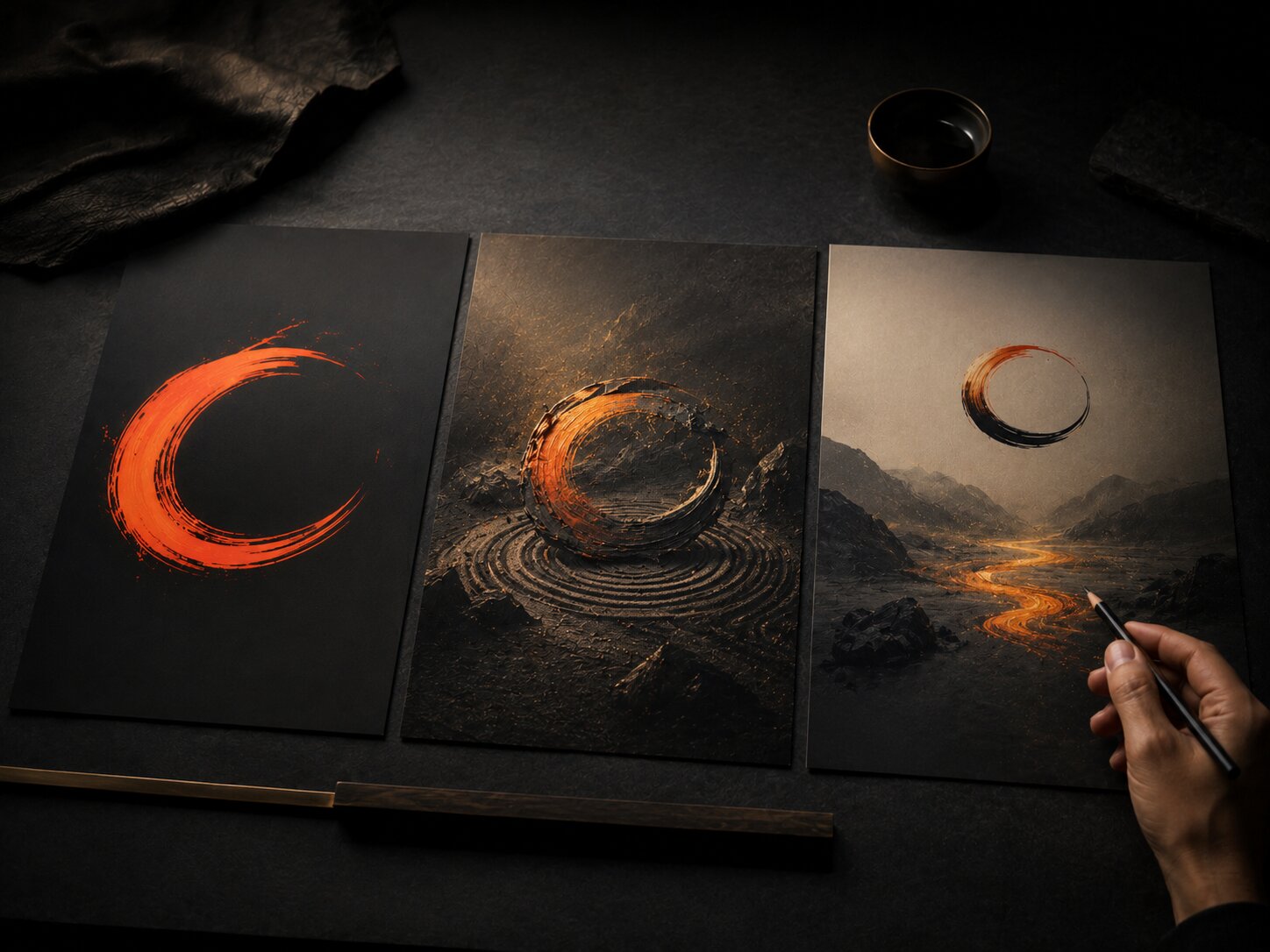
- Build one coherent visual world, then adapt it for awareness, trust, and action.
A creator’s visual campaign often fails for a quiet reason: the assets look good individually, but they are not doing the same job. A mysterious teaser, a release cover, a testimonial-style post, a short-form video, a landing page banner, and a final call-to-action graphic cannot all speak to the audience in the same way.
Someone discovering you for the first time needs a fast signal. Someone who has already seen your work needs more context. Someone ready to listen, follow, buy, subscribe, pre-save, book, or join needs clarity and confidence. Treating every viewer as if they are at the same stage creates friction.
This guide shows how to plan audience journey visuals across three practical stages: awareness, trust, and action. The framework is useful for independent artists, musicians planning releases, digital creators shaping a visual identity, and creative teams building campaign systems with AI-assisted workflows.
The goal is not to make your creativity feel like a corporate funnel. It is to make sure every asset has a clear role, so your visual world becomes easier to recognize, believe in, and respond to.
Table of Contents
- Key Takeaways
- Map the Journey by Audience State, Not by Asset Type
- Design Awareness Visuals That People Can Understand Quickly
- Use Trust Visuals to Give the Audience a Reason to Care
- Make Action Visuals Clear Without Making Them Feel Cheap
- Build One Visual World, Then Adapt It by Journey Stage
- Use AI to Explore the Journey, Not Replace Creative Judgment
- Review Results by Role, Not Just by Raw Engagement
- How Orias AI Supports Journey-Based Creative Packs
- Frequently Asked Questions
- Sources Used
Key Takeaways
| Point | Details |
|---|---|
| Not every asset should ask for action | Awareness visuals should make people recognize the world, not force a decision too early. |
| Trust visuals need context | Behind-the-scenes frames, process notes, proof, story fragments, and consistent design cues help the audience understand why the work matters. |
| Action visuals should reduce hesitation | Clear format, readable hierarchy, direct CTA, and platform-appropriate layout matter more than mystery at the decision point. |
| Consistency is not repetition | The same mood, symbol, color behavior, and visual rhythm can be adapted differently for teaser posts, thumbnails, release visuals, banners, and short videos. |
| AI works best with a defined role | Use AI for ideation, variations, mood exploration, and asset expansion, then use human judgment for taste, rights, ethics, and final selection. |
Map the Journey by Audience State, Not by Asset Type
Most creators start campaign planning by listing formats: Instagram post, TikTok, YouTube thumbnail, Spotify Canvas, newsletter header, landing page hero, story post. That is useful for production, but weak for strategy.
A better starting point is audience state.
Ask:
- Is this person seeing me for the first time?
- Have they heard of me but not formed a clear opinion?
- Do they already trust the work but need a reason to act?
- Are they a fan, follower, listener, collector, buyer, or collaborator?
- What visual would make the next step feel natural?
Traditional marketing often describes this as a funnel, but current platform behavior is less linear. Think with Google and BCG describe modern journeys as overlapping behaviors such as streaming, scrolling, searching, and shopping rather than a clean step-by-step path. The practical takeaway for creators is simple: people may discover, evaluate, and act in different orders, depending on platform, timing, and intent. Think with Google explains customer journey mapping as a way to understand how people move across different touchpoints.
For creative planning, the awareness-trust-action model is still useful, as long as you treat it as a flexible map rather than a rigid staircase.
Awareness
The audience does not know enough yet. Your job is to make the creative world legible fast.
Good awareness assets include:
- Short visual teasers
- Strong thumbnails
- Mood-led social posts
- Reels, Shorts, or TikTok clips
- Campaign announcement visuals
- Abstract but recognizable key images
- High-contrast hooks for scrolling feeds
These visuals should answer: “What kind of world is this?”
Trust
The audience has noticed something, but they need more context before they care.
Good trust assets include:
- Behind-the-scenes visuals
- Process clips
- Story posts explaining the idea
- Artist notes
- Visual breakdowns
- Testimonials or press quotes, when available
- Before-and-after creative development
- Moodboard-to-final-asset comparisons
These visuals should answer: “Why should I believe in this?”
Action
The audience is close to doing something. Do not make them work too hard.
Good action assets include:
- Release-day posts
- Pre-save or listen-now graphics
- Tour, drop, launch, or booking visuals
- Landing page banners
- Email headers
- Product or merch cards
- Final reminder stories
- Platform-specific CTA assets
These visuals should answer: “What should I do next?”

Design Awareness Visuals That People Can Understand Quickly
Awareness visuals are not meant to explain everything. They are meant to create a first signal strong enough to be remembered.
For creators, this often means resisting the urge to put too many ideas into one asset. A musician may want to show the song title, artist name, release date, genre, lyric fragment, portrait, album cover, and visual metaphor in one post. A visual storyteller may want to show the full concept in one frame. A creator may want to explain the entire series at once.
That usually weakens the asset.
At the awareness stage, your image should have one dominant impression:
- A face
- A symbol
- A mood
- A gesture
- A striking color relationship
- A visual contradiction
- A cinematic frame
- A memorable texture
- A single object connected to the concept
YouTube’s own thumbnail guidance emphasizes that viewers usually encounter a thumbnail and title first, and those elements help them decide whether to watch. YouTube also recommends designing for the target audience, keeping thumbnails from becoming too complex, and making title information accurate and easy to understand. YouTube Help provides thumbnail and title tips for clearer viewer decision-making.
That logic applies beyond YouTube. A strong awareness visual should be simple enough to read in motion, but specific enough to belong to you.
Awareness Asset Checklist
Before publishing an awareness visual, ask:
- Can someone understand the mood in one second?
- Is there one clear focal point?
- Does the visual still work when cropped or viewed small?
- Is it recognizable without reading a long caption?
- Does it create curiosity without misleading the viewer?
- Does it feel connected to the larger creative world?
Mistake to avoid: Making awareness visuals too explanatory. Discovery assets should open a door, not deliver the entire press kit.
Use Trust Visuals to Give the Audience a Reason to Care
Trust is where many creative campaigns become thin. The artist posts a teaser, then another teaser, then another teaser, then a release announcement. The audience sees style, but not enough substance.
Trust visuals are the bridge between attention and belief.
They help people understand the work behind the work:
- What inspired it
- What changed during the process
- What problem it solves or feeling it expresses
- What the creator cares about
- How the piece, song, video, product, or campaign came together
- Why this release or project matters now
For musicians, this could be a short vertical clip explaining the emotional origin of a track. Spotify for Artists describes Clips as under-30-second vertical videos that can be used across the release cycle for pre-release hype, promoting a release, or sharing the stories behind songs.
For visual creators, trust might come from showing the evolution of a concept: rough idea, reference mood, visual rule, first generated options, human curation, final asset. The point is not to reveal every private detail. The point is to make the audience feel the work has intention.
Trust Visuals Can Be Quiet
Not every trust asset needs to be dramatic. Some of the strongest trust-building visuals are restrained:
- A close-up of texture from the final artwork
- A still frame from a shoot
- A studio detail
- A lyric fragment paired with a visual symbol
- A simple comparison between two rejected directions and the chosen one
- A creator’s note paired with a clean image
- A process carousel with no hype language
Trust grows when the visual system feels coherent. If every asset uses a different style, the audience may enjoy individual posts but fail to understand the identity behind them.
Trust Asset Checklist
Use this before creating mid-journey campaign visuals:
- Does this asset reveal something meaningful?
- Does it deepen the audience’s understanding?
- Does it connect the creative idea to the person, project, or release?
- Does it maintain the same visual language as the awareness assets?
- Does it avoid over-explaining or sounding defensive?
- Does it make action feel more natural later?
Pro Tip: Build trust assets from creative decisions you already made. Mood, rejected concepts, symbols, locations, references, materials, edits, and constraints can all become useful campaign content.
Make Action Visuals Clear Without Making Them Feel Cheap
Action visuals are where creative people often become uncomfortable. A beautiful campaign suddenly turns into a loud “OUT NOW” graphic that feels disconnected from the rest of the visual world.
The solution is not to avoid calls to action. The solution is to design action assets with the same taste as the rest of the campaign.
At the action stage, clarity matters. The audience should know what is available, where to go, and why now. But the asset should still belong to the same world.
| Goal | Weak Action Visual | Stronger Action Visual |
|---|---|---|
| Music release | Generic “stream now” template. | Release artwork adapted into a clean vertical asset with one direct listen CTA. |
| Creator product | Busy discount graphic. | Product image, one benefit, one CTA, consistent brand mood. |
| Visual campaign | Random final reminder post. | Cropped campaign hero image with date, title, and clear next step. |
| YouTube video | Clickbait thumbnail. | Accurate, emotionally clear thumbnail-title pairing. |
| Newsletter signup | Over-designed form banner. | Calm visual header showing what the audience will receive. |
Google Ads Help describes full-funnel planning across awareness, brand consideration, and action video formats, with different metrics and formats contributing to different stages. Google Ads Help outlines video campaign goals for different stages of the audience journey. For creators, the lesson is not that every campaign needs paid ads. It is that action assets should be planned as a specific creative role, not improvised at the last minute.
Action Assets Need Hierarchy
A good action visual usually has three levels:
- Recognition: The viewer knows this belongs to your world.
- Offer or event: The viewer understands what is available.
- Next step: The viewer knows what to do.
That hierarchy can be visual, not just textual. Use scale, spacing, contrast, image crop, motion, and layout to guide the eye.
Action Asset Checklist
Before publishing an action asset, check:
- Is the CTA visible and easy to understand?
- Is the visual still consistent with the campaign mood?
- Is the crop safe for the platform?
- Does it avoid unnecessary text?
- Does the landing destination match the promise?
- Is the asset designed for the audience’s current level of familiarity?
Mistake to avoid: Using mystery when the audience needs direction. At the action stage, ambiguity can reduce confidence.
Build One Visual World, Then Adapt It by Journey Stage
A strong audience journey does not require three unrelated art directions. It requires one visual world with different communication modes.
Think of the campaign as a system:
- Core mood: dark, playful, surreal, intimate, raw, cinematic, nostalgic, futuristic, minimal, handmade.
- Main symbol: object, silhouette, texture, location, motif, gesture, character, shape.
- Color behavior: muted, high contrast, monochrome, warm highlights, cold shadows, soft gradients.
- Composition rule: centered subject, negative space, close crop, diagonal tension, layered collage, symmetrical layout.
- Type or text behavior: no text, tiny text, bold title, handwritten note, clean label, caption-led format.
- Motion behavior: slow loop, hard cut, handheld, smooth reveal, flicker, zoom, stillness.
Once these rules are defined, each journey stage can adapt them.
Example: Independent Musician Release
Awareness:
- Abstract teaser visual using the main symbol
- Short vertical clip with no full song reveal
- Cropped lyric mood frame
- Profile banner update
Trust:
- Behind-the-song Clip
- Studio photo or handwritten note
- Carousel showing artwork detail and meaning
- Short story about the sound or influence
Action:
- Release-day artwork adaptation
- Spotify Canvas or visual loop
- Listen-now story asset
- Link-in-bio banner
- Email header for fans
Spotify’s Canvas guidelines are a useful reminder that platform-specific visuals have constraints: Canvas is a short vertical loop, and Spotify advises avoiding rapid cuts, considering phone screen cropping, and connecting Canvas identity to album art, profile images, headers, or playlists. Spotify Support explains Canvas guidelines for artist visuals.
Example: Digital Creator Content Series
Awareness:
- Bold thumbnail system
- One visual hook per episode
- Short clip with clear emotional premise
Trust:
- Process breakdown
- “How I made this” carousel
- Reference-to-result post
- Lessons learned from the previous episode
Action:
- Subscribe prompt
- Downloadable resource visual
- Course, template, or newsletter CTA
- Recap post linking the full series
YouTube also supports A/B testing up to three different titles and thumbnails for eligible creators using YouTube Studio, with results based on watch time. This makes thumbnail and title development less guesswork-driven, but it still requires strong creative hypotheses to test. YouTube Help explains title and thumbnail experiments for eligible channels.
Use AI to Explore the Journey, Not Replace Creative Judgment
AI can be extremely useful for audience journey visuals, but only when it is given structure.
A weak AI workflow sounds like this:
“Make me a cool promo image.”
A stronger workflow sounds like this:
“Create three awareness-stage visual directions for an independent electronic artist releasing a cold, cinematic track. Use the same abstract symbol, but vary the composition for vertical short-form, square feed, and wide banner formats. Avoid readable text. The goal is curiosity, not conversion.”
AI is useful for:
- Exploring visual metaphors
- Generating mood directions
- Creating asset variations
- Testing layout options
- Expanding one concept into multiple formats
- Drafting campaign prompts
- Creating structured creative briefs
- Repurposing ideas across platforms
- Comparing awareness, trust, and action versions
AI is not a substitute for:
- Taste
- Originality
- Rights review
- Cultural judgment
- Brand fit
- Final editing
- Platform-specific checks
- Ethical decision-making
Adobe’s AI positioning around creative workflows emphasizes scaling content across formats while maintaining brand governance, quality, and control. Adobe Business describes AI for creative workflows in the context of content production and brand control. That distinction matters for independent creators too. Speed is useful only when the output still feels intentional.
A Practical AI Prompt Framework
Use this structure when creating audience journey visuals:
- Audience state: awareness, trust, or action.
- Creative world: mood, symbol, color, texture, lighting.
- Asset format: vertical, square, wide, thumbnail, banner, loop, carousel.
- Communication role: curiosity, context, proof, reminder, conversion.
- Constraints: no readable text, no logos, no clutter, no off-brand elements.
- Review criteria: consistency, clarity, platform fit, originality.
Example:
Create three trust-stage visual concepts for a musician’s upcoming single. The awareness visuals already use a dark room, blue side light, and a cracked glass symbol. Keep those cues, but show more context: studio process, emotional backstory, and release preparation. Make each concept suitable for a vertical story or carousel slide. Avoid readable text, logos, screens, and generic sci-fi effects.
The output may not be final, but it gives you a controlled starting point.
Review Results by Role, Not Just by Raw Engagement
Audience journey visuals should be evaluated according to their job.
An awareness asset may be successful if it earns reach, saves, profile visits, or comments from new people. A trust asset may be successful if it increases replies, watch time, shares, newsletter clicks, or meaningful conversations. An action asset may be successful if it drives listens, signups, sales, bookings, pre-saves, or link clicks.
TikTok’s full-funnel guidance separates measurement across awareness, consideration, intent, purchase, and loyalty, with different signals such as reach, frequency, video views, site visits, events, and purchase actions depending on the stage. TikTok Ads explains full-funnel marketing for different campaign objectives.
For creators, this prevents a common mistake: judging every post by the same metric.
A process post may not get the same reach as a dramatic teaser, but it may build trust with the people most likely to support the project. A direct CTA may not get the most likes, but it may convert better among existing fans. A thumbnail may get clicks, but if it overpromises, it can hurt watch behavior and audience trust.
Simple Review Table
| Asset Role | Useful Signals | What to Improve |
|---|---|---|
| Awareness | Reach, impressions, profile visits, new viewers, shares. | Focal point, crop, hook, contrast, recognizability. |
| Trust | Saves, comments, replies, watch time, repeat views. | Context, story, proof, emotional specificity. |
| Action | Clicks, listens, signups, purchases, bookings. | CTA clarity, layout hierarchy, landing page match. |
| Retention | Return visits, repeat engagement, fan responses. | Continuity, cadence, audience relationship. |
Pro Tip: Review the campaign as a sequence. A single post can underperform while the full journey still works better than scattered one-off assets.
How Orias AI Supports Journey-Based Creative Packs
Orias AI is useful for creators who want to move from rough ideas to clearer visual systems without jumping between disconnected tools. The platform positions itself as one workspace for text, image, and video generation, with model comparison, file uploads, references, and a saved gallery for generated work.
For audience journey visuals, that matters because the work is not just “make one image.” The real workflow is:
- Define the campaign idea
- Build a mood and reference direction
- Generate awareness, trust, and action concepts
- Compare variations
- Refine the strongest direction
- Adapt it into format-specific assets
- Keep the visual world consistent
- Review before publishing
A musician could use Orias AI to turn a song mood into teaser frames, Canvas ideas, release-day visuals, and short promo copy. A visual storyteller could shape a campaign world, then adapt it into thumbnails, banners, story assets, and concept frames. A creative team could use it to keep rough ideas, references, prompts, and generated outputs in one workflow while still applying human review before anything goes live.
The best use is not to publish everything AI creates. The best use is to make better creative decisions faster.
Frequently Asked Questions
What are audience journey visuals?
Audience journey visuals are creative assets designed for different audience moments. An awareness visual helps people notice and recognize you. A trust visual gives them context and reasons to care. An action visual helps them take the next step.
How do I know whether an asset is for awareness, trust, or action?
Look at the viewer’s likely state. If they do not know you, the asset should be simple, memorable, and curiosity-driven. If they know you but need context, use process, story, proof, or consistency. If they are ready to act, make the next step clear.
Should every campaign have separate visuals for each stage?
Not always, but most serious campaigns benefit from it. A small release or content series might only need a teaser, a context post, and a final CTA. A bigger launch may need multiple assets for each stage across several platforms.
Can AI create a full audience journey visual system?
AI can help generate ideas, variations, prompts, visual directions, and format adaptations. It still needs human direction. The creator should decide what feels original, accurate, ethical, on-brand, and publish-ready.
What is the biggest mistake creators make with journey visuals?
The biggest mistake is using one type of asset for every audience moment. A mysterious teaser may work for discovery, but it can frustrate people who are ready to act. A direct sales graphic may work at the end, but feel too aggressive for first-time discovery.
How should musicians use this framework for a release?
Use awareness visuals before the release to introduce the mood. Use trust visuals to share the story, process, lyrics, studio moments, or meaning behind the track. Use action visuals on release day and after launch to drive listening, saving, sharing, and deeper fan connection.
How do I keep visuals consistent without making them repetitive?
Create rules for mood, color, lighting, symbols, composition, and texture. Then change the crop, format, scale, CTA, and level of explanation depending on the journey stage. Consistency comes from shared creative DNA, not from duplicating the same design everywhere.