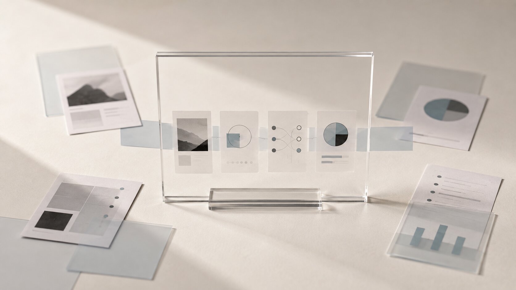
AI Email Campaign Visuals: Designing Headers, Offers, and Product Stories Faster
Create consistent AI email campaign visuals for headers, promotional offers, product stories and mobile-ready creative without losing your brand identity.
TL;DR:
- AI can speed up email visual production, but it works best when every image has a clearly defined job inside the campaign.
- Build one visual direction first, then adapt it into a header, offer block, product story, and supporting asset family.
- Keep essential copy, prices, deadlines, and calls to action outside images, then test every asset on mobile and with images disabled.
Email visuals always look simple after the campaign goes live.
A strong header. A clean offer. Maybe three product images arranged in a way that feels effortless.
Behind that polished result, though, there is usually a less polished pile of decisions about cropping, lighting, type placement, brand colours, image dimensions, product order, mobile layouts, and whether the campaign still makes sense when images do not load.
For independent creators and small creative teams, that production work can become the slowest part of the campaign. You may already know the story you want to tell, but turning it into six usable visual assets is another problem entirely.
AI can make that process faster. It can help you explore directions, build controlled variations, adapt one concept across several sections, and reduce repetitive production work.
But speed only helps when the campaign has a clear visual system. Otherwise, you simply generate more images that do not belong together.
This guide explains how to move from a rough campaign idea to a practical set of email visuals, including headers, promotional offers, product stories, and reusable supporting assets.
Table of Contents
- Key Takeaways
- Give Every Email Visual One Clear Job
- Build the Campaign World Before Generating Assets
- Design Headers for Recognition, Not Decoration
- Make Offers Readable Before Making Them Beautiful
- Turn Products Into a Visual Story
- Generate a Connected Asset Family
- Prepare Everything for the Inbox
- Build Faster Email Visual Workflows With Orias AI
- Frequently Asked Questions
- Sources Used
Key Takeaways
| Point | Details |
|---|---|
| Start with the message | Decide what the reader should notice, understand, or do before choosing a visual style. |
| Build one visual system | Reuse the same lighting, materials, palette, framing, and product treatment across the campaign. |
| Keep critical information live | Prices, deadlines, offer terms, and buttons should normally remain editable text instead of being baked into images. |
| Generate in asset families | Create headers, product crops, backgrounds, and detail images from the same approved direction. |
| Design for mobile first | A visual that only works at desktop width is not ready for an email campaign. |
| Review every AI output | Check product accuracy, text, logos, composition, accessibility, file size, and brand fit before publishing. |
Give Every Email Visual One Clear Job
Before opening an image generator, write down what each visual needs to accomplish.
Not what it should look like. What it should do.
A header might need to introduce a seasonal mood. An offer image might need to make a specific product feel urgent or valuable. A product story image might need to explain how several items belong together.
Those are different jobs. They should not all be solved with the same generic lifestyle scene.
A simple campaign map might look like this:
| Email Section | Main Visual Job | Useful Asset |
|---|---|---|
| Header | Establish the campaign idea. | Wide hero image. |
| Offer block | Focus attention on the deal. | Product-led promotional visual. |
| Product story | Explain context, use, or sequence. | Detail images or editorial panels. |
| Recommendation section | Make comparison easier. | Consistent product crops. |
| Closing section | Reinforce the mood or identity. | Simple texture or secondary image. |
This step matters because AI responds much better to a defined purpose than to broad requests such as “create a premium email banner.”
“Premium” can mean almost anything. A better direction explains the actual scene, product role, mood, composition, and empty space needed for the email layout.
Example Direction: Create a wide editorial still life for an autumn product launch. Feature one ceramic speaker on a dark oak surface, with warm side lighting, muted rust and charcoal tones, and clean negative space on the left for live email copy.
That gives the image a real production role.
Mistake to Avoid: Generating individual assets without deciding where they will appear. You will often end up with the wrong crop, no room for copy, or several good images that fight each other.
Build the Campaign World Before Generating Assets
The fastest workflow is not prompt, download, repeat.
It is deciding on a visual world once, then producing several assets inside it.
Your direction does not need to be a complete brand manual. A short creative brief is enough:
- Campaign idea
- Intended audience
- Main product or subject
- Emotional tone
- Colour range
- Lighting style
- Materials or environment
- Composition rules
- Elements to avoid
- Required email formats
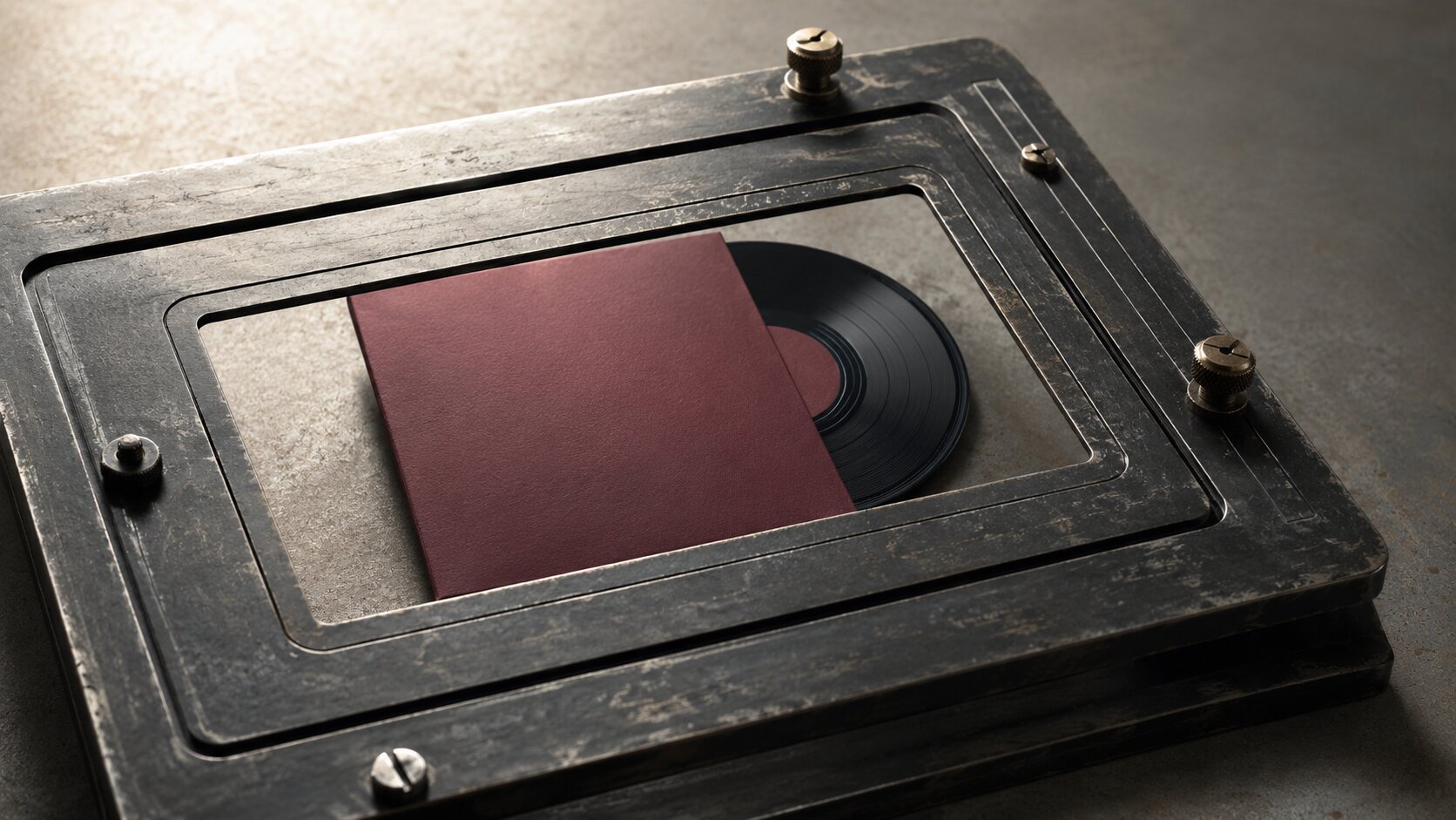
Suppose a musician is announcing a limited vinyl release. The direction might be:
Quiet late-night listening room. Deep brown wood, faded burgundy fabric, low amber light, soft grain, restrained composition. The vinyl sleeve remains the visual anchor. No neon lighting, glossy nightclub scenes, crowded props, or readable generated text.
That brief can support a header, a close product crop, a detail scene, a background texture, and a social adaptation without changing the core idea.
Consistency comes from repeating decisions, not repeating the exact same image.
You can vary:
- Camera distance
- Product angle
- Amount of negative space
- Background depth
- Prop density
- Orientation
- Detail level
Keep the visual rules stable while changing the composition.
Use References as Boundaries
References are most useful when they explain specific qualities instead of asking AI to copy an existing artist or campaign.
Instead of saying “make it look like Brand X,” describe what you actually need:
- Soft directional window light
- Heavy paper texture
- Low-saturation green and cream
- Symmetrical product arrangement
- Documentary-style close crop
- Large areas of simple background
That produces a clearer direction and gives you more control over originality.
Pro Tip: Approve one anchor image before generating the rest. Use it to judge colour, lighting, texture, scale, and mood. Every later asset should feel as though it came from the same visual world.
Design Headers for Recognition, Not Decoration
The header is usually the first large visual inside the email, so it carries a lot of pressure.
It needs to establish the idea quickly without making the opening section feel crowded.
Strong email headers normally have:
- One dominant subject
- One clear focal point
- Enough contrast to remain readable at a small size
- Space for a headline or button
- A composition that still works after mobile cropping
Keep the top section simple. Header elements should support the primary message rather than compete with it.
Decide Where the Copy Will Live
Before generating the header, choose one of three approaches.
Copy Beside the Image
Generate a product or subject positioned to one side. Leave the other side visually quiet for live text.
Copy Below the Image
Use a full-width visual with no embedded wording. Place the headline, supporting copy, and CTA underneath.
Copy Over the Image
Use this only when the background has a genuinely clean area and the email builder can maintain readable contrast across devices.
Do not rely on the image itself to carry essential wording.
Keeping the headline and CTA as live HTML text is normally safer. It remains readable when images are blocked, is easier to revise, and adapts more reliably across screen sizes.
Generate for Cropping
A wide desktop header may become much narrower on a phone. Important subjects placed at the extreme edge can disappear or become awkwardly compressed.
Ask for:
- A centred or safely offset focal subject
- Extra breathing room around key objects
- No important detail near the outer edges
- A background that can tolerate cropping
Do not judge the visual only as a full-resolution image. Shrink it down and view it at roughly the size it will occupy in a real inbox.
Make Offers Readable Before Making Them Beautiful
Offer visuals tend to become overloaded because everyone wants the discount, product, urgency, branding, and supporting details visible at once.
That usually creates a small poster rather than an effective email section.
Separate the offer into two layers.
| Layer | Purpose |
|---|---|
| Visual layer | Creates attention, context, and desire. |
| Information layer | Explains the terms and gives the reader a clear next step. |
The visual might show:
- One featured product
- A bundle arrangement
- A before-and-after use case
- A seasonal treatment
- A close detail that makes the product feel tangible
The live email content should carry:
- Price
- Discount
- Deadline
- Eligibility
- Product name
- Call to action
- Legal or offer conditions
This is important because recipients may block images or use assistive technology. Meaningful information should not disappear with the image.
Build a Clear Priority
A practical offer section should answer these questions in order:
- What is being offered?
- Why should I care?
- What are the terms?
- What do I do next?
The image should help answer the first two. It should not be forced to explain all four.
Mistake to Avoid: Generating a complete promotional graphic with prices and button text inside it. AI-generated lettering can contain errors, and baked-in offer details are difficult to update later.
Turn Products Into a Visual Story
A product story is more than a row of catalogue images.
It gives the reader a reason to understand the product in context. That might mean showing how it is made, how several items work together, what changes during use, or why the details matter.
From Wide View to Close Detail
Start with the product in context, then move closer.
For a handmade object, that could mean:
- The object in a simple environment
- A close view of the material
- A construction detail
- The finished product in use
Problem, Product, Result
This structure works well for functional offers.
- Show the situation or need.
- Introduce the product.
- Show the improved outcome.
Keep the result grounded. It should feel believable rather than exaggerated.
Collection as a Visual Sequence
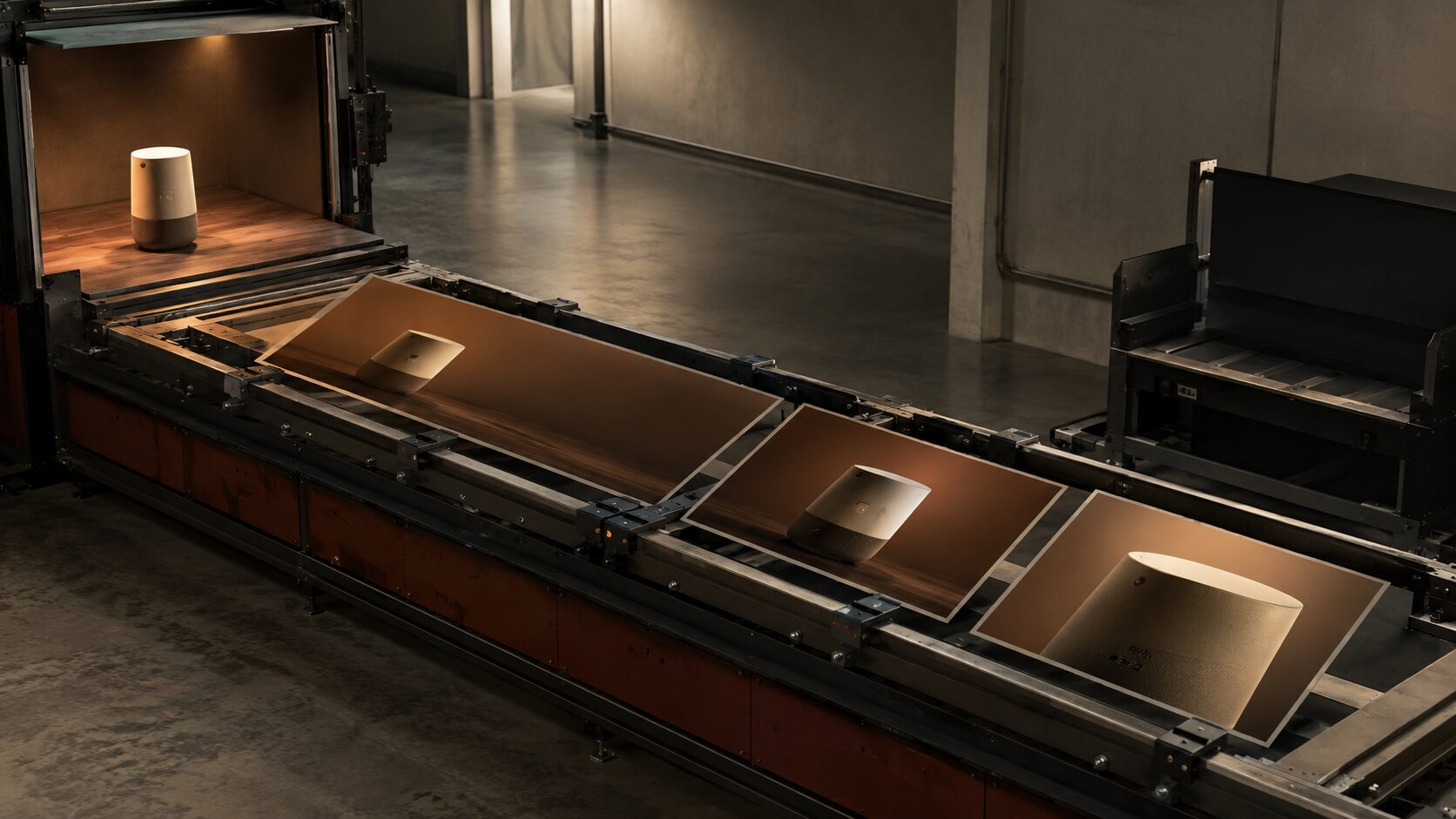
For multiple products, give every item the same treatment:
- Matching camera angle
- Stable background
- Similar scale
- Consistent shadows
- Shared colour temperature
This reduces visual noise and makes comparison easier.
AI is particularly useful here because it can help explore several consistent framing options from one direction.
Generated product imagery still needs close inspection. Packaging, physical details, proportions, labels, and materials can change unexpectedly between outputs.
For real commercial products, original photography or controlled product renders may remain the safer source of truth. AI can then support backgrounds, environments, crops, visual concepts, or clearly illustrative scenes.
Generate a Connected Asset Family
Once the direction and anchor image are approved, produce assets as a batch.
A practical email campaign pack might include:
- One wide header
- One mobile-safe header alternative
- Two offer-block visuals
- Three consistent product crops
- Two close detail images
- One simple background texture
- One closing visual
- A few social crops based on the same direction
The key is to generate by role, not randomly.
A Useful Batch Sequence
- Header exploration: Create several broad compositions and choose one direction.
- Subject consistency: Lock the main product, environment, materials, and lighting.
- Format adaptation: Generate wide, square, vertical, and close-detail versions.
- Supporting assets: Create quieter backgrounds, textures, dividers, or secondary images.
- Human edit: Correct product details, remove artefacts, refine colour, crop, compress, and add live copy in the email builder.
The goal is to explore options inside one brief, then use human judgement to select and refine the usable results.
Name Files by Function
Do not leave exports called image-final-4-new.png.
Use names such as:
spring-launch-header-desktop.jpgspring-launch-header-mobile.jpglinen-set-offer-block.jpglinen-set-detail-weave.jpgspring-launch-background-light.png
It sounds minor, but clear naming prevents mistakes during campaign assembly and review.
Prepare Everything for the Inbox
A strong image is not finished until it behaves properly inside an email.
Use web-ready image formats, prepare images in RGB, add appropriate alt text, and compress files before uploading them to the email platform.
Email templates normally have limited content widths. Oversized image files can create slow loading, clipping, or inconsistent rendering.
Treat platform image dimensions as guidance rather than universal rules. Your email builder’s actual template width should determine the final export.
Run This Checklist Before Publishing
- Does the main idea survive at mobile width?
- Is any important copy trapped inside the image?
- Does the email still make sense with images disabled?
- Does every informative image have useful alt text?
- Are decorative images marked appropriately?
- Are buttons live and easy to tap?
- Are product details accurate?
- Are file sizes reasonable?
- Are colours prepared for screen display?
- Have you previewed the email in multiple clients?
- Does dark mode create any unexpected contrast problems?
- Are all rights, permissions, and disclosures handled?
Write Alt Text Around Purpose
Good alt text does not need to describe every shadow and texture.
It needs to communicate the useful meaning.
| Version | Alt Text |
|---|---|
| Weak | Product photo. |
| Better | Limited-edition burgundy vinyl beside its illustrated sleeve. |
| Linked image | View the limited-edition vinyl bundle. |
Decorative textures, flourishes, and separators should not create unnecessary noise for screen-reader users.
Build Faster Email Visual Workflows With Orias AI
Orias AI helps creators keep rough campaign ideas, references, visual directions, prompt variations, copy drafts, and supporting assets inside one connected creative workflow.
That matters when you are trying to make a header, an offer section, and a product story feel connected rather than assembled from unrelated tools and last-minute decisions.
A practical workflow looks like this:
- Define the campaign message.
- Collect references and mood material.
- Set one clear visual direction.
- Generate a limited group of header concepts.
- Approve one anchor image.
- Adapt the direction into offer and product-story assets.
- Refine, resize, and compress the selected visuals.
- Review the final campaign as one connected asset family.
The useful approach is still selective. Generate several directions, approve one, create the required asset family, then finish the work with editing, accessibility checks, resizing, and real inbox testing.
Frequently Asked Questions
Can AI Create a Complete Email Campaign Design?
AI can help create the visual direction, image assets, copy options, and layout ideas. You will still need an email builder to assemble the campaign, create live text and buttons, manage responsive behaviour, add links, and run final tests.
Should Email Headers Include Text Inside the Image?
Essential headlines and offer details are normally better kept as live text. This makes them easier to edit, more accessible, and more reliable when images are blocked. Decorative lettering may appear inside an image, but it should not be the only place critical information is shown.
What Size Should an Email Header Image Be?
Use the width recommended by your email platform and template. Many email layouts use a content width of roughly 600 pixels, although source images may be exported at a higher resolution for sharper displays. Compress the final file and test its loading speed and crop.
How Do I Keep AI-Generated Email Visuals Consistent?
Create a short direction that defines palette, lighting, materials, camera style, product treatment, and exclusions. Approve one anchor image, then generate all other assets as variations inside the same system instead of starting from a new prompt each time.
Is It Safe to Use AI-Generated Product Images?
It depends on the product and context. AI can introduce inaccurate labels, shapes, materials, or features, so every commercial product image needs careful review. When exact appearance matters, use original photography or verified renders as the primary source.
How Many Visuals Should an Email Contain?
There is no perfect number. Use enough imagery to support the message without making the campaign slow or difficult to scan. A focused promotional email may need one hero and a few product images, while a longer editorial email may use several smaller story images.
What Is the Biggest Mistake in AI Email Design?
The biggest mistake is generating attractive images before deciding what each section needs to communicate. The result may look polished, but the header, offer, and product story will not work together.