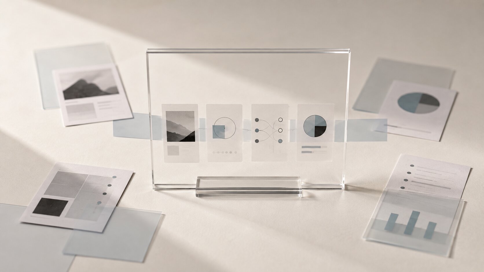
Lead Magnet Visuals: Turning Useful Resources into Save-Worthy AI Assets
Turn checklists, guides, templates and useful resources into clear, memorable AI-assisted lead magnet visuals people actually want to save and use.
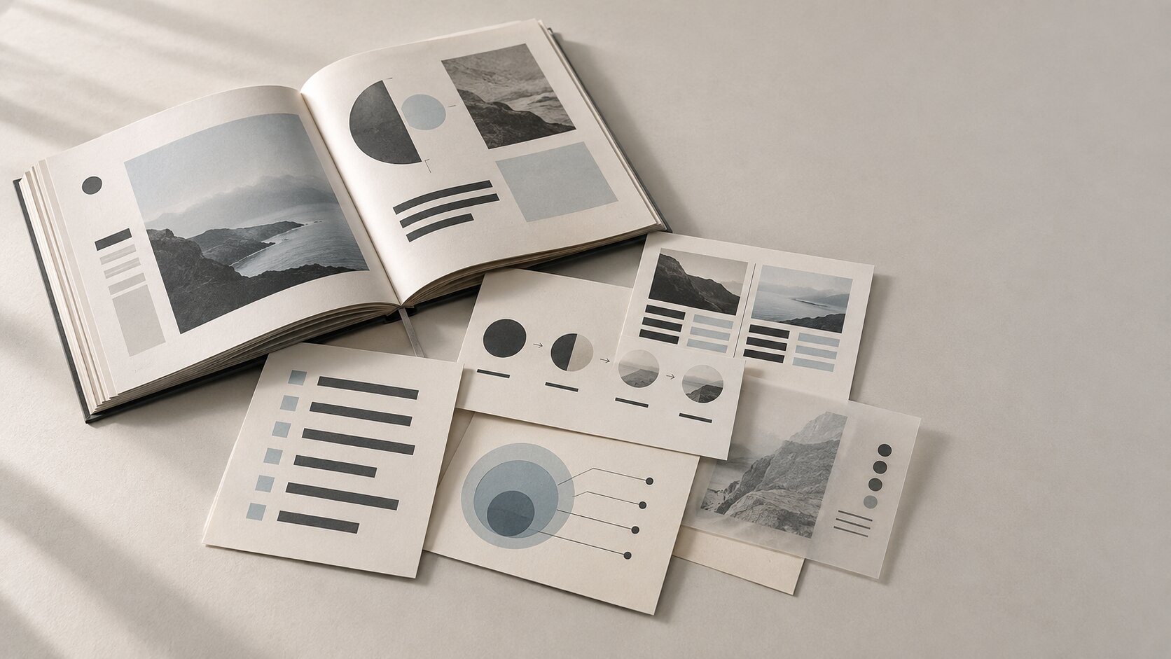
TL;DR:
- A strong lead magnet needs useful information and a visual structure that makes that information easy to understand, save, and revisit.
- Design the resource around its job first, then use AI to explore visual directions, supporting imagery, layouts, and reusable asset variations.
- Keep final judgment human, especially around clarity, accuracy, brand fit, readability, and whether the resource is genuinely useful in practice.
You can spend hours making a genuinely useful checklist, guide, worksheet, template, or mini playbook and still end up with something people download once, skim, and forget.
The problem usually is not the information.
It is the packaging.
A useful resource becomes much more valuable when someone can glance at it and understand where to start, find an answer without rereading five pages, screenshot a section, save a visual reference, or return to it three weeks later and still know what they are looking at.
That is where visuals matter.
And AI can help, as long as you are not asking it to randomly decorate a PDF.
The better approach is to turn useful information into a visual system.
One that can work as a downloadable resource, a social preview, a carousel, a supporting graphic, or a small library of reusable assets without losing the original point.
Table of Contents
- Key Takeaways
- Make the Resource Useful Before Making It Beautiful
- Find the Parts People Will Actually Save
- Give the Whole Resource One Visual Logic
- Use AI for Exploration, Not Autopilot
- Turn One Lead Magnet Into a Small Asset Family
- Check the Boring Details That Decide Whether It Gets Used
- Build the Next Resource Faster Without Making It Look Recycled
- Using Orias AI to Build a Connected Lead Magnet System
- Frequently Asked Questions
- Sources Used
Key Takeaways
| Point | Details |
|---|---|
| Start with utility | Decide what the reader should be able to do with the resource before choosing its visual style. |
| Design for saving | Checklists, frameworks, examples, diagrams, and reference pages deserve stronger visual treatment because people may revisit them. |
| Build a visual system | Repeat type hierarchy, spacing, color behavior, image treatment, and layout rules instead of designing every page from scratch. |
| Let AI create options | Use AI for concept exploration, image directions, variations, and repurposing, then curate and refine the results yourself. |
| Create more than a PDF | One strong resource can produce social previews, carousel slides, standalone reference graphics, and follow-up content. |
| Review usability | Readability, contrast, mobile viewing, accuracy, and export quality matter just as much as visual style. |
Make the Resource Useful Before Making It Beautiful
A lead magnet has a job.
Maybe it helps someone plan a release.
Maybe it is a shot list for creators.
Maybe it is a pricing worksheet, a brand checklist, a set of creative prompts, or a framework for planning social content.
Write that job down before you open an image generator.
For example:
After using this resource, an independent musician should have a basic visual plan for the two weeks around a release.
That sentence already tells you more about the design than a prompt like "create a premium futuristic PDF."
You know the resource probably needs stages.
You know the user needs to see progress.
You may need checkboxes, examples, timelines, or clearly separated actions.
The mistake is starting with an aesthetic and trying to force the information inside it.
A beautiful 20-page guide with weak navigation is still annoying to use.
Give Every Section a Reason to Exist
Before designing, sort the material into three rough groups:
- Must understand: the core explanation.
- Must use: checklists, prompts, worksheets, steps, or templates.
- Nice to know: examples, commentary, and extra context.
Your strongest visual emphasis usually belongs to the second group.
That is the material people are most likely to return to.
Find the Parts People Will Actually Save
Not every page needs to look like a social post.
In fact, trying to make everything visually dramatic usually makes the resource harder to use.
Look instead for what could become a standalone reference.
A guide about planning creator campaigns might contain a page called Five Assets to Prepare Before Launch.
That page has obvious save value.
A music promotion guide might contain a simple release timeline.
A visual storytelling resource might include a framing checklist.
A photography guide might contain a lighting comparison.
Those are natural visual anchors.
Use the Screenshot Test
Ask a very simple question:
If someone screenshotted one part of this resource, which part would it be?
That is probably where you should spend more design effort.
Turn it into something that still makes sense outside the full document.
Give it a clear heading, enough context, and a visual structure that can stand on its own.
This also makes repurposing much easier later.
Show Relationships, Not Decoration
If the information describes a process, show a sequence.
If it compares two choices, show them side by side.
If it describes hierarchy, make the hierarchy visible.
If it gives a framework, turn the framework into a recognizable structure.
Adobe's graphic design guidance notes that size, weight, color, imagery, and other design elements can establish an order of importance and guide the eye through information.
That is much more useful than adding a decorative AI image because an empty corner feels unfinished.
Give the Whole Resource One Visual Logic
A lead magnet starts to feel considered when everything seems intentional.
That does not mean every page looks the same.
It means the reader learns the visual language quickly.
For example:
- Large serif headings always introduce a new section.
- Small numbered markers always indicate actions.
- Pale background panels always contain examples.
- One accent color identifies templates or exercises.
- Photography appears only on opening pages.
- Diagrams use the same line weight and shape language.
After a few pages, the reader knows how the document works without thinking about it.
That is good design.
Build a Tiny Visual Rulebook First
You do not need a 60-page brand manual.
A compact creative brief is enough.
| Mood | Calm, bold, handmade, editorial, technical, playful, or raw. |
| Color behavior | Mostly neutral with one accent, muted photography, high-contrast monochrome, or a soft warm palette. |
| Type behavior | Strong editorial titles, simple body copy, and compact labels. |
| Image behavior | Documentary photos, abstract physical compositions, collage, illustrations, or clean diagrams. |
| Layout behavior | Spacious pages, dense reference cards, modular grids, or oversized chapter openings. |
| Avoid | Glossy stock imagery, random 3D graphics, fake interfaces, generic AI surrealism, and excessive gradients. |
Now your AI prompts have boundaries.
More importantly, so do your own design decisions.
Consistency comes from creative direction and repeatable rules, not simply from generating the same type of image again and again.
Use AI for Exploration, Not Autopilot
AI becomes genuinely useful when you give it a defined problem.
Instead of:
Create lead magnet visuals about content planning.
Try something more specific:
Explore four editorial visual directions for a downloadable creator workbook about planning one month of visual content. The resource should feel practical, independent, tactile, and contemporary. Avoid corporate dashboards, glowing AI imagery, generic laptops, and readable fake text. Each direction should suggest a cover concept, section divider treatment, supporting image style, and reusable reference graphic style.
Now you are exploring systems instead of asking for one magic image.
Where AI Is Genuinely Helpful
AI can speed up several parts of the process.
| Stage | How AI Can Help |
|---|---|
| Concept exploration | Try different visual worlds before committing to one. |
| Supporting imagery | Generate visuals for chapter openings, scenarios, metaphors, or examples. |
| Variation | Explore several crops, compositions, backgrounds, or treatments around the same creative idea. |
| Information structure | Turn rough notes into possible sections, tables, comparisons, or sequences. |
| Repurposing | Adapt one concept into social posts, promo visuals, carousel ideas, and campaign previews. |
| Creative QA | Review whether a visual system still matches the original creative brief. |
The final selection still needs your judgment.
AI does not know whether an image feels tired in your niche, whether a metaphor is too obvious, whether a visual subtly changes the meaning of the resource, or whether something simply feels wrong for your audience.
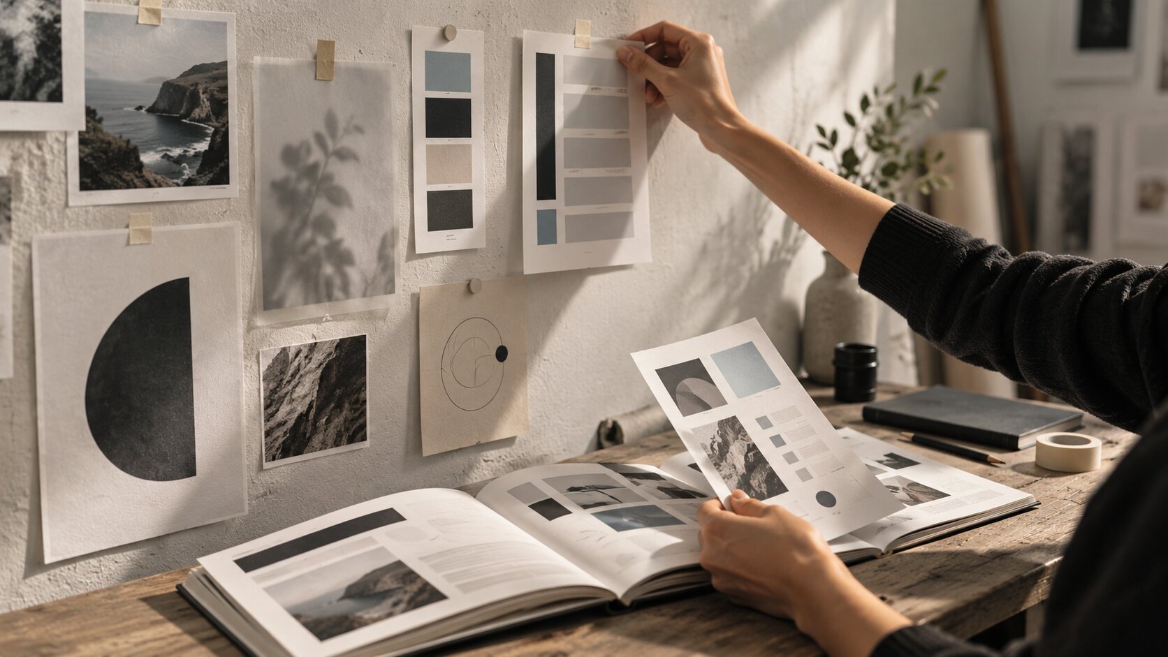
Do Not Ask the Image Model to Typeset Your Guide
Generate imagery with AI if it helps.
Build final typography separately.
Readable text needs control.
If important instructions, numbers, labels, or explanations are baked into generated imagery, you are giving away that control.
Editing also becomes unnecessarily difficult.
Use AI as one layer of the system, not the entire production environment.
Turn One Lead Magnet Into a Small Asset Family
A useful lead magnet should not live alone behind one download button.
Once the main resource is finished, look at what else its visual system can produce.
Suppose you created a 12-page guide called The Independent Artist's Release Visual Checklist.
The same creative direction could produce:
| Asset | Job |
|---|---|
| Lead magnet cover | Communicate the value quickly. |
| 5-slide carousel | Preview part of the framework. |
| Standalone checklist | Give people a useful saveable asset. |
| Story graphic | Promote the download. |
| Article illustration | Support a related blog post. |
| Email graphic | Reintroduce the resource later. |
| Follow-up worksheet | Extend the original guide. |
You are not inventing seven campaigns.
You are letting one useful idea travel into several formats.
This is where a clear visual system starts paying for itself.
The cover, checklist, carousel, email graphic, and follow-up worksheet can all look related without becoming duplicates of one another.
Check the Boring Details That Decide Whether It Gets Used
This part is not glamorous.
It matters anyway.
Can Someone Read It Comfortably?
Tiny pale-gray text might look tasteful on your monitor and become miserable on a phone.
W3C's WCAG guidance specifies a contrast ratio of at least 4.5:1 for normal text, with different thresholds for larger text.
Even if your PDF is not being built specifically as a web interface, that gives you a useful readability benchmark.
Also check:
- Body text size
- Line length
- Paragraph spacing
- Heading contrast
- Text placed over images
- Tables at mobile scale
- Labels inside diagrams
Does It Still Work Without the Pretty Image?
Remove the hero artwork mentally.
Can the reader still understand the page?
If not, you may be using imagery to hide weak information structure.
Did AI Introduce Nonsense?
Inspect generated details closely.
Look for incorrect objects, malformed hands, broken symbols, fake labels, misleading diagrams, accidental logos, visual inconsistencies, and anything that changes the meaning of the content.
Publishing straight from generation is rarely the best move.
Is the Export Actually Usable?
Open the final file on a phone.
Zoom out.
Zoom in.
Click the links.
Check whether pages load cleanly.
Make sure the file size is reasonable.
Then send it to someone who has not seen the project and ask them to find one specific piece of information.
You will learn more from that than from staring at the cover for another hour.
Build the Next Resource Faster Without Making It Look Recycled
The real advantage appears after you have made two or three resources.
Save the system, not just the finished PDF.
Keep:
- Approved type hierarchy
- Page grid
- Color rules
- Image prompts
- Reusable prompt blocks
- Diagram style
- Cover composition principles
- Checklist format
- CTA treatment
- Export settings
- Rejected visual patterns
Then, when the next resource arrives, you are not starting from a blank page.
But do not clone the previous lead magnet and swap the title.
Reuse the grammar.
Change the story.
A photography workbook and a music release checklist might share typography and spacing while using completely different image concepts and page rhythms.
That is how consistency stays recognizable without becoming repetitive.
Pro Tip: Keep one short sentence at the top of your creative brief that describes what the resource should feel like to use. Something like, "This should feel like a working tool someone keeps open beside them, not an ebook they read once."
That sentence can settle surprisingly many design arguments.
Using Orias AI to Build a Connected Lead Magnet System
Orias AI can be useful when the resource begins as a messy collection of notes, references, screenshots, moods, rough copy, and half-formed visual ideas.
Instead of jumping directly to finished assets, you can use that context to explore directions, compare image concepts, refine the visual language, and develop supporting assets around the same idea.
That matters with lead magnets because you are rarely making just one thing.
You are building the resource itself, the cover, the promotional visuals, the preview content, and often several follow-up assets.
Keeping those outputs connected to the same creative direction is far more useful than generating each one from scratch.
Start with the useful idea.
Clarify who it is for and what they should be able to do with it.
Build the mood and visual rules.
Explore a few directions.
Then extend the selected direction into the cover, diagrams, reference graphics, social previews, and supporting campaign assets.
AI can help create options.
Your job is still deciding what deserves to exist.
Frequently Asked Questions
What Is a Lead Magnet Visual?
A lead magnet visual is any visual element that helps package, explain, preview, or promote a downloadable resource.
That can include the cover, diagrams, worksheets, checklists, illustrations, reference cards, social previews, and promotional graphics.
Can I Create an Entire Lead Magnet With AI?
AI can help with research structure, ideation, drafts, visual concepts, images, variations, and repurposing.
You should still review the information, edit the writing, control important typography, check visual accuracy, confirm rights and usage requirements, and refine the final layout yourself.
What Kinds of Lead Magnets Benefit Most From Visual Design?
Checklists, templates, workbooks, planning guides, frameworks, comparison guides, resource collections, mini courses, and step-by-step processes benefit especially well because good design makes their structure easier to understand and revisit.
How Many Visual Styles Should One Lead Magnet Use?
Usually one coherent visual system is enough.
You can vary composition and page density, but core decisions such as typography, color behavior, imagery, spacing, and graphic language should feel related.
Should Every Page Contain an AI-Generated Image?
No.
Many pages need space more than imagery.
Use visuals where they clarify, organize, demonstrate, or strengthen an idea.
A quiet page with excellent typography can be far more useful than a crowded page with an unnecessary illustration.
How Do I Make a Lead Magnet Feel Worth Saving?
Give the reader something they will realistically need again.
A clear checklist, framework, reference chart, worksheet, prompt collection, sequence, or comparison can create repeat value.
Then make that information easy to find and understand when they return.
How Do I Keep Several Lead Magnets Visually Consistent?
Keep a small set of stable rules for typography, spacing, color, image treatment, and graphic elements.
Let the subject of each resource introduce new imagery and compositions while the underlying design language stays familiar.