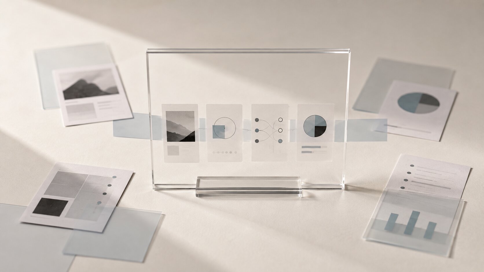
Thought Leadership Visuals: Turning Expert Ideas into Shareable AI Content
Turn expert ideas into clear thought leadership visuals, AI-assisted content systems, carousels, videos and shareable creative assets without losing the original point of view.

TL;DR:
- Strong thought leadership visuals begin with one clear expert idea, not with an image prompt or a design style.
- Translate the idea into a visual mechanism that explains how the thinking works, then adapt that same core concept into carousels, videos, articles, presentations, and social posts.
- AI is useful for exploring directions, generating variations, and repurposing assets, but the point of view, evidence, taste, and final judgment should still come from the expert or creative team.
Experts rarely have a shortage of ideas.
The harder part is turning those ideas into content people can quickly understand, remember, and share.
A useful observation might begin inside an interview, a client conversation, a workshop, a research note, or a lesson learned after years of doing the work.
Then someone tries to turn it into content.
The result is often a portrait, a large quotation, and a background that looks vaguely related to the topic.
The idea is technically still there.
Most of what made it interesting is not.
That problem matters even more now that AI can generate images, layouts, short videos, presentation concepts, and social variations very quickly.
Faster production does not automatically create stronger thought leadership.
What matters is whether the visual helps someone understand the expert thinking underneath the content.
The goal is not to decorate an opinion.
It is to give that opinion a visual form that can travel.
This guide shows how to move from a raw expert idea to a clearer visual concept, explore it with AI, build a reusable content system around it, and keep the original point of view intact while the format changes.
Table of Contents
- Key Takeaways
- Find the Idea That Is Actually Worth Visualizing
- Separate the Evidence From the Clever Phrase
- Turn the Expert Idea Into a Visual Mechanism
- Build a Family of Formats Around One Core Idea
- Use AI to Explore Options, Not to Invent the Point of View
- Keep the Visual Language Consistent Without Repeating One Template
- Review the Visual for Meaning Before You Publish It
- Where Orias AI Fits Into the Workflow
- Frequently Asked Questions
- Sources Used
Key Takeaways
| Point | Details |
|---|---|
| Start with a position | Visualize one specific expert claim rather than a broad subject such as leadership, AI, creativity, or innovation. |
| Preserve the evidence | Real observations, examples, processes, and supporting facts should remain intact as the idea moves into new formats. |
| Visualize the mechanism | Strong editorial visuals show how an idea works instead of simply placing decorative imagery beside a quotation. |
| Build a content system | One strong idea can become a hero image, carousel, short video, article graphic, presentation sequence, and social post. |
| Use AI for exploration | AI can help compare metaphors, compositions, formats, and variations, while expert judgment decides what is accurate and worth publishing. |
| Adapt instead of simply resizing | Keep the core idea stable while recomposing the surrounding visual treatment for each platform and format. |
Find the Idea That Is Actually Worth Visualizing
Broad topics are usually poor starting points for thought leadership visuals.
The future of remote work is a topic.
How AI is changing marketing is a topic.
Leadership during change is a topic.
None of those statements tells the audience what the expert actually believes.
A better starting point is a sentence someone could reasonably agree with, disagree with, or act on.
For example:
A good AI workflow does not only reduce the time required to create a first option. It reduces the time between a weak idea appearing and the team deciding to reject it.
Now there is something to work with.
The idea has tension.
It challenges the usual focus on generation speed and shifts attention toward decision speed.
More importantly, it contains a process that can be visualized.
Run the Four-Question Test
Before opening an image generator or design tool, answer four questions:
- What exactly is the expert claiming?
- Why does the expert believe it?
- What do people commonly do or assume instead?
- What should change if the reader accepts the idea?
If those answers are still vague, the visual stage is probably too early.
LinkedIn recommends that thought leadership content bring a distinctive perspective, useful insight, and a recognizable human voice rather than simply repeating common industry talking points.
That distinction matters visually too.
The more specific the position, the easier it becomes to design something that feels specific in return.
Pro Tip: If the same visual could sit beside ten different articles in your industry, it probably is not expressing the expert idea yet.
Separate the Evidence From the Clever Phrase
A memorable sentence and a useful expert idea are not always the same thing.
Imagine a creative director says:
Consistency begins before generation starts.
It sounds good.
But the line becomes much more useful when you understand the evidence underneath it.
Maybe the creative director has repeatedly seen that teams who define materials, lighting, framing, proportions, reference images, and color behavior before generating anything produce more coherent visual systems.
Teams without those constraints spend much more time trying to repair inconsistency one prompt at a time.
Now the idea contains a mechanism:
Define creative rules early → reduce random decisions later → create a more coherent series
That is far more useful than the quotation alone.
Before building the visual, collect a small source packet around the idea.
- The central claim
- Two or three supporting observations
- A real example or scenario
- The usual approach the expert disagrees with
- One practical consequence for the audience
You do not need to publish every part.
The purpose is to give the creative process enough factual structure that AI does not have to invent the logic for you.
Keep a Canonical Version of the Idea
Write the core thought in one or two plain sentences and keep that version separate from captions, headlines, carousels, scripts, and design treatments.
As the idea moves through more formats, return to the canonical version.
Ask whether the content is becoming easier to understand or whether the format has quietly changed what the expert originally meant.
Turn the Expert Idea Into a Visual Mechanism
This is where thought leadership visuals become more interesting than normal content decoration.
Do not begin with:
What image would look good with this topic?
Try:
If this idea were a physical process, what would actually be happening?
Imagine an expert argues that reliability is not the absence of failure.
Reliability is the ability of a system to absorb a problem, redistribute stress, continue operating, and recover.
The obvious visual would be a shield, a server, or a green checkmark.
Those objects suggest safety.
They do not explain resilience.
A stronger visual might show a tensioned structural cable where one outer strand has partially failed, but the remaining strands tighten and redistribute the load.
Now the image contains the idea.
| Expert Idea | Possible Visual Mechanism |
|---|---|
| Small unchecked errors become expensive later | A slight defect enters a manufacturing process and becomes more visible after every stage. |
| One verified idea can adapt to many formats | One fixed physical element remains intact while the surrounding structure is reshaped into different proportions. |
| Constraints can improve creative focus | A flowing material passes through preset gates that block waste paths and direct useful movement. |
| Early review prevents expensive corrections | A small fault is detected during a pressure test before the final release stage. |
| A resilient system can continue after partial failure | A damaged load-bearing structure redistributes force through its remaining components. |
Physical mechanisms are not the only answer.
You can also work with diagrams, timelines, editorial photography, structured typography, data, collage, spatial relationships, or motion.
The important part is the relationship between the visual behavior and the expert claim.
A metaphor should make the idea easier to grasp.
It should not become a puzzle the audience needs another paragraph to decode.
Build a Family of Formats Around One Core Idea
Another common problem appears after the first visual is finished.
The article gets one image.
The LinkedIn post gets another.
The short video introduces a third concept.
The presentation starts from scratch again.
Every asset might be competent on its own, but they do not reinforce one another.
A better model is to treat the expert idea as a content core.
Different formats become different expressions of the same underlying thought.
Hero Image
Use one frame to establish the central mechanism.
The image should work as an editorial entry point rather than attempting to explain every detail.
Carousel
Turn the thinking into a sequence.
- Introduce the expert claim.
- Show the usual assumption or approach.
- Expose the problem.
- Reveal the alternative mechanism.
- Translate the idea into a practical takeaway.
Short Video
Use motion when the idea depends on sequence, transformation, pressure, accumulation, comparison, or cause and effect.
You do not need a completely new concept.
Animate the mechanism you already developed.
Article or Newsletter
Let the visual act as an anchor for a deeper explanation, then use smaller diagrams or supporting graphics where the reasoning becomes more detailed.
Presentation
Break the same idea into a sequence of evidence, contrast, mechanism, and implication.
The visual world stays recognizable even though the composition is now designed for a wide screen.
Quote Post
Quote graphics still have a place.
They work better as one layer of a larger thought leadership system rather than being the entire system.
The key is not simple resizing.
It is reinterpretation.
A vertical short video should not feel like a cropped landscape image.
A compact social card should not look like a presentation slide that has been squeezed into a square.
The core idea remains stable.
The composition changes to suit the context.
Use AI to Explore Options, Not to Invent the Point of View
AI can make a weak idea look surprisingly polished.
That is not always helpful.
You get strong lighting, detailed materials, clean composition, and several impressive variations.
The content still has nothing specific to say.
A better workflow gives AI a defined role after the expert position is clear.
Expert material → core claim → supporting evidence → visual mechanism → creative options → selection → adaptation → publishing
Where AI Is Most Useful
Once the thinking is defined, AI can help you:
- Explore several visual metaphors for the same idea
- Compare literal, editorial, abstract, and physically realistic directions
- Test different materials, scale, environments, and camera angles
- Generate rough storyboard options
- Recompose a chosen concept for different aspect ratios
- Create supporting visual variations for a content series
- Develop alternate hooks or headline treatments around the same approved idea
Then human judgment becomes more important, not less.
Which direction is most accurate?
Which one feels predictable?
Which metaphor exaggerates the point?
Which option actually fits the expert's visual identity?
Which image would still make sense if the audience never knew AI had been involved?
Google Search guidance similarly emphasizes useful, original content that provides real value rather than using generative tools simply to produce large volumes of pages with little additional value.
The same principle works well for thought leadership.
AI should expand the presentation of the expertise.
It should not manufacture the appearance of expertise.
Keep the Visual Language Consistent Without Repeating One Template
Consistency is often interpreted too literally.
Same font.
Same frame.
Same logo position.
Same layout for twenty posts.
The content becomes recognizable.
It can also become extremely predictable.
A stronger visual system defines a smaller set of constants while allowing individual compositions to change.
You might define:
- Preferred materials and surfaces
- Lighting behavior
- Level of realism
- Camera distance
- Color behavior
- Amount of negative space
- Relationship between object and environment
- Typography rules
- How much visual complexity is acceptable
The exact objects can change.
The visual world remains recognizable.
An independent creator does not need a huge brand manual to make this work.
A short creative direction can be enough:
Real materials. Quiet backgrounds. One physical process in each frame. Minimal objects. No futuristic interface overlays. No text inside generated imagery.
Those decisions narrow the visual space before every new asset begins.
That makes consistency easier to maintain without forcing every piece into the same template.
Review the Visual for Meaning Before You Publish It
The final review should be editorial, not only aesthetic.
First, look at the visual without the headline.
What does it appear to communicate?
Then read the expert claim again.
Does the image reinforce the same idea, or is it merely related to the same broad topic?
Check Whether the Metaphor Overstates the Claim
An expert might be discussing a small operational inefficiency.
If the generated scene looks like a catastrophic structural collapse, the image may create more drama than the idea supports.
Check Whether the Evidence Survived
If the original insight depends on a sequence, comparison, boundary, or cause and effect relationship, make sure the visual treatment did not remove that relationship for the sake of a cleaner composition.
Check for AI for AI's Sake
Surreal imagery, impossible materials, glowing structures, floating objects, and cinematic effects can all be useful.
They can also become repetitive very quickly.
Unusual imagery should help the idea land.
It should not be there simply to signal that AI was used.
Check Whether the Concept Can Travel
A strong visual direction usually survives more than one format.
If the concept only works as one carefully cropped square and collapses as soon as you need a vertical video or wide article header, it may depend too heavily on a single composition trick.
Pro Tip: Ask someone who did not help create the asset to explain what they think the visual means before showing them the original expert statement.
Where Orias AI Fits Into the Workflow
The difficult part of thought leadership content is often the space between having a strong idea and having a coherent set of publishable assets.
The expert may already know what they want to say.
The creative challenge is turning that thinking into a visual direction that can survive several formats without becoming generic.
Orias AI can support that creative layer by helping creators move from rough ideas, references, moods, and concepts into clearer visual directions and connected content assets.
Instead of treating each post, image, or campaign asset as a separate creative problem, you can build around one source idea and develop a visual world that remains connected as the output changes.
A practical thought leadership workflow can look like this:
- Collect the expert's raw idea, examples, notes, references, and supporting evidence.
- Write one clear canonical version of the core claim.
- Identify the process, tension, comparison, or relationship inside the idea.
- Explore several genuinely different visual mechanisms.
- Select the direction that explains the thinking most clearly.
- Refine the chosen visual language and remove anything that distorts the original meaning.
- Adapt the concept into social posts, carousels, editorial images, videos, presentations, and campaign assets.
- Review every version against the original expert claim before publishing.
The order matters.
Expertise first.
Visual exploration second.
AI is most useful when it gives a strong idea more ways to travel without changing what made the idea worth sharing in the first place.
Frequently Asked Questions
What Are Thought Leadership Visuals?
Thought leadership visuals are images, diagrams, carousels, videos, presentation graphics, and other visual assets designed to communicate an expert point of view.
Their job is to make the thinking easier to understand, not simply make the content look more polished.
Can AI Create Thought Leadership Content?
AI can help organize source material, explore visual directions, generate variations, create rough layouts, and adapt content into multiple formats.
The actual point of view should still come from real expertise, experience, research, or informed analysis.
What Is the Best Format for an Expert Idea?
It depends on the structure of the idea.
A single observation may work as one editorial visual.
A sequence of reasoning may work better as a carousel.
A transformation, process, or cause and effect relationship may be clearer in short-form video.
How Do You Turn an Expert Opinion Into a Visual?
First identify the exact claim and the evidence behind it.
Then look for the mechanism inside the idea, such as movement, pressure, accumulation, filtering, comparison, transformation, constraint, or recovery.
Build the visual around that mechanism rather than around a generic image associated with the topic.
How Do You Keep AI-Generated Thought Leadership Consistent?
Define a small visual system before producing the full series.
Set rules for materials, lighting, color behavior, realism, composition, typography, and the amount of visual complexity.
Keep those rules stable while allowing individual scenes and formats to change.
Should AI-Generated Visuals Contain Text?
Usually it is safer to generate the visual separately and add typography during layout.
That gives you more control over wording, readability, hierarchy, accessibility, and platform-specific resizing.
What Is the Biggest Mistake When Using AI for Thought Leadership?
Starting with generation before deciding what the expert actually wants to say.
AI can create a lot of polished content very quickly.
Without a clear point of view, that usually means producing more variations of something generic.
Sources Used
- LinkedIn Marketing Solutions, Creating a Thought Leadership Marketing Plan
- Google Search Central, AI Features and Your Website
- Google Search Central, Google Search's Guidance About AI-Generated Content
- Canva, Visual Brand Storytelling
- Canva, Visual Style Guide
- Adobe, The State of Customer Experience in an AI-Driven World
- Orias AI