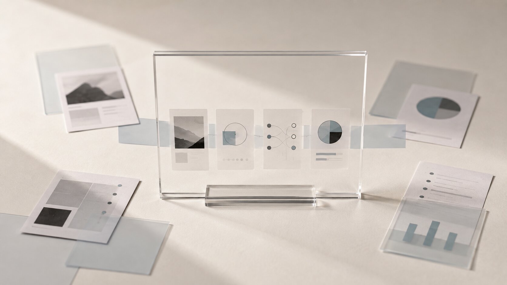
Conversion Moment Visuals: Using AI Assets at the Point of Decision
Create AI-assisted visuals that answer the final question, reduce hesitation, and help people act when they reach the point of decision.

TL;DR:
- A conversion visual should not merely attract attention. It should help someone feel ready to take the next step.
- Start with the decision, identify the hesitation behind it, and create a visual that provides the missing proof or clarity.
- Use AI to explore controlled variations, adapt approved directions, and build consistent asset sets, then review every final output with human judgment.
Most creative campaigns put a lot of effort into the beginning of the journey.
The teaser needs to stop the scroll. The cover needs to set a mood. The first campaign post needs to create curiosity. The landing page needs to look polished enough that people stay.
Then the visitor reaches the point where they are expected to do something.
Buy the ticket. Pre-save the release. Book the session. Join the mailing list. Download the pack. Order the print. Choose the paid plan.
And right there, the visual story often becomes weaker. The page shows a generic image, a block of text, and a button that asks for commitment without providing much additional confidence.
That final moment deserves its own visual strategy. A person who has already shown interest does not necessarily need another atmospheric image. They may need to see what they will receive, how it will feel in use, whether the offer is credible, or what happens after they click.
This guide explains how to design those assets, where AI is genuinely useful, and how to avoid creating conversion visuals that look impressive but fail to answer the question standing between interest and action.
Table of Contents
- Key Takeaways
- The Last Visual Has a Different Job
- Name the Decision Before You Design the Asset
- Match the Visual to the Real Source of Hesitation
- Build a Small Proof System, Not a Random Gallery
- Use AI to Develop Controlled Variations
- Protect Continuity From the First Click to the Final Action
- Review the Mobile Decision Zone
- Measure Whether the Visual Removes Friction
- Where Orias AI Fits Into the Workflow
- Frequently Asked Questions
- Sources Used
Key Takeaways
| Point | Details |
|---|---|
| Design for one decision | A conversion asset should support a specific action such as buying, booking, subscribing, downloading, or saving. |
| Answer the final hesitation | Show the result, contents, process, credibility, or next step that the person still needs to understand. |
| Keep the visual promise consistent | The landing page should feel like a natural continuation of the ad, post, email, or campaign asset that brought the person there. |
| Use fewer, stronger assets | One clear hero visual and a few supporting proof images usually work better than a crowded collection of similar options. |
| Let AI expand an approved direction | AI is useful for composition studies, format adaptation, visual variations, and asset families, but it should not invent the truth of the offer. |
| Evaluate behavior, not taste alone | Track whether the visual improves meaningful actions and reduces repeated questions or confusion. |
The Last Visual Has a Different Job
A visual that attracts attention and a visual that supports a decision are not doing the same work.
Early campaign assets can leave room for interpretation. A release teaser might show a strange object, an unfinished room, a close-up texture, or a single symbolic scene. Mystery can be useful when the goal is curiosity.
Near the point of conversion, that same ambiguity can become friction.
Someone considering a limited vinyl edition may want to see the actual package, sleeve, insert, and record color. A person booking a creative service may want to see what a completed project includes. A creator buying a template pack may want to understand the range of layouts rather than looking at another mood-driven campaign image.
| Attention-stage visual | Decision-stage visual |
|---|---|
| Creates curiosity | Creates confidence |
| Can stay suggestive | Should provide clarity |
| Introduces a mood | Shows value, proof, or outcome |
| Opens a story | Helps complete an action |
This does not mean the final visual has to become dull or purely functional. It can still feel artistic, considered, and distinctive. It simply needs to carry useful information as well as atmosphere.
Name the Decision Before You Design the Asset
A common AI workflow begins with visual generation. Someone writes a prompt, creates several striking images, and then looks for places to use them.
Conversion assets work better when the order is reversed.
Start by naming the action:
- Buy the ticket
- Pre-save the release
- Book the session
- Join the membership
- Download the resource
- Order the physical edition
- Choose a plan
- Submit an inquiry
Then complete this sentence:
Before someone takes this action, they need to see or understand...
The answer gives the visual a purpose.
An independent musician might decide that listeners need to see what makes a deluxe release different from the standard version. A visual storyteller may need to show the scale and finish of a printed work. A creative team selling a campaign package may need to show how one approved concept becomes a coordinated system of launch assets.
Use a five-line asset brief
Before generating anything, write down:
- Action: What should the person do?
- Hesitation: What could make them stop?
- Proof: What would help them continue?
- Placement: Where will the visual appear?
- Constraint: What must the image avoid implying?
This small brief prevents a common problem: using one image to communicate the product, the mood, the creator’s personality, the campaign theme, the features, and the call to action all at once.
Pro Tip: If the job of the visual cannot be described in one clear sentence, the asset probably has too many responsibilities.
Match the Visual to the Real Source of Hesitation
Different questions require different forms of visual proof.
A polished creator portrait will not explain what is included in a paid bundle. An atmospheric product render will not show whether a template is easy to use. A dramatic campaign scene will not tell someone what happens after they submit a booking request.
When the offer feels unclear
Show the contents.
Arrange the main product and supporting elements so they can be understood at a glance. This could include a physical edition with its packaging, a digital pack with several representative layouts, or a creative service shown as a small set of finished deliverables.
Avoid turning the image into a wall of tiny objects. The purpose is immediate understanding, not exhaustive documentation.
When the result is hard to imagine
Show the work in context.
Place the poster in a believable environment. Show the release identity across the cover, announcement post, and event visual. Present the creator pack inside a realistic publishing workflow. Let the person picture the finished result in their own life or work.
Baymard Institute’s product page research has repeatedly shown the importance of images that help people evaluate products, inspect details, and understand scale or real-world use.
When the person needs more trust
Show real evidence.
Use process details, authentic samples, finished work, real materials, or a clear before-and-after sequence. AI can help crop, organize, extend, clean, or adapt those materials, but it should not fabricate customer outcomes, fake interfaces, invented testimonials, or products that do not exist.
When the next step feels uncertain
Show what happens after the click.
A simple visual can explain the delivery process, booking sequence, download structure, access screen, or onboarding path. This kind of asset may not be the most dramatic image in the campaign, but it can remove a surprisingly important source of hesitation.
Build a Small Proof System, Not a Random Gallery
Near the decision point, more content is not automatically better.
A long gallery can introduce competing styles, repeat the same information, and push the primary action farther down the page. Instead, build a compact system in which every asset has a separate role.
Start with one primary visual
This image should answer the most important question.
For a physical release, it might show the full edition. For a creative service, it might show the completed visual system. For a digital toolkit, it might show the strongest representative result at a size that remains readable on mobile.
Add two or three supporting assets
Each one should add something new:
- A close detail that shows quality or finish
- A contextual image that shows real use
- A proof image that supports credibility or explains the next step
Do not fill the space with almost identical variations. A different crop is only useful when it reveals different information.
Remove assets that create new questions
Review the full decision zone and remove:
- Decorative images unrelated to the offer
- AI-generated details that do not match the real product
- Text embedded inside images when normal page text would work better
- Mixed visual styles that make the offer feel fragmented
- Repeated images that add no new information
- Elements that compete visually with the primary action
The Web Content Accessibility Guidelines encourage the use of real text instead of images of text when possible. Informative images should also have useful text alternatives so that their meaning is not limited to the visual presentation.

Use AI to Develop Controlled Variations
AI is useful when you already know what the asset needs to communicate.
It can help explore several ways to present the same proof:
- A full product view versus a closer material detail
- A clean studio setup versus a realistic use context
- A quiet composition versus a more expressive campaign version
- Horizontal, square, and vertical adaptations
- Different amounts of negative space around the call to action
- Several layouts built around the same approved visual identity
The goal is not to generate endless possibilities. It is to create a limited set of meaningful alternatives that can be compared against the decision brief.
Write prompts around function, not decoration
A useful conversion prompt should explain:
- What the image contains
- What uncertainty it should reduce
- What the viewer must notice first
- Where the image will be used
- What must not appear
For example:
Realistic editorial product scene for the order section of a limited music release. Show one complete vinyl package with the outer sleeve, inner booklet, transparent protective wrap, and colored record clearly visible. The composition should help a buyer understand exactly what is included. Clean horizontal layout, believable materials, controlled lighting, no people, no readable text, no extra merchandise, and no decorative clutter.
Once a strong direction appears, refine that direction instead of restarting the entire process with unrelated prompts.
Every generated output still needs human review. Check proportions, material accuracy, strange details, misleading features, recognizable third-party elements, and whether the asset honestly represents what the person will receive.
Protect Continuity From the First Click to the Final Action
A person should not feel as if they entered a different campaign after clicking.
If the promotional post uses warm grainy photography, a restrained palette, and close human details, the conversion page should not suddenly switch to glossy synthetic renders and unrelated typography.
The final asset does not need to repeat the original creative exactly. It should continue the same visual logic while becoming more informative.
Keep these elements connected:
- Color palette
- Lighting direction
- Material treatment
- Subject framing
- Image texture
- Typography
- Emotional tone
- The promise being made
Google Ads guidance recommends keeping landing pages relevant to the advertisement and making it easy for visitors to understand and navigate the offer. This continuity matters even outside paid advertising. It tells the visitor that they are still in the right place.
AI can support this by generating an asset family from one approved visual direction. The important phrase is “approved visual direction.” Random prompting usually creates surface-level similarity at best. Real consistency comes from clear rules.
Review the Mobile Decision Zone
A conversion visual can look excellent in a desktop mockup and become nearly useless on a phone.
Details disappear. Product components become too small. A centered subject gets cropped. Text inside the image becomes unreadable. The primary button moves below several screens of decorative content.
Google uses the mobile version of a page for indexing and recommends providing equivalent content and useful image information across mobile and desktop experiences. Image optimization also matters because large visual files can contribute heavily to page weight.
TikTok’s advertising guidance also expects landing pages to function properly on mobile devices. The platform distinguishes between a click and a landing page that successfully loads, which is a useful reminder that the experience after the click matters.
Run a real-device check
Open the page on an actual phone and ask:
- Can I understand the offer without zooming?
- Is the main subject visible immediately?
- Does the image support the button rather than compete with it?
- Does the asset still make sense after cropping?
- Can I understand the key information without reading text inside the image?
- Does the page load quickly enough on normal mobile data?
- Does the visual match the campaign asset that brought me here?
Check more than one screen size. A composition that survives a large modern phone may still fail on a smaller device.
Measure Whether the Visual Removes Friction
Creative teams naturally discuss visuals in terms of taste.
This one feels more premium. That one feels more emotional. The third option has better energy.
Those reactions matter, but they do not tell you whether the asset helps someone act.
Look at behavior connected to the decision:
- Clicks on the primary action
- Completed purchases
- Booking form submissions
- Pre-saves or sign-ups
- Add-to-cart actions
- Drop-off after opening the page
- Repeated questions before purchase
- Support requests related to delivery or contents
A visual may be helping even when the change is not dramatic. If fewer people ask what is included, the offer is probably clearer. If more people start the checkout but do not finish, the next problem may be price, form complexity, payment options, or page performance rather than the image.
Test one meaningful visual change at a time. Compare a clear product view with an atmospheric image. Compare a usage example with a flat presentation. Avoid changing the headline, price, button, layout, and image simultaneously, because the result will be impossible to interpret.
Where Orias AI Fits Into the Workflow
Orias AI helps creators move from rough ideas, references, moods, and unfinished concepts toward clearer visual directions and more usable creative packs.
For conversion moments, that can mean developing one approved campaign world into a focused set of decision-stage assets: a primary offer visual, a result image, a close detail, a contextual use scene, and platform-ready variations.
The goal is not to replace the creator’s judgment. It is to make the visual system easier to explore, refine, and prepare without losing the artistic logic that made the project distinctive in the first place.
Frequently Asked Questions
What is a conversion moment visual?
It is an image or visual asset placed near a meaningful action, such as purchasing, booking, subscribing, downloading, or registering. Its role is to provide the clarity or proof needed to support that decision.
How is a conversion visual different from an ad creative?
An ad creative usually tries to attract attention and create interest. A conversion visual appears later and helps the person understand the result, offer, credibility, or next step.
Can I use the same image throughout the whole campaign?
You can preserve the same creative direction, but each stage may need a different asset. A teaser can remain mysterious, while the purchase or booking page usually needs more specific information.
How many visuals should appear near the call to action?
One primary visual and two or three supporting images are often enough. Each additional asset should answer a different question or provide new information.
Can AI create the entire conversion asset set?
AI can help create concepts, variations, compositions, backgrounds, and format adaptations. Final assets still need human review for accuracy, brand fit, originality, rights, accessibility, and honest representation.
What are the most common conversion visual mistakes?
Common problems include excessive abstraction, mismatch with the campaign, unreadable mobile details, embedded text, visual clutter, repeated images, and AI-generated features that do not exist in the real offer.
How do I know if the visual is working?
Compare meaningful behavior before and after the change. Look at action clicks, completed purchases or sign-ups, drop-off, and the questions people ask before deciding. Test one clear visual hypothesis at a time.

Sources Used
- Google Ads Help, Optimize Your Ads and Landing Page
- Google Search Central, Mobile-First Indexing Best Practices
- Baymard Institute, Product Image and Human Model Research
- W3C Web Accessibility Initiative, Images Tutorial
- TikTok Ads Manager, Landing Page View
- Canva Help Center, Using Magic Studio Safely and Legally
- Orias AI