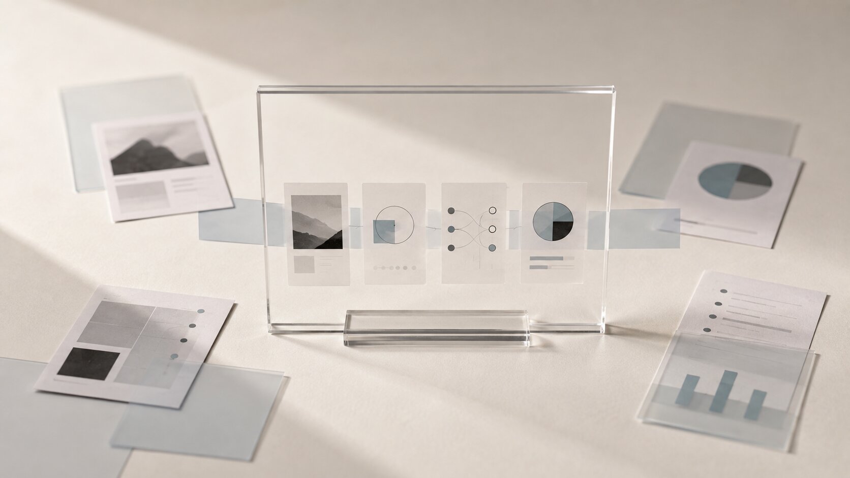
AI Thumbnail Systems: Designing Previews That Earn the First Click
Build a repeatable AI thumbnail workflow for clearer previews, stronger visual identity, faster testing, and more qualified first clicks.
TL;DR:
- A strong thumbnail makes one clear promise instead of trying to explain the whole piece of content.
- Use AI to explore controlled variations, then rely on human judgment to choose, refine, crop, and verify the final preview.
- Build a reusable system around visual hierarchy, recognizable brand rules, platform-specific formats, and real audience behavior.
Creators often spend hours making the actual thing, then leave the thumbnail until the final ten minutes.
The video is edited. The tutorial is useful. The release visual looks right. The campaign has a real idea behind it. Then someone grabs a random frame, adds a few words, increases the saturation, and hopes for the best.
That last-minute preview may be the only part most people ever see.
A thumbnail system fixes this. Not by turning every image into loud clickbait, and not by copying whatever happens to be popular that week. The goal is to create a reliable way to translate the value of your content into a small, fast visual decision.
This guide explains how to define that promise, use AI without losing taste, generate meaningful variations, keep previews recognizable, and learn from actual audience behavior.
Table of Contents
- Key Takeaways
- The Click Is Decided Before the Detail Is Seen
- Write the Thumbnail Brief Before You Generate Anything
- Give Every Preview One Visual Promise
- Turn One Direction Into a Controlled Thumbnail Family
- Design for the Feed, Not the Full-Size Artboard
- Use AI for Range, Then Remove What Feels Generic
- Test the Promise, Not Just the Decoration
- Build Thumbnail Production Into the Wider Creative Pack
- Where Orias AI Fits Into the Workflow
- Frequently Asked Questions
- Sources Used
Key Takeaways
| Point | Details |
|---|---|
| Start with a promise | Decide what the viewer should understand or feel before choosing images, text, effects, or generation settings. |
| Use one dominant idea | A thumbnail usually needs one subject, one tension point, and one clear reading path. |
| Generate controlled variations | Change one meaningful variable at a time so you can compare concepts rather than unrelated AI outputs. |
| Judge at real display size | A design that works on a large monitor may become unreadable inside a crowded mobile feed. |
| Measure qualified clicks | A higher click-through rate is useful only when viewers stay and receive what the preview promised. |
| Save the system | Keep approved layouts, prompts, crops, exclusions, and test results so the next thumbnail starts from evidence. |
The Click Is Decided Before the Detail Is Seen
A thumbnail works in a strange little window.
The viewer has not watched the video. They have not read the full caption. They do not know whether the content is thoughtful, funny, practical, cinematic, or worth their time.
They have a title, a small image, some surrounding competition, and perhaps a second to decide.
That means a preview has three jobs:
- Make the subject understandable.
- Create a reason to look closer.
- Set an expectation the content can honestly meet.
The third job is easy to ignore. A dramatic thumbnail may win curiosity while creating the wrong expectation. That can produce clicks, but it can also bring viewers who quickly realize the content is not what they thought it was.
YouTube recommends looking at click-through rate together with traffic source, impressions, audience familiarity, average view duration, and watch time. A high click-through rate paired with weak viewing behavior may mean the packaging attracted attention but failed to match the experience.
The real goal is not the largest possible number of clicks.
It is the right first click from someone who is likely to care about what comes next.
Write the Thumbnail Brief Before You Generate Anything
Opening an image generator without a brief usually creates polished confusion.
You get cinematic faces, glowing objects, dramatic lighting, floating symbols, oversized expressions, and several images that look impressive on their own. The problem is that none of them may communicate the actual content.
A useful thumbnail brief can be short. Five lines are often enough.
The Five-Line Thumbnail Brief
- Content promise: What will the viewer get?
- Viewer state: What are they struggling with, looking for, or curious about?
- Visual subject: What single person, object, result, or situation can represent the idea?
- Emotional note: Should the image feel urgent, surprising, calm, risky, useful, strange, or revealing?
- Recognition rule: What color, type treatment, framing style, texture, or recurring element connects it to your identity?
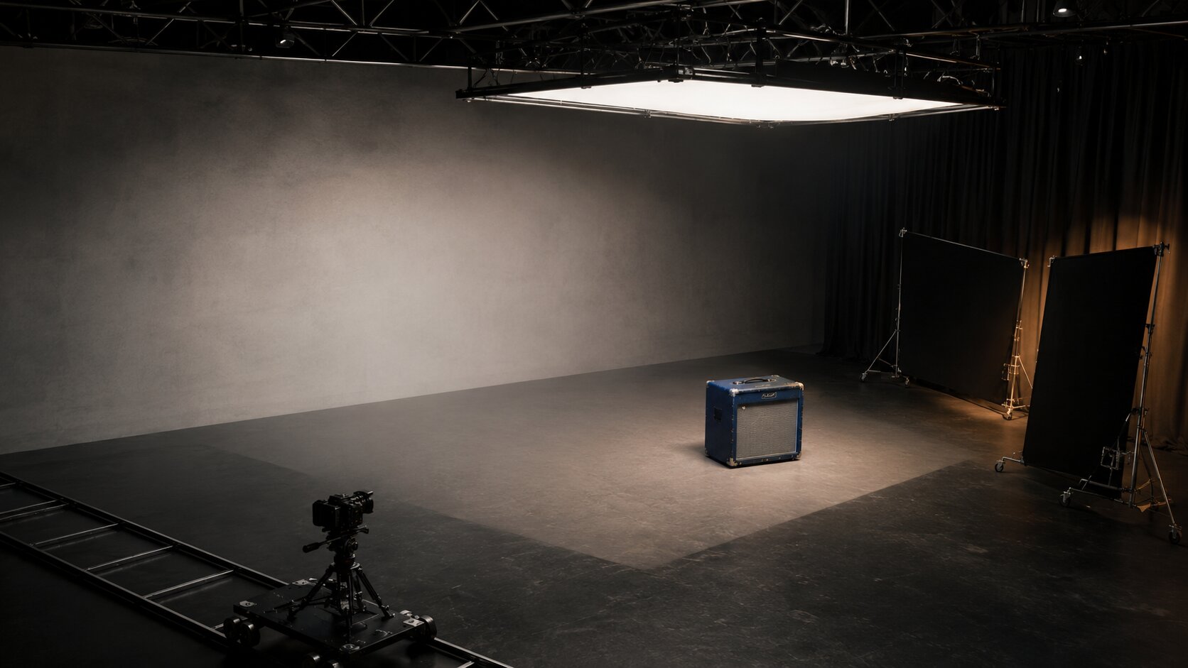
For a musician sharing a studio breakdown, the brief might look like this:
- Promise: See how the final chorus was built from a weak early demo.
- Viewer state: Curious about music production and creative transformation.
- Visual subject: One clear contrast between the rough session and the finished performance world.
- Emotional note: Discovery rather than shock.
- Recognition rule: Deep blue background, silver highlights, and condensed title typography.
Notice what is missing: camera specifications, fifteen visual metaphors, and a paragraph of adjectives.
Those details can come later. First, the idea has to work.
Pro Tip: Write three possible thumbnail promises before writing three image prompts. Many weak thumbnails are actually weak positioning decisions disguised as design problems.
Give Every Preview One Visual Promise
Small images punish indecision.
When a thumbnail tries to show the creator, the product, the before state, the after state, the logo, three supporting objects, a background scene, and six words of text, the eye has nowhere to land.
The viewer sees effort, but not meaning.
Visual hierarchy solves this by controlling what gets noticed first, second, and third. Contrast, scale, position, color, spacing, and typography can all signal which element matters most.
First Read: The Subject
This is the dominant face, object, outcome, transformation, or scene.
It should remain clear when the image is small. A detailed environment may look beautiful at full size but become visual dust in the feed.
Second Read: The Tension
Tension gives the viewer a reason to care.
- Rough versus finished
- Empty versus complete
- Hidden versus revealed
- Failed versus repaired
- Ordinary versus unexpected
- One option versus another
- A question versus a visible clue
Tension does not always need arrows, shocked expressions, or giant red circles. It can come from composition, distance, lighting, scale, interruption, or contrast between materials.
Third Read: The Context
A small amount of text or a familiar visual marker can clarify the promise.
Text should add information the image cannot carry alone. It should not repeat the title word for word.
| Weak Combination | Stronger Combination |
|---|---|
| Title: “How I Fixed My Mix” and thumbnail text: “How I Fixed My Mix” | Title: “How I Fixed My Mix” and thumbnail text: “The Chorus Was Empty” |
| Six small screenshots from a workflow | One enlarged before-and-after detail |
| A generic AI portrait looking surprised | A specific visual consequence from the content |
| A decorative logo in the largest position | A recognizable style with the actual topic as the focal point |
The best thumbnail concept is often the one you can describe in a single sentence.
- A cloudy draft becomes one clean final form.
- An unfinished release world is missing one crucial asset.
- Two similar options reveal one important difference.
That sentence becomes the visual anchor for generation, layout, and review.
Turn One Direction Into a Controlled Thumbnail Family
A thumbnail system should create consistency without making every post look cloned.
The easiest way to achieve that is to divide design choices into two groups.
Keep These Elements Stable
- One or two typography styles
- A controlled color family
- Recurring subject placement
- A consistent edge or border treatment
- A familiar lighting mood
- A standard text zone
- A preferred level of realism
- A defined approach to logos or channel marks
Let These Elements Change
- The main subject
- The emotional tension
- The scale relationship
- The location
- The key object
- The before-and-after state
- The thumbnail phrase
This creates a family resemblance. Viewers can sense that the content belongs to you without feeling as though they have already seen the exact same preview.
For an independent artist, stable rules might include midnight blue, pale cyan light, minimal text, wide negative space, and one central material form. One thumbnail could use liquid. Another could use architecture. A third might use glass or stone.
The surface changes. The world stays familiar.
This is especially useful during a release campaign. The announcement, track breakdown, visualizer, behind-the-scenes clip, and live version can each have their own promise while still feeling like parts of one release.
Design for the Feed, Not the Full-Size Artboard
Creators usually review thumbnails in the wrong conditions.
The image fills the editing window. Every texture is visible. The small labels feel readable. The background detail looks rich. Everyone approves it.
Then it appears as a small rectangle between several louder images.
Before publishing, review the thumbnail in at least four ways.
Shrink It Hard
Reduce the image until it is close to its likely mobile display size.
- Is the main subject still obvious?
- Can the text be read immediately?
- Does the tension survive?
- Do any elements merge together?
- Is there still one clear focal point?
Place It Beside Competing Previews
Do not review only against a blank canvas.
Place the image inside a rough feed mockup with several thumbnails from the same topic area. The aim is not to become louder than everyone else. It is to see whether your preview has a distinct silhouette, contrast pattern, and visual idea.
Check Every Important Crop
A single creative concept may need several preview versions:
- Horizontal video thumbnail
- Vertical cover
- Square profile grid preview
- Website card
- Newsletter image
- Social link preview
Do not assume one crop will handle all of them.
Keep the important subject away from fragile edges, but avoid pushing everything into the exact center. A safer composition can still feel intentional.
Export at Proper Quality
YouTube recommends large, high-resolution custom thumbnails and advises creators to keep designs clean and readable across devices. Its testing guidance recommends using assets of at least 1280 × 720 pixels to avoid experiment variants being downscaled.
Platform behavior can differ between standard videos, vertical formats, search placements, channel pages, and mobile feeds. Treat each output as a real delivery format, not a minor resize.
Use AI for Range, Then Remove What Feels Generic
AI is very good at giving you more options.
That is useful when you need to explore:
- Different visual metaphors
- Changes in camera distance
- Alternate subject placement
- Cleaner backgrounds
- Variations in expression
- Material or lighting choices
- Horizontal and vertical compositions
- Campaign-specific visual worlds
It becomes less useful when every option changes at once.
If version A is a studio portrait and version B is an abstract glass sculpture, you have not tested a thumbnail variable. You have changed the entire concept.
A stronger process keeps the concept stable and changes one dimension at a time.
A Controlled Generation Sequence
- Concept: Generate three genuinely different ways to express the promise.
- Composition: Choose the strongest concept, then test close-up, medium, and wide framing.
- Tension: Try visual states such as clear versus cloudy, complete versus interrupted, or ordinary versus exaggerated.
- Brand fit: Bring the winning direction into your visual world using approved color, light, texture, and typography rules.
- Platform versions: Adapt the selected image into the necessary crops and safe compositions.
Human judgment matters at every stage.
AI may produce an image with strange hands, broken typography, misleading product details, impossible objects, accidental logos, or visual references that feel too close to someone else’s recognizable work.
Even when the image is technically clean, it can still feel generic.
Watch for the usual signs:
- Dramatic light with no narrative purpose
- Random glowing elements
- Polished but meaningless background detail
- Exaggerated facial emotion unrelated to the content
- Visual symbols that have become obvious AI clichés
- Too many elements competing for attention
- A style that fits the tool more than the creator
The answer is not necessarily a longer prompt.
Often, the answer is stronger selection and more deletion.
Test the Promise, Not Just the Decoration
Thumbnail testing becomes useful when the variations represent different ideas.
Changing blue text to yellow text may help, but it rarely teaches you as much as testing two different viewer promises.
- Version A: Focuses on the finished result.
- Version B: Focuses on the frustrating problem.
- Version C: Focuses on an unexpected transformation.
YouTube currently allows eligible creators to test up to three titles, thumbnails, or title-and-thumbnail combinations. Its system evaluates performance using watch time rather than simply choosing the variation that produces the most clicks.
That distinction matters.
A thumbnail should not only open the door. It should lead into the right room.
Record More Than the Winning Thumbnail
For each published asset, save:
- Thumbnail version
- Title used with it
- Traffic source
- Impressions
- Click-through rate
- Average view duration
- Watch time from impressions
- Qualitative audience feedback
- What changed between versions
Do not make decisions from tiny samples or immediate fluctuations. YouTube advises waiting for enough impressions and considering traffic-source differences before interpreting click-through rate changes.
Over time, patterns will begin to appear.
Perhaps your audience responds to visible outcomes rather than abstract concepts. Maybe clean object-led previews work better than portraits. Existing subscribers may prefer familiar visual language while new viewers respond to more explicit context.
Those patterns become part of the system.
Build Thumbnail Production Into the Wider Creative Pack
A thumbnail should not be an isolated image created after everything else is complete.
Plan it while the content is still being made.
During a video shoot, capture dedicated stills with extra negative space. During a music release, generate preview concepts alongside the cover, teaser frames, and visualizer. During a campaign, define the thumbnail promise while choosing the headline and content angle.
This creates better source material and reduces the need to rescue weak frames later.
A practical thumbnail asset pack might contain:
- Master preview concept
- Clean image without text
- Horizontal thumbnail
- Vertical cover
- Square crop
- Two alternate text treatments
- Dark and light background options
- Source prompt or generation notes
- Editing file
- Rights and usage notes
- Test variants
- Final performance observations
This may sound like extra work. In practice, it prevents repeated work.
The next time you publish a related piece, you already have a visual direction, reusable layout logic, crop rules, and evidence from the previous release.

Where Orias AI Fits Into the Workflow
Orias AI helps creators move from a loose content idea toward a clearer thumbnail system without treating every preview as a separate design problem.
You can begin with a mood, reference, release concept, story angle, or rough creative direction. From there, the idea can be shaped into a more coherent visual world with thumbnail concepts, promo assets, release visuals, voice variants, and platform-ready creative packs that feel connected.
The useful part is not simply generating more images.
It is building a clear relationship between the content promise, the visual direction, the variations you explore, and the final assets you decide to publish.
Frequently Asked Questions
What Is an AI Thumbnail System?
An AI thumbnail system is a repeatable workflow for planning, generating, editing, testing, and saving thumbnails. It combines creative direction, design rules, AI-assisted variation, platform formatting, human review, and performance data.
Can AI Create a Complete Thumbnail Automatically?
AI can create source images, compositions, concepts, and variations, but the result still needs review. Text, brand accuracy, visual clarity, platform crops, usage rights, and the honesty of the content promise should be checked by a person.
How Much Text Should a Thumbnail Include?
Use only the text needed to add context or tension. A short phrase is usually easier to read than a complete sentence. Test the design at real feed size and remove words that merely repeat the title.
Should Every Thumbnail Use the Same Template?
No. Keep a few recognition rules stable, such as color behavior, typography, lighting, or composition style, while changing the subject and tension for each piece of content. Consistency should create familiarity rather than repetition.
What Should I Test First?
Test different promises before testing minor decoration. Compare a result-led version, a problem-led version, and a transformation-led version. This gives you more useful information than changing only a color or font.
Does a High Click-Through Rate Mean the Thumbnail Works?
Not by itself. Check whether viewers stay, whether watch time is healthy, where the impressions came from, and whether the content satisfies the expectation created by the preview.
How Can Musicians Use a Thumbnail System?
Musicians can build connected previews for music videos, visualizers, studio breakdowns, live sessions, release announcements, interviews, and behind-the-scenes content. The system helps each asset carry a distinct idea while staying inside the same release world.
Sources Used
- YouTube Help, Thumbnail and Title Tips
- YouTube Help, A/B Test Titles and Thumbnails
- YouTube Help, Impressions and Click-Through-Rate FAQs
- YouTube Help, Decoding CTR and Impressions in YouTube Analytics
- YouTube Official Blog, YouTube Studio Explained
- TikTok for Business, Search Ads Creative
- Canva Design School, The Ultimate Guide to Visual Hierarchy
- Adobe Express, Basic Principles of Graphic Design
- Orias AI