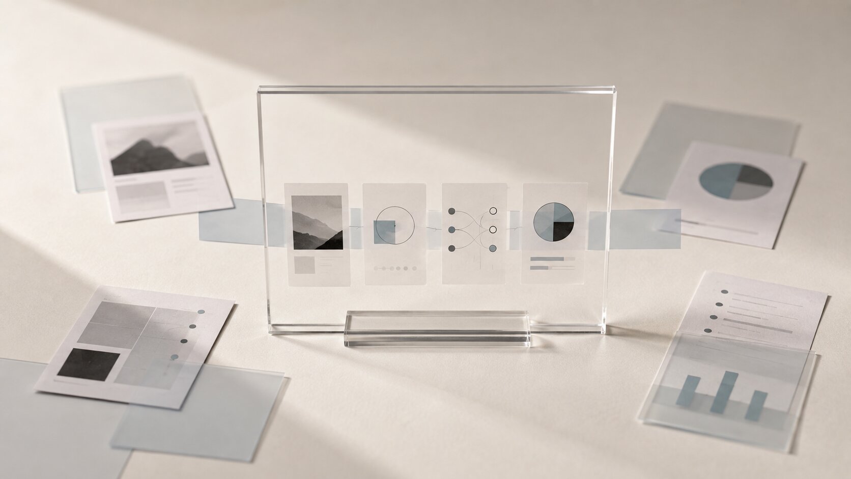
Visual Search Readiness: Designing AI Assets for Discovery Across Search, Social and AI Answers
Design AI assets that are easier to discover across Google, social platforms, visual search and AI-powered answers.

TL;DR:
- Visual search readiness means designing your images so people, platforms, and AI systems can understand what they are looking at.
- It is not just about making something beautiful.
- The practical move is simple: create clear, consistent assets, give them useful context, publish them in the right formats, and avoid treating AI output as finished the second it appears.
A visual can look great and still be hard to find.
That’s the annoying part. You can spend hours shaping a cover, campaign image, teaser, thumbnail, or mood-led AI visual, then watch it disappear into the feed because the platform doesn’t quite understand it. Or because it gets cropped badly. Or because the file name says final-final-03.png, the page around it says almost nothing, and the image itself could mean five different things depending on who’s looking.
Search has changed too. People don’t only type queries into Google anymore. They search with screenshots, camera uploads, social feeds, saved posts, AI answers, recommendations, thumbnails, and “show me something like this” behavior. Google Lens lets people search using a photo, camera, or almost any image to find visually similar images and related content. Pinterest Lens also lets users upload or select an image to discover related ideas.
So for creators, musicians, artists, and visual storytellers, the job is no longer just “make a nice asset.” The job is to make a visual that carries enough meaning to travel. Across search. Across social. Across AI answers. Across the tiny thumbnail someone notices while half-scrolling on their phone.
This guide walks through how to design AI-assisted assets that are more discoverable without flattening your style into something generic.
Table of Contents
- Key Takeaways
- Design the Image So It Can Be Understood Without the Caption
- Build One Visual Idea, Then Adapt It for Each Discovery Surface
- Give Search Engines the Context They Need
- Make Social Assets Searchable, Not Just Scrollable
- Prepare Your Visuals for AI Answers and Multimodal Search
- Use AI for Variations, Then Curate Like a Human
- A Simple Visual Search Readiness Checklist
- How Orias AI Fits Into This Workflow
- Frequently Asked Questions
- Sources Used
Key Takeaways
| Point | Details |
|---|---|
| Clear visuals travel better | If the main subject, mood, and visual signal are easy to read, the asset has a better chance of working across thumbnails, feeds, visual search, and AI summaries. |
| Context matters as much as the image | Google says it uses surrounding page content, captions, titles, filenames, and alt text to understand image subject matter. |
| One format is not enough | A cover, Reel, thumbnail, blog image, and social teaser all need different crops and emphasis, even if they share the same creative direction. |
| AI output needs a review layer | AI can help explore options quickly, but taste, originality, platform fit, and rights checks still need human judgment. |
| Discovery starts before publishing | Search readiness should be part of the creative workflow, not something added after the asset is already exported. |
Design the Image So It Can Be Understood Without the Caption
A good discovery-ready visual has a clear read.
Not boring. Not obvious. Just clear enough that the viewer can answer, almost instantly: what kind of thing am I looking at?
For a musician, that might mean the release visual has one strong emotional world: cold industrial night, soft nostalgic bedroom, sun-burned desert, glossy club energy, whatever fits the sound. For a creator, it might mean a visual system that clearly points to “tutorial,” “behind the scenes,” “new drop,” “case study,” or “personal story.”
The common mistake is making AI visuals too dense. Too many objects. Too many textures. Too many symbolic details. It may feel rich while you’re generating it, but it becomes muddy in a small crop.
Start with a visual sentence
Before prompting or designing, write one plain sentence:
“This image should feel like a quiet, cinematic launch moment for an independent electronic release.”
Or:
“This asset should show a handmade fashion collection as earthy, tactile, and slightly surreal.”
That sentence becomes the anchor. Every visual choice should support it.
Ask yourself:
- What is the main subject?
- What mood should someone feel in two seconds?
- What should not be in the image?
- Would this still make sense as a small thumbnail?
- Would a search system have enough clues to understand the topic?
This is especially important with AI-generated assets because the tool can easily add decoration that looks impressive but says nothing. A discoverable image usually has fewer ideas and stronger signals.
Avoid “aesthetic soup”
Aesthetic soup is what happens when the image has a vibe but no readable meaning.
You’ve seen it: neon smoke, chrome shapes, dreamy lighting, random flowers, floating fabric, cinematic blur, maybe a person facing away. Pretty, but hard to place.
For visual search, that is a problem. For social discovery, it is also a problem. People might like the mood, but they may not understand why they should care.
Better: keep the mood, but make the subject sharper. A music release visual can still be abstract, but it should have a recognizable visual world. A campaign image can be surreal, but the object hierarchy should make sense. A thumbnail can be artistic, but it still needs a focal point.
Build One Visual Idea, Then Adapt It for Each Discovery Surface
The same asset should not be forced everywhere.
A square album cover is not a vertical short-form video cover. A YouTube thumbnail is not an Instagram carousel slide. A blog hero image is not a TikTok ad. Each surface gives the viewer a different amount of space, time, and context.
Spotify’s cover art requirements call for a 1:1 image between 640px and 10000px wide and tall, in TIFF, PNG, or JPG, with sRGB color space. Apple Music cover art must be a perfect square and at least 4000 x 4000 pixels. YouTube thumbnail guidance recommends 1280 x 720 pixels with a 16:9 aspect ratio. TikTok’s in-feed ad specs recommend vertical 9:16 video, with vertical dimensions at least 540 x 960px.
That does not mean you need a totally new concept for every platform. It means you need a flexible system.
Think in asset families
Instead of creating one image, create a family:
| Asset Type | Best Use | Creative Adjustment |
|---|---|---|
| Square master visual | Album cover, profile grid, release artwork | Strong central composition, readable at small size |
| Vertical crop | Reels, Stories, TikTok, Spotify Canvas direction | More breathing room above and below, safe central subject |
| Wide crop | Blog hero, YouTube, campaign banner | Clear left/right balance, space for layout if needed |
| Thumbnail variant | YouTube, social previews, search snippets | Higher contrast, simpler subject, fewer tiny details |
| Detail crop | Carousel, teaser, behind-the-scenes post | Close-up texture, object, face, or visual motif |
This is where AI can help a lot. You can explore different compositions and crops around one idea. But don’t let each variation drift into a new universe. Keep the palette, lighting, subject logic, and mood connected.
Pro Tip:
Create the square, vertical, and wide versions before you publish anything. If you only discover later that your best image breaks in a 9:16 crop, you’ll either compromise the design or rush a weaker replacement.

Give Search Engines the Context They Need
Search engines are not mind readers.
They use signals around the image to understand what it is, where it belongs, and when it might be useful. Google’s image SEO guidance says it extracts information about an image from the page content, including captions and image titles, and recommends placing images near relevant text on relevant pages. Google also recommends descriptive filenames, titles, and alt text for images.
So yes, the visual matters. But the words around it matter too.
Use filenames that say something
Bad:
image-04.pngnew-cover-final.pngai-art-v2.jpg
Better:
midnight-electronic-album-cover-blue-glass.jpegindependent-fashion-campaign-earth-tones-lookbook.jpegabstract-release-visual-amber-liquid-promo.jpeg
A good filename is not stuffed with keywords. It is just honest and specific.
Write alt text like a person
Alt text should describe the image for accessibility and context. Don’t turn it into a keyword dump.
Weak alt text:
“AI music visual art creative album cover promo aesthetic”
Better:
“Abstract blue glass album cover artwork for an electronic music release”
Or:
“Warm studio portrait visual for an independent artist release campaign”
Keep it useful. If the image is decorative, say less. If it carries meaning, describe the meaning clearly.
Place the image near relevant copy
If you publish a release visual on a landing page, don’t leave it floating without context. Put it near the track title, artist name, release date, genre cues, and a short description of the creative world.
For a blog post, place images near the section they support. For a campaign page, match the image to the message around it. For a portfolio, explain the project, format, and intent.
Structured data can also help search systems understand page content. Google says it uses structured data to understand the content of a page and gather information about entities such as people, books, or companies. For creators, this does not mean adding schema everywhere blindly. It means your website should be technically clean enough that important creative work is not hidden from search.
Make Social Assets Searchable, Not Just Scrollable
Social discovery is messy.
Someone may find you through a Reel cover, a saved carousel, a TikTok search, an Instagram Explore result, a YouTube thumbnail, or a repost. The platform may read your caption, audio, visual content, engagement signals, profile topic, and probably a lot more than you can directly control.
What you can control is whether your asset communicates quickly.
Design for the crop you’ll actually get
A vertical asset may look perfect in your design tool and still fail in the feed because buttons, captions, profile icons, or interface elements cover key details.
Meta’s Instagram Reels ad guide lists 9:16 as the recommended ratio for Reels image ads and shows 1440 x 2560 pixels as the recommended resolution. TikTok’s ad policy also expects ad content to be legible and high resolution, with standard video sizes including 9:16, 1:1, and 16:9.
For organic creators, the same basic idea applies: keep the important stuff readable and safely placed.
A simple rule:
- Put the main subject near the center.
- Don’t place tiny text at the edges.
- Keep faces, titles, product details, or visual hooks away from UI-heavy zones.
- Test the asset as a phone screenshot before posting.
Make the first frame work harder
For short-form video, the first frame and cover image matter. They help people decide whether to stop, tap, save, or ignore.
If you are promoting a music release, the cover might carry the mood, but the short-form teaser needs movement, tension, or a visual reason to stay. Spotify Canvas, for example, is a 3 to 8 second vertical 9:16 visual loop that appears in the Now Playing View instead of album artwork.
That’s a different job than cover art. A cover can be iconic and still. A Canvas-style loop needs motion logic. A Reel cover needs instant recognition. A YouTube thumbnail needs contrast and curiosity.
Same world. Different job.
Prepare Your Visuals for AI Answers and Multimodal Search
AI answers are changing how people discover content, but the basics are still surprisingly grounded.
Google’s own guidance for AI features says site owners should make content crawlable, easy to find through internal links, available in textual form, supported by high-quality images and videos when useful, and aligned with structured data that matches visible page content.
That last part matters. AI systems need context. If your image is strong but your page is vague, the image has less to attach to.
Don’t hide the meaning inside the image only
If your release visual includes the entire concept, but the page copy says almost nothing, AI systems may not understand the story behind it.
Write a short description:
- What is the project?
- Who made it?
- What is the visual direction?
- What format is the asset?
- What mood or genre does it belong to?
- Is it cover art, campaign art, a teaser, a poster, or a behind-the-scenes visual?
This does not need to be long. It just needs to be real.
Example:
“A dark blue abstract release visual for an ambient electronic single, built around glass textures, soft reflections, and a quiet night-drive mood.”
That line gives search and AI systems more to work with than “new artwork out now.”
Use consistent naming across the campaign
If the project is called Night Bloom, don’t publish assets under five unrelated names.
Use a consistent pattern:
night-bloom-cover-art.jpegnight-bloom-vertical-teaser.jpegnight-bloom-youtube-thumbnail.jpegnight-bloom-press-visual.jpeg
Then keep the same project language in captions, page titles, alt text, and descriptions.
This helps humans too. A fan, editor, playlist curator, or collaborator can understand the campaign faster.
Use AI for Variations, Then Curate Like a Human
AI is useful in the messy middle of the creative process.
It can help you explore moods, generate layout directions, test visual metaphors, create crop options, build promo variations, and turn rough references into something more concrete. But it should not replace your eye.
The biggest risk with AI visuals is not that they look bad. Often, they look too good too quickly. That speed can trick you into accepting the first polished thing instead of asking whether it actually fits.
A better AI asset workflow
Use this simple sequence:
- Define the creative direction. Write the mood, subject, palette, references, exclusions, and format needs.
- Generate broad options. Explore different compositions, not just tiny style changes.
- Select based on purpose. Choose the image that fits the campaign, not just the prettiest one.
- Refine the winner. Clean up details, simplify clutter, improve crop safety, adjust color, and check readability.
- Create platform variants. Export square, vertical, wide, thumbnail, and detail crops.
- Add publishing context. Filename, alt text, caption, page copy, metadata, and internal links.
- Review after publishing. Check how it appears in search previews, feeds, link cards, and profile grids.
Mistakes to avoid
Don’t publish a raw AI output without checking hands, faces, text-like marks, logos, artifacts, or accidental copyrighted-looking elements.
Don’t use a different visual style for every post if you are trying to build recognition.
Don’t assume one prompt equals a campaign.
And don’t let the tool make the final taste decision. That part is still yours.
A Simple Visual Search Readiness Checklist
Use this before publishing an AI-assisted asset.
Creative clarity
- The image has one clear main idea.
- The subject is readable at thumbnail size.
- The mood matches the project, release, or campaign.
- The visual style fits your wider identity.
- There is no random AI clutter or accidental detail.
Platform fit
- The asset has the right crop for its intended platform.
- Important details are safe from UI overlays.
- Text, if used, is large enough to read.
- The image still works without sound or motion.
- A square, vertical, and wide version exist when needed.
Search context
- The filename is descriptive.
- Alt text describes the image clearly.
- The image appears near relevant page copy.
- Captions and titles support the same topic.
- The page is crawlable and internally linked where relevant.
AI answer readiness
- Important information is available in text, not only inside the image.
- The visible page content matches any structured data used.
- The project, creator, format, and visual direction are easy to understand.
- The asset is connected to a real page, not only a floating social post.
Final human review
- The image has been checked for artifacts.
- Rights, likeness, and brand safety have been considered.
- The final asset feels like your world, not just an AI style sample.
- The campaign has enough consistency across formats.
How Orias AI Fits Into This Workflow
Orias AI is useful for the part most creators struggle to keep organized: turning rough ideas into a visual system that can actually be published.
Instead of jumping from one prompt to one disconnected image, you can use Orias AI to shape moods, references, creative directions, release visuals, promo assets, voice variants, and publish-ready creative packs around one clear concept. That matters for visual search readiness because discoverability is not only a technical SEO task. It starts with a coherent visual world.
For an artist, that might mean building the cover, vertical teaser direction, social promo images, and campaign copy from the same emotional core. For a creator, it might mean turning one content idea into a consistent set of thumbnails, post visuals, and supporting assets. For a small creative team, it can help reduce the usual drift between “nice image” and “usable campaign.”
The goal is not to make every asset look identical. It is to make every asset feel connected enough that people, platforms, and search systems can recognize what it belongs to.
Frequently Asked Questions
What does visual search readiness mean?
Visual search readiness means your image is clear, well-contextualized, and technically prepared for discovery through search engines, social platforms, visual search tools, and AI-powered answers. It includes the image itself, but also filenames, alt text, captions, page copy, formats, and publishing context.
Can AI-generated images rank in visual search?
AI-generated images can be indexed and discovered if they are published on crawlable pages and supported by useful context. The issue is not whether the image was made with AI. The issue is whether it is clear, relevant, original enough for your use case, and surrounded by information that helps search systems understand it.
How should musicians prepare release visuals for discovery?
Musicians should create a square cover image, vertical social or Canvas-style assets, wide promo crops, and thumbnail-friendly versions from the same visual direction. Cover art also needs to follow platform requirements, such as square format rules for Spotify and Apple Music.
Is alt text still important for AI and visual search?
Yes. Alt text helps describe image content, especially when the image carries meaning. It should be clear and human-readable. Google’s image guidance recommends descriptive filenames, titles, and alt text, and also looks at surrounding page content to understand images.
Should I use the same image on every platform?
No. Use the same creative direction, but adapt the asset. A square cover, 9:16 Reel, 16:9 YouTube thumbnail, and blog hero all need different framing. Reusing one file everywhere often leads to bad crops, weak thumbnails, or hidden details.
What is the biggest mistake creators make with AI visuals?
The biggest mistake is treating a polished AI image as finished. A visual still needs creative review, cleanup, cropping, metadata, platform checks, and context. AI can speed up exploration, but it does not automatically understand your audience, release plan, taste, or long-term identity.
Do AI answers care about images?
AI-powered search experiences can use many kinds of signals, and Google’s guidance for AI features specifically recommends supporting textual content with high-quality images and videos when helpful. Still, important meaning should not live only inside the image. Put the project details, creator information, and visual context in readable text too.
Sources Used
- Google Search Central: Image SEO Best Practices
- Google Search Central: AI Features and Your Website
- Google Search Central: Introduction to Structured Data
- Google Lens: Search What You See
- Pinterest Help: Pinterest Lens
- Spotify for Artists: Cover Art Requirements
- Spotify for Artists: Canvas Guidelines
- Apple Music for Artists: Cover Art Guidelines
- YouTube / Google Ads Help: Thumbnail Specs
- TikTok Ads Manager: In-Feed Ad Specs
- Meta Business: Instagram Reels Ad Specs
- Orias AI