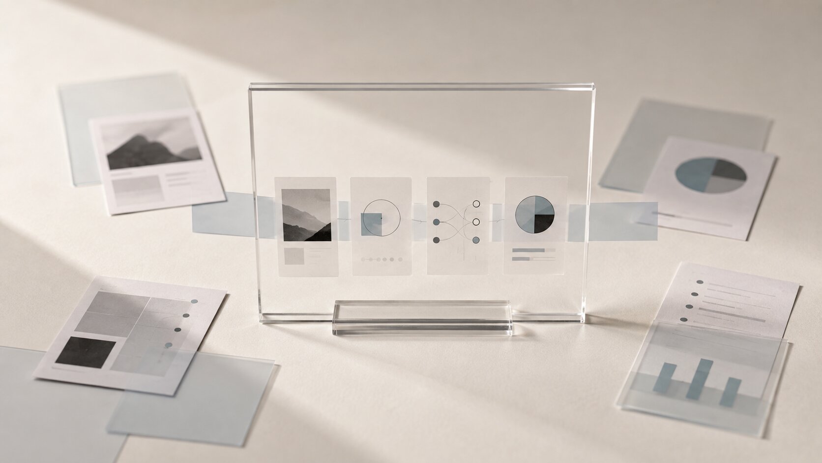
Offer-Led Content: Designing AI Assets Around the Promise, Not the Aesthetic
Design AI assets around the core promise of your offer, not just the look, so every visual supports a clearer campaign.

TL;DR:
- Offer-led content starts with what the audience is being promised, not what the asset should look like.
- The most useful AI workflow is to define the promise first, then use mood, format, composition, and platform choices to support that promise.
- A strong visual is not just beautiful. It makes the reason to care easier to feel.
A lot of AI-generated content looks impressive for about three seconds.
Then the problem shows up.
The image has style, lighting, texture, maybe even a polished campaign feel. But it doesn’t really say anything. You can’t tell what the creator is offering, why the viewer should care, or what feeling the audience is supposed to leave with. It’s just a nice-looking asset floating without a job.
That’s the gap this guide is about.
For artists, musicians, visual storytellers, and small creative teams, AI can make visuals faster. But speed doesn’t automatically create clarity. The real advantage comes when you use AI to express a promise: the reason someone should listen, watch, save, click, follow, buy, or remember. Once that promise is clear, the aesthetic becomes a tool. Not the starting point.
Table of Contents
- Key Takeaways
- What Offer-Led Content Actually Means
- Write the Promise Before You Generate Anything
- Turn the Promise Into Visual Direction
- Build an Asset System Instead of One Pretty Image
- Use AI to Explore the Promise From Different Angles
- Match the Promise to the Platform
- Review the Asset Like a Real Viewer Would
- How Orias AI Fits an Offer-Led Workflow
- Frequently Asked Questions
- Sources Used
Key Takeaways
| Point | Details |
|---|---|
| Start with the promise | Before choosing style, define what the audience should understand, feel, or want. |
| Aesthetic should support the offer | Visual style matters, but only when it makes the promise easier to read. |
| One idea needs multiple assets | A release, drop, product, or story usually needs thumbnails, teasers, covers, loops, and social crops. |
| AI is best for controlled variation | Use AI to explore angles, moods, formats, and compositions after the direction is clear. |
| Platform context changes the asset | A Spotify Canvas, TikTok teaser, YouTube thumbnail, and Instagram Reel do not carry the promise in the same way. |
| Human review is non-negotiable | Final assets still need taste, context, rights checks, resizing, and platform-specific review. |
What Offer-Led Content Actually Means
Offer-led content means the creative asset is built around the thing being promised to the viewer.
That promise might be simple:
- “This song will feel like late-night escape.”
- “This visual pack helps your release look more serious.”
- “This video shows how the product solves one annoying problem.”
- “This campaign invites people into a darker, more cinematic world.”
- “This post gives creators a faster way to plan a launch.”
The offer is not always a discount, product, or sales pitch. For artists, the offer is often emotional. A mood. A world. A moment. A point of view. A reason to stop scrolling because the work feels like it belongs to them somehow.
The mistake is starting with questions like:
“What style should this be?”
“Should it look cinematic?”
“Can we make it more futuristic?”
“What if it had chrome liquid and dramatic lighting?”
Those questions are fine later. But if you ask them first, the asset can become decorative. It may look polished, but it won’t carry meaning.
A better starting question is:
“What are we promising the audience if they give this asset their attention?”
That small shift changes the whole workflow.
| Aesthetic-led asset | Offer-led asset |
|---|---|
| Starts with style | Starts with audience promise |
| Looks good in isolation | Works inside a campaign |
| Often feels generic | Feels tied to a specific idea |
| Depends on prompting harder | Depends on clearer direction |
| May be hard to repurpose | Can expand into multiple formats |
The goal is not to make ugly, practical content. It’s to make beautiful work that actually knows what it’s doing.
Write the Promise Before You Generate Anything
Before opening an AI image tool, write one sentence.
Not a paragraph. Not a brand manifesto. One plain sentence.
Use this structure:
This asset should make people feel or understand that [promise], so they want to [next action].
Promise examples
For a musician:
This asset should make people feel that the new single is intimate, nocturnal, and emotionally raw, so they want to pre-save or listen when it drops.
For a digital creator:
This asset should make people understand that this guide simplifies AI content planning, so they want to read the full post.
For a visual storyteller:
This asset should make people feel like they are entering a strange, elegant, dreamlike world, so they want to follow the series.
For a product campaign:
This asset should make people understand that the product removes a frustrating step, so they want to see how it works.
This sentence becomes the creative anchor.
It helps you decide what belongs and what doesn’t. If a generated image looks cool but doesn’t support the promise, it’s not the right image. Maybe it becomes a reference. Maybe it inspires another direction. But it shouldn’t become the final asset just because it looks expensive.

A simple promise check
Before generating, answer these five questions:
- Who is this for?
- What are they supposed to notice first?
- What feeling should stay with them?
- What action or thought should happen next?
- What would make the asset misleading, confusing, or too vague?
That last question matters more than people think. A lot of weak AI content is not bad because it’s low quality. It’s bad because it promises the wrong thing.
A gentle folk release shouldn’t look like a cyberpunk energy drink campaign unless that contrast is intentional. A practical creator guide shouldn’t look like abstract luxury perfume unless the promise is more emotional than instructional. A product teaser shouldn’t hide the actual product benefit behind a pile of visual effects.
Good creative direction is often subtraction.
Turn the Promise Into Visual Direction
Once the promise is clear, then you can talk about the look.
But now the look has a job.
Think of visual direction as the bridge between the promise and the asset. It translates an idea into decisions about mood, composition, color, texture, pacing, and format.
Here’s a practical way to do it.
1. Choose the emotional temperature
Ask whether the promise should feel:
- Warm or cold
- Quiet or intense
- Raw or polished
- Personal or cinematic
- Strange or familiar
- Fast or slow
- Clean or messy
A musician releasing a vulnerable acoustic track may need soft light, close framing, tactile texture, and visual restraint. A creator launching a bold tutorial series may need sharper contrast, clearer hierarchy, and more direct framing.
Neither is better. They serve different promises.
2. Define the visual evidence
Visual evidence means the things in the asset that help the audience believe the promise.
| Promise | Visual evidence |
|---|---|
| “This release feels intimate” | Close crops, quiet rooms, low light, human-scale details |
| “This creator knows the workflow” | Ordered surfaces, clear asset families, structured layouts |
| “This product saves time” | Before/after contrast, removed clutter, visible simplification |
| “This campaign is premium” | Negative space, controlled materials, restrained color, careful lighting |
| “This story feels surreal” | Dreamlike scale, unfamiliar textures, symbolic objects |
This is where AI becomes useful. You can test visual evidence quickly. But the evidence still has to point back to the promise.
3. Set boundaries before variation
AI tools are very good at adding more. More glow. More detail. More objects. More drama.
That is not always helpful.
Set boundaries like:
- No readable text inside generated images
- No random interface screens
- No fake charts or fake dashboards
- No unrelated futuristic elements
- No style references you don’t have rights to use
- No visual clichés that weaken the concept
For creative teams, this boundary list is almost as important as the prompt. It protects the promise from getting diluted.
Build an Asset System Instead of One Pretty Image
Most campaigns do not need one asset.
They need a small system.
A musician may need cover art, a Spotify Canvas, teaser clips, vertical story posts, YouTube visualizer thumbnails, and maybe a release announcement. A creator may need a blog hero image, social previews, carousel slides, short-form hooks, and a newsletter visual. A product team may need a landing page hero, ad variations, comparison graphics, and retargeting creatives.
That’s why offer-led content should expand from one promise into several asset roles.
| Asset role | What it should do |
|---|---|
| Hero asset | Establish the main world, mood, or campaign idea |
| Teaser | Create curiosity quickly |
| Thumbnail | Make the promise readable in a crowded feed |
| Loop or motion asset | Keep the feeling alive without overexplaining |
| Story/Reel asset | Deliver the promise in a vertical, fast-viewing context |
| CTA asset | Make the next step obvious |
| Repurposed crop | Adapt the same idea without losing identity |
This is where many AI workflows break. People generate one beautiful square image and then force it into every placement.
That usually creates problems. Important details get cropped. The composition feels weak in vertical format. The thumbnail is too complex at small size. The story post has no clear focal point. The campaign starts to feel inconsistent because every asset was improvised separately.
A better approach is to create a master direction, then generate or adapt assets by role.
The promise stays the same. The expression changes.
Use AI to Explore the Promise From Different Angles
AI is not just a machine for making final images. It can be much more useful as a creative exploration tool.
Once you have the promise, ask AI to explore variations like:
- calmer vs more intense
- literal vs symbolic
- product-focused vs mood-focused
- minimal vs detailed
- human-centered vs object-centered
- dark version vs light version
- teaser version vs announcement version
The important part is that each variation should still answer the same creative brief.
Don’t ask for “10 cool images for my new release.” That gives the tool too much room to wander.
Ask for something more grounded:
“Create visual directions for a late-night electronic single that promises emotional escape, quiet tension, and a sense of moving through an empty city. The assets need to work as cover art, vertical teaser, and short looping visual.”
That prompt gives AI a job.
Use variation to compare, not to avoid choosing
There’s a trap here. AI makes it easy to keep generating forever.
One more version. One more mood. One more lighting setup. One more surreal object.
At some point, this becomes avoidance. The real creative work is choosing.
A practical rule: generate enough to compare directions, then stop and curate. Pick the asset that communicates the promise most clearly, not the one with the most impressive surface.

Keep a decision log
For bigger campaigns, write down why you chose the final direction.
Something like:
“We chose the dark green glass direction because it feels intimate, premium, and slightly unstable. It supports the release promise better than the brighter chrome direction, which felt too energetic.”
This helps later when you repurpose the campaign. You’re not guessing what the visual identity means. You’ve already named it.
Match the Promise to the Platform
The same promise behaves differently depending on where the asset appears.
A viewer on TikTok is often moving fast. A viewer on Spotify is already listening. A viewer on YouTube may be deciding whether the title and thumbnail are worth a click. A viewer on Instagram may see the asset as part of a broader visual identity.
So the platform changes the expression of the promise.
TikTok and short-form vertical video
TikTok’s own creative guidance recommends building for the platform, using vertical 9:16 video, at least 720p resolution, keeping content inside safe zones, and making the proposition clear early. TikTok also recommends using hooks, captions or text overlays, and a clear CTA where relevant. TikTok Creative Best Practices
For offer-led content, this means the promise cannot wait.
The first seconds should make the viewer understand the angle. Not the whole story, just the reason to keep watching.
For a creator, that might be:
- “Your AI visuals look good but say nothing.”
- “Here’s how to turn one release idea into five assets.”
- “Stop prompting for style before you know the promise.”
For an artist, it might be more visual than verbal:
- A striking first frame
- A strong mood shift
- A repeated symbol
- A moment that matches the song’s emotional hook
The mistake is treating TikTok as a dumping ground for resized campaign visuals. A vertical crop is not automatically a vertical idea.
Spotify Canvas and music release loops
Spotify says Canvas is a short vertical visual loop that appears in the Now Playing view instead of album artwork, with requirements including 3 to 8 seconds, 9:16 format, 720px to 1080px tall, and MP4 or JPG format. Spotify also recommends avoiding rapid cuts, considering phone cropping, and connecting the Canvas theme to album art or other artist visuals. Spotify Canvas Guidelines
That makes Canvas a perfect example of offer-led thinking.
The viewer is already inside the song. So the asset doesn’t need to explain everything. It needs to deepen the promise of the track.
A strong Canvas might show one symbolic motion, one emotional loop, or one visual motif from the release world. It should feel connected, not random.
YouTube thumbnails and titles
YouTube’s thumbnail and title guidance is very direct: titles should accurately represent the video, stay succinct, and put important words near the beginning. YouTube also recommends checking analytics and understanding how thumbnails and titles work together to create interest. YouTube Thumbnail & Title Tips
That’s offer-led content in plain terms.
The thumbnail makes a promise. The title clarifies it. The video has to deliver it.
For AI-assisted thumbnails, avoid overloading the image with detail. The question is not “Is this image impressive?” The question is “Can someone understand the reason to click when this is small, fast, and surrounded by other options?”
YouTube and video ad structure
Google’s ABCD framework for YouTube ads breaks effective creative into Attention, Branding, Connection, and Direction. In simple terms: hook attention, make the brand or source clear, help people feel or understand something, and give them a next step. Google Ads ABCD Framework
Even if you are not running ads, that structure is useful.
For creators, the “brand” may be your artist name, channel identity, series concept, or visual signature. “Direction” may be listen, watch, save, read, subscribe, pre-save, or join the release day.
Aesthetic alone does not cover those jobs.
Instagram, Reels, and Meta placements
Meta’s ads guide for Instagram Reels lists 9:16 as the ratio for Reels video ad specs, and Meta’s placement guidance often changes by surface, which is why it’s safer to plan assets by placement instead of assuming one crop will work everywhere. Meta Instagram Reels Ads Guide
For creators, the practical lesson is simple: make your promise flexible.
Your wide hero visual might set the campaign mood. Your 9:16 Reel might show the hook. Your square post might act as a clean announcement. Your story frame might carry the CTA.
Same promise. Different job.
Review the Asset Like a Real Viewer Would
Before publishing, step away from the prompt and look at the asset like someone who owes you nothing.
Ask:
- What do I understand in the first second?
- What emotion comes through before I read anything?
- Is the focal point obvious?
- Does this asset match the actual offer?
- Is anything misleading?
- Does the crop still work on mobile?
- Does the asset need text, or is text being used to fix a weak idea?
- Does this feel like my world, or just like AI output?
This is especially important with AI-generated assets because polish can hide weak thinking.
A generated image might have beautiful lighting and still be wrong for the campaign. It might look expensive but feel emotionally empty. It might match a trend but not your voice. It might be good enough to post, but not good enough to represent the release, product, or idea.
Check rights, edits, and transparency
AI-assisted assets may still need editing, resizing, compression, retouching, accessibility checks, and platform review. If your workflow involves AI-generated or AI-edited media, it is also worth thinking about provenance and transparency. Adobe describes Content Credentials as metadata that can include information about how content was made, including whether it was generated by AI or edited with tools like Photoshop. Adobe Content Credentials Overview
This does not mean every creator needs a legal department. It means you should be intentional.
Avoid using protected characters, living artists’ styles as direct imitation, misleading realistic imagery, or assets that imply events or endorsements that did not happen. Keep your references clean. Keep your source files organized. Keep your final edits reviewable.
Human judgment is part of the workflow, not a final formality.
How Orias AI Fits an Offer-Led Workflow
Orias AI is useful when you do not want your creative process to start and end with random prompting.
For offer-led content, the work usually begins with rough material: a release idea, a few references, a mood, a product promise, a campaign direction, or a half-formed visual world. The goal is to turn that into clearer creative packs, promo assets, release visuals, voice variants, and publish-ready directions.
That is exactly where an offer-led workflow helps.
Instead of asking AI for “a cool visual,” you can shape the idea first:
- What is being promised?
- Who is it for?
- What should the visual world feel like?
- Which assets are needed?
- Which formats matter?
- What should stay consistent across the campaign?
- What needs human review before publishing?
Used this way, AI becomes less like a slot machine and more like a creative production partner. It helps you explore, compare, refine, and repurpose without losing the main idea.
The promise stays at the center. The aesthetic works around it.
Frequently Asked Questions
What is offer-led content?
Offer-led content is content built around the promise being made to the audience. That promise might be practical, emotional, artistic, or commercial. The key is that the asset is designed to make the viewer understand why they should care.
How is offer-led content different from aesthetic-led content?
Aesthetic-led content starts with the look. Offer-led content starts with the reason. Aesthetic still matters, but it is chosen to support the promise instead of becoming the whole point.
Can artists and musicians use offer-led content without sounding salesy?
Yes. For artists and musicians, the offer is often emotional rather than commercial. A song might promise escape, intimacy, catharsis, confidence, nostalgia, or tension. The visual assets should help the audience feel that promise faster.
How should I use AI in an offer-led workflow?
Use AI after you define the promise, audience, mood, and asset roles. AI is helpful for exploring directions, generating variations, testing compositions, and adapting a concept into multiple formats. It should not decide the core meaning for you.
What is the biggest mistake creators make with AI promo assets?
The biggest mistake is publishing assets that look polished but do not communicate a clear idea. The second biggest mistake is using one generated image everywhere without adapting it for platform, crop, viewer behavior, and campaign role.
Do I need different assets for every platform?
Usually, yes. You do not always need completely different concepts, but you do need platform-aware versions. A YouTube thumbnail, TikTok teaser, Spotify Canvas, Instagram Reel, and landing page hero all carry the promise differently.
How do I know if an AI asset is ready to publish?
It is ready when the promise is clear, the crop works, the asset matches your actual offer, the style fits your identity, the file meets platform needs, and you have reviewed it for rights, accuracy, and context. If it only looks good, it is not finished yet.
Sources Used
- Spotify for Artists, Canvas Guidelines
- TikTok Business Help Center, Creative Best Practices for Performance Ads
- Google Ads Help, ABCDs of Effective Video Ads
- YouTube Help, Thumbnail & Title Tips
- Meta Business Ads Guide
- Adobe Creative Cloud Help, Content Credentials Overview
- Content Authenticity Initiative
- Orias AI