Negative Prompt Strategy: Defining What Your Brand Should Never Look Like
Use negative prompts, brand guardrails and human review to prevent AI-generated visuals from drifting into generic or off-brand territory.

TL;DR:
- A negative prompt strategy is not just a list of things to remove from AI images.
- It is a creative direction tool that defines the visual territory your brand should avoid: clichés, wrong moods, unsafe references, overused aesthetics, poor production quality, and platform-specific mistakes.
- The strongest workflow combines positive direction, negative constraints, human review, and a reusable brand “never list.”
Most creators learn to prompt by describing what they want: cinematic lighting, editorial composition, album-cover energy, soft texture, surreal atmosphere, clean typography, a specific color mood. That is useful, but it is only half of creative direction.
The other half is knowing what should never appear.
For artists, musicians, creators, and visual storytellers, this matters because AI tools can produce attractive images that are still wrong for the brand. A visual can be technically polished and still feel too corporate, too generic, too glossy, too chaotic, too close to another artist’s world, or completely disconnected from the story you are trying to build.
Negative prompt strategy helps you reduce that drift. It gives your AI workflow a boundary. Instead of regenerating endlessly because “something feels off,” you build a practical system for excluding the wrong tone, wrong symbols, wrong visual clichés, wrong platform behavior, and wrong production artifacts before they spread across your campaign.
This guide shows how to define what your brand should never look like, turn that into reusable negative prompts, and use human review to keep AI-assisted creative work consistent, ethical, and publish-ready.
Table of Contents
- Key Takeaways
- Negative Prompts Are Brand Boundaries, Not Magic Erasers
- Build Your “Never Look Like This” List
- Separate Visual Problems From Brand Problems
- Write Negative Prompts That Do Not Confuse the Model
- Use Negative Strategy Across the Whole Creative Pack
- Review AI Outputs Like a Creative Director
- Turn One Negative Prompt Into a Reusable Brand System
- How Orias AI Fits Into This Workflow
- Frequently Asked Questions
- Sources Used
Key Takeaways
| Point | Details |
|---|---|
| Negative prompts define exclusion rules | They help clarify what should not appear in your visuals, such as unwanted objects, aesthetics, moods, artifacts, or brand conflicts. |
| Positive direction still matters more | A negative prompt works best when the main prompt clearly defines the desired mood, subject, format, and creative purpose. |
| Brand risk is not only technical | Off-brand AI visuals can come from clichés, wrong audience signals, copied aesthetics, inconsistent hierarchy, or platform mismatch. |
| Different platforms need different exclusions | A Spotify Canvas, YouTube thumbnail, vertical teaser, and release artwork may need separate “avoid” rules because each format behaves differently. |
| Human judgment is essential | AI can generate options quickly, but taste, originality, rights awareness, and final brand fit still require review. |
| The best negative prompts become reusable | A strong “never list” can become part of your creative system for future releases, campaigns, and asset packs. |
Negative Prompts Are Brand Boundaries, Not Magic Erasers
A negative prompt tells an AI image system what to avoid. In tools that support negative prompting directly, this may appear as a separate field or parameter. Midjourney, for example, documents a --no parameter for excluding unwanted elements from an image. Midjourney’s documentation describes this as a way to tell the model what should not appear.
But for brand work, the concept is broader than a tool feature.
A negative prompt strategy is a set of creative boundaries. It answers questions like:
- What visual clichés weaken our identity?
- What mood makes us feel like another brand?
- What textures, symbols, colors, or compositions feel wrong?
- What production flaws make the work look unfinished?
- What platform mistakes make the asset less usable?
This distinction matters because AI tools do not always interpret “no” the way a human does. If you write “no neon cyberpunk city,” some models may still focus on the words “neon,” “cyberpunk,” and “city.” Negative instructions can help, but they are not guaranteed removal tools. Research on text-to-image systems has also shown that prompt-image consistency remains a difficult problem, especially when prompts contain complex details, attributes, and relationships. A recent survey on text-to-image prompt following discusses these limitations.
So the goal is not to trust one negative line to fix everything. The goal is to combine exclusion rules with clear positive direction, careful selection, and post-generation refinement.
Weak approach
“Album cover, cinematic, no bad anatomy, no ugly, no boring, no generic.”
Better approach
“Minimal nocturnal release artwork for an experimental electronic single, quiet tension, deep shadow, one abstract reflective object, restrained composition, tactile surface. Avoid neon cyberpunk, festival poster energy, fantasy armor, smiling portraits, fake text, logo-like symbols, glossy stock-photo lighting, and cluttered backgrounds.”
The second prompt does two things. It defines the desired world and blocks the wrong worlds.

Build Your “Never Look Like This” List
Before writing negative prompts, build a brand-level “never list.” This should be more specific than “don’t be generic.” A good never list names the visual territories that would damage your creative identity.
Start with five categories.
1. Mood Exclusions
Mood is often where AI drift begins. A musician planning a melancholic release may accidentally get visuals that feel like a luxury perfume ad. A visual storyteller building a handmade documentary world may get images that look like glossy sci-fi concept art.
Define the moods that are off-limits:
- too corporate
- too comedic
- too futuristic
- too luxury
- too childish
- too aggressive
- too romantic
- too clean
- too chaotic
- too dystopian
For example, an independent folk artist might exclude “tech startup aesthetic, luxury fashion campaign, nightclub lighting, cyberpunk, plastic surfaces, hyper-polished skin.” A digital creator with a sharp educational brand might exclude “dreamy fantasy, mystical fog, scrapbook clutter, overly sentimental lighting.”
2. Symbol Exclusions
AI models often reach for familiar symbols. For music, that may mean microphones, stages, vinyl records, headphones, neon equalizers, speakers, cassette tapes, or crowds. These can be useful in some contexts, but they can also flatten an artist’s identity into obvious genre shorthand.
Create a list of symbols you do not want unless deliberately requested:
- microphones
- headphones
- generic instruments
- random planets
- skulls
- wings
- roses
- flames
- masks
- crowns
- meaningless geometric cubes
- fake logos
- unreadable text
This is especially important if your creative world relies on subtler cues: texture, atmosphere, gesture, material, color behavior, or recurring abstract symbols.
3. Style Exclusions
Style exclusions protect originality. They help prevent your brand from sliding into overused AI aesthetics or looking too close to another visual culture.
Examples:
- no generic AI glow
- no cyberpunk city
- no fantasy concept art
- no stock photo lifestyle
- no corporate 3D illustration
- no vaporwave cliché
- no fake magazine cover
- no plastic-smooth rendering
- no overly symmetrical poster layout
- no imitation of living artists or specific copyrighted franchises
The last point matters. Negative prompting is also a way to reduce similarity risk. It should not be used to generate “almost like” another artist while hiding the reference. YouTube’s impersonation policy includes cases where channels copy profile pictures, banners, specific color schemes, or use AI-generated likeness or voice to falsely imply authorization.
4. Quality Exclusions
Some negative prompts are purely practical. They block common AI artifacts or production problems.
Examples:
- no distorted hands
- no extra fingers
- no fake readable text
- no watermark
- no low-resolution texture
- no blurred face
- no warped typography
- no crowded composition
- no random UI elements
- no duplicated objects
- no broken perspective
Use these carefully. A long list of generic quality negatives can become noise. Keep the list relevant to the asset type.
5. Platform Exclusions
Each platform has its own viewing context. A good negative prompt strategy accounts for this before publishing.
Spotify Canvas is a strong example. Spotify’s Canvas guidelines recommend avoiding rapid cuts or intense flashing graphics, considering phone-screen cropping, and noting that the song and artist name already appear in the Now Playing view.
For a Canvas-style visual, your negative prompt might include:
“Avoid rapid flashing, crowded edges, tiny details near the frame border, lyric text, artist name text, incomplete music-video narrative, busy overlays.”
For YouTube thumbnails, the problem is different. YouTube advises creators to review thumbnails, think about the audience and discovery context, and use Analytics after posting to understand the effect of thumbnails and titles. Your exclusions might focus on illegible text, low contrast, misleading imagery, or a layout that loses meaning at small sizes.
Separate Visual Problems From Brand Problems
Not every unwanted result is the same kind of issue. If you treat every flaw as a negative prompt problem, your prompts become bloated and less useful.
Use this simple diagnostic table.
| Problem Type | Example | Best Fix |
|---|---|---|
| Object problem | The image keeps adding microphones | Add a specific negative object list |
| Mood problem | It feels too glossy and commercial | Rewrite the positive mood direction and add mood exclusions |
| Composition problem | The subject is too small for a thumbnail | Specify framing, hierarchy, crop, and format |
| Brand problem | It looks like another artist’s campaign | Rebuild the creative direction and remove derivative references |
| Quality problem | Hands, text, or faces are distorted | Regenerate, edit manually, or avoid relying on that detail |
| Platform problem | The asset does not work vertically | Create a format-specific prompt and review crop safety |
This separation keeps your workflow precise. A negative prompt can remove “headphones,” but it cannot solve a weak concept. It can reduce “fake text,” but it cannot replace typography design. It can discourage “neon cyberpunk,” but it cannot automatically create a meaningful visual identity.
Adobe has described a related brand-consistency issue at scale: generative AI can produce large volumes of content, but without shared brand grounding, outputs may optimize for plausibility rather than brand accuracy. Adobe Experience League frames this as a brand consistency challenge. That is exactly why negative strategy should sit inside a broader creative system, not at the end as a cleanup trick.
Write Negative Prompts That Do Not Confuse the Model
A useful negative prompt is specific, relevant, and short enough to guide the model without overwhelming the main direction.
Use nouns and visual categories
Instead of vague judgments, name what should not appear.
Weak:
“No ugly, no bad, no weird, no boring.”
Better:
“No stock-photo lighting, no fake text, no random people, no glossy plastic texture, no neon city, no cluttered background.”
The second version gives the model clearer visual categories.
Avoid contradicting your positive prompt
Contradiction is one of the fastest ways to get unstable results.
Confusing:
“Bright colorful festival poster, no bright colors, no crowds, no stage lights.”
Better:
“Quiet after-hours music release visual, muted color, empty venue atmosphere, no crowd, no stage performance, no festival poster energy.”
If the desired concept is “after the show,” do not prompt for a festival poster and then negate the festival.
Replace “no” with positive alternatives when possible
Sometimes the best negative prompt is a stronger positive prompt.
Instead of:
“No clutter.”
Use:
“Minimal composition, generous negative space, one focal object, clean background.”
Instead of:
“No corporate.”
Use:
“Personal, handmade, intimate, tactile, imperfect, independent studio feel.”
OpenAI’s prompting guidance emphasizes providing clear instructions, relevant context, and structured boundaries when working with models. For visual workflows, that means the positive prompt should carry the creative intent, while negative prompts act as guardrails.
Keep a reusable quality block
For visual assets, you can keep a compact quality block and adapt it by format.
“Avoid fake readable text, watermark, distorted anatomy, extra fingers, duplicate faces, random logos, low-resolution artifacts, cluttered edges.”
Do not paste this into every prompt automatically. Use it when the asset actually includes people, text-like elements, logos, or close detail.
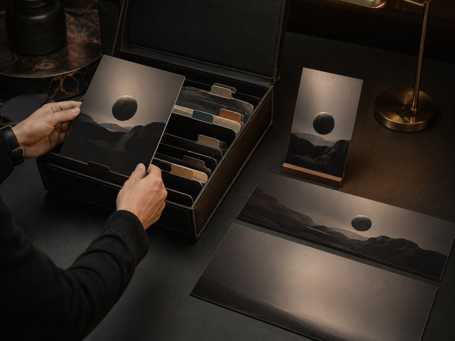
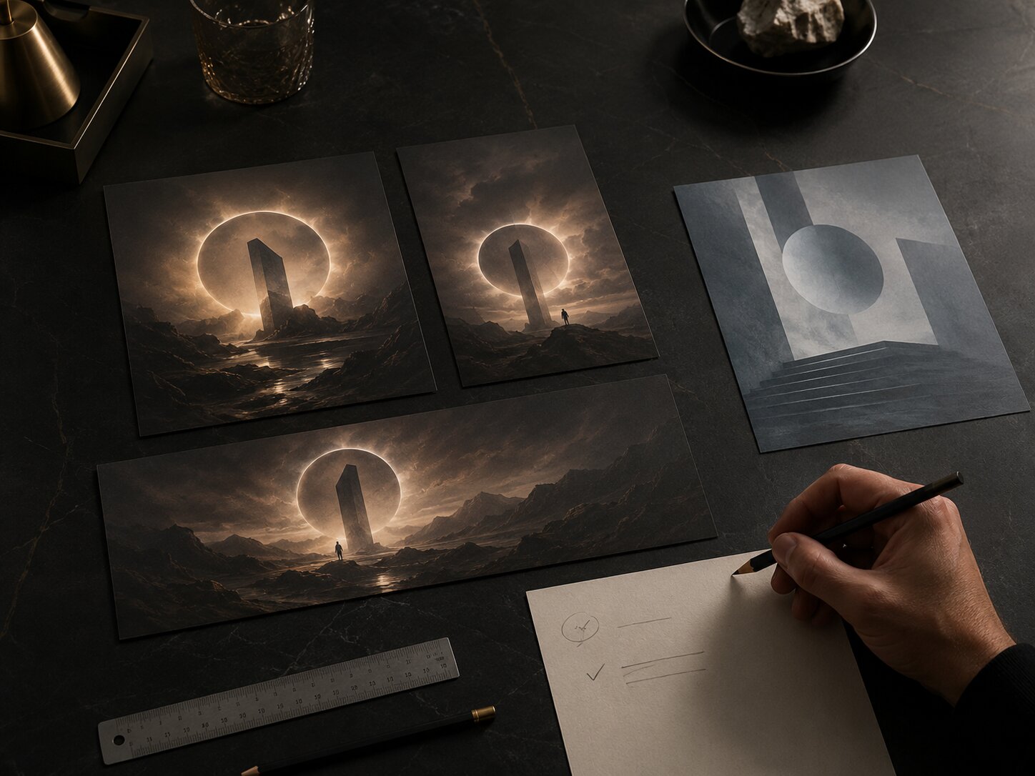
Use Negative Strategy Across the Whole Creative Pack
A brand rarely needs one image. It needs a system: release artwork, social teasers, thumbnails, banners, story frames, short video covers, ad variations, and recap assets.
Negative prompt strategy becomes more valuable when it travels across that system.
Release Artwork
For release visuals, the risk is often cliché. Musicians may want emotional depth, but AI may generate obvious symbols: crying faces, broken hearts, neon stages, headphones, roses, smoke, or dramatic silhouettes.
Negative prompt focus:
- genre clichés
- fake typography
- over-literal symbols
- crowded details
- imagery that competes with final title design
“Single-cover visual world, abstract symbol of tension and release, cold tactile surface, restrained cinematic shadow, no microphone, no headphones, no stage, no crowd, no fake album title, no neon equalizer, no romantic rose symbolism.”
Social Teasers
For short-form teasers, the risk is visual noise. TikTok’s creative guidance repeatedly emphasizes platform-native storytelling, community behavior, clear takeaways, vertical format, and sound-on experience. TikTok Business Creative Center offers practical creative recommendations for mobile-first content. Negative prompts for teaser visuals should protect clarity.
Negative prompt focus:
- tiny details
- cluttered edges
- text that will be unreadable on mobile
- overproduced ad look
- visuals that ignore vertical framing
“Vertical teaser frame, immediate focal point, mobile-first crop, atmospheric motion cue, no tiny text, no dense background, no horizontal poster layout, no fake interface, no polished corporate ad style.”
YouTube Thumbnails
For thumbnails, the risk is either under-communication or overstatement. YouTube’s own thumbnail guidance encourages creators to review whether thumbnails bring out the best of the video and to use Analytics after publishing to evaluate impact.
Negative prompt focus:
- misleading facial emotion
- too much detail
- low contrast
- unreadable text
- generic reaction-image composition
- anything that violates platform policies
“Clear thumbnail concept, strong focal hierarchy, expressive but honest visual cue, no misleading shock expression, no clutter, no small unreadable text, no graphic policy-sensitive imagery, no copied creator style.”
Campaign Banners
For banners, the risk is poor adaptation. A banner is not just a cropped square image. It needs horizontal rhythm, safe spacing, and room for copy or platform UI.
Negative prompt focus:
- central-only composition that fails wide crop
- important details at edges
- busy texture behind copy
- poster-like density
“Wide campaign banner, calm horizontal composition, left-side focal object, open space for copy, no busy center clutter, no critical details near edges, no fake text, no vertical-only framing.”
Review AI Outputs Like a Creative Director
Negative prompts reduce mistakes, but review catches what prompts miss.
A good review process asks four questions.
1. Does this look like us?
Do not ask only whether the image is beautiful. Ask whether it belongs to your world. If your brand is intimate and raw, a technically impressive glossy render may still fail.
2. Does this avoid our forbidden territory?
Compare the output against your never list. Did the model sneak in a cliché symbol, an unwanted mood, or a reference that feels too close to someone else’s identity?
3. Does it work in the actual format?
Check the crop. Check the mobile view. Check whether small details disappear. Check whether the asset needs space for text, logos, captions, subtitles, or platform UI.
YouTube’s channel branding guidance notes that strong brands are easier to remember when visuals have a consistent look, feel, and voice, and recommends aligning profile picture and banner identity with branding beyond YouTube. That principle applies beyond YouTube: every asset should feel connected without being mechanically identical.
4. Is it safe and ethical to publish?
Review for rights, resemblance, misleading claims, platform rules, and AI transparency expectations. For music creators, this is becoming more relevant as platforms and the industry continue to discuss how AI involvement should be disclosed. Apple Music for Artists provides official marketing tools and identity guidelines for promoting music, badges, links, and related assets.
A negative prompt can help avoid copying a recognizable style, logo, character, or person. It does not replace legal or editorial judgment.
Turn One Negative Prompt Into a Reusable Brand System
The best negative prompt strategy becomes a reusable brand asset.
Create a simple document with four parts.
1. Core Positive Direction
This is what your brand should feel like.
“Quiet cinematic realism, tactile materials, restrained composition, emotional tension, human-led creative process, premium dark studio atmosphere, abstract symbolism, no readable text unless intentionally designed.”
2. Universal Negative Rules
These apply to almost every asset.
“No generic AI glow, no stock photo lifestyle, no fake logos, no fake readable text, no cluttered desk, no meaningless cubes, no cyberpunk city, no fantasy armor, no copied artist style, no random UI panels.”
3. Format-Specific Negative Rules
These change by output.
- Vertical teaser: no horizontal-only composition, no tiny details, no cluttered edges.
- Square artwork: no fake album title, no over-literal genre symbols, no crowded center.
- Wide banner: no important details at edges, no busy copy area.
- Thumbnail: no unreadable text, no misleading shock imagery, no low contrast.
4. Review Notes From Real Outputs
Every time an output fails, write down why.
- “Model keeps adding fake interface panels when we say AI.”
- “Too much neon appears when we use the word futuristic.”
- “Hands create quality issues in close-up approval scenes.”
- “Mood becomes corporate when we say premium.”
This turns trial and error into institutional memory. Over time, your negative prompt strategy becomes less about fighting the model and more about understanding your own creative standards.
How Orias AI Fits Into This Workflow
Orias AI helps creators move from rough ideas, references, moods, and half-formed concepts into clearer visual directions, campaign materials, release visuals, promo assets, and publish-ready creative packs. Its value is especially strong when you treat AI generation as part of a structured creative workflow rather than a one-off prompt experiment.
For negative prompt strategy, that means using Orias AI to define both sides of the brand: what the visual world should include and what it should avoid. A creator can shape a campaign direction, generate options, compare outputs against a “never list,” refine the strongest versions, and keep the final asset family consistent across formats.
For musicians, this can help protect a release from generic genre imagery. For digital creators, it can keep thumbnails, teasers, and banners aligned. For visual storytellers, it can preserve mood and symbolism while still allowing variation.
The goal is not to remove human taste from the process. The goal is to give taste a clearer system to work through.
Frequently Asked Questions
What is a negative prompt in AI image generation?
A negative prompt is an instruction that tells an AI image tool what to avoid, such as unwanted objects, styles, colors, artifacts, or moods. Some tools have a dedicated negative prompt field or parameter, while others require you to include exclusions in the main prompt.
Do negative prompts always work?
No. Negative prompts can reduce unwanted elements, but they do not guarantee removal. Some models may still respond to the words inside the negative instruction, especially if the overall prompt is contradictory or overloaded.
Should I use negative prompts for every brand asset?
Use them when they clarify the creative boundary. A reusable brand-level negative list is helpful, but each asset should still have its own format-specific exclusions. A YouTube thumbnail, Spotify Canvas, and release artwork do not need identical constraints.
What should a brand include in its “never list”?
Include off-brand moods, overused visual clichés, unwanted symbols, poor-quality artifacts, risky references, platform-specific issues, and anything that makes the work feel like another creator or brand.
Can negative prompts help with visual consistency?
Yes, but only as part of a larger system. Consistency comes from clear creative direction, recurring visual cues, format rules, review criteria, and refinement. Negative prompts help by reducing drift away from that system.
Are negative prompts enough to avoid copyright or style imitation issues?
No. They can help you avoid obvious references, logos, characters, or copied visual traits, but they do not replace rights review, ethical judgment, or platform policy checks.
What is the biggest mistake creators make with negative prompts?
The biggest mistake is using a long generic list instead of a precise brand-specific strategy. “No ugly, no bad, no weird” is much weaker than naming the exact visual territories your brand must avoid.
Sources Used
- OpenAI API Prompt Engineering Guide
- OpenAI GPT Image Generation Prompting Guide
- Midjourney Documentation
- Adobe Experience League
- Spotify for Artists Canvas Guidelines
- Apple Music for Artists
- Apple Music Identity Guidelines
- TikTok for Business Creative Center
- YouTube Help Thumbnail & Title Tips
- YouTube Channel Branding Guidance
- YouTube Impersonation Policy
- Orias AI