Launch Narrative Map: Connecting Teasers, Explainers, Proof and CTA Assets
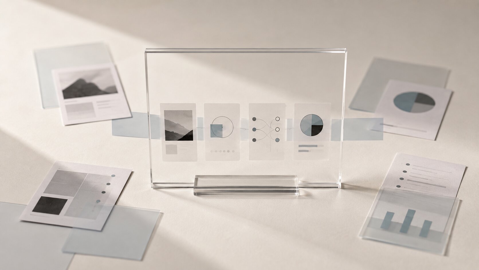
Build a launch narrative map that connects teasers, explainers, proof assets and CTA posts into one clear creative campaign.

TL;DR:
- A launch narrative map helps you plan what each campaign asset is supposed to do before you start making visuals.
- Teasers create curiosity, explainers give context, proof assets build belief, and CTA assets tell people what to do next.
- The real trick is not making more content. It is making each piece feel connected to the same story.
A lot of launches feel scattered because the assets were made one at a time.
You make a teaser because the release is coming soon. Then you make an explainer because people seem confused. Then you post a testimonial, a behind-the-scenes clip, a countdown, a link post, a carousel, maybe a vertical video, maybe a banner. Each piece might look fine on its own, but together they do not really build anything.
That is where a launch narrative map helps.
It gives your campaign a simple shape. Not a rigid content calendar. Not a massive marketing deck. Just a clear way to connect the emotional build-up, the explanation, the proof, and the final action. For artists, musicians, creators, and small creative teams, this can make the difference between “we posted a lot” and “people actually understood what we were launching.”
This guide breaks down how to build that map, how to connect different asset types, and how to use AI without letting the whole thing turn into generic campaign noise.
Table of Contents
- Key Takeaways
- What a launch narrative map actually does
- Give every asset a job before you design it
- Start with the promise, not the post format
- Build the four-part asset chain
- Keep the visual world steady while the message changes
- Use AI to explore the map, then edit it like a human
- A simple launch narrative map template
- Where Orias AI fits into the workflow
- Frequently Asked Questions
- Sources Used
Key Takeaways
| Point | Details |
|---|---|
| A launch needs sequence, not just volume | Teasers, explainers, proof, and CTA assets work best when they move the audience through a clear story. |
| Each asset should answer one question | “Why should I care?”, “What is it?”, “Can I trust it?”, and “What do I do now?” are different jobs. |
| Visual consistency comes from direction | Repeating colors is not enough. Mood, texture, framing, pacing, and tone should feel connected. |
| AI is useful early and in the middle | Use it to explore angles, asset variations, campaign structure, and visual routes, but still review everything manually. |
| CTA assets should not appear out of nowhere | Calls to action work better when the audience has already been warmed up with context and belief. |
| The map should stay flexible | A launch narrative map is a guide. You can adjust it after audience response, platform performance, or creative instinct. |
What a launch narrative map actually does
A launch narrative map is a planning tool for creative campaigns.
It shows how each asset connects to the larger story of the launch. Instead of asking, “What should we post today?”, you ask, “What does the audience need to understand or feel at this stage?”
That shift matters.
For a musician, the map might connect a mysterious short teaser, a visual mood reveal, a story about the song, a few proof moments from early listeners or live clips, and then a release-day CTA.
For a digital creator, it might connect a problem-led teaser, a short explainer, a process breakdown, examples of the result, and then a link to watch, buy, subscribe, download, or join.
For a visual artist, it might connect a fragment of the work, a studio note, a material or process explanation, a gallery or collector proof point, and then an invitation to view the full piece.
The point is simple: every asset should push the story forward.
Not every post has to sell. Not every post has to explain. Not every post has to shout. Some assets are there to create tension. Some are there to make the idea easier to understand. Some are there to show that the thing is real. Some are there to ask for action.
When those roles are mixed up, campaigns get muddy.
A teaser that explains too much can kill curiosity. A CTA that arrives too early can feel needy. A proof asset with no context can feel random. An explainer with no emotional hook can feel like homework.
The map keeps those pieces in order.
Give every asset a job before you design it
Before you open a design tool, write a prompt, generate images, or build a content calendar, give each asset a job.
Not a format. A job.
A format is “Instagram Reel,” “YouTube Short,” “carousel,” “poster,” “thumbnail,” or “banner.” A job is what that asset needs to do in the audience’s mind.
Here is the cleaner way to think about it.
| Asset Type | Main Job | Audience Question It Answers |
|---|---|---|
| Teaser | Create curiosity | “Why should I pay attention?” |
| Explainer | Give meaning | “What is this actually about?” |
| Proof | Build belief | “Is this real, good, useful, or worth my time?” |
| CTA | Direct action | “What should I do next?” |
This sounds obvious, but it prevents a lot of weak launch content.
A teaser does not need to include the whole backstory. It might only show a mood, a line, a fragment, a distorted visual, a short motion loop, or a question. The aim is to open a gap.
An explainer closes part of that gap. It gives people enough context to understand the release, project, offer, video, artwork, or campaign.
A proof asset makes the idea feel grounded. That proof might be social proof, process proof, quality proof, emotional proof, or platform proof. For musicians, Spotify for Artists and Apple Music for Artists both provide promotional tools that help artists create and share release-related assets, links, badges, QR codes, and campaign materials around music launches.
A CTA asset then gives the audience a clear next step. Listen now. Watch the full video. Pre-save. Join the list. Open the drop. View the collection. Download the pack. Buy tickets. Send the brief. Try the tool.
The mistake is trying to make one asset do all four jobs.
That is usually when the post becomes crowded. Too much text. Too many visual ideas. Too much explanation. Too many buttons. Too much pressure.
Give each piece one main job, then let the sequence do the heavy lifting.
Start with the promise, not the post format
Most messy launches start with format-first thinking.
“We need five Reels.”
“We need three carousels.”
“We need a YouTube thumbnail.”
“We need a banner.”
“We need a release post.”
Maybe you do. But format is not the starting point.
The better starting point is the promise.
The promise is the simple reason someone should care. It does not have to be salesy. For creative work, it can be emotional, aesthetic, personal, practical, or cultural.
A few examples:
| Launch Type | Weak Starting Point | Stronger Promise |
|---|---|---|
| New single | “My song is out Friday” | “A late-night track for people who are tired of pretending they are fine” |
| Visual pack | “New visuals available” | “A darker, cleaner visual system for creators who want their release to feel cinematic” |
| YouTube essay | “New video about burnout” | “A practical look at why creative burnout often starts before the work begins” |
| Art collection | “New pieces dropping” | “A quiet series about memory, distance, and objects that feel half-forgotten” |
| Digital product | “Templates for creators” | “A faster way to turn rough campaign ideas into publish-ready assets” |
Once the promise is clear, the assets become easier to plan.
The teaser hints at the promise.
The explainer unpacks it.
The proof supports it.
The CTA invites people into it.
This also helps with AI workflows. Random prompts usually produce random assets. A clear promise gives the AI something to orbit around. You can explore different moods, compositions, image directions, voice variants, and campaign angles without losing the center.
A useful prompt does not start with “make a cool promo post.” It starts with the emotional and practical core of the launch.
For example:
“Create three visual directions for a launch campaign around a melancholic electronic single about leaving a city at night. The campaign should move from mystery to emotional context to release-day action. Keep the visual world minimal, cinematic, and slightly cold.”
That gives you a direction.
Not a final answer, but a direction.

Build the four-part asset chain
The easiest way to build a launch narrative map is to divide the campaign into four connected stages.
Not every launch needs the same number of assets. A small release might only need one asset per stage. A larger campaign might need several. The structure still helps.
1. Teaser assets: make people notice the shape of the thing
Teasers are not miniature explainers.
They are small openings.
A teaser might show one striking detail, one phrase, one sound, one frame, one object, one texture, or one question. It should feel like the beginning of a world, not the full tour.
For visual campaigns, teaser assets can include:
- A cropped image from the final visual world
- A short motion loop with no full reveal
- A mood-led poster
- A title reveal
- A cryptic but relevant line
- A countdown image
- A behind-the-scenes fragment
For music launches, teaser content can hint at the sonic mood, lyric world, artwork style, or emotional setting. It does not have to explain the full song.
On short-form platforms, the opening seconds matter. TikTok’s own creative guidance emphasizes having a hook, highlighting a clear point, and ending with a clear CTA, with the hook prioritized early in the video. Meta’s guidance for video ads also recommends showing the brand and key message early, especially within the first few seconds.
That does not mean every creative teaser should feel like an ad.
It means the first moment needs intention.
Do not waste the opening. Do not bury the mood. Do not make people wait too long to understand why the asset exists.
2. Explainer assets: make the idea easier to enter
Once people are curious, they need context.
Explainers help the audience understand what the launch is, why it exists, and how to read it.
This can be simple. A good explainer does not need to sound like a press release.
It can answer:
- What is being launched?
- Who is it for?
- What inspired it?
- What problem or feeling does it respond to?
- What makes it different from the last thing?
- What should people notice first?
For creators, explainer assets might be carousels, captions, short talking-head videos, story slides, pinned posts, visual breakdowns, or short landing page sections.
For musicians, explainers might include the story behind the track, the visual concept, the release timeline, or what the listener should expect from the song and the world around it.
For artists, explainers might show process, materials, references, themes, or the thinking behind the collection.
The mistake to avoid: over-explaining.
An explainer should make the work more accessible, not flatten it. You do not need to remove all mystery. You just need to give people a handle.
Think of it like opening a door, not writing a textbook.
3. Proof assets: show that the work has weight
Proof is where many creative launches feel thin.
Creators often jump from “here is the idea” straight to “please click.” But people usually need a reason to believe before they act.
Proof does not always mean testimonials or numbers.
It can mean:
| Proof Type | What It Shows | Example |
|---|---|---|
| Process proof | The work was actually made with care | Studio clips, sketches, drafts, rejected versions |
| Quality proof | The final thing has craft | Detail shots, before/after refinements, clean previews |
| Social proof | Other people are responding | Comments, early listener reactions, creator mentions |
| Platform proof | The release exists in real places | Spotify link, Apple Music badge, YouTube premiere, gallery page |
| Use proof | The thing works in context | Mockups, campaign examples, real use cases |
For music, platform-native promotional tools can help here. Apple Music Marketing Tools can generate links, badges, QR codes, embeddable players, and other release assets, while Spotify for Artists offers promotional tools and campaign features for artists looking to reach listeners around releases.
For video creators, proof might be a strong thumbnail-title pairing, a clip that shows the best idea in the video, or comments from people who watched early.
For visual storytellers, proof might be the asset system itself: the same world working across a poster, vertical teaser, thumbnail crop, banner, and story frame.
The mistake is using proof too late.
If the first proof asset appears only after launch day, you may already have lost people who needed a little more confidence before clicking.
4. CTA assets: make the next step obvious
A CTA asset is not just a button.
It is the moment where the campaign stops hinting and starts asking.
That ask should be clear.
Not five asks. One.
- Listen now.
- Watch the full piece.
- View the collection.
- Save the release.
- Join the waitlist.
- Download the pack.
- Try Orias AI.
- Book the session.
Canva’s CTA guidance frames a call to action as the thing that tells the user what to do next, which is still one of the simplest ways to think about it.
For creative launches, the CTA asset should still feel like part of the world. It should not suddenly look like a generic sales graphic.
Keep the visual system intact. Same mood. Same atmosphere. Same core language. But remove friction.
A good CTA asset usually has:
- One clear action
- One clear destination
- One reason to act now
- One visual focus
- Enough context for people who missed earlier posts
The last point matters.
Not everyone sees the whole sequence. Some people will first encounter your campaign on the CTA post. So the asset should be direct, but not empty.
Instead of:
“Out now. Link in bio.”
Try something with more context:
“The new visual pack is live. Built for dark, cinematic release campaigns, with vertical teasers, cover-style frames, and promo layouts ready to adapt.”
Still clear. Still useful. Much less flat.
Keep the visual world steady while the message changes
The message can change from stage to stage.
The visual world should not fall apart.
That means your teaser, explainer, proof, and CTA assets should feel like they belong to the same campaign, even when they do different jobs.
This is where a lot of AI-assisted campaigns go wrong. The creator generates one image for a teaser, another for a carousel, another for a thumbnail, another for a banner, and suddenly every asset looks like it came from a different project.
The fix is not just “use the same colors.”
You need a small creative direction system.
Define:
| Direction Element | What to Decide |
|---|---|
| Mood | Quiet, tense, playful, intimate, cinematic, raw, polished |
| Palette | Main colors, accent colors, background behavior |
| Materials | Grain, glass, paper, metal, liquid, fabric, light, shadow |
| Composition | Close-up, wide negative space, centered object, fragmented crops |
| Typography style | Minimal, handwritten, bold, soft, editorial, no-text approach |
| Motion feel | Slow, sharp, looping, glitchy, gentle, rhythmic |
| Voice | Direct, poetic, casual, mysterious, instructional |
You do not need a giant brand guide for every launch.
You just need enough rules that each asset feels related.
Here is a simple example for a music release:
| Asset | Message Role | Visual Treatment |
|---|---|---|
| Teaser | Hint at the emotional world | Cropped night road, blurred light, no title yet |
| Explainer | Share the song story | Same road texture, lyric fragment, short caption |
| Proof | Show early response or process | Studio clip with same cold color grade |
| CTA | Drive listeners to release | Full artwork reveal, clear title, streaming link direction |
Same world. Different jobs.
That is the whole idea.

Use AI to explore the map, then edit it like a human
AI can help a lot with launch mapping.
It can help you turn a messy idea into campaign angles. It can generate visual directions. It can suggest asset roles. It can help you adapt one concept into multiple formats. It can create voice variants for captions, short scripts, and CTA lines.
But it should not be the final judge.
AI is good at variation. Humans are better at taste, timing, honesty, and knowing what feels right for the work.
A balanced workflow might look like this:
- Write the launch promise in plain language.
- Ask AI for possible teaser, explainer, proof, and CTA angles.
- Choose the angles that feel closest to the real project.
- Generate visual directions from those chosen angles.
- Remove anything that looks generic, misleading, or off-brand.
- Adapt the strongest direction across formats.
- Review each asset manually before publishing.
- Track what people respond to and adjust the next batch.
The key is curation.
Do not publish every decent output. Do not let the tool decide what your launch means. Do not accept a visual just because it looks polished.
A polished wrong asset is still wrong.
AI should help you see options faster. It should not replace the creative decision that holds the campaign together.
Pro Tip
When using AI for launch assets, create a “do not use” list before you generate.
- No generic glowing AI effects
- No fake interface screens
- No random floating shapes
- No unreadable fake text
- No overused cyber visuals
- No stock-photo creator poses
- No visuals that imply a feature, product, or result that does not exist
This keeps the campaign closer to your actual world.
A simple launch narrative map template
You can build a launch narrative map in a basic table.
No fancy system needed.
Start with this:
| Stage | Audience State | Asset Goal | Possible Formats | Notes |
|---|---|---|---|---|
| Teaser | Unaware or mildly curious | Make them notice | Reel, short, cropped visual, story, poster | Keep it simple. One hook or mood. |
| Explainer | Interested but unsure | Give context | Carousel, caption, short video, landing section | Explain without draining the mystery. |
| Proof | Curious but not convinced | Build belief | Process clip, reaction, preview, use case, platform asset | Show care, quality, response, or real-world presence. |
| CTA | Ready or nearly ready | Move to action | Release post, link post, email, banner, pinned story | One action. One destination. One reason. |
Now fill it in with your actual launch.
Here is a sample for an independent musician releasing a single:
| Stage | Asset Idea | Message |
|---|---|---|
| Teaser | 7-second vertical loop with a lyric fragment | “Something colder is coming Friday.” |
| Explainer | Carousel about the song’s mood and story | “This track started as a voice note after leaving the city at 2 a.m.” |
| Proof | Studio clip plus early listener quote | “The first people who heard it called it my quietest track, but also the heaviest.” |
| CTA | Release-day artwork with streaming direction | “The single is out now. Listen wherever you usually disappear into music.” |
And here is one for a creator launching a visual asset pack:
| Stage | Asset Idea | Message |
|---|---|---|
| Teaser | Abstract crop of the pack’s core visual world | “A darker campaign system is opening soon.” |
| Explainer | Short breakdown of what the pack includes | “Vertical teasers, release frames, banner crops, and social layouts built from one visual direction.” |
| Proof | Before/after showing rough idea to finished assets | “From loose mood to usable campaign set.” |
| CTA | Clean launch post | “Explore the pack and start shaping your next release campaign.” |
Notice how the map does not need to be complicated.
It just needs to stop the launch from becoming a pile of disconnected posts.
Where Orias AI fits into the workflow
Orias AI is useful when you have the beginning of an idea, but not the full campaign shape yet.
That is a common place to be. You might have a mood, a song title, a few references, a visual direction, a rough offer, or a feeling you want the launch to carry. But turning that into teasers, explainers, proof assets, CTA posts, and publish-ready variations can take a lot of manual back-and-forth.
Orias AI helps creators move from rough creative input into clearer visual worlds, promo assets, release visuals, campaign materials, voice variants, and creative packs. For a launch narrative map, that means you can explore the campaign as a connected system instead of making one asset at a time.
The important part is still your judgment.
Use Orias AI to shape options, connect the pieces, and speed up production. Then choose what actually fits your project, your taste, and your audience.
That is where the work starts to feel intentional.
Frequently Asked Questions
What is a launch narrative map?
A launch narrative map is a simple plan that connects your campaign assets into one story. It shows what each asset is supposed to do, from creating curiosity to explaining the idea, building belief, and asking for action.
How is a launch narrative map different from a content calendar?
A content calendar tells you when something will be published. A launch narrative map tells you why each asset exists. You can use both together, but the narrative map should usually come first.
How many assets does a launch campaign need?
It depends on the size of the launch. A small release might need four strong assets: one teaser, one explainer, one proof asset, and one CTA. A larger campaign might need several assets in each category, adapted for different platforms.
Can AI help create teaser and CTA assets?
Yes. AI can help with campaign angles, visual directions, copy variations, format adaptation, and asset ideas. But you still need to review the results for accuracy, taste, originality, rights, and platform fit before publishing.
What is the biggest mistake creators make with launch assets?
The biggest mistake is making assets one by one without a shared story. The result is usually a campaign that looks busy but does not build momentum. Another common mistake is asking for action before the audience understands why they should care.
Should every asset have the same visual style?
They should feel connected, but not identical. A teaser can be more mysterious, an explainer can be clearer, proof can feel more grounded, and CTA assets can be more direct. The mood, palette, texture, and creative direction should still feel like one world.
Where should proof assets appear in a launch?
Proof assets usually work best before and during the main CTA push. They help people believe in the release, product, artwork, or campaign before you ask them to act. Proof can also continue after launch through reactions, results, process notes, or real-world use.
Sources Used
- Spotify for Artists, Campaign Kit and music promotion resources
- Spotify for Artists, Promo Cards and display campaign resources
- Apple Music for Artists and Apple Music Provider Support, Promote and Marketing Tools resources
- TikTok Business Help Center, creative best practices for performance ads
- Meta Business Help Center, best practices for Instagram video ads
- Adobe Business, creative brief guidance
- Canva, call-to-action and marketing asset guidance
- Buffer, social media calendar and creator planning resources
- Orias AI