AI Moodboarding: Turning Raw References into a Clear Creative Direction
Turn raw references into a clear AI moodboard, creative direction and publish-ready visual system for campaigns.
TL;DR:
- AI moodboarding works best when you treat references as raw material, not as a final style to copy.
- The goal is to extract mood, lighting, texture, symbols, composition, and emotional direction, then turn those signals into a clear creative system.
- The most important step is human curation: AI can expand options quickly, but your taste decides what belongs.
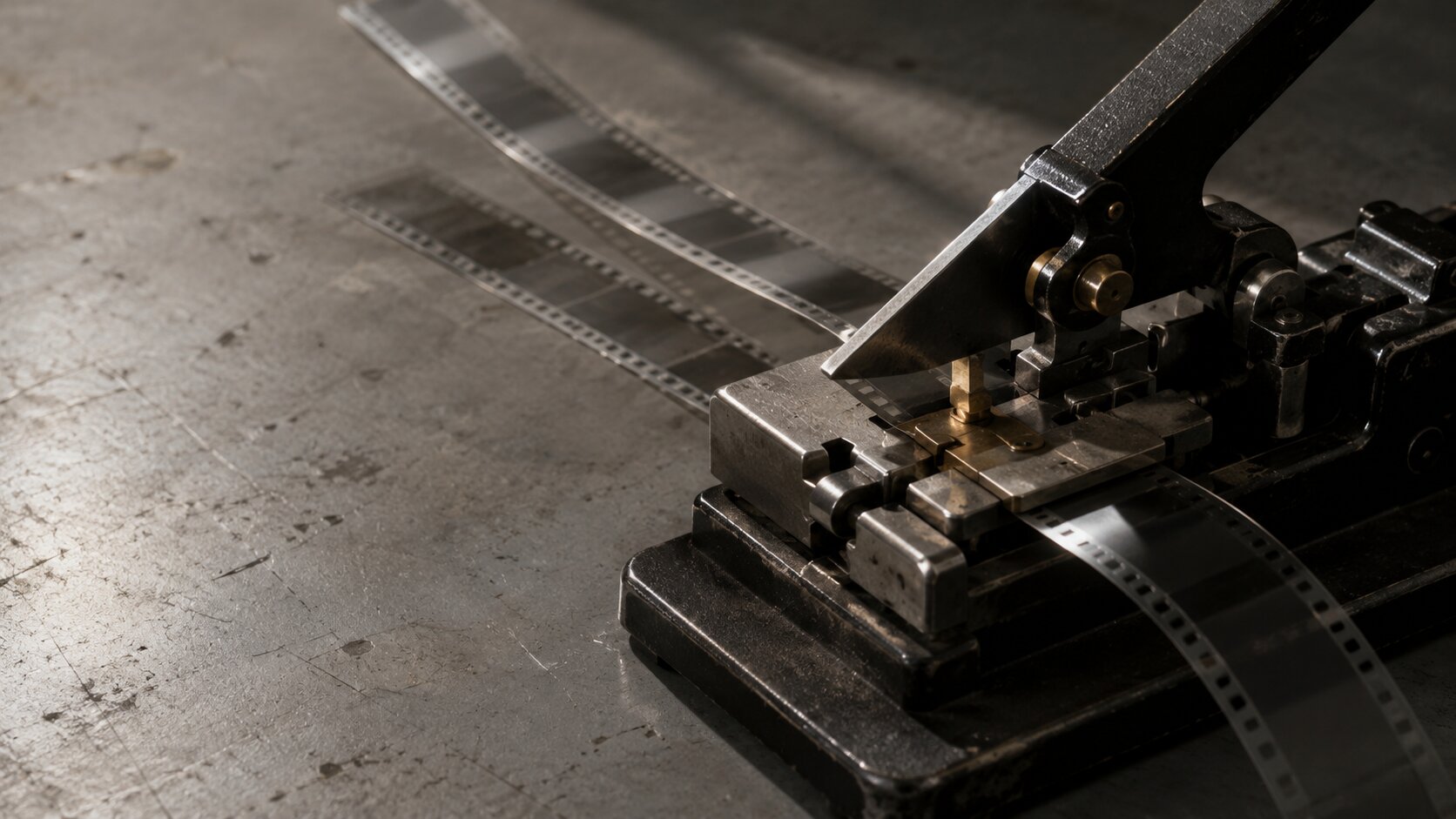
Most creative projects do not begin with a clean brief. They begin with screenshots, album covers, film stills, Pinterest saves, color fragments, visual memories, rough lyrics, campaign notes, and half-formed feelings that are hard to explain.
That mess is not a problem. It is often where the best direction starts. The problem appears when references stay messy for too long. A board full of beautiful images can still fail if it does not tell you what to make, what to avoid, and how the final assets should feel across formats.
AI moodboarding helps close that gap. Instead of using AI only to generate random visuals, creators can use it to organize references, identify patterns, test visual directions, and build a repeatable creative language. This is especially useful for artists, musicians, visual storytellers, and content creators who need more than one image. They need release covers, vertical videos, thumbnails, social posts, campaign visuals, and brand-consistent creative packs.
This guide explains how to turn raw references into a clear AI-assisted creative direction without losing your artistic voice.
Table of Contents
- What an AI Moodboard Should Actually Do
- Collect References Like Clues, Not Decorations
- Translate Visual Inspiration into Creative Direction
- Use AI to Explore Controlled Variations
- Build a Direction Board That Can Produce Assets
- Keep the Human Taste Layer Visible
- Turn the Moodboard into a Publish-Ready Workflow
- How Orias AI Fits Into the Moodboarding Process
- Frequently Asked Questions
- Sources Used
Key Takeaways
| Point | Details |
|---|---|
| A moodboard is not just a collage | It should clarify the emotional tone, visual rules, and production direction behind a project. |
| References need interpretation | Instead of copying images, extract qualities such as light, texture, framing, pacing, and symbolism. |
| AI is strongest in exploration | Use it to test visual routes, prompt variations, compositions, and asset families quickly. |
| Consistency comes from constraints | Clear rules around color, space, typography, subject matter, and mood prevent generic AI output. |
| Human review is non-negotiable | Taste, originality, rights checks, cultural context, and brand fit still require human judgment. |
| The final board should produce assets | A useful AI moodboard should guide covers, social visuals, thumbnails, videos, and campaign materials. |
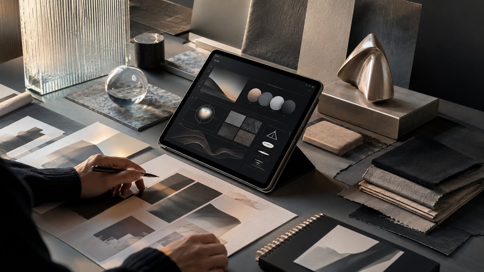
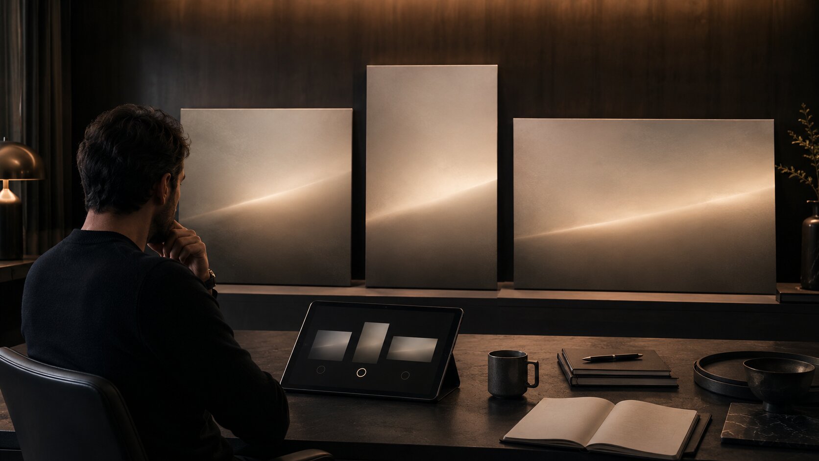
What an AI Moodboard Should Actually Do
A traditional moodboard brings visual material into one place so a creative team can align around a look, feeling, or concept. Figma describes moodboarding as a way to move from creative chaos toward clearer visual direction, while Adobe frames moodboards as visual layouts that combine images, colors, text, and textures to express a creative concept.
An AI moodboard should go one step further.
It should not only show inspiration. It should help you make decisions. For a creator or musician, that means answering questions like:
- What does this project feel like before it becomes content?
- What visual world does the audience enter?
- What colors, textures, and symbols belong here?
- What should the visuals avoid?
- How does this direction translate into a cover, vertical video, thumbnail, carousel, and promo asset?
The mistake is treating AI moodboarding as “upload references and generate something similar.” That leads to imitation, inconsistency, and often weak creative ownership.
A better goal is to build a direction system. The board becomes a bridge between instinct and production. It turns scattered references into visual rules that can guide multiple outputs.
For example, a musician preparing a dark electronic release might begin with references from night photography, brutalist architecture, metallic textures, blurred club lighting, and minimal typography. The final direction should not be “make it look like these five images.” It should become something more precise: cold blue-black palette, low-angle framing, reflective surfaces, negative space, anonymous human presence, sharp light interruptions, and restrained motion.
That is a direction. AI can work with that.
Collect References Like Clues, Not Decorations
The quality of an AI moodboard depends on the quality of the references behind it. More images do not automatically create more clarity. In many cases, too many references make the direction weaker.
Start by collecting references in categories instead of one giant board.
Reference categories that actually help
Use separate groups for:
- Mood: atmosphere, emotion, intensity, softness, tension, nostalgia, luxury, chaos.
- Light: natural light, flash, neon, studio glow, shadow, haze, reflection.
- Color: dominant palette, contrast level, saturation, warmth, coldness.
- Texture: grain, metal, fabric, glass, paper, skin, smoke, water, concrete.
- Composition: close-up, wide negative space, symmetry, motion blur, cropping.
- Symbols: objects, gestures, environments, repeated motifs.
- Format examples: album covers, short-form frames, posters, thumbnails, social layouts.
This gives AI — and your own brain — a cleaner structure.
A visual storyteller creating a campaign for a short film might collect cinematic stills for lighting, poster references for hierarchy, behind-the-scenes images for atmosphere, and social content examples for pacing. A musician might collect cover art, live show lighting, lyric fragments, fashion details, and motion references for Canvas-style loops.
Spotify’s current Canvas guidance defines Canvas as a short vertical loop for the Now Playing view and lists practical requirements such as 3–8 seconds, 9:16 vertical format, 720–1080 px height, and MP4 or JPG format. Spotify’s cover art requirements also specify square 1:1 artwork, supported image formats, sRGB color space, and minimum and maximum pixel dimensions.
That matters because your moodboard should not live apart from production. If the campaign needs a cover, a vertical loop, and short-form social visuals, the board should account for those formats from the beginning.
Add “not this” references
A strong moodboard includes boundaries.
Add a small section for what the project should avoid. This might include overly polished studio portraits, cliché cyberpunk neon, generic AI faces, messy typography, overly literal symbols, or colors that feel off-brand.
This is especially useful with AI because negative direction reduces drift. Instead of only telling the tool what to create, you are clarifying what does not belong.
Pro Tip: For every five references you collect, write one sentence explaining why each reference matters. If you cannot explain why it belongs, it may just be decoration.
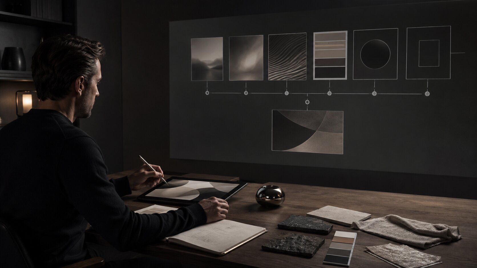
Translate Visual Inspiration into Creative Direction
A reference is an image. A direction is a decision.
The most important part of AI moodboarding is translation: turning visual inspiration into language that can guide prompts, asset generation, editing, and review.
Here is a practical translation framework.
| Raw Reference Element | Creative Direction Translation |
|---|---|
| A foggy night street | Atmosphere: isolated, cinematic, uncertain, slow-moving |
| Chrome objects | Material language: reflective, cold, precise, futuristic |
| Cropped portrait | Composition: intimate, incomplete, emotionally withheld |
| Washed-out beige palette | Color: muted, nostalgic, quiet, editorial |
| Handwritten notes | Human texture: personal, imperfect, diaristic |
| Harsh flash photo | Energy: immediate, raw, documentary, unpolished |
This is where many creators skip too quickly. They jump from references straight into generation. The result is often visually interesting but strategically unclear.
Instead, write a short creative direction statement before generating anything.
This project should feel like a quiet signal from a future city after midnight: minimal, cold, reflective, and emotionally distant. The visuals should use negative space, metallic texture, soft blue-black shadows, small human silhouettes, and restrained movement. Avoid neon overload, cyberpunk clichés, readable text, and overly perfect AI faces.
That statement is more useful than a folder of 80 images.
Turn the direction into reusable prompt ingredients
Break the direction into promptable components:
- Subject: anonymous figure, object, environment, symbol.
- Setting: studio, street, room, stage, landscape, abstract space.
- Lighting: soft glow, hard flash, moonlit, projection, backlight.
- Palette: muted earth tones, icy monochrome, warm analog, high contrast.
- Camera language: close crop, wide frame, overhead, shallow depth of field.
- Texture: grain, glass, paper, dust, fabric, liquid, metal.
- Emotional tone: intimate, tense, euphoric, sacred, restless, surreal.
- Exclusions: no readable text, no logos, no celebrity likeness, no clutter.
This gives you a modular system instead of one fragile prompt.
Use AI to Explore Controlled Variations
AI is powerful for variation, but variation without constraints creates noise.
The goal is not to generate 100 random images and pick the least bad one. The goal is to test controlled creative routes. Adobe’s Firefly Boards, for example, positions AI moodboarding around uploading or generating images, remixing ideas, and using style references to apply specific visual elements.
For a creator, that suggests a smarter workflow: use AI to compare directions, not just produce isolated visuals.
Test three visual routes
Create three controlled directions from the same source material:
- Literal route: close to the original concept.
- Atmospheric route: focused on feeling, color, and texture.
- Symbolic route: built around metaphor, objects, and visual motifs.
For example, for a song about emotional distance:
| Route | Visual Approach | Risk |
|---|---|---|
| Literal | One person alone in a room | Can feel obvious or generic |
| Atmospheric | Empty spaces, cold light, blurred movement | Can become too abstract |
| Symbolic | Two chairs, glass reflection, broken signal | Can become too obscure |
AI can help generate rough explorations of each route. Your job is to decide which route carries the strongest emotional and strategic potential.
Keep one variable stable
When testing, avoid changing everything at once.
If you are comparing color palettes, keep the subject and composition similar. If you are comparing compositions, keep the palette stable. If you are comparing symbols, keep the lighting language consistent.
This makes your judgment sharper. You are no longer reacting to random novelty. You are evaluating creative decisions.
Do not confuse “impressive” with “right”
AI-generated images can look polished quickly. That polish is seductive. But a beautiful image may still be wrong for the project.
Ask:
- Does this match the emotional promise?
- Could this belong to the same world as the other assets?
- Does it feel specific to this artist, release, brand, or campaign?
- Would it still work when cropped to mobile formats?
- Is it original enough to publish after refinement?
If the answer is no, the image is exploration, not direction.
Build a Direction Board That Can Produce Assets
A clear AI moodboard should eventually become a production board. That means it needs enough structure to guide actual assets.
For Orias AI’s audience, that may include:
- Music release cover
- Spotify Canvas-style visual loop
- YouTube thumbnail
- TikTok or Reels vertical frame
- Instagram carousel
- Tour or launch poster
- Website hero image
- Press visual
- Short campaign teaser
- Brand world reference sheet
Each format has different constraints. TikTok’s creative best practices emphasize vertical 9:16 creative, at least 720p resolution, sound or music, and keeping content visible inside platform UI safe zones. Meta’s Ads Guide provides format-specific design specifications and technical requirements for placements across its advertising products.
You do not need to memorize every spec at the moodboard stage. But you should design the direction so it can survive format changes.
Create asset rules from the board
Write rules like:
- Covers use centered compositions with large negative space.
- Vertical videos use slow movement, reflective surfaces, and minimal subject motion.
- Social posts use close-up details, not full scenes.
- Thumbnails need stronger contrast and simpler silhouettes.
- Promo graphics should avoid heavy text over complex images.
- All assets should keep the same palette and material language.
This is how a moodboard becomes a campaign system.
Build a “hero asset” and “supporting asset” structure
Not every image needs to carry the whole concept.
A strong creative pack often has:
- Hero asset: the main visual that defines the campaign.
- Texture assets: close-ups, materials, details, backgrounds.
- Motion assets: loops, transitions, atmospheric clips.
- Social assets: crops, teasers, quote cards, story frames.
- Utility assets: thumbnails, banners, profile updates, announcement graphics.
This prevents the common mistake of forcing one image to work everywhere.
Keep the Human Taste Layer Visible
AI moodboarding should make your taste stronger, not replace it.
The U.S. Copyright Office’s AI materials emphasize that copyright questions around generative AI outputs are tied to human authorship and the nature of human creative contribution. Its 2025 copyrightability report addresses how existing copyright principles apply to AI-generated outputs, reinforcing the importance of human creative input and case-by-case evaluation.
Even outside legal questions, human judgment is essential for creative quality.
AI can help you generate options, remix visual cues, and speed up exploration. It cannot fully understand your lived context, your audience relationship, your artistic history, or the subtle difference between “almost right” and “this is the world.”
Review every AI output through five filters
Use this checklist before anything becomes part of the final direction:
- Taste: Does it feel intentional, or just visually expensive?
- Originality: Is it too close to a reference, trend, artist, or known style?
- Brand fit: Does it belong to this creator’s visual identity?
- Context: Could the audience misunderstand the image?
- Production readiness: Can it be edited, resized, cropped, animated, and published?
For artists and musicians, add two more:
- Likeness safety: Does it accidentally resemble a real person too closely?
- Release fit: Does it match the sound, lyrics, era, and emotional world of the project?
Keep rejected outputs
Do not delete everything that fails. Create a rejected or “wrong direction” section.
This helps you see patterns. Maybe the AI keeps making the visuals too glossy. Maybe it overuses faces. Maybe it adds unnecessary surreal objects. Maybe it pushes the palette too bright.
Those failures are useful. They sharpen the rules.
Turn the Moodboard into a Publish-Ready Workflow
The final value of AI moodboarding is not the board itself. It is what the board lets you produce.
Use this workflow:
1. Define the creative question
Start with a focused question:
- What should this release feel like?
- What visual world should this campaign introduce?
- How should this creator’s next era look?
- What should the audience understand before they hear, watch, or click?
2. Gather references by function
Separate mood, light, palette, texture, subject, composition, and format examples.
3. Extract direction language
Write a short creative direction statement and a list of visual rules.
4. Generate controlled variations
Use AI to explore routes, not random outputs. Keep variables stable when comparing.
5. Curate and refine
Select the strongest direction. Remove anything that weakens the concept.
6. Build the asset map
Decide which assets you need: cover, vertical video, thumbnails, carousels, banners, promo visuals, or story frames.
7. Adapt for platforms
Adjust crops, safe zones, resolution, contrast, and motion for each destination.
8. Review before publishing
Check quality, rights, brand fit, likeness risk, text legibility, and platform suitability.
This workflow gives you a repeatable process. You are not starting from scratch every time you need a visual. You are building from a direction.
How Orias AI Fits Into the Moodboarding Process
Orias AI is designed for creators who need to move from rough ideas into clearer creative output. In the context of AI moodboarding, that means helping users turn references, moods, concepts, and campaign thoughts into more usable visual worlds.
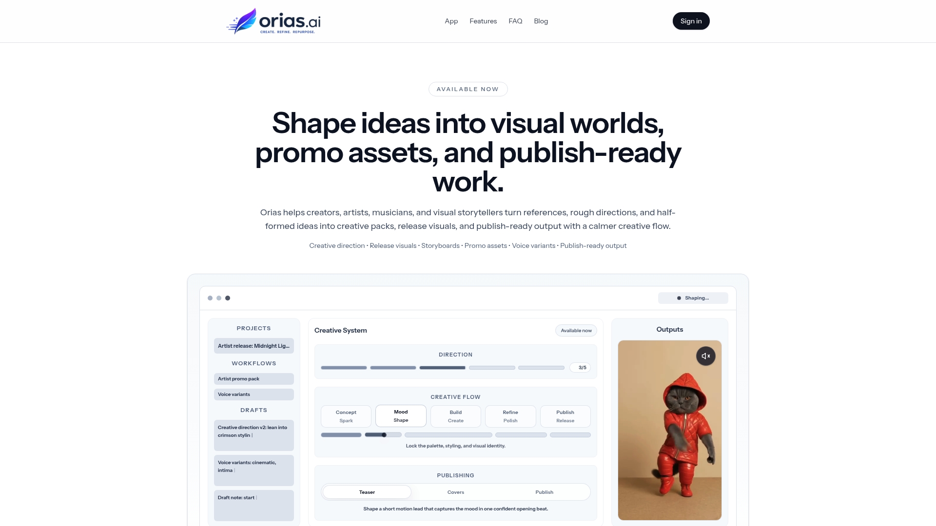
Instead of treating each prompt as a one-off experiment, creators can use Orias AI to shape a more complete creative pack: visual directions, release assets, promo materials, voice variants, and publish-ready content that share the same mood and logic.
For independent artists, this can make release planning feel less scattered. For visual storytellers, it can help connect concept, atmosphere, and asset production. For creative teams, it can make the handoff from reference board to campaign output more structured.
The best use of Orias AI is not to replace direction. It is to make direction easier to express, test, refine, and turn into assets.
Frequently Asked Questions
What is AI moodboarding?
AI moodboarding is the process of using AI tools to organize references, explore visual directions, generate variations, and turn creative inspiration into a clearer production system. It combines traditional moodboarding with AI-assisted ideation and asset development.
How is an AI moodboard different from a regular moodboard?
A regular moodboard usually collects visual inspiration. An AI moodboard can also help translate that inspiration into prompts, variations, creative rules, and asset directions. The best AI moodboards are not just collages; they are working systems for production.
Can musicians use AI moodboarding for release visuals?
Yes. Musicians can use AI moodboarding to define the visual world of a single, EP, album, tour, or content campaign. It can help align cover art, Canvas-style loops, social teasers, lyric visuals, thumbnails, posters, and press images around one coherent direction.
Should I upload reference images into AI tools?
Reference images can be useful, but they should be used carefully. Avoid using images to copy another artist’s work or imitate a recognizable style too closely. Use references to extract general qualities such as color, lighting, texture, framing, and atmosphere.
How do I stop AI-generated visuals from looking generic?
Use stronger constraints. Define the emotional tone, palette, materials, composition, symbols, exclusions, and format needs before generating. Generic output usually comes from vague prompting, weak curation, or relying on AI polish instead of a clear creative direction.
Do AI-generated moodboard assets need editing before publishing?
Usually, yes. AI-generated visuals may need retouching, cropping, resizing, color correction, typography, rights review, platform-specific adjustment, and human approval before they are ready to publish.
What should be included in a final creative direction board?
A final direction board should include the core mood, palette, texture language, lighting references, composition rules, symbols, “avoid” examples, prompt ingredients, and asset examples for the formats you plan to publish.
Sources Used