Visual Storytelling Techniques Every Creator Should Know
Learn practical visual storytelling techniques for creators using mood, composition, pacing, AI workflows, and campaign-ready asset systems.
TL;DR:
- Strong visual storytelling is not about making everything look expensive; it is about making every image, frame, color, and format serve a clear creative idea.
- The most useful technique is to define the emotion and narrative before choosing the format.
- Build a repeatable workflow that turns one concept into consistent visuals across platforms.
Most creators do not struggle because they have no ideas. They struggle because their ideas stay scattered: a few saved references, a vague mood, a half-finished prompt, a cover concept, three possible campaign directions, and no clear system for turning any of it into publish-ready visuals.
That matters because visual storytelling now carries more of the creative message than ever. A song release, short film, digital product, artist campaign, or social series often meets the audience first through a thumbnail, teaser, poster, Canvas loop, Reel, Short, profile banner, or behind-the-scenes clip. YouTube recommends thinking carefully about titles, descriptions, and thumbnails, while also emphasizing the opening seconds for Shorts creators. Spotify’s Canvas guidance also shows how even an eight-second looping visual can become part of a track’s listener experience.
This guide breaks down visual storytelling techniques that creators, artists, musicians, and creative teams can use immediately. It covers mood, references, composition, pacing, AI-assisted ideation, asset systems, and the judgment needed to keep your work personal rather than generic.
Table of Contents
- Key Takeaways
- Read the Story Before You Choose the Style
- Build a Mood System, Not a Random Mood Board
- Use Composition to Tell the Viewer Where to Look
- Design for Sequence: Hook, Shift, Payoff
- Turn One Concept Into a Full Asset Family
- Use AI for Exploration, Then Curate Like a Director
- Keep Your Visual Identity Consistent Without Making It Repetitive
- From Rough Idea to Publish-Ready Direction With Orias AI
- Frequently Asked Questions
- Sources Used
Key Takeaways
| Point | Details |
|---|---|
| Start with meaning | Decide what the viewer should feel, understand, or remember before choosing colors, effects, shots, or formats. |
| References need structure | A useful mood board separates palette, texture, subject, framing, typography, motion, and emotional tone. |
| Attention is designed | Composition, contrast, hierarchy, and the first seconds of video guide the viewer’s eye and reduce confusion. |
| Campaigns need asset systems | One idea should become multiple platform-specific assets, not a single poster copied everywhere. |
| AI works best with direction | Use AI to explore variations, but rely on human judgment for taste, originality, ethics, and final selection. |
| Consistency beats random output | A creator’s visual identity comes from repeatable decisions, not from using the same filter on everything. |
Read the Story Before You Choose the Style
Visual storytelling starts before the visual. The first question is not “What should this look like?” It is “What is the viewer supposed to feel or understand?”
For a musician, the answer might be: this release feels like late-night recovery after a chaotic relationship. For a digital creator, it might be: this series makes complex ideas feel playful and easy to enter. For an artist, it might be: this collection should feel intimate, handmade, and slightly unstable.
Once the story is clear, style becomes easier to choose. Neon lighting, grain, handwritten type, distorted faces, empty rooms, documentary footage, clean product shots, or collage textures are not random aesthetics. They become storytelling tools.
| Story Question | Creative Translation |
|---|---|
| What is the emotional core? | Color, texture, lighting, facial expression, pacing |
| Who is the viewer? | Platform, format, level of context, visual complexity |
| What should they remember? | Main symbol, hook image, phrase, motif |
| What should they do next? | CTA, save, stream, watch, share, pre-save, buy, follow |
| What should be avoided? | Visual clichés, tonal mismatch, overproduction, unclear hierarchy |
Mistake to avoid: choosing an aesthetic because it is trending before checking whether it fits your story. Trend-native content can work well on platforms such as TikTok, where TikTok itself describes trends as storytelling templates, but a trend should still be adapted to your world rather than pasted over it.
Pro Tip: Write a one-sentence visual thesis before creating anything: “This campaign should feel like ____ because the audience needs to ____.” That sentence becomes your creative filter.
Build a Mood System, Not a Random Mood Board
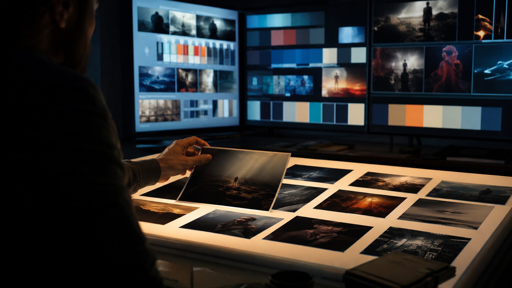
A mood board is often treated as a collage of images the creator likes. That is useful for taste, but not enough for production. A mood system turns references into decisions.
Instead of collecting thirty images and hoping they explain the direction, sort them into categories:
- Color world: muted earth tones, cold blue, high-contrast black and white, saturated club lighting.
- Texture: film grain, glossy chrome, paper collage, soft blur, plastic, dust, water, skin, concrete.
- Subject language: close-up faces, empty objects, landscapes, hands, silhouettes, crowds.
- Composition: centered portrait, asymmetry, negative space, rule of thirds, cropped bodies.
- Typography: handwritten, condensed editorial, brutalist, elegant serif, sticker-like labels.
- Motion: slow dissolve, jump cuts, looped gesture, handheld movement, kinetic text.
- Emotional temperature: calm, violent, nostalgic, euphoric, lonely, absurd, luxurious.
Adobe’s design guidance frames principles such as emphasis, hierarchy, contrast, balance, and repetition as tools that strengthen composition and communication. That same logic applies to mood boards: references should help you make repeatable visual choices, not just decorate a planning document.
A useful reference breakdown
When you save a reference, add one note explaining why it belongs. For example:

| Reference | Why It Matters |
|---|---|
| Close-up portrait in red light | Good emotional intensity, but face should be less polished |
| Grainy street image | Texture fits the release mood |
| Minimal poster with small type | Strong hierarchy for announcement graphics |
| 8-second loop with slow motion | Useful model for Spotify Canvas or teaser motion |
This creates a shared language for solo creators, collaborators, designers, editors, and AI tools. It also prevents the common problem where everyone likes the mood board but interprets it differently.
Use Composition to Tell the Viewer Where to Look
Good visual storytelling respects attention. Viewers should not have to decode where the focal point is, what matters, or how the visual connects to the message.
Composition is the invisible hand that guides the eye. It includes framing, scale, contrast, spacing, depth, color, typography, and the relationship between subject and background.
For thumbnails and social graphics, the priority is clarity at small sizes. YouTube’s thumbnail guidance recommends thinking about the target viewer, using the rule of thirds, adding branding and descriptive text where useful, and keeping text readable.
For creators, that means every visual should pass a small-screen test:
- Shrink it to phone size.
- Look for three seconds.
- Ask: what is the first thing I notice?
- Ask: do I understand the promise, mood, or subject?
- Remove anything that competes with the main idea.
Composition techniques that improve storytelling
- Use scale to create importance. A large face, object, or symbol tells the viewer what matters emotionally.
- Use contrast to create focus. Light against dark, sharp against soft, saturated against muted, stillness against motion.
- Use negative space to create tension. Empty space can suggest loneliness, luxury, silence, anticipation, or unease.
- Use repetition to create identity. Repeated framing, colors, symbols, or type treatments make a campaign feel intentional.
- Use cropping to create intimacy. A cropped hand, mouth, instrument, car window, or stage light can imply a larger story without explaining everything.
Mistake to avoid: filling every available space. Busy visuals can feel energetic, but they often weaken the viewer’s memory of the central idea.
Design for Sequence: Hook, Shift, Payoff
Many creators think about individual assets. Strong visual storytellers think in sequences.
A sequence could be a 10-slide carousel, a music release rollout, a three-part Reel series, a YouTube intro, a TikTok narrative, a tour announcement, or a set of teaser images. In each case, the story needs movement.
| Stage | Purpose | Example |
|---|---|---|
| Hook | Stop attention | A strange image, question, face, lyric, object, contrast |
| Context | Give meaning | A short caption, visual clue, behind-the-scenes detail |
| Shift | Create movement | Reveal, transformation, new angle, before/after, tension |
| Payoff | Deliver memory | Release date, final frame, title, chorus, CTA, visual symbol |
Google’s YouTube creative framework identifies Attention, Branding, Connection, and Direction as core principles for effective video ads. Even if you are not making ads, the structure is useful: earn attention, make the creator or project recognizable, build emotional relevance, and guide the viewer toward the next step.
For short-form video, the opening moment is especially important. YouTube advises Shorts creators to think about how the first one to two seconds can grab viewers in the feed. TikTok’s official creative guidance also emphasizes vertical production, sound or music, resolution basics, and keeping key content visible within safe zones.
For musicians: sequence the release visually
Instead of making one cover and then improvising social posts, plan the visual arc:
- Announcement: title, date, central image.
- Mood teaser: no hard sell, just atmosphere.
- Lyric or theme asset: one line, one emotional image.
- Behind-the-scenes asset: studio, sketch, reference, process.
- Release-day asset: clear CTA and platform direction.
- Post-release asset: fan reaction, alternate visual, live version, breakdown.
Spotify recommends that Canvas visuals avoid rapid cuts or intense flashing, account for phone cropping, and try to tell a complete story even within an eight-second loop. That is a useful reminder: shorter formats still need narrative discipline.
Turn One Concept Into a Full Asset Family
A visual story becomes more powerful when it travels across formats without losing coherence. The goal is not to copy the same image everywhere. The goal is to adapt the same creative idea to each context.
Think of your central concept as a world. Each asset is a different doorway into that world.
Example: one music release concept
Concept: “A late-night city drive after a breakup, seen through reflections.”
| Asset | Adaptation |
|---|---|
| Cover art | Main portrait reflected in rainy glass |
| Spotify Canvas | Slow loop of streetlights moving across the face |
| Instagram Reel | 7-second lyric teaser with windshield texture |
| TikTok | Behind-the-scenes clip showing the reference board |
| YouTube thumbnail | High-contrast face, title phrase, strong emotional expression |
| Story post | Countdown sticker over blurred night road |
| Press image | Cleaner portrait using the same palette and mood |
| Merch mockup | Minimal symbol from the reflection pattern |
This is how creators move from isolated visuals to campaign systems. It also makes production easier because each asset does not need to be invented from zero.
Asset family checklist
Before publishing, check:
- Does every asset share the same emotional world?
- Are the formats adapted to platform behavior?
- Is the text readable on mobile?
- Are safe zones respected for vertical video?
- Does each asset have one clear job?
- Is there enough variation to avoid fatigue?
- Are final files resized, named, and organized?
Mistake to avoid: making one square artwork and cropping it into every platform. Cropping can break composition, hide important text, or make the story feel careless.
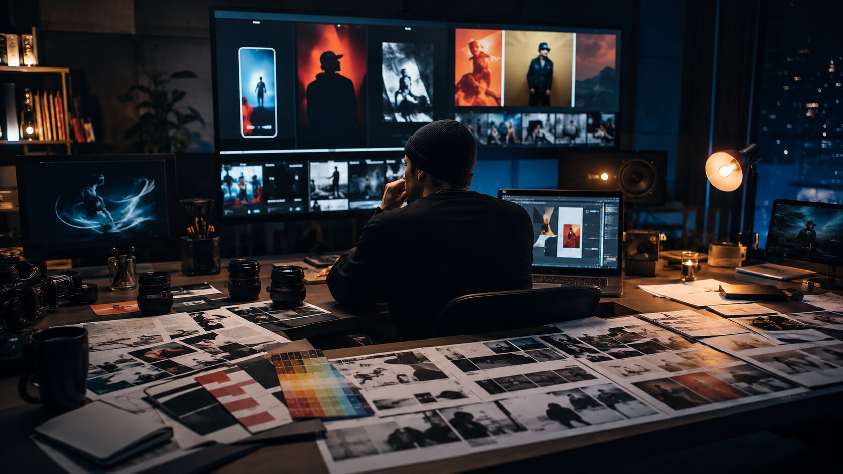
Use AI for Exploration, Then Curate Like a Director
AI can be extremely useful in visual storytelling, but only when it is part of a directed workflow. It is strong for ideation, variation, mood exploration, layout options, prompt testing, voice variants, and asset repurposing. It is weaker when the creator asks it to replace taste, authorship, or decision-making.
A strong AI-assisted workflow looks like this:
- Define the story: emotional thesis, audience, format, constraints.
- Collect references: palette, texture, composition, typography, motion.
- Write creative direction: what to include, what to avoid, what the work should feel like.
- Generate variations: explore different framings, styles, symbols, and formats.
- Curate: select only what matches the concept.
- Refine: edit, retouch, crop, resize, rewrite, sequence.
- Check rights and context: usage permissions, likeness, brand safety, platform fit.
- Publish and learn: review performance and audience response.
The key is that consistency comes from direction, not from random prompting. A vague prompt may produce attractive images, but attractive is not the same as right.
What human judgment should control
| Human Decision | Why It Matters |
|---|---|
| Taste | AI can produce options, but you decide what belongs in your world. |
| Originality | You must avoid generic outputs and overfamiliar visual clichés. |
| Brand fit | A strong asset still fails if it does not sound or look like you. |
| Ethics | Likeness, cultural references, disclosure, and source material need review. |
| Final selection | Publishing is an editorial decision, not an output dump. |
Copyright and AI rules are also evolving. The U.S. Copyright Office has stated that generative AI outputs may be protected only where sufficient human authorship determines expressive elements, and that prompts alone are not enough for copyright protection. This does not mean creators should avoid AI; it means they should treat AI as an assistive tool and keep human creative contribution visible in the process.
Keep Your Visual Identity Consistent Without Making It Repetitive
Consistency does not mean every post looks identical. It means people can recognize your creative world across different formats.
A visual identity can include:
- recurring colors,
- preferred contrast levels,
- subject matter,
- framing habits,
- typography rules,
- symbols or motifs,
- motion style,
- editing rhythm,
- language and caption tone.
Canva’s brand consistency guidance emphasizes aligning design, voice, and brand strategy so content feels connected rather than fragmented. For independent creators, this does not require a corporate brand book. A one-page visual identity guide is enough to start.
A simple creator style guide
Create a document with:
- Three words for your visual world: cinematic, raw, intimate.
- Primary palette: black, deep blue, pale yellow.
- Avoid list: glossy luxury, corporate gradients, comedy meme fonts.
- Typography direction: narrow sans serif, small uppercase, generous spacing.
- Image rules: close crops, natural blur, night lighting.
- Motion rules: slow loops, no aggressive zooms, minimal cuts.
- Platform notes: vertical-first for short video, readable thumbnail text, safe zones.
The avoid list is especially important. Clear creative direction is not only about what to make. It is about what to reject.
Pro Tip: If your visuals feel inconsistent, do not start by changing tools. Start by writing down your repeatable decisions.
From Rough Idea to Publish-Ready Direction With Orias AI
Orias AI is built for creators, artists, musicians, and visual storytellers who need to turn references, rough directions, moods, and half-formed ideas into clearer creative packs, release visuals, promo assets, storyboards, voice variants, and publish-ready output.
That fits the real challenge behind visual storytelling: not simply generating more assets, but making the creative direction coherent enough to support a campaign.
For a music release, Orias AI can help organize a mood, explore visual directions, build promo concepts, create variations, and turn one core idea into a practical asset system. For creators and visual teams, it can support the messy middle between inspiration and execution: references become direction, direction becomes formats, and formats become content that is easier to refine and publish.
The best use is not to hand over your artistic voice. It is to clarify it, pressure-test it, and translate it into visuals that are consistent enough to travel.
Frequently Asked Questions
What is visual storytelling?
Visual storytelling is the use of images, composition, color, motion, typography, sequence, and symbols to communicate a narrative or emotion. For creators, it means every asset should help the audience understand the world, mood, or message behind the work.
What are the most important visual storytelling techniques?
The most important techniques are emotional clarity, strong composition, visual hierarchy, consistent mood, meaningful color, sequence planning, and platform-aware adaptation. Together, they help viewers know where to look, what to feel, and what to remember.
How can musicians use visual storytelling for a release?
Musicians can use visual storytelling by creating a release world before making assets. That world can guide cover art, Spotify Canvas, teasers, lyric clips, press images, merch mockups, and social posts so the release feels cohesive rather than improvised.
Can AI help with visual storytelling?
Yes. AI can help with ideation, mood exploration, visual variations, storyboards, copy directions, and asset repurposing. The creator still needs to define the concept, curate outputs, refine details, check rights, and make final creative decisions.
How do I keep my visuals consistent across platforms?
Create a simple visual identity guide with your palette, typography, image style, motion rules, recurring symbols, and avoid list. Then adapt each asset to the platform instead of cropping the same file everywhere.
What makes AI-generated visuals feel generic?
AI-generated visuals often feel generic when they start from vague prompts, rely on overused aesthetics, ignore the creator’s real references, or skip human editing. Specific creative direction and careful curation make the difference.
Do I need expensive tools to tell better visual stories?
No. Better storytelling usually starts with clearer decisions: mood, message, composition, sequence, and consistency. Professional tools can help, but they cannot replace a strong creative direction.