Tell a Story Through Visual Content
Turn ideas, moods, references and creative direction into stronger visual stories for social content, music releases, campaigns, and AI-assisted workflows.

TL;DR:
- To tell a story through visual content, start with the emotional point you want the audience to understand.
- Translate that idea into mood, subject, setting, sequence, and platform-specific assets.
- Strong visual storytelling is not about one beautiful image; it is about building a connected system of visuals that makes the same idea easier to feel and remember.
A good visual can stop someone from scrolling. A good visual story makes them understand why they should care.
That difference matters for creators, musicians, artists, and creative teams because most audiences now meet your work through fragments: a thumbnail, a vertical clip, a cover image, a teaser, a carousel, a short loop, a behind-the-scenes frame. Each asset may be small, but together they shape how people interpret your project.
The challenge is that many creators approach visual content backward. They start with the format first: “I need a Reel,” “I need a cover,” “I need a promo image,” “I need an AI prompt.” The stronger approach is to start with the story: what is changing, what emotion is being carried, what world does the audience enter, and what should they remember after seeing it?
This guide gives you a practical way to turn ideas, references, moods, and rough creative instincts into visual storytelling systems that work across platforms, campaigns, and AI-assisted workflows.
Table of Contents
- Find the story before choosing the asset
- Build a visual spine: subject, setting, tension, change
- Turn references into direction, not imitation
- Create sequence instead of isolated visuals
- Use AI to explore the world, then edit like a director
- Adapt the same story across platforms without flattening it
- Refine the story after publishing
- How Orias AI supports visual storytelling workflows
- Frequently Asked Questions
Key Takeaways
| Point | Details |
|---|---|
| Story comes before format | Decide what the audience should feel or understand before making a poster, Reel, thumbnail, cover, or AI image. |
| Visual storytelling needs change | Even a still image should imply a before, after, conflict, transformation, or emotional shift. |
| References need translation | Do not copy references directly. Extract lighting, texture, framing, mood, pacing, and visual rules. |
| Consistency is built through systems | Use repeatable color, typography, composition, format crops, and asset rules to keep a campaign coherent. |
| AI helps most during exploration | AI is strongest for variation, mood testing, prompt development, and asset expansion, but human judgment should drive final selection. |
Find the story before choosing the asset
Visual storytelling begins with a simple question: what is the audience supposed to understand without needing a long explanation?
For a musician, the answer might be: “This release feels like leaving a city behind.” For a fashion creator, it might be: “This collection is about quiet confidence.” For a visual artist, it might be: “The work explores memory, distortion, and family history.” For a founder or creative team, it might be: “This campaign shows how a rough idea becomes a finished identity.”
That answer becomes the creative anchor. Without it, every asset becomes a separate design problem. With it, each asset becomes part of a shared narrative.
Use a one-sentence story brief
Before creating visual content, write one sentence in this format:
This visual story is about [subject] moving through [emotional or practical change] in a world that feels [mood].
Examples:
- “This visual story is about an independent artist moving from isolation to connection in a world that feels nocturnal, intimate, and handmade.”
- “This visual story is about a creator turning scattered references into a clear campaign world that feels sharp, modern, and disciplined.”
- “This visual story is about a new release entering public life after months of private work, in a world that feels cinematic, tense, and hopeful.”
This brief is useful because it gives every later decision a standard. If an image looks good but does not support the sentence, it may not belong.
Avoid the decoration trap
The most common mistake is treating visuals as decoration. A beautiful color palette, cinematic lighting, or stylish AI image can still fail if it does not carry meaning.
A stronger test is:
- What is the subject trying to express?
- What has just happened or is about to happen?
- What emotion is visible in the environment?
- What detail gives the audience context?
- What should the viewer remember?
A story-driven visual does not need to explain everything. It needs to create direction.
Build a visual spine: subject, setting, tension, change
A visual story needs structure. It does not always need a full plot, but it should contain enough narrative pressure to feel alive.
Think of the visual spine as four parts.
| Element | Creative question | Example |
|---|---|---|
| Subject | Who or what carries the story? | Artist, object, room, crowd, handwritten notes, final artwork |
| Setting | Where does the story live? | Studio, bedroom, venue, city street, editing room, rehearsal space |
| Tension | What is unresolved? | Before release, after rejection, during transformation, between public and private identity |
| Change | What shifts? | Rough idea becomes campaign, silence becomes performance, scattered references become a visual world |
This structure works for both still images and moving content. A single image can imply tension through a half-packed suitcase, a rejected print, a glowing screen, or a hand selecting one final frame from many options.
Make the environment do narrative work
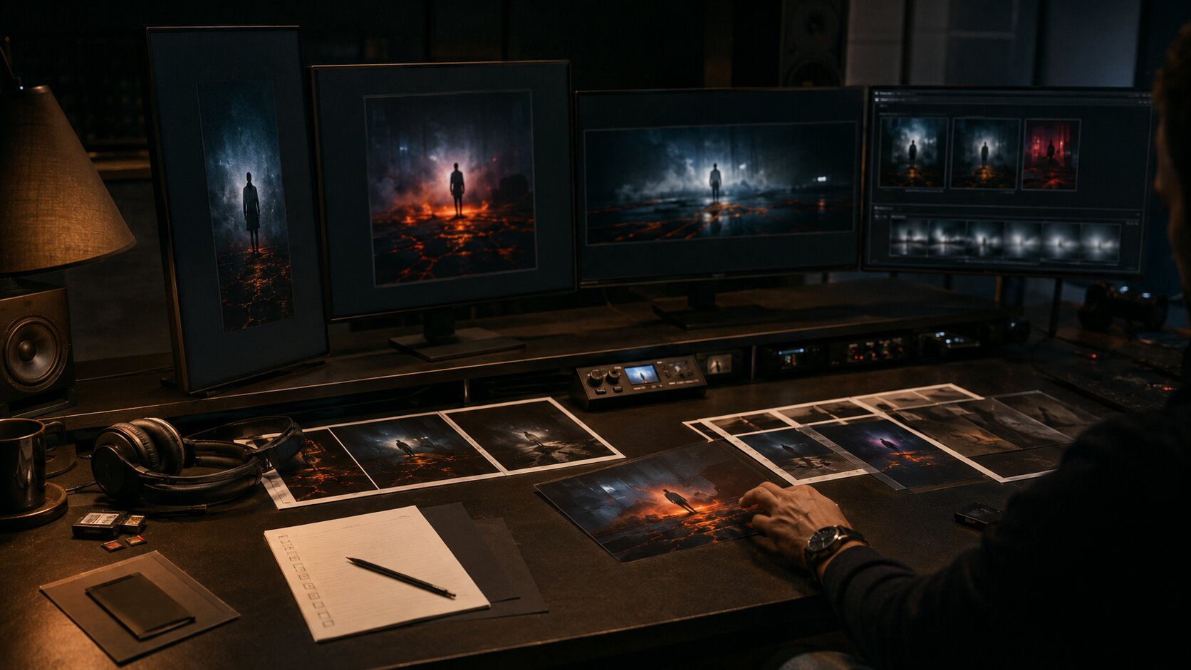
Visual storytelling becomes stronger when the background is not generic. A desk, wall, floor, venue, car, or phone screen can reveal the story without adding text.
For example, a music release campaign could include:
- a notebook with non-readable lyric fragments
- printed cover variations
- a laptop with blurred edit timelines
- a final selected asset placed apart from rejected options
- lighting that suggests late-night decision-making
- a phone showing cropped social previews
None of these details need to explain the whole project. Together, they create atmosphere and narrative context.
Use contrast to create meaning
Contrast gives visual content energy. It can be emotional, spatial, temporal, or stylistic.
Useful contrasts include:
- private studio vs public stage
- rough sketch vs polished asset
- warm human light vs cold screen light
- old reference material vs new AI-generated variations
- empty room vs active community
- silence before release vs noise after launch
When a visual feels flat, it often lacks contrast. Add a meaningful opposition instead of adding more objects.
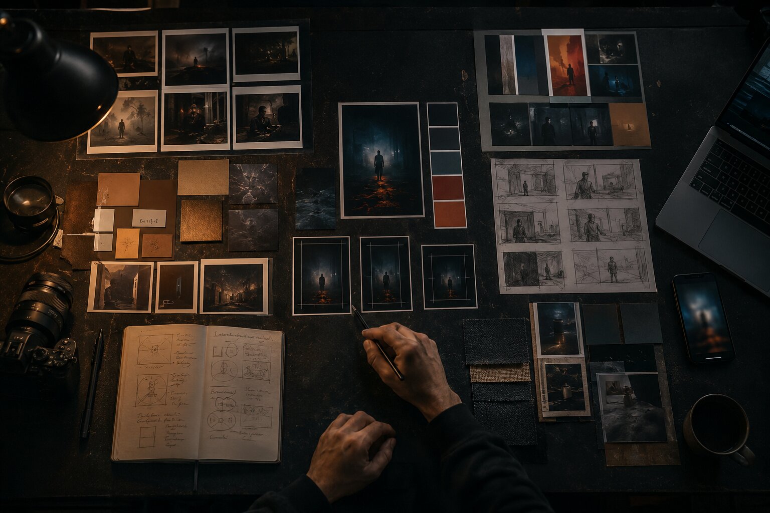
Turn references into direction, not imitation
References are essential, but they become dangerous when they are used too literally. The goal is not to recreate another artist’s image. The goal is to understand what makes a visual language work.
Break each reference into components:
- Lighting: soft, harsh, natural, fluorescent, backlit
- Color: muted, monochrome, acidic, earthy, high contrast
- Framing: close-up, wide, overhead, symmetrical, handheld
- Texture: glossy, grainy, analog, clean, distressed
- Emotion: intimate, chaotic, restrained, surreal, confident
- Pacing: calm, abrupt, looping, episodic, fast-cut
- Production level: documentary, editorial, premium, raw, DIY
This turns inspiration into a usable creative direction.
Create a visual rule set
A visual rule set is a short list of decisions that keeps the story coherent. It does not need to be complicated.
Example for an independent artist release:
- Use low-key lighting with warm practical lamps.
- Avoid bright daylight.
- Keep frames intimate and close to human details.
- Use deep blues, browns, and muted amber.
- Show process objects: notebooks, printed photos, instruments, edit screens.
- Avoid futuristic AI clichés, robots, and fake interface text.
- Keep typography minimal and spacious.
This kind of rule set is especially important when using AI tools. Consistency comes from clear creative direction, not from random prompting.
Pro Tip: When a reference board starts feeling too broad, remove anything that cannot be described in reusable language. “Cool image” is not direction. “Close framing, soft flash, red shadow, documentary tension” is direction.
Create sequence instead of isolated visuals
A story rarely lives in one asset. It usually unfolds across multiple touchpoints.
For a creator campaign, that might mean:
- a hero image that establishes the world
- a short vertical teaser that introduces motion
- a carousel that explains process
- a thumbnail that creates curiosity
- a behind-the-scenes image that adds credibility
- a final post that invites action
For a music release, it might include cover art, Spotify Canvas, teaser clips, lyric visuals, Reels, YouTube thumbnails, playlist pitching assets, and post-release content. Spotify describes Canvas as a short vertical visual loop shown in the Now Playing view, with guidance around duration, vertical format, avoiding rapid cuts, and connecting the Canvas identity to album art or related visuals. Spotify Canvas Guidelines
Map the story across moments
A useful campaign sequence can follow this structure:
| Campaign moment | Story role | Visual content example |
|---|---|---|
| Tease | Create mystery | Cropped object, blurred studio frame, short loop |
| Reveal | Show the world | Cover image, hero asset, announcement post |
| Explain | Add meaning | Carousel, process post, visual notes |
| Invite | Prompt action | Release-day video, link post, countdown |
| Extend | Keep the world alive | Alternate edits, live clips, fan-inspired visuals |
The mistake to avoid is publishing the same asset everywhere with minor resizing. Repurposing is useful, but storytelling improves when each format has a role.
Design for memory
Audiences may not remember every post. They may remember a visual motif: a red room, a cracked mirror, a handwritten symbol, a repeated camera angle, a specific type treatment, a glowing street corner, a recurring object.
Choose one or two motifs and repeat them intentionally. Repetition makes the story easier to recognize.
Use AI to explore the world, then edit like a director
AI can be extremely useful for visual storytelling, but only when it is treated as part of the creative process rather than the final authority.
Use AI for:
- testing visual worlds
- expanding rough references into mood directions
- generating prompt variations
- exploring lighting and composition
- creating alternate crops or format ideas
- building campaign asset concepts
- developing visual consistency before production
Do not use AI as a substitute for taste. The final decisions still need human judgment: what fits the artist, what feels emotionally true, what is ethically safe, what looks too generic, what needs editing, and what should not be published.
Give AI narrative instructions, not only style instructions
A weak prompt says:
cinematic poster, moody lighting, cool colors, music artist
A stronger prompt says:
A cinematic editorial image of an independent musician at the end of a late-night release planning session, surrounded by printed cover options, handwritten notes with no readable words, a laptop showing blurred campaign visuals, and one final selected image separated from rejected drafts. The mood is focused, intimate, and slightly tense, showing the moment when a private idea becomes a public release.
The second prompt gives the model subject, setting, emotional state, objects, composition, and story purpose. That creates better material for selection and refinement.
Build a review pass into the workflow
Before publishing AI-assisted visuals, check:
- Does the image support the story brief?
- Are there visual errors, distorted details, or misleading elements?
- Does it look too generic or too close to a reference?
- Does it match the campaign’s color, texture, and format rules?
- Does it need retouching, cropping, typography, or resizing?
- Are rights, likeness, brand safety, and platform context acceptable?
AI speeds up exploration. It does not remove responsibility.
Adapt the same story across platforms without flattening it
Different platforms reward different visual decisions. Your story can stay consistent while the execution changes.
YouTube’s official thumbnail guidance emphasizes audience targeting, readable text when used, strong composition, avoiding overly complex designs, and checking how thumbnails appear across devices. YouTube also notes that most top-performing videos use custom thumbnails. YouTube thumbnail guidance
TikTok’s creative guidance recommends making creative platform-native, using vertical 9:16 orientation, meeting baseline resolution expectations, keeping key content visible within UI safe zones, and testing to refine strategy. TikTok creative best practices
That means the same visual story may need different versions:
| Format | What matters most | Storytelling adjustment |
|---|---|---|
| YouTube thumbnail | Immediate clarity and curiosity | Use one strong emotional or visual hook |
| TikTok/Reels | Native motion and fast context | Show the story quickly in vertical framing |
| Instagram carousel | Progression and explanation | Break the story into steps or chapters |
| Spotify Canvas | Short looping visual identity | Create a simple, memorable motion idea |
| Website hero | Atmosphere and positioning | Let the full world breathe with stronger art direction |
The mistake is assuming consistency means sameness. Real consistency means the audience recognizes the same world even when the asset changes.
Treat templates as story containers
Templates are not only production shortcuts. They can protect the visual story.
A creator or team might define:
- title placement rules
- safe crop areas
- recurring type scale
- approved image treatments
- motion pacing
- thumbnail composition patterns
- color and contrast rules
- export sizes for each platform
Design systems and reusable components are often used to keep experiences consistent across projects; Figma describes components as reusable elements that help create and manage consistent designs. Figma component guide Figma’s design-system guidance also frames design systems as building blocks and standards that help maintain a consistent look and feel at scale. Figma design systems guide
For visual storytellers, the principle is the same: build repeatable creative structures so every new asset does not start from zero.
Refine the story after publishing
A visual story does not end when the first post goes live. Publishing gives you feedback.
Look for signals such as:
- which image people saved or shared
- which thumbnail earned more clicks
- which carousel slide held attention
- which visual motif people commented on
- which behind-the-scenes asset created more connection
- which format felt off-brand or unclear
Do not treat performance data as a replacement for creative judgment. Treat it as audience feedback. Sometimes the most meaningful asset is not the loudest one. Sometimes a quieter process image deepens trust more than a polished campaign graphic.
Run a post-campaign visual audit
After a release, launch, or campaign, collect the assets and ask:
- Did the visuals feel like one world?
- Which asset explained the story best?
- Which format felt weakest?
- Was the audience given enough context?
- Did the AI-generated material feel refined or unfinished?
- What should become part of the next visual system?
This is how creators improve over time. Not by chasing every trend, but by learning what their own visual language can carry.
Canva’s brand consistency guidance also emphasizes that consistent presentation across platforms, centralized assets, templates, and clear brand guidelines help teams keep content aligned as output grows. Canva brand consistency guide
How Orias AI supports visual storytelling workflows
Orias AI is built for creators who do not want to stop at a single prompt or one-off image. Visual storytelling usually begins with rough material: a mood, a phrase, a release idea, a reference board, a campaign direction, a visual world that is not yet organized.
Orias AI helps turn that raw creative input into clearer directions, visual concepts, promo assets, release visuals, voice variants, and publish-ready creative packs. That makes it useful when you need to move from “I know the feeling” to “I know what the campaign should look like.”
For artists, musicians, digital creators, and creative teams, the advantage is structure. Instead of generating disconnected visuals, you can develop a more coherent world: the hero image, the short-form assets, the supporting posts, the visual tone, the campaign language, and the variations needed for different platforms.
The result is not less human creativity. It is a better container for it.
Frequently Asked Questions
What does it mean to tell a story through visual content?
It means using images, video, composition, color, setting, motion, and sequence to communicate an idea or emotion. The visual should suggest context, tension, mood, or change, even when there is very little text.
Can a single image tell a full story?
Yes, but it usually needs implied action. A still image can show what just happened, what is about to happen, or what emotional state the subject is in. Details like objects, lighting, framing, and environment help the viewer infer the story.
How do I make visual content feel consistent across platforms?
Create a small visual system before producing assets. Define color, lighting, typography, motifs, composition rules, and platform-specific crops. Then adapt the story for each format instead of reposting the exact same asset everywhere.
How can musicians use visual storytelling for a release?
Musicians can build a release world around the song’s mood, lyrics, production style, or emotional arc. That world can inform cover art, Canvas loops, teaser videos, lyric visuals, thumbnails, behind-the-scenes posts, and post-release content.
Is AI good for visual storytelling?
AI is useful for ideation, mood exploration, prompt variation, format testing, and expanding a creative direction. It still needs human review for originality, taste, emotional fit, accuracy, ethics, and final production quality.
What is the biggest mistake in visual storytelling?
The biggest mistake is making assets that look stylish but do not communicate a clear idea. Strong visuals need narrative purpose. Every image should help the audience understand the world, emotion, or message more clearly.
How do I start if I have no visual direction yet?
Start with words, not images. Write one sentence describing the subject, emotional shift, and mood. Then collect references, extract visual rules, create a few test assets, and refine the direction before building the full content system.