How to Use References, Prompts, and Mood Boards Together
Combine references, prompts and mood boards to create clearer visual direction, stronger AI outputs and consistent campaign assets.

TL;DR:
- References show what you are responding to, mood boards organize the emotional and visual direction, and prompts translate that direction into specific creative outputs.
- The best workflow is not “collect images, write a prompt, hope for the best.”
- Gather references, curate a mood board, define the rules of the visual world, then write prompts that generate assets within that world.
Creative work often starts as a blur: a song that feels nocturnal, a campaign that should feel intimate but cinematic, a visual identity that needs to be raw without looking unfinished. The problem is not always a lack of ideas. More often, it is that the idea has not been translated into a clear visual system.
That is where references, prompts, and mood boards become powerful together. A reference can point to lighting, texture, framing, styling, color, energy, or emotion. A mood board turns scattered references into a readable creative direction. A prompt gives an AI tool or creative collaborator the instructions needed to produce something specific.
For artists, musicians, creators, and visual storytellers, this matters because campaigns are no longer built from one image. A release may need cover concepts, vertical teasers, lyric cards, profile visuals, YouTube thumbnails, Spotify Canvas ideas, short-form video frames, and social posts. Without a system, every asset starts from zero.
This guide explains how to combine references, prompts, and mood boards into a repeatable creative workflow that keeps your work coherent without flattening your voice.
Table of Contents
- The three tools do different jobs
- Begin with references, not prompts
- Curate the mood board into a visual argument
- Turn the board into prompt-ready language
- Use AI for range, then curate for identity
- Convert one direction into a full asset system
- Keep the workflow editable, ethical, and platform-aware
- How Orias AI supports this workflow
- Frequently Asked Questions
- Sources Used
Key Takeaways
| Point | Details |
|---|---|
| References are raw material | They help you identify visual qualities such as lighting, palette, composition, texture, styling, and emotional tone. |
| Mood boards are decision tools | A good mood board does not collect everything you like. It narrows the direction and makes creative choices visible. |
| Prompts need translation | Strong prompts convert the mood board into clear instructions: subject, environment, mood, format, constraints, and exclusions. |
| Consistency comes before generation | AI output becomes stronger when the creative world is defined before asset generation begins. |
| Human judgment remains central | AI can explore options quickly, but taste, brand fit, ethics, and final selection still require human direction. |
| Assets should be planned as a system | A campaign needs format variations, not isolated images: wide, square, vertical, thumbnail, teaser, and post-ready versions. |
The three tools do different jobs
References, prompts, and mood boards are often treated as interchangeable, but they solve different creative problems.
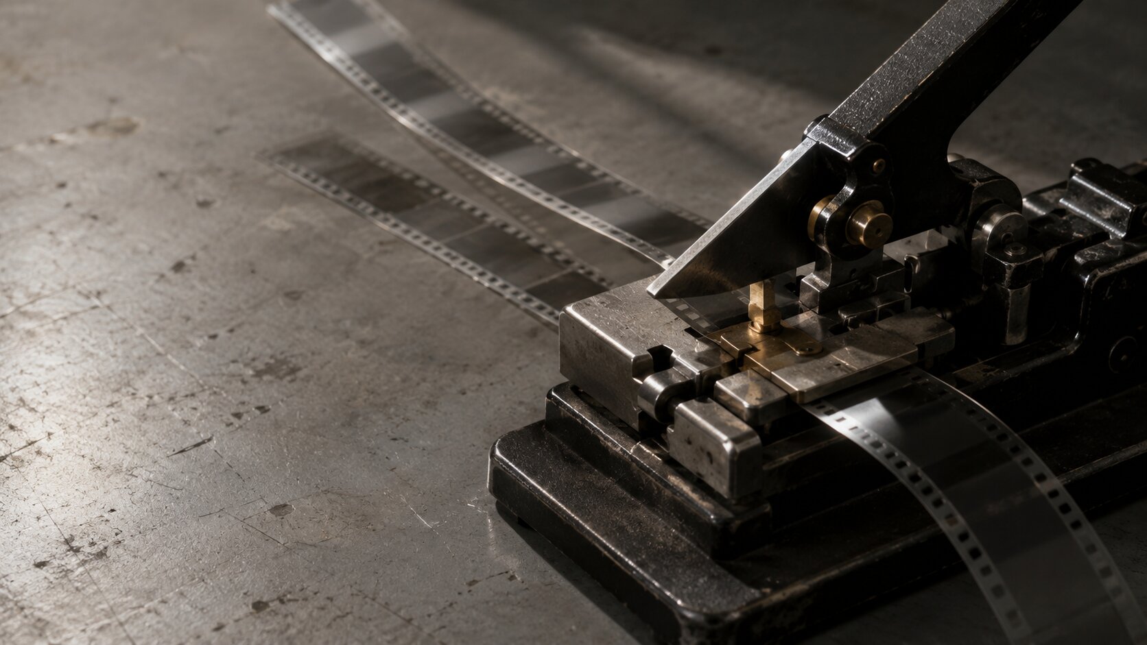
A reference is a piece of inspiration. It might be a still from a film, a fashion editorial, an album cover, a color palette, a backstage photo, a typography sample, a set design, or a social post layout. A reference says, “There is something here worth studying.”
A mood board is a curated arrangement of references. Adobe describes mood boards as collections of imagery, text, and other elements that evoke emotions, develop concepts, and create themes visually. Canva similarly notes that mood boards often include images, logos, sketches, color swatches, stylized text, and textures.
A prompt is an instruction. In an AI workflow, the prompt translates creative intent into operational language. OpenAI defines prompt engineering as writing effective instructions so a model can generate content that meets requirements, while noting that outputs are non-deterministic and prompting is partly iterative.
| Tool | Purpose | Common mistake |
|---|---|---|
| Reference | Shows inspiration | Copying the surface instead of identifying the useful quality |
| Mood board | Organizes direction | Adding too much until the board has no point of view |
| Prompt | Produces output | Writing vague instructions without visual rules |
The workflow works best when each tool passes information to the next. References give you material. Mood boards create direction. Prompts create execution.
Begin with references, not prompts
A common mistake in AI-assisted creative work is starting with the prompt too early. The creator writes something like:
“Make a cinematic album cover for an emotional indie song.”
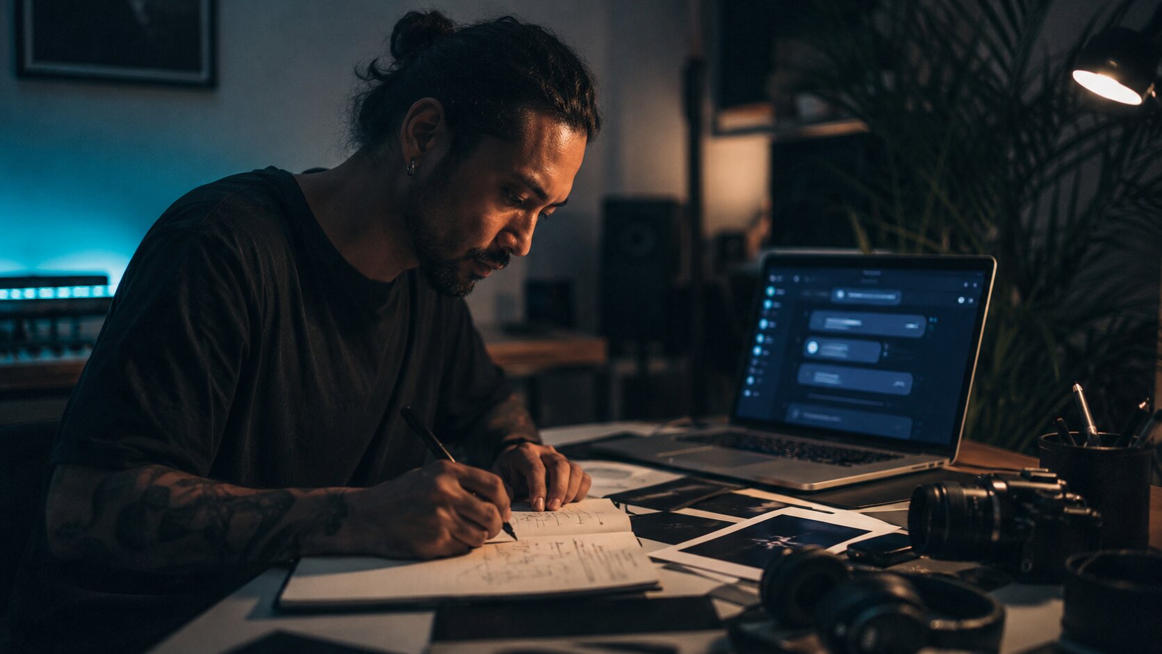
That is not wrong, but it is too open. “Cinematic” could mean handheld documentary realism, glossy fashion lighting, neon noir, vintage film grain, surreal dream imagery, or a polished streaming-platform aesthetic. “Emotional” could mean grief, intimacy, nostalgia, rage, release, softness, loneliness, or euphoria.
Before prompting, collect references that help answer three questions.
What should the work feel like?
Start with emotion, not format. For example:
- quiet confidence
- post-breakup stillness
- underground club tension
- summer nostalgia
- spiritual minimalism
- chaotic tour diary energy
- luxury isolation
- intimate bedroom-pop realism
The emotional field prevents your visual direction from becoming random.
What should the work look like?
Look for concrete visual traits:
- Lighting: soft window light, harsh flash, sodium streetlight, blue stage haze
- Color: muted earth tones, black-and-silver, washed pastels, saturated red, cold green
- Camera language: close-up, wide environmental portrait, overhead flat lay, motion blur
- Texture: grain, gloss, paper, skin, smoke, rain, plastic, metal
- Composition: centered, asymmetrical, crowded, minimal, negative space
- Styling: casual, ceremonial, futuristic, vintage, improvised, editorial
This is where references become useful. You are not asking AI to recreate a reference. You are extracting direction from it.
What should the work avoid?
Negative direction is just as important as positive direction. A creator might decide:
- no fake neon cyberpunk look
- no glossy stock-photo faces
- no over-polished luxury aesthetic
- no readable fake text
- no random sci-fi elements
- no literal musical notes or floating headphones
- no generic “AI art” glow
This saves time later. Many weak AI outputs happen because the prompt only says what to include, not what to reject.
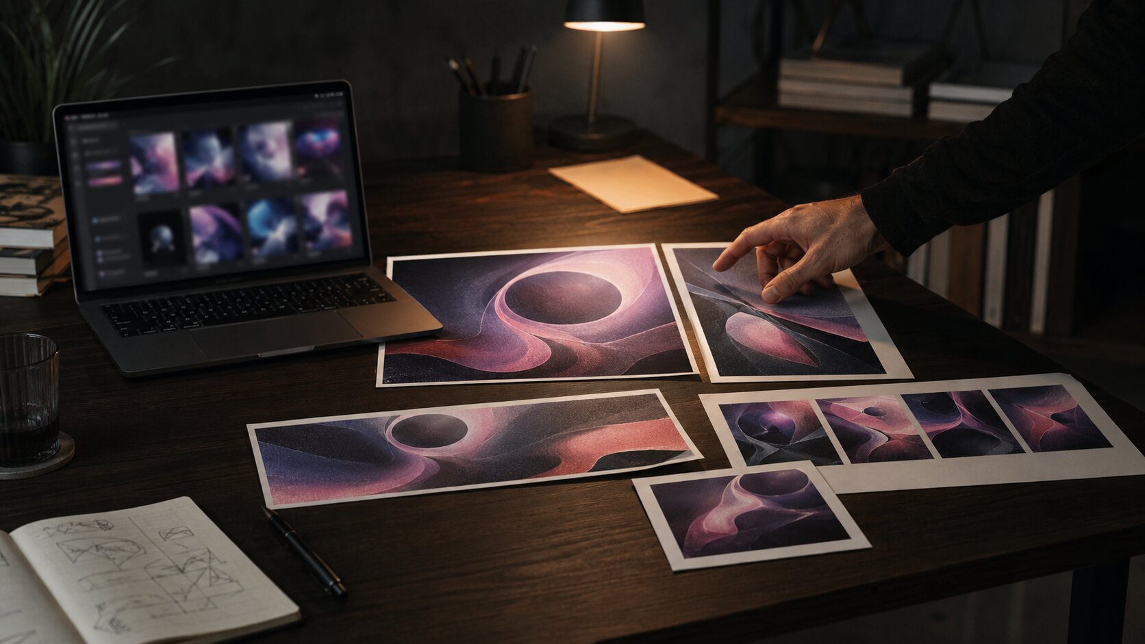
Curate the mood board into a visual argument

A mood board should not be a folder of attractive images. It should make a visual argument: “This is the world we are building.”
For a musician, that world might define the visual atmosphere around a single, EP, album, tour, or social campaign. For a digital creator, it might define a recurring content identity. For a creative team, it might align everyone before production starts.
A useful board usually has fewer references than people expect. Too many images dilute the signal. Instead of adding everything, group the board into intentional zones.
Build the board in layers
- Emotional core: The images that capture the feeling of the project.
- Color and light: The palette, contrast, shadows, glow, temperature, and exposure style.
- Subject and styling: Clothing, posture, human presence, props, performance energy, or absence of people.
- Environment: Bedroom, club, street, desert, studio, car, backstage corridor, empty venue, rooftop, rehearsal room.
- Graphic system: Type mood, spacing, overlays, logo placement, crop logic, texture, borders, repeated motifs.
- Format examples: Vertical stories, square posts, thumbnails, banners, cover art, looping visuals.
This structure helps you see whether the direction can survive across formats.
Add notes beside the visuals
Mood boards often fail because they rely on taste without explanation. Add short notes such as:
- “Use this for shadow depth, not wardrobe.”
- “Color reference only.”
- “Good sense of solitude.”
- “Avoid the typography; too corporate.”
- “This framing works for vertical teasers.”
- “Texture direction: imperfect, grainy, physical.”
These notes are especially important when AI is involved. A model does not automatically know which part of a reference matters. Human annotation creates the bridge between inspiration and instruction.
Reduce the board to a direction sentence
Before writing prompts, summarize the board in one sentence.
“A nocturnal, intimate visual world for an independent electronic release, built around dim blue interiors, warm practical lights, soft grain, close human gestures, and quiet tension rather than futuristic clichés.”
This sentence becomes the creative anchor. Every prompt, asset, and edit should stay connected to it.
Turn the board into prompt-ready language
A prompt should not simply describe an image you want. It should translate the mood board into a production brief.
Use this structure:
Project context:
What is this for?

Creative direction:
What world are we building?

Subject:
Who or what appears?

Setting:
Where does it happen?

Mood:
What should it feel like?

Visual style:
Lighting, color, lens, texture, composition.

Format:
Aspect ratio, crop, platform, asset type.

Constraints:
What to avoid.

Output goal:
What the asset should be useful for.
For example:
Create a cinematic realistic vertical teaser image for an independent alt-pop single campaign.

The visual world is intimate, nocturnal, and emotionally restrained: dim blue interiors, warm practical lamp light, soft film grain, close human gestures, and quiet tension.

Show a musician sitting alone on the floor of a small rehearsal room after midnight, surrounded by cables, a notebook, and an old keyboard. The face should be partially turned away, not posed like a fashion shoot.

Use low-key lighting, muted blue-gray shadows, warm amber highlights, shallow depth of field, realistic skin texture, and documentary editorial composition.

Format: 9:16 vertical crop for short-form social content.

Avoid neon cyberpunk, fake readable text, glossy stock-photo styling, exaggerated sadness, futuristic robots, and literal music-note graphics.
This prompt is stronger because it includes context, direction, subject, visual rules, format, and exclusions.
Use prompt variants, not random rewrites
Instead of generating ten unrelated prompts, create controlled variations.
| Variant | What changes | What stays fixed |
|---|---|---|
| Location test | Bedroom, venue, car, street, studio | Mood, palette, subject identity |
| Framing test | Close-up, wide shot, overhead, silhouette | Color, lighting, texture |
| Energy test | Still, in motion, post-performance, pre-release | Campaign world |
| Format test | Cover, vertical teaser, square post, thumbnail | Core concept |
This gives you range without losing coherence.
Keep a prompt memory
When a prompt works, save it. Do not only save the final image. Save:
- the prompt
- the reference board
- the output
- what worked
- what failed
- final edits
- platform version
- date and campaign context
This becomes your creative system. Over time, you stop starting from scratch.
Use AI for range, then curate for identity
AI is useful because it can generate options quickly. But speed can create a new problem: too many images, too little judgment.
The goal is not to publish the first impressive output. The goal is to use AI as a visual exploration tool, then curate like a creative director.
Ask of each output:
- Does this match the emotional core?
- Does it belong to the same visual world as the board?
- Could this work across multiple campaign assets?
- Does it feel specific to the artist or creator?
- Is it too generic, polished, literal, or trend-driven?
- Does it need editing before publication?
This matters because AI often produces images that look finished before they are conceptually finished. A glossy image can still be wrong.
Create a selection hierarchy
- Exploration: Anything that reveals a possible direction.
- Candidate: Outputs that match the board and could become campaign assets.
- Final system: A smaller set that works together across formats.
The best creative workflow is selective. Rejecting attractive but off-brand images is part of the work.
Watch for “AI sameness”
AI-generated visuals can become generic when prompts rely on common terms like “cinematic,” “beautiful,” “futuristic,” “dreamy,” “high quality,” or “aesthetic” without more precise direction.
Better prompts use specific visual language:
- “soft tungsten light from a bedside lamp”
- “overexposed flash on textured wall”
- “creased paper scan texture”
- “empty venue after soundcheck”
- “matte black wardrobe against faded green tiles”
- “wide negative space for headline overlay”
Specificity protects your identity.
Convert one direction into a full asset system

A strong creative direction should produce more than one image. It should become a system of assets.
For a music release, that system might include:
- cover art direction
- Spotify Canvas concept
- vertical teaser frames
- lyric card backgrounds
- press image treatment
- profile header
- YouTube thumbnail
- Instagram carousel
- short-form video visual language
- tour or event poster adaptation
Platform context matters. TikTok’s creative guidance emphasizes vertical 9:16 orientation, high-resolution assets, and visibility within the app’s UI safe zone for performance creative. Spotify’s Canvas guidelines specify a short vertical loop for tracks. YouTube’s thumbnail guidance encourages clear targeting, readable branding or text where used, strong composition, and avoiding overly complex designs.
That does not mean every asset should look identical. It means they should feel related.
Plan crops before generating finals
A concept that works as a wide hero image may fail as a vertical story. A detailed composition may collapse on a phone screen. A beautiful background may not leave space for type.
Before finalizing, define core formats:
| Asset | Format need | Creative consideration |
|---|---|---|
| Cover art | Square | Must remain readable at small size |
| Vertical teaser | 9:16 | Needs safe space for UI overlays |
| YouTube thumbnail | 16:9 | Needs one clear visual idea |
| Social carousel | 4:5 or square | Should work as a sequence |
| Spotify Canvas | Vertical loop | Must communicate quickly without overloading the viewer |
| Website hero | Wide | Needs atmosphere and negative space |
The same mood board can guide all of these, but each prompt should respect the asset’s job.
Repurpose with intention
Do not simply crop one image into every format. Instead, adapt the concept.
For example, a campaign built around “midnight rehearsal room isolation” could become:
- square cover: musician framed by cables and blue shadow
- vertical teaser: close-up of hand adjusting a synth
- lyric card: empty rehearsal chair under warm lamp
- thumbnail: expressive face and strong negative space
- Canvas: slow loop of flickering light over instruments
- carousel: sequence of objects, room, artist, detail, final release visual
The world stays consistent. The asset changes according to use.
Keep the workflow editable, ethical, and platform-aware
AI-assisted visual work still needs review. Treat generated output as draft material, not automatic publication material.
Check rights and source materials
Do not use references as a way to imitate a living artist, photographer, designer, or brand too closely. Use references to define qualities, not to clone someone’s protected expression or recognizable style.
For U.S. copyright context, the U.S. Copyright Office has been actively examining AI-related copyright issues, including AI-generated works, digital replicas, and training.
Practical guidance:
- Use references for analysis, not direct copying.
- Avoid prompts that name living artists when the goal is imitation.
- Keep records of your own creative input.
- Edit and refine outputs manually where possible.
- Check platform and tool terms before commercial use.
- Be transparent when disclosure is required or appropriate.
Preserve transparency where possible
Adobe notes that Content Credentials can add context about how a file was created or edited and that Adobe Firefly automatically applies them to assets where all pixels are generated with Firefly.
Even if you are not using Adobe tools, the principle is useful: keep a trail. Save prompts, references, drafts, edits, and final exports. For teams, this helps with accountability. For independent creators, it helps you understand your own process.
Edit before publishing
AI outputs often need:
- color correction
- typography
- cropping
- retouching
- compositing
- resizing
- accessibility review
- safe-zone checks
- file compression
- legal or rights review
- brand consistency review
Publishing raw output can make a project feel unfinished, even when the image looks technically impressive.
How Orias AI supports this workflow
Orias AI is built around the reality that creators rarely begin with perfect briefs. They begin with fragments: a mood, a song, a reference, a phrase, a campaign idea, a half-formed visual world.
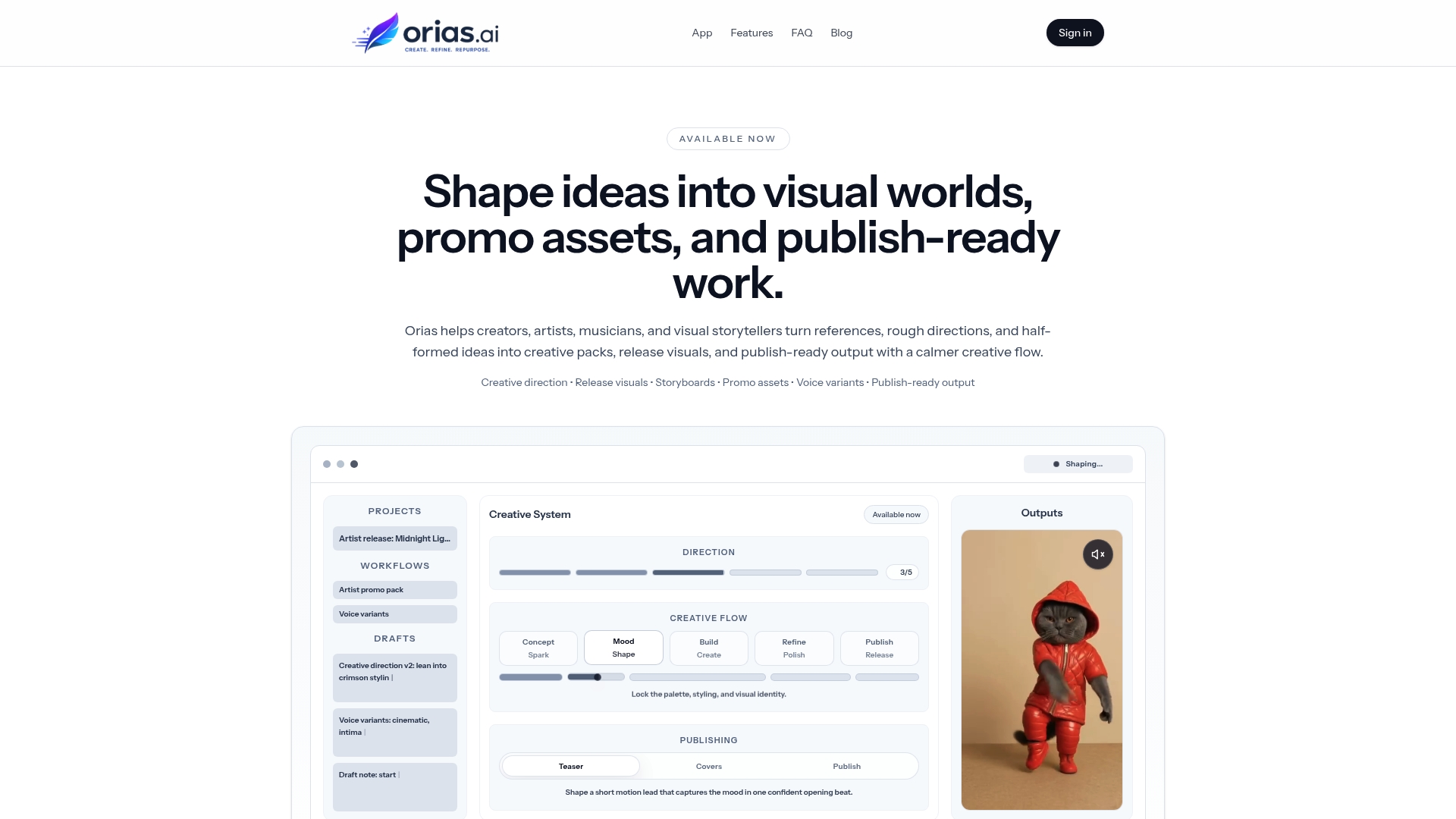
Used well, Orias AI can help turn those fragments into clearer creative direction, promptable concepts, voice variants, visual worlds, promo assets, release visuals, and publish-ready creative packs. The value is not just faster generation. It is the ability to move from rough inspiration to a more organized creative system.
For artists and visual storytellers, that means you can treat AI less like a slot machine and more like a structured studio process: define the world, explore variations, curate the strongest direction, and adapt it across the formats your campaign actually needs.
Frequently Asked Questions
What is the difference between references and a mood board?
References are individual pieces of inspiration. A mood board is a curated collection that organizes those references into a clear direction. References say, “I like something here.” A mood board says, “This is the visual world we are building.”
Should I make a mood board before writing AI prompts?
Yes, especially for creative campaigns, artist visuals, or brand identity work. A mood board helps you define mood, palette, composition, texture, and constraints before prompting. This usually produces more consistent AI outputs.
How many references should a mood board include?
Use enough to clarify the direction, but not so many that the board becomes unfocused. For many projects, 12–25 carefully selected references are more useful than 100 loosely related images.
Can I use copyrighted images as references?
You can study references for inspiration, but you should avoid copying protected expression or using references to imitate a specific artist, photographer, designer, or brand too closely. When in doubt, use references to extract general qualities such as lighting, palette, framing, or atmosphere rather than direct visual replication.
What makes a good prompt from a mood board?
A good prompt translates the board into specific instructions. It should include project context, subject, setting, mood, visual style, format, and exclusions. The more clearly the prompt explains what the references mean, the better the output usually becomes.
How do I keep AI-generated campaign visuals consistent?
Start with a creative direction sentence, reuse core visual rules, save successful prompts, and create controlled variations instead of random new prompts. Consistency comes from the system behind the assets, not from one perfect generation.
How should musicians use this workflow for a release?
Start by defining the emotional world of the song or project. Build a mood board around that feeling, then create prompts for each asset: cover art, vertical teasers, Canvas concepts, lyric cards, thumbnails, profile visuals, and social posts. Review everything as one campaign system before publishing.
Sources Used
- Adobe Express — The Ultimate Guide to Mood Boards
- Canva — Free Mood Board Creator / Mood Board Guide
- OpenAI — Prompt Engineering Guide
- TikTok for Business — Creative Best Practices
- Spotify for Artists — Canvas Guidelines
- YouTube Help — Thumbnail & Title Tips
- U.S. Copyright Office — Copyright and Artificial Intelligence
- Adobe Firefly Help — Content Credentials Overview