How to Create a Visual Identity for Your Music Project with AI
Build a consistent visual identity for your music project with AI, from moodboards and creative direction to release visuals and promo assets.
TL;DR:
- A strong music visual identity is not just a cover image or a few social posts.
- It is a repeatable creative system: mood, references, colors, typography, imagery, motion, layouts, and platform-ready assets working together.
- AI can help you explore directions faster, but consistency comes from clear human choices, not random prompting.
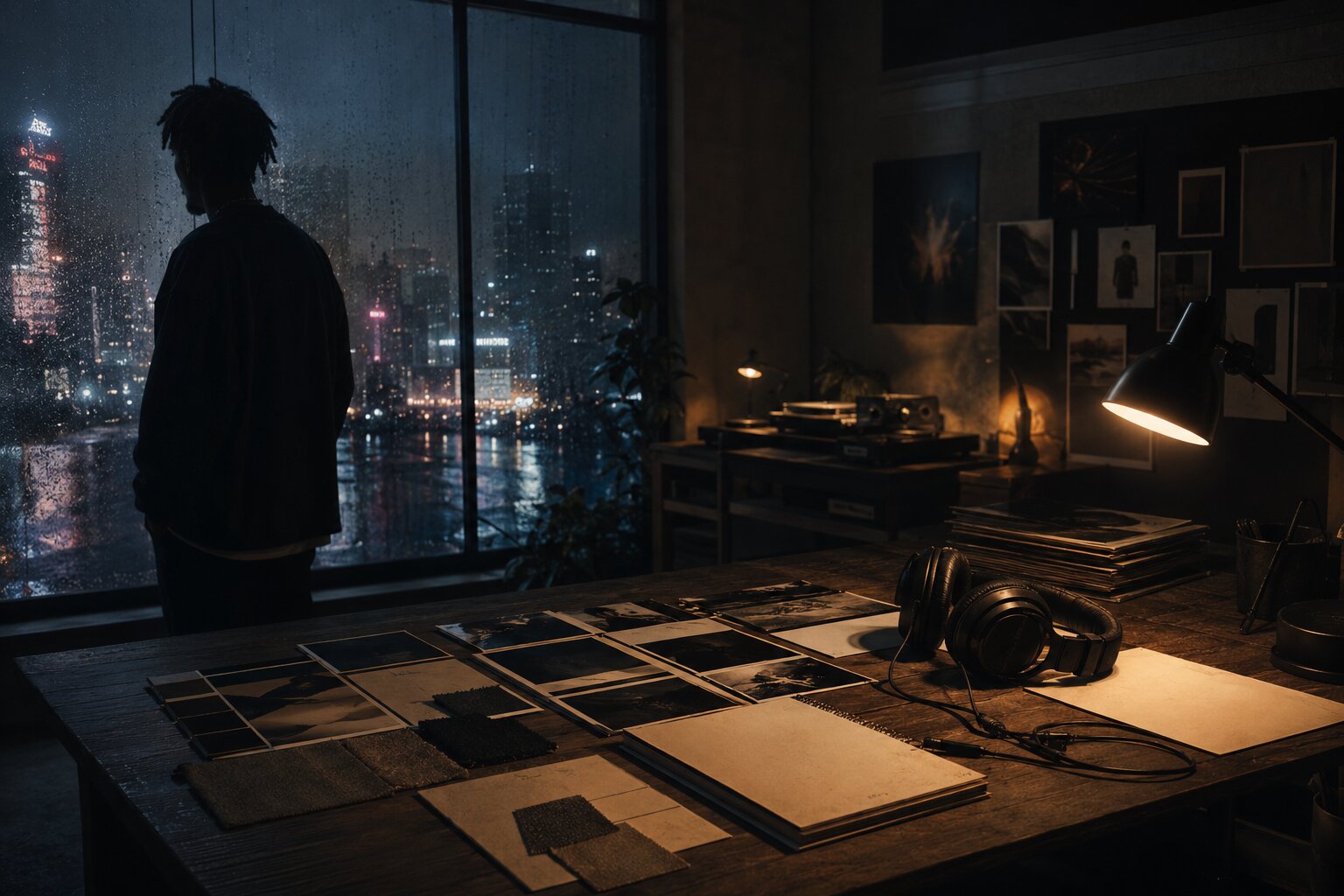
A music project rarely lives in one place anymore. A listener may first see your song as a TikTok clip, then notice your cover art on a streaming platform, then follow you on Instagram, then watch a short live session on YouTube. Before they remember every lyric, they often remember a feeling: the color palette, the face, the texture, the symbol, the world around the sound.
That is what visual identity does. It gives your music a recognizable shape.
For independent artists, producers, bands, DJs, and visual storytellers, the challenge is not usually a lack of ideas. It is turning scattered inspiration into a coherent visual world: one that fits the music, survives across platforms, and can be repeated without becoming boring.
AI can make that process much easier. It can help you test moods, describe your aesthetic, generate image directions, build promo concepts, adapt assets, and plan campaigns. But AI is not a substitute for taste. The strongest results come when you use AI as a creative partner inside a structured workflow, then curate, edit, and finalize with intention.
This guide shows you how to create a visual identity for your music project with AI, from the first mood references to release visuals, social assets, and post-launch iteration.
Table of Contents
- Key Takeaways
- Start with the feeling listeners should recognize
- Turn references into a visual system, not a moodboard dump
- Use AI for direction before you use it for final assets
- Build the identity kit your music project can actually use
- Convert one concept into a full release asset map
- Refine, resize, and check rights before publishing
- Keep the visual world alive after release day
- Shape your release visuals with Orias AI
- Frequently Asked Questions
- Sources Used
Key Takeaways
| Point | Details |
|---|---|
| Visual identity starts with mood | Define the emotional world of the music before choosing fonts, colors, images, or formats. |
| AI works best with direction | Strong prompts come from clear references, audience context, release goals, and creative constraints. |
| Consistency needs a system | Build reusable rules for color, type, imagery, composition, motion, and tone instead of designing every asset from scratch. |
| Platform formats matter | A cover, Spotify Canvas, YouTube thumbnail, Instagram Reel, and TikTok clip each need different framing and technical checks. |
| Human curation is essential | AI can generate options, but you decide what feels original, ethical, on-brand, and ready to publish. |
| One concept can become many assets | A single release world can produce cover ideas, teaser frames, social posts, banners, captions, short video loops, and campaign visuals. |
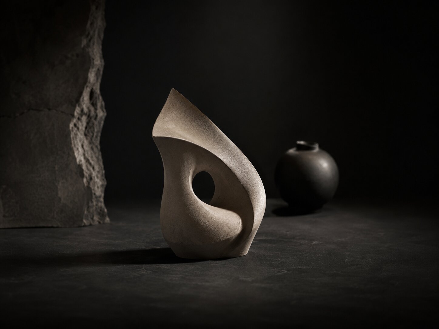
Start with the feeling listeners should recognize
Before you open an AI tool, describe the emotional identity of the music.
Not the genre. Not the algorithm category. The feeling.
A visual identity for a music project should answer questions like:
- What does this song or project feel like before someone presses play?
- Is the world warm, cold, chaotic, sacred, minimal, glamorous, lonely, playful, cinematic, raw, futuristic, nostalgic?
- Should the visuals feel handmade, high-fashion, documentary, surreal, analog, club-focused, dreamlike, or diaristic?
- What should listeners remember after seeing three different assets from the same release?
This matters because AI tools can generate endless attractive images. That abundance is useful, but it can also flatten your taste. Without a defined emotional target, you may end up choosing visuals because they look impressive, not because they belong to your music.
Create a mood statement
Start with a short creative sentence. For example:
“This project should feel like late-night city loneliness, soft neon, blurred movement, and intimate self-reflection.”
Or:
“This EP should feel like sun-damaged memories, vintage family photos, dry landscapes, and quiet resilience.”
A mood statement gives you a filter. Every AI-generated image, cover concept, teaser, or promo asset should either support that sentence or intentionally challenge it.
Separate sound references from visual references
Your musical influences are not always your visual influences. A producer inspired by Burial, Sade, and Frank Ocean may not want visuals that directly imitate any of them. Instead, they might build a world from night photography, old transit stations, blue-gray textures, handwritten notes, and understated portraiture.
Use AI to bridge that gap. Ask it to translate sonic qualities into visual language:
“Translate the feeling of sparse electronic drums, intimate vocals, and rainy late-night textures into a visual direction for an independent music release. Suggest colors, lighting, locations, wardrobe, textures, typography mood, and image references.”
The answer should not be treated as final truth. Use it as a vocabulary builder.
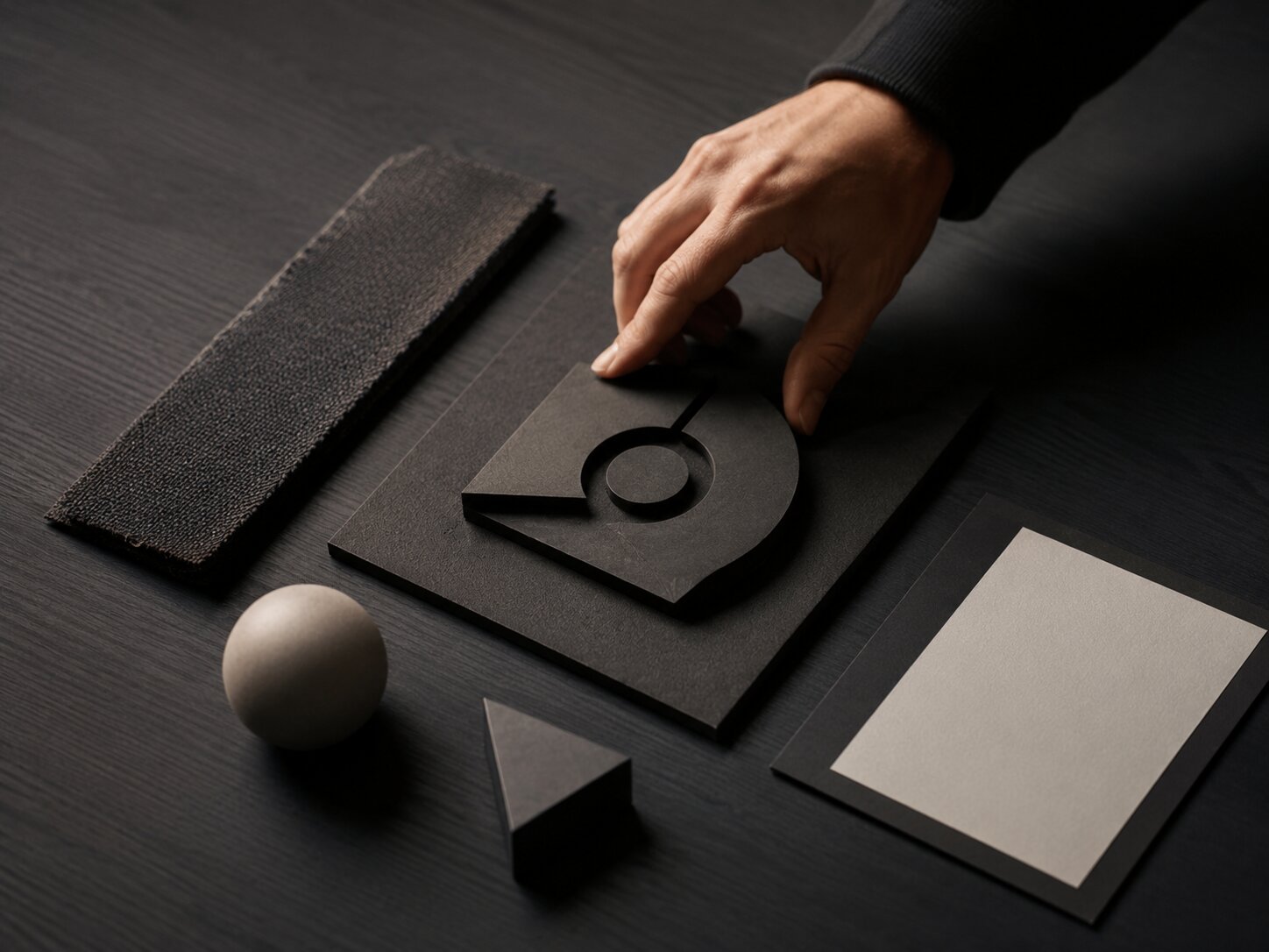
Turn references into a visual system, not a moodboard dump
A moodboard is useful, but it is not a visual identity. A moodboard collects inspiration. A visual system explains how that inspiration should behave.
For a music project, your reference set might include album covers, fashion editorials, film stills, live performance photos, typography samples, lighting references, objects, locations, colors, or screenshots from social content. The key is to organize them into decisions.
Sort references into creative categories
Instead of dumping everything into one folder, separate references by function:
| Reference Type | What to Look For |
|---|---|
| Color | Dominant tones, accent colors, contrast level, warmth or coolness |
| Light | Flash, daylight, neon, shadow, haze, backlight, grain |
| Image style | Portraits, landscapes, collage, abstract textures, objects, performance shots |
| Typography | Serif, sans serif, handwritten, distorted, minimal, editorial, brutalist |
| Composition | Centered portrait, negative space, close crop, cinematic wide shot, layered collage |
| Motion | Slow loop, jump cuts, handheld camera, liquid movement, flicker, glitch, stillness |
| Tone | Romantic, aggressive, mysterious, humorous, spiritual, intimate, rebellious |
Then use AI to summarize the pattern:
“Analyze these visual references as a creative director. Identify the repeated color choices, lighting style, image language, typography mood, composition patterns, and what they communicate emotionally.”
This moves you from “I like these images” to “This is the system behind the images.”
Avoid direct imitation
References should guide taste, not become a copy machine. This is especially important when using AI. Do not ask AI to create work “in the exact style of” a living artist, photographer, designer, or another musician’s campaign. Instead, describe formal qualities: lighting, texture, mood, framing, period influence, materials, color relationships, and emotional tone.
A stronger prompt is:
“Create a grainy, high-contrast black-and-white portrait direction with harsh side lighting, empty negative space, and a quiet post-punk mood.”
A weaker prompt is:
“Make it look like this famous artist’s album campaign.”
The first gives you usable creative direction. The second risks derivative work and weakens your own identity.
Use AI for direction before you use it for final assets
Many creators make the same mistake: they go straight from idea to image generation.
That can work for experiments, but it is fragile for an actual release. A better workflow is:
- Define the music and audience context.
- Build mood and reference language.
- Generate several creative directions.
- Choose one direction.
- Generate assets inside that direction.
- Refine, edit, resize, and prepare for publishing.
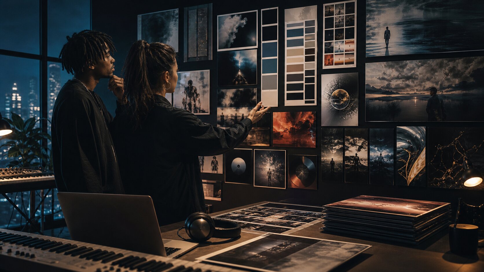
AI is strongest when it helps you explore options quickly. It can produce mood territories, naming concepts, art direction notes, image prompts, campaign ideas, caption variants, storyboard beats, and layout suggestions. Then you decide which direction has the strongest relationship to the music.
Create three visual territories
Ask AI to generate several directions, not one. For example:
“Create three distinct visual identity territories for an alternative R&B single about emotional distance. For each direction, include mood, color palette, image style, typography feel, cover concept, short video idea, and social content angle.”
The output might give you:
- A cold minimal portrait direction
- A surreal domestic interior direction
- A night-drive city direction
Now you can compare. Which one feels most specific? Which one can scale into multiple assets? Which one feels like you, not just a trend?
Build a human selection filter
Before choosing, score each direction against five criteria:
| Criterion | Question |
|---|---|
| Fit | Does it match the music emotionally? |
| Originality | Does it feel personal rather than generic? |
| Repeatability | Can it support many assets, not just one image? |
| Platform flexibility | Can it work as cover art, vertical video, thumbnails, and posts? |
| Practicality | Can you realistically produce or refine it with your time, budget, and tools? |
This prevents AI from pulling you toward the most visually dramatic option when the quieter idea is actually more accurate.
Build the identity kit your music project can actually use
Once you choose a direction, turn it into an identity kit. This does not need to be a corporate brand book. It should be a practical creative guide that helps you make consistent assets.
Your music visual identity kit should include
1. Mood statement
A one-sentence description of the emotional world.
2. Color palette
Choose a small set: primary color, secondary color, background color, accent color, and neutral. Avoid using every color AI suggests.
3. Typography direction
You do not need to finalize every font immediately, but define the feeling: condensed uppercase, soft serif, handwritten, clean sans, distorted display type, minimal editorial, and so on.
4. Image rules
Decide what appears in the world: faces, objects, locations, symbols, textures, landscapes, crowds, empty spaces, performance shots, body details, abstract forms.
5. Composition rules
For example: close crops, centered stillness, heavy negative space, collage layering, blurred motion, or diagonal energy.
6. Motion language
This is essential for music. Decide whether movement should be slow, looped, flashing, handheld, cinematic, glitchy, floating, or rhythmic.
7. Voice and copy tone
Your captions, teasers, and release notes should feel connected to the visuals. A diaristic visual world probably should not use overly polished corporate copy.
Make the system small enough to remember
A visual identity becomes useful when you can actually apply it under pressure. For a single release, keep your rules compact:
- 3–5 colors
- 1–2 type styles
- 3 image motifs
- 2 composition rules
- 1 motion principle
- 1 caption tone
This gives you enough consistency without making the project feel rigid.
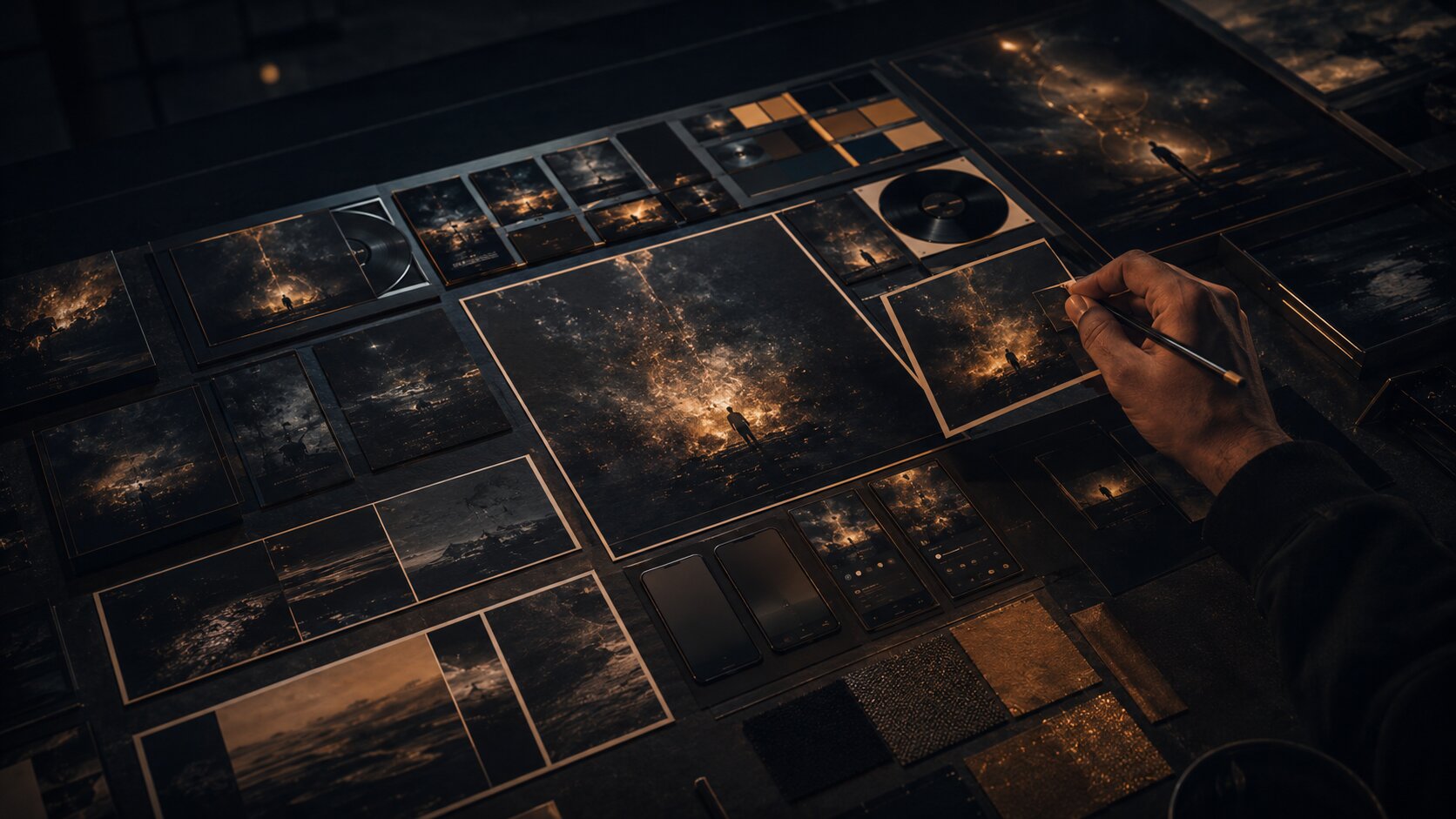
Convert one concept into a full release asset map
A music identity becomes real when it travels across assets. Your goal is not to make one beautiful image. Your goal is to create a release world that can appear wherever listeners meet the project.
Social and video platforms play a major role in music discovery. Deloitte’s Digital Media Trends research reported that 82% of Gen Zs and 70% of millennials discover new artists or music through social media or user-generated video sites, which makes visual consistency across those surfaces especially important for artists building recognition. Deloitte
Build assets by campaign stage
Instead of generating random posts, map your release campaign:
| Stage | Asset Ideas |
|---|---|
| Pre-announcement | Cryptic mood images, texture posts, lyric fragments, visual teaser |
| Announcement | Cover reveal, release date post, artist photo, short trailer |
| Pre-save / pre-release | Vertical teaser, story frames, countdown graphics, behind-the-scenes clips |
| Release day | Cover art, streaming link visuals, short-form video, platform banners |
| Post-release | Live clip, lyric breakdown, alternate visual, fan repost template, acoustic version visual |
| Long tail | Playlist pitch image, YouTube thumbnail, merch mockup, tour poster variation |
This is where AI becomes especially useful. You can ask it to adapt one direction into multiple formats:
“Using this visual identity, create a release asset plan for a single. Include cover art direction, Spotify Canvas idea, Instagram Reel concept, TikTok teaser, YouTube thumbnail, story posts, and post-release content.”
Think in formats, not just images
Different platforms have different constraints.
Spotify Canvas, for example, is a short vertical visual loop that appears in the Now Playing view instead of album artwork. Spotify’s guidance says Canvas should be 3–8 seconds long, vertical 9:16, between 720px and 1080px tall, and in MP4 or JPG format. Spotify also recommends connecting the Canvas identity to album art, profile images, headers, or playlists. Spotify for Artists
Apple Music’s cover art guidance asks for square artwork in JPG, PNG, or GIF format at least 4000 x 4000 pixels, while also warning against blurry images, misleading artwork, pricing references, barcodes, and images from other copyright holders without permission. Apple Music for Artists
YouTube recommends custom thumbnails at 3840 x 2160 pixels, with a minimum width of 640 pixels, common JPG/GIF/PNG formats, and a 16:9 aspect ratio because it is widely used in YouTube players and previews. YouTube Help
These details affect the creative process. A cover that works as a square may not work as a vertical loop. A beautiful dark image may disappear as a thumbnail. A typography-heavy design may be rejected or cropped badly on some platforms.
Refine, resize, and check rights before publishing
AI can help you get to a strong draft quickly, but publishing requires a different mindset. You are no longer exploring. You are preparing public-facing material.
Use a final asset checklist
Before anything goes live, check:
- Does the visual still match the mood statement?
- Is the artist name, release title, or logo used only where appropriate?
- Does the image stay readable at small sizes?
- Are important faces, text, or symbols inside safe areas?
- Are there unwanted AI artifacts in hands, eyes, text, logos, backgrounds, or shadows?
- Does the asset meet the platform’s format requirements?
- Do you have the right to use all source images, fonts, samples, textures, and references?
- Does the final work feel like your project, not a generic AI image?
Apple Music’s artist image guidance is a useful reminder that platform visuals often have editorial and rights requirements. Apple advises artists to upload only photos they have legal authorization to share and lists common rejection issues such as low-quality images, borders, marketing copy, third-party logos, typography, QR codes, and misleading imagery. Apple Music for Artists
Do not skip editing
AI output often needs finishing. That may include:
- Retouching artifacts
- Cropping for each platform
- Rebuilding typography manually
- Adjusting contrast for mobile
- Exporting separate square, vertical, and widescreen versions
- Removing accidental marks or pseudo-logos
- Creating alt versions for light and dark backgrounds
- Checking how the asset looks on an actual phone
The more visible the asset, the more careful the review should be. Cover art, artist profile images, campaign hero visuals, and thumbnails deserve extra attention because they become anchors for the project.
Design for mobile first
Most music promo assets are seen on phones. That means your visual identity needs to survive speed, compression, and small screens.
For vertical video placements like Stories and Reels, Meta guidance emphasizes keeping key creative elements away from edges and interface areas, and Instagram Help recommends 9:16 vertical media for Reels creative. Meta Business Help
A practical rule: export your asset, send it to your phone, and view it in the environment where it will appear. If the title is unreadable, the face is hidden by UI, or the mood disappears in dark mode, fix it before publishing.
Keep the visual world alive after release day
A visual identity should not vanish after the first announcement post. The strongest release worlds evolve.
After the song is out, reuse and reinterpret the identity:
- Turn unused cover concepts into story backgrounds.
- Use key frames as lyric cards.
- Convert the color palette into live show posters.
- Build a YouTube visualizer from the motion language.
- Create alternate crops for playlist pitches and press outreach.
- Use behind-the-scenes photos that match the same lighting and color rules.
- Let fan content influence future visual variations without breaking the system.
Spotify’s release guidance encourages artists to prepare visuals and video assets around release activity and to revisit performance data after launch to understand how the release affected audience behavior. Spotify for Artists
That last part matters. Visual identity is creative, but it also benefits from review. After release week, look at what worked:
- Which teaser had the strongest saves, shares, comments, or click-throughs?
- Did people respond more to portrait-based visuals or abstract visuals?
- Did the cover art match the way listeners described the song?
- Did the vertical video identity feel connected to the streaming artwork?
- Which assets felt easy to create, and which were too complicated to repeat?
Use those insights to refine the next release. Over time, your project develops a visual language that becomes more recognizable because it is repeated, tested, and improved.
Shape your release visuals with Orias AI
Orias AI is built for creators, artists, musicians, and visual storytellers who need to turn rough ideas, references, and half-formed directions into clearer creative packs, release visuals, promo assets, voice variants, and publish-ready output. Its workflow is designed around moving from direction and references into generated, refined, and exportable creative work.
For a music project, that means you can start with a mood, add references, shape a visual direction, and build a usable release pack instead of jumping between disconnected tools. The goal is not to replace your taste. It is to help you organize it, test it, and turn it into assets that feel coherent across the whole campaign.
Use Orias AI when you need to:
- Develop a release visual concept
- Turn references into a clearer creative direction
- Create promo assets around one consistent mood
- Explore caption and voice variants
- Build social and email promo materials
- Prepare a creative pack for a single, EP, album, or creator campaign
The strongest use case is not “make me something cool.” It is “help me turn this specific musical world into a visual system I can publish.”
Frequently Asked Questions
How do I create a visual identity for a music project with AI?
Start by defining the mood of the music, then collect references, organize them into colors, imagery, typography, and motion, and use AI to generate several creative directions. Choose one direction, build a compact identity kit, then create platform-specific assets such as cover art, social posts, short videos, thumbnails, and release graphics.
Can AI design my album cover?
AI can help generate cover concepts, visual directions, textures, backgrounds, and layout ideas. However, the final cover still needs human editing, rights checks, typography review, and platform-specific formatting. Treat AI as a concept and production assistant, not as a replacement for final art direction.
What should be included in a musician’s visual identity?
A practical music visual identity should include a mood statement, color palette, typography direction, image style, composition rules, motion language, and copy tone. For releases, it should also include asset rules for cover art, vertical video, social posts, banners, thumbnails, and promo materials.
How do I keep AI-generated visuals from looking generic?
Use specific references, emotional language, constraints, and personal context. Avoid broad prompts like “make it cinematic” or “make it cool.” Describe the world, lighting, textures, symbols, audience, and story behind the music. Most importantly, curate heavily and reject outputs that do not feel connected to your artistic identity.
Do I need different visuals for Spotify, TikTok, Instagram, and YouTube?
You need one consistent identity, but different asset versions. A square cover, vertical Spotify Canvas, TikTok teaser, Instagram Reel, YouTube thumbnail, and profile image all have different framing needs. Keep the mood, color, and image language consistent while adapting the format for each platform.
Is it safe to use AI-generated art for music promotion?
It can be useful, but you should review every asset carefully. Check platform rules, avoid misleading imagery, do not copy another artist’s style, confirm you have rights to uploaded references or source materials, and inspect the final output for artifacts, logos, accidental text, or copyrighted elements.
What is the biggest mistake artists make with AI visuals?
The biggest mistake is generating one-off images without a system. A music project needs a visual world that can repeat across release assets, not just a single impressive picture. Start with direction, then generate, refine, and adapt.
Sources Used
- Spotify for Artists — Canvas Guidelines
- Spotify for Artists — Preparing for Release Day and Beyond
- Apple Music for Artists — Artist Image Guidelines
- Apple Music for Artists — Cover Art Guidelines
- YouTube Help — Custom Thumbnail Best Practices
- Meta Business / Instagram Help — Reels and Stories Creative Guidance
- Deloitte Insights — Music Discovery and UGC Videos
- TikTok Business — Creative Codes and Creative Center
- Canva Help Center — Brand Kit Best Practices
- Orias AI — Official Website