How to Build a Strong Concept Before Creating Visual Assets
Learn how to shape a clear creative concept before producing visuals, promos, release assets, or AI-generated content.
TL;DR:
- A strong concept gives your visuals a reason to exist before you start designing, generating, or posting.
- The best workflow starts with the creative job, emotional direction, audience context, and visual rules.
- Once the concept is clear, you can move into references, AI exploration, asset planning, refinement, and publishing with far more consistency.
Many creative projects do not fail because the visuals are ugly. They fail because the idea underneath them is unclear. A poster may look polished, a teaser may have strong colors, and an AI-generated image may be technically impressive — but if the concept is vague, every asset starts to feel disconnected.
This is especially true for artists, musicians, content creators, and visual storytellers working across many formats at once: cover art, teasers, thumbnails, short-form videos, social posts, profile imagery, release announcements, storyboards, and campaign layouts. Without a strong concept, every new asset becomes a separate creative decision.
A better approach is to build the concept first. That means defining the emotional world, audience impression, visual language, and practical asset system before production begins. This guide shows how to turn a rough idea into a clear creative direction that can support stronger visuals, better AI prompts, more consistent branding, and a smoother publishing workflow.
Table of Contents
- A strong concept is a decision system, not a pretty mood
- Begin with the creative job your assets must do
- Translate the mood into visual rules
- Use references as evidence, not decoration
- Explore with AI, then edit like a creative director
- Turn the concept into an asset map before production
- Stress-test the idea across platforms and contexts
- Bring the workflow into Orias AI
- Frequently Asked Questions
- Sources Used
Key Takeaways
| Point | Details |
|---|---|
| Concept comes before production | A strong concept defines the emotional, visual, and strategic direction before assets are made. |
| Mood is not enough | Mood boards help, but they must be translated into usable rules for color, texture, framing, typography, motion, and tone. |
| AI works best with direction | AI can generate variations quickly, but the quality depends on clear input, reference context, and human curation. |
| Platform context matters early | Spotify, Apple Music, TikTok, YouTube, and social platforms have different visual expectations and technical constraints. |
| One concept should become many assets | A useful concept can travel across cover art, teasers, posts, profile images, videos, thumbnails, and campaign materials. |
| Human judgment protects the voice | Taste, ethics, originality, brand fit, and final selection still need a creator’s judgment. |
A strong concept is a decision system, not a pretty mood
A strong concept is not just “dark cinematic visuals” or “dreamy pastel energy.” Those are moods. A concept goes further. It explains what the project is trying to make someone feel, what visual world it belongs to, and how each asset should behave.
For a musician, the concept might be: “A late-night city romance seen through security-camera grain, neon reflections, and lonely wide shots.” For a creator launching a new video series, it might be: “A warm, practical workshop where complex ideas become simple visual systems.” For a visual storyteller, it might be: “A surreal archive of lost memories built from paper textures, soft blur, and fragmented portraits.”
The difference is specificity. A strong concept gives you criteria for decisions:
- Does this image belong in the world?
- Does this color palette support the emotional tone?
- Does this teaser feel connected to the cover?
- Does this thumbnail still read clearly at small size?
- Does this AI output feel like the artist, or just like a trend?
Creative briefs are useful here because they define scope, goals, audience, messages, deliverables, timelines, and roles before execution begins. Adobe describes a creative brief as a roadmap that aligns stakeholders and gives creative teams clear direction while still leaving room for concept development. Adobe’s creative brief guide is a useful reference for understanding this planning layer.
The mistake to avoid is treating the concept as decoration. A concept is not something you add after the visuals are done. It is the system that helps you choose what to make, what to reject, and how to keep the work coherent.
Begin with the creative job your assets must do
Before choosing colors, references, models, prompts, or layouts, define the job of the project. Every visual asset should serve a purpose.
Ask:
- Is this asset meant to announce, explain, tease, convert, deepen the world, or build recognition?
- Is the audience discovering the project for the first time or already invested?
- Is the goal emotional connection, memorability, clarity, or action?
- Where will the asset appear first?
- What should someone understand in three seconds?
A release campaign, for example, may need several different jobs:
| Asset | Creative job |
|---|---|
| Cover art | Establish the emotional world of the release. |
| Spotify Canvas | Add motion and atmosphere to the track experience. |
| Instagram teaser | Create curiosity before release day. |
| YouTube thumbnail | Make the story readable at small size. |
| TikTok clip | Feel native, immediate, and watchable. |
| Press image | Represent the artist clearly and professionally. |
| Story posts | Remind existing fans without feeling repetitive. |
This is where many creators rush. They open a design tool or AI image generator too early, then try to reverse-engineer meaning from whatever looks best. That can produce interesting images, but it rarely produces a campaign.
For musicians, the job also needs to respect platform context. Spotify artist images have specific requirements for avatar, header, and gallery images, and Spotify advises against infringing material, text, advertising, busy backgrounds, and direct promotion of an upcoming tour or album in artist images. Spotify for Artists’ image guidelines are worth reviewing before producing profile assets. Apple Music for Artists also emphasizes that artist images should represent the artist and that users should only upload images they have legal authorization to share. Apple Music for Artists’ image guidelines cover similar platform expectations.
Pro Tip: Write the asset job before the prompt. Instead of starting with “generate a cinematic album cover,” start with: “Create a lead visual that makes the release feel nocturnal, intimate, and slightly dangerous, with enough simplicity to work as cover art and enough atmosphere to extend into teasers.”
Translate the mood into visual rules
A mood is useful, but it is not production-ready. To make it practical, convert it into visual rules.
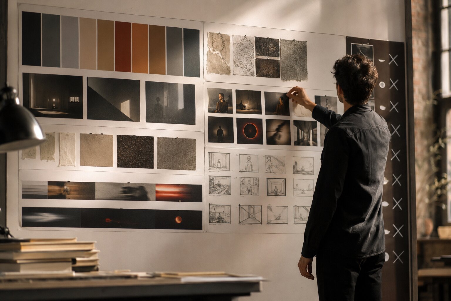
A mood board can collect imagery, text, colors, textures, and other elements that express a theme or emotional direction. Adobe describes mood boards as a way to evoke emotions, drive concepts, and visually shape themes before deeper design work begins. Adobe Express’ mood board guide gives a useful overview of this early creative stage.
The next step is to turn that mood board into a creative direction sheet. This is where the concept becomes usable.
Define the emotional axis
Choose three to five emotional words that describe the world. Avoid broad words like “cool,” “modern,” or “beautiful.” Use language that creates direction.
Better examples:
- restrained, nocturnal, intimate, metallic
- raw, sun-bleached, restless, documentary
- playful, elastic, bright, handmade
- haunted, archival, fragile, cinematic
- clean, focused, optimistic, editorial
Then define what the concept is not. This prevents drift.
- The world is intimate, not dramatic.
- It is nostalgic, not retro costume.
- It is polished, not corporate.
- It is surreal, not random.
- It is minimal, not empty.
Build the visual grammar
A concept becomes stronger when it has repeatable ingredients.
| Creative element | Decision to make |
|---|---|
| Color | Warm, cool, muted, high contrast, monochrome, neon, earthy. |
| Light | Natural, flash, backlit, low-key, overexposed, soft, harsh. |
| Texture | Grain, gloss, paper, chrome, dust, fabric, blur. |
| Composition | Close-up, wide, centered, cropped, chaotic, symmetrical. |
| Type | Serif, handwritten, condensed, clean, distorted, no type. |
| Motion | Slow loop, hard cuts, handheld, glitch, stillness, rhythm. |
| Voice | Poetic, direct, mysterious, conversational, urgent. |
The mistake to avoid is collecting references without naming what they prove. A reference board full of beautiful images can still leave you lost. A useful board says: “We like this lighting, not this styling,” or “Use this framing, but avoid this color temperature.”
Use references as evidence, not decoration
References should help you make decisions. They should not become a collage of unrelated inspiration.
A practical reference set includes four categories:
- Mood references — emotional atmosphere, lighting, texture, energy.
- Format references — examples of covers, posters, thumbnails, vertical clips, or campaign layouts.
- Audience references — visual language your audience already understands.
- Anti-references — examples of what the project should avoid.
Anti-references are underrated. They protect the concept from becoming generic. If you are building visuals for an experimental electronic release, you might decide to avoid obvious cyberpunk clichés: random neon grids, anonymous hooded figures, futuristic city stock imagery. That negative boundary makes the final work more specific.
For AI-assisted workflows, references also help reduce randomness. When uploading or describing references, explain the role of each one:
- “Use the first image for color mood only.”
- “Use the second image for framing, not wardrobe.”
- “Use the third image for texture and grain.”
- “Avoid the glossy fashion-ad feeling in the fourth image.”
This keeps the tool from flattening everything into an average. It also keeps you in control of taste.
Mistake to avoid: Do not copy a reference so closely that the final work becomes derivative or legally risky. Use references to define direction, not to reproduce someone else’s image, character, composition, logo, or campaign identity.
Explore with AI, then edit like a creative director
AI is useful for concept exploration because it can quickly generate visual directions, prompt variations, campaign copy, layout ideas, and mood alternatives. But speed is not the same as clarity.
The best AI workflow is not “prompt once and publish.” It is a loop:
- Frame the concept.
- Generate several directions.
- Compare outputs against the creative rules.
- Select what fits.
- Refine details.
- Adapt to formats.
- Review for quality, rights, and platform fit.
AI can help you widen the field of possibilities. Human judgment narrows it back down.
Use structured prompts
A strong prompt usually includes:
- Project type
- Audience
- Emotional direction
- Visual world
- References or constraints
- Format
- What to avoid
- Evaluation criteria
Create three visual directions for an independent alt-pop single called “Glass Weather.” The mood is fragile, nocturnal, reflective, and intimate. The world should feel like rain on apartment windows, soft blue-gray light, and quiet emotional tension. Avoid cyberpunk clichés, overdramatic heartbreak imagery, and literal glass-shattering visuals. Each direction should include color palette, lighting, texture, framing, typography approach, and possible assets for cover art, teaser frames, and vertical social clips.
That prompt is not just asking for an image. It is asking for a direction.
Curate before scaling
Once you generate options, do not immediately make twenty assets. First, choose the strongest direction and ask:
- Is it ownable enough?
- Can it work in multiple formats?
- Does it fit the artist’s existing identity?
- Does it have emotional depth?
- Is it too close to a trend?
- Does it still feel good when simplified?
This matters because consistency does not come from repeating the same prompt. It comes from repeating the same creative logic.
Keep the creator’s voice intact
AI can make work look polished quickly, but it can also smooth away the strange, personal, imperfect qualities that make an artist recognizable. Keep those qualities visible.
For example, if your music is raw and diaristic, a hyper-polished luxury visual system may feel false. If your creator brand is warm and educational, overly cinematic mystery may create distance. If your story world is handmade, perfect symmetry might weaken it.
The goal is not to make the most impressive image. The goal is to make the right image.
Turn the concept into an asset map before production
A strong concept should become an asset system. This is where you decide how one idea travels across formats.
Content repurposing means adapting existing content into new formats for different platforms, and Buffer notes that repurposing works best when it becomes part of the initial workflow rather than an afterthought. The same principle applies to visual concepts: plan the variations before production pressure hits. Buffer’s content repurposing guide offers a helpful perspective on planning content variations early.
Create an asset map with three levels.
1. Hero assets
These are the main identity pieces:
- Album or single cover
- Campaign key visual
- Main poster
- YouTube thumbnail system
- Launch teaser
- Profile or press image
Hero assets define the world. They should be the most carefully reviewed.
2. Support assets
These carry the concept across channels:
- Story slides
- Feed posts
- Short-form video frames
- Lyric snippets
- Behind-the-scenes layouts
- Email headers
- Release countdown graphics
- Playlist pitch visuals
- Event or drop announcements
Support assets can be simpler, but they should still follow the same visual grammar.
3. Utility assets
These make publishing easier:
- Cropped versions
- Safe-zone versions
- Text-free versions
- Thumbnail alternates
- Vertical, square, and horizontal exports
- Caption variants
- Background textures
- Reusable templates
Utility assets prevent last-minute chaos. They also reduce the temptation to create off-brand filler when a platform needs a different size or format.
For musicians, this planning matters because some visual formats are highly specific. Spotify Canvas, for example, is a short vertical loop that appears in the Now Playing view instead of album artwork; Spotify lists requirements including a 3–8 second length, 9:16 vertical ratio, 720–1080px height, and MP4 or JPG format. Spotify’s Canvas guidelines can help creators prepare the format correctly.
Pro Tip: Before finalizing the concept, ask whether it can produce at least one strong static image, one short motion idea, one text-led promo layout, and one small-format thumbnail. If it cannot travel, it may be too narrow.
Stress-test the idea across platforms and contexts
A concept that looks strong in one mockup may break in real publishing conditions. Test early.
Test for platform behavior
Different platforms reward different visual decisions. TikTok’s business guidance recommends vertical 9:16 creative, at least 720P resolution, safe-zone awareness, sound or music, and creative that feels native to the platform rather than overly polished. TikTok’s creative best practices are useful when preparing short-form campaign content. Google’s video ad guidance frames effective YouTube creative around Attention, Branding, Connection, and Direction, with emphasis on drawing attention, integrating brand cues, creating emotional connection, and making the next action clear. Google’s ABCD framework offers a practical lens for evaluating video assets.
For creators, this means the same concept may need different expressions:
| Platform or use case | Concept adaptation |
|---|---|
| TikTok / Reels | More immediate, vertical, human, motion-first. |
| YouTube thumbnail | Clear subject, strong contrast, readable story. |
| Spotify artist profile | Representative, clean, not overly promotional. |
| Apple Music artist image | Artist-focused, legally cleared, non-advertorial. |
| Instagram carousel | Sequential storytelling, detail, mood expansion. |
| Press kit | Professional, flexible, easy for editors to use. |
Test for scale
Check whether the concept works:
- As a tiny profile image
- As a full-screen vertical video
- In black and white
- With and without text
- Cropped square
- Cropped 9:16
- In motion
- Next to previous work
- Next to competitor or genre-adjacent visuals
If the concept only works in one perfect hero image, it may not be strong enough for a campaign.
Test for clarity
Show the concept to one trusted person and ask:
- What kind of world does this feel like?
- What emotion do you get first?
- What genre, story, or creator type does it suggest?
- What feels unique?
- What feels generic?
- What would you expect the music, video, or campaign to sound or feel like?
You are not asking them to approve your taste. You are checking whether the concept communicates.
Bring the workflow into Orias AI
Orias AI is built for creators, artists, musicians, and visual storytellers who need to move from rough ideas, references, and half-formed directions into clearer creative packs, release visuals, promo assets, and publish-ready output. The platform’s workflow centers on choosing a direction, adding references and context, generating and refining visuals or copy, and exporting work for publishing.
That makes it especially useful at the concept-building stage, not just the asset-generation stage.
A practical Orias AI workflow might look like this:
- Start with a rough idea, release mood, campaign goal, or story world.
- Add references, notes, mood boards, lyrics, visual cues, or positioning.
- Generate multiple creative directions instead of one final asset.
- Compare those directions against your emotional and visual rules.
- Choose the strongest route and refine the language.
- Build key visuals, teaser concepts, promo copy, captions, and publish-ready variations.
- Keep shaping the pack until the concept feels coherent across formats.
The value is not simply faster output. It is a calmer path from idea to direction to usable assets. For independent creators and small teams, that can mean fewer disconnected files, fewer last-minute decisions, and a clearer visual world around each release, campaign, or story.
Frequently Asked Questions
What is a strong visual concept?
A strong visual concept is the creative logic behind a set of assets. It defines the mood, audience impression, visual language, format needs, and boundaries so that every image, video, layout, or promo piece feels connected.
Should I make a mood board before creating visual assets?
Yes, but the mood board should not be the final strategy. Use it to collect emotional and visual references, then translate those references into practical rules for color, lighting, composition, texture, typography, motion, and tone.
How can AI help with concept development?
AI can help generate directions, compare moods, write creative prompts, create visual variations, draft campaign copy, and explore asset ideas quickly. The creator still needs to curate, refine, fact-check, check rights, and decide what fits the artistic voice.
What is the biggest mistake creators make before designing assets?
The biggest mistake is starting production before defining the concept. This often leads to visuals that look good individually but feel disconnected across platforms, posts, release materials, and campaign moments.
How do musicians build a concept for release visuals?
Start with the emotional world of the song or project. Define the mood, audience impression, visual references, colors, textures, and formats needed: cover art, Canvas, teasers, social posts, profile updates, press images, and short-form video assets.
How do I keep visual assets consistent across platforms?
Create a simple visual direction sheet before production. Include approved colors, type choices, image style, framing rules, texture, motion behavior, copy tone, and examples of what to avoid. Then adapt the concept to each platform instead of reposting the same asset everywhere.
Can I publish AI-generated visuals immediately?
It is better to review and refine them first. Check whether the output fits the concept, whether details are clean, whether the format suits the platform, whether any references create rights concerns, and whether the final result still feels like your creative voice.
Sources Used
- Adobe Business: Creative Brief Guide
- Adobe Express: Mood Board Guide
- Spotify for Artists: Artist Image Guidelines
- Spotify for Artists: Canvas Guidelines
- Apple Music for Artists: Artist Image Guidelines
- TikTok Business Help Center: Creative Best Practices
- Google Ads Help: ABCDs of Effective Video Ads
- Buffer: Content Repurposing Guide
- Orias AI