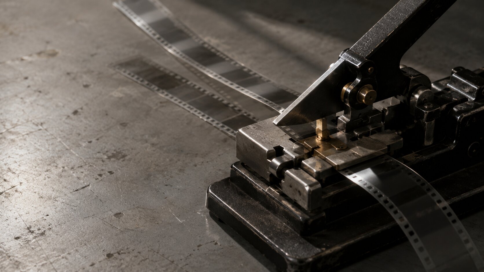
How to Build a Repeatable Creative System with AI
Learn how to build a repeatable AI creative system for stronger visual identity, faster campaigns, and more consistent publish-ready assets.
TL;DR:
- A repeatable creative system with AI is not a folder of prompts. It is a structured way to move from idea to mood, direction, assets, refinement, publishing, and review.
- The most important practical takeaway is to define your creative rules before generating anything.
- Use AI to produce controlled variations, then rely on human taste, context, and audience strategy to refine the final creative pack.
Most creators do not struggle because they lack ideas. They struggle because every new release, post, video, campaign, or visual direction starts from zero. The result is familiar: too many tabs, too many references, too many half-finished prompts, and a final set of assets that almost works but does not quite feel like one world.
AI can make that chaos faster. It can also help solve it.
For artists, musicians, visual storytellers, and digital creators, the real opportunity is not simply generating more images, captions, videos, or concepts. The better move is to build a repeatable creative system: a workflow that helps you shape raw ideas into consistent, flexible, publish-ready creative without flattening your voice.
This guide shows how to design that system. You will learn how to define your creative world, translate references into usable rules, use AI for controlled exploration, build campaign-ready asset sets, and review your process so each release becomes easier than the last.
Table of Contents
- What a repeatable creative system actually does
- Map your creative world before opening an AI tool
- Turn references into rules, not random inspiration
- Design the workflow around batches, variants, and decisions
- Build platform-ready assets without fragmenting the idea
- Keep human taste in charge of the machine
- Review the system after every release or campaign
- How Orias AI fits into a repeatable creative workflow
- Frequently Asked Questions
- Sources Used
Key Takeaways
| Point | Details |
|---|---|
| A system protects your voice | Repeatability does not mean making everything look the same. It means making creative decisions easier to repeat. |
| AI works best after direction | Random prompting creates random output. Clear mood, references, constraints, and asset goals produce stronger results. |
| References need translation | A mood board is only useful when you convert it into rules for color, texture, composition, pacing, typography, and emotional tone. |
| Variants need a decision process | Generate options in batches, compare them against criteria, and keep only the assets that support the concept. |
| Platform formats matter early | Spotify Canvas, YouTube thumbnails, Shorts, Reels, TikTok, covers, banners, and teasers all need different framing decisions. |
| Review turns one campaign into the next | After publishing, document what worked creatively and operationally so the system improves over time. |
What a repeatable creative system actually does
A repeatable creative system is a workflow that turns creative uncertainty into a set of reusable decisions.
It does not replace instinct. It gives instinct a structure.
For a musician, the system might turn a single release mood into cover art directions, Spotify Canvas ideas, teaser frames, social captions, lyric graphics, short-form video concepts, and a visual language for the campaign. Spotify’s Canvas guidelines, for example, require short vertical loops between 3 and 8 seconds, so planning that format early helps avoid last-minute cropping or motion problems. Spotify Canvas guidelines can help creators understand the format before production begins.
For a visual creator, the system might turn a personal aesthetic into recurring post formats, thumbnails, storyboards, quote cards, behind-the-scenes templates, and campaign variants.
For a creative team, it might reduce the gap between strategy and production. Instead of “make it feel cinematic,” the system defines what cinematic means for this project: low contrast or high contrast, handheld or polished, quiet or maximal, nostalgic or futuristic, intimate or surreal.
A useful AI creative system answers five questions before production begins:
- What is the emotional world?
- What visual rules keep it consistent?
- What assets are needed?
- What variations should be explored?
- What makes an output ready to publish?
The mistake is treating AI like a slot machine. You type, refresh, save a few outputs, and hope the result feels coherent. A repeatable system changes the relationship. AI becomes a collaborator inside a defined creative direction, not the source of the direction itself.
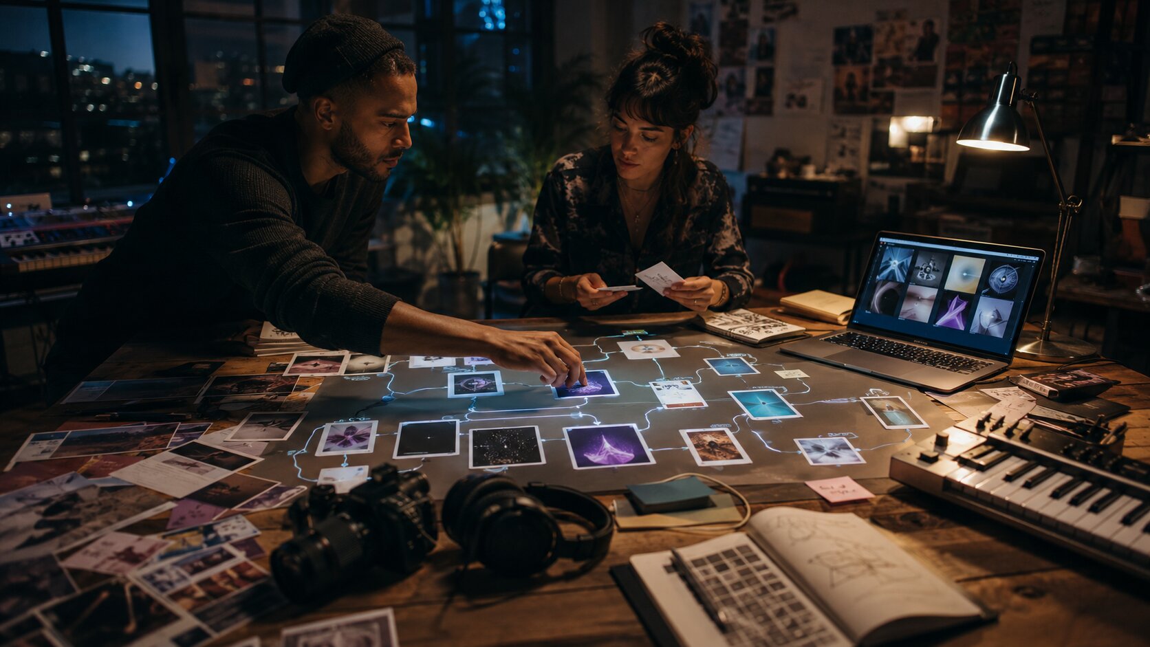
Map your creative world before opening an AI tool
The first layer of the system is not technical. It is editorial.
Before you generate assets, write a short creative map. This should be simple enough to reuse and specific enough to guide decisions.
Define the project in one sentence
Start with a sentence that combines the project, audience, and emotional promise.
Examples:
- “A dark electronic single about late-night detachment, expressed through cold city light, blurred movement, and minimal typography.”
- “A creator campaign for a handmade fashion drop, built around tactile detail, soft imperfection, and intimate studio process.”
- “A visual storytelling series about memory, using washed-out color, fragmented scenes, and recurring objects.”
This sentence becomes your anchor. When AI gives you something impressive but off-concept, the sentence helps you say no.
Build a creative direction card
A creative direction card is a reusable brief. Keep it short, but include enough detail to guide AI prompts, human edits, and final selection.
| Field | What to include |
|---|---|
| Mood | Three to five emotional words |
| Visual references | Films, photography styles, eras, materials, lighting moods, or design movements |
| Color world | Core palette, accent colors, tones to avoid |
| Composition | Close-up, wide, symmetrical, chaotic, negative space, collage, documentary |
| Texture | Grain, gloss, blur, paper, chrome, shadow, fabric, analog noise |
| Typography | Minimal, expressive, handwritten, condensed, editorial, brutalist |
| Do not use | Anything that breaks the identity |
| Asset goals | Cover, teaser, story, short video, thumbnail, ad, campaign pack |
This is where consistency begins. Canva’s brand consistency guidance emphasizes that visual identity includes logos, colors, typography, graphics, messaging, templates, and platform alignment—not just one isolated design element.
A creator does not need a corporate brand book. But every serious creator benefits from a small set of creative rules.
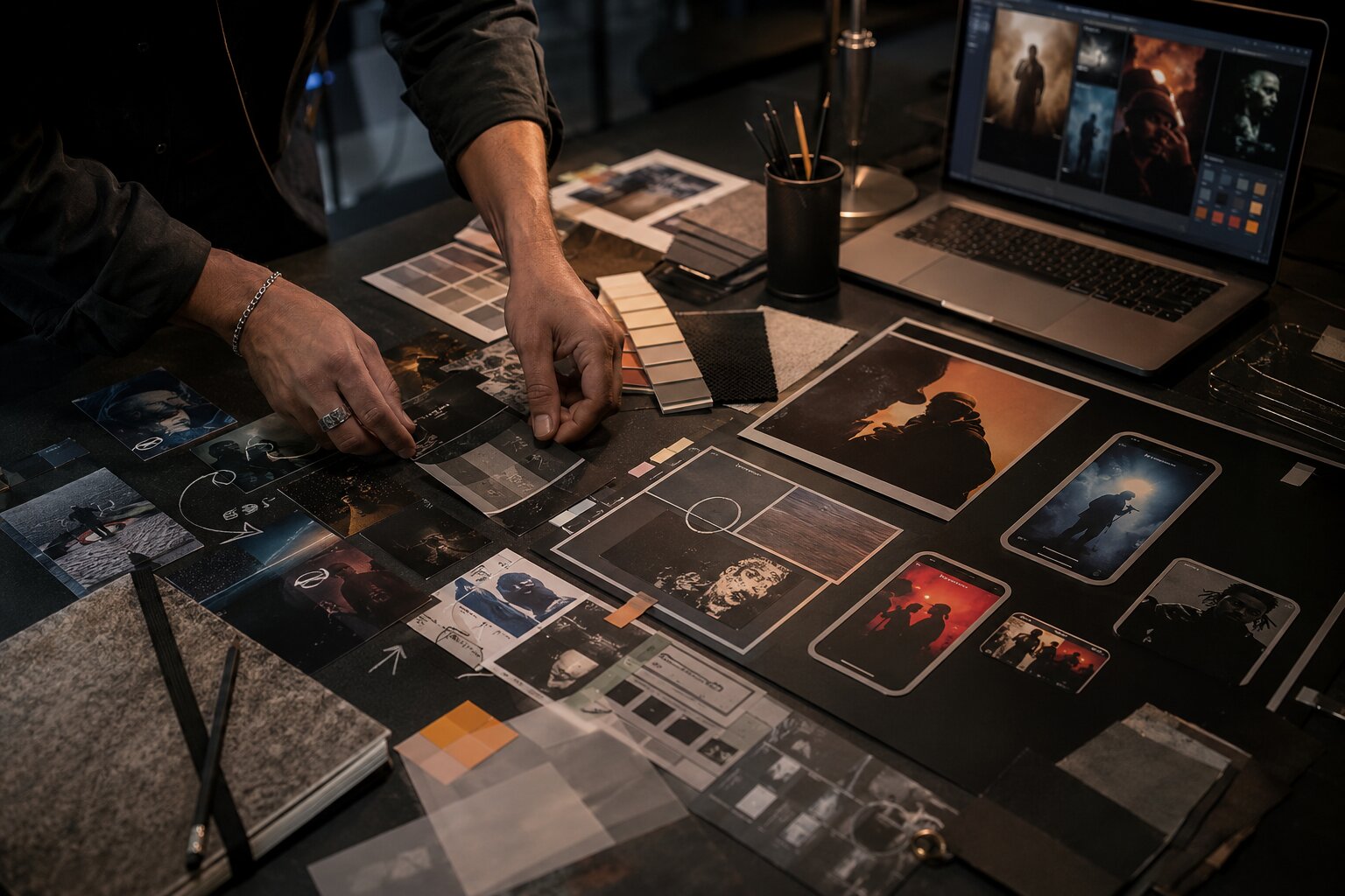
Turn references into rules, not random inspiration
References are useful only when they become decisions.
A folder full of screenshots can easily create confusion. One image has the lighting you like. Another has the color. Another has the composition. Another has the mood, but not the typography. If you feed all of that into an AI workflow without interpretation, the output often becomes a vague blend.
The better approach is to label what each reference is doing.
Use the “reference translation” method
For every reference, ask:
- What should be borrowed?
- What should not be copied?
- What emotion does it create?
- What production rule can come from it?
- Where could it go wrong?
Example:
| Reference observation | Creative rule |
|---|---|
| Blurred flash photo at night | Use motion blur and direct light, but avoid party clichés |
| Vintage magazine cover | Use editorial spacing and strong type hierarchy, but keep the palette modern |
| Desaturated city footage | Keep color cold and restrained; avoid warm lifestyle tones |
| Close-up fabric texture | Use tactile detail as a recurring motif |
This method protects originality. You are not asking AI to imitate a specific artist or reproduce a protected work. You are extracting broader creative attributes: mood, framing, pacing, texture, contrast, and composition.
Create reusable prompt blocks
Instead of writing a new prompt every time, build prompt blocks you can combine.
A simple structure:
- World block: the mood, setting, emotional tone
- Style block: color, texture, lighting, composition
- Subject block: person, object, scene, symbol, product, performance moment
- Format block: square cover, vertical story, 16:9 thumbnail, short motion loop
- Constraint block: avoid clichés, avoid over-polish, keep typography clean, preserve negative space
For example:
Create a vertical teaser frame for an independent electronic music release. The world is cold, nocturnal, and emotionally distant. Use blue-black tones, sodium streetlight accents, motion blur, reflective glass, and minimal negative space. Avoid cyberpunk clichés, neon overload, and readable brand logos. Leave room for small release text near the lower third.
The result is not guaranteed to be final. But it is more likely to land near your intended world.
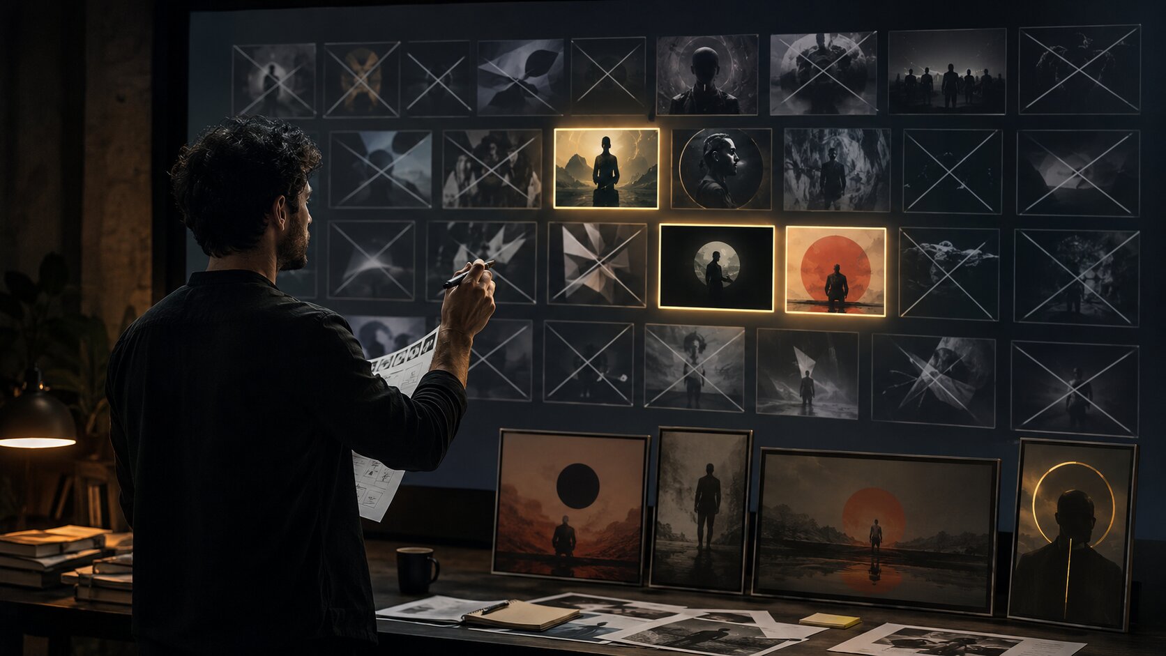
Design the workflow around batches, variants, and decisions
A repeatable system needs rhythm. Without rhythm, AI exploration becomes endless.
Think in batches, not one-off outputs.
The five-batch creative workflow
| Batch | Purpose | What to decide |
|---|---|---|
| Concept batch | Explore possible visual worlds | Which direction feels most honest? |
| Composition batch | Test framing and layout | What structure works across formats? |
| Asset batch | Generate campaign pieces | What belongs in the final pack? |
| Refinement batch | Fix weak details | What needs editing, cropping, rewriting, or regenerating? |
| Publishing batch | Adapt to platforms | What is ready for each channel? |
The most important batch is often the first one. Do not rush from idea to final assets. Use AI to explore multiple interpretations of the same brief: quieter, darker, more intimate, more graphic, more documentary, more surreal, more minimal.
Then choose.
AI can generate range. You provide taste.
Use a scoring system before polishing
Before editing anything, score each option from 1 to 5 across four criteria:
| Criteria | Question |
|---|---|
| Concept fit | Does it express the project’s emotional idea? |
| Identity fit | Does it feel like you or the artist? |
| Format usefulness | Can it work in the required asset sizes? |
| Distinctiveness | Does it avoid generic AI aesthetics? |
Anything that scores low on concept fit should be removed, even if it looks polished. The most dangerous AI output is not the ugly one. It is the beautiful one that weakens the idea.
Pro Tip: Keep a “killed but useful” folder. Some outputs may not fit the current release but can teach you what textures, prompts, or compositions to revisit later.
Build platform-ready assets without fragmenting the idea
Creative consistency does not mean posting the same image everywhere. It means adapting one idea intelligently.
A release campaign may need a cover, Spotify Canvas, vertical teaser, YouTube visualizer thumbnail, Instagram Reel cover, TikTok clip, story slide, email header, press image, and short caption variants. Each format has different constraints.
YouTube advises creators to think carefully about titles, descriptions, and thumbnails because they help viewers understand what to expect; it also notes that the first 1–2 seconds matter for Shorts viewers scrolling through the feed. YouTube Creators provides creator guidance around packaging and viewer expectations. TikTok’s own creative guidance recommends vertical 9:16 creative, sound or music, visible safe zones, and strong hooks early in the video. TikTok creative best practices can help creators plan short-form assets more deliberately.
The system should therefore separate the core idea from the format execution.
Core idea vs. format execution
| Layer | Example |
|---|---|
| Core mood | “Nocturnal distance after a breakup” |
| Visual motif | Reflections in glass, empty roads, blue-black light |
| Hero asset | Cover art with blurred figure behind wet glass |
| Motion asset | Slow 3–8 second reflective loop for Canvas |
| Short video hook | “A song for the part of the night where everything feels unreal” |
| Thumbnail | High-contrast face or object with clear title space |
| Story post | Minimal animated date reveal |
| Caption style | Sparse, emotional, not over-explained |
This approach lets each platform feel native without losing the campaign world.
Create an asset matrix
Before production, list every asset you need.
| Asset | Format | Purpose | Notes |
|---|---|---|---|
| Cover image | Square | Main release identity | Must read at small size |
| Canvas loop | Vertical | Streaming visual | Keep simple; avoid lyric-sync assumptions |
| Teaser Reel | Vertical | Awareness | Hook in first seconds |
| Story slide | Vertical | Reminder | Date, title, pre-save or release note |
| YouTube thumbnail | 16:9 | Click clarity | Strong focal point and readable type |
| Press visual | Horizontal or square | Media use | Less text, more atmosphere |
The mistake is generating visuals first and discovering format needs later. That usually causes awkward crops, unreadable text, and a campaign that feels patched together.
Keep human taste in charge of the machine
AI can accelerate ideation, structure, variation, and production. It cannot know what your work means to you.
A strong creative system keeps human judgment visible at every stage.
The creator’s role in an AI-assisted system
| AI can help with | The human must decide |
|---|---|
| Generating mood directions | Which direction feels true |
| Producing visual variations | Which one has taste and tension |
| Drafting captions | What sounds authentic |
| Repurposing assets | What each platform actually needs |
| Creating fast options | What deserves to be published |
| Suggesting structure | What should be removed |
Adobe describes generative AI as something that can assist and amplify human ingenuity, while emphasizing creator rights and responsible development. Adobe’s AI overview is a useful reference for thinking about AI as assistance rather than replacement.
There are also legal and ethical limits to consider. The U.S. Copyright Office has stated that AI-generated outputs may be copyrightable only where sufficient human expressive elements are determined by a human author, and not from prompts alone. The U.S. Copyright Office’s AI resources provide useful context for creators working with AI-generated material.
For creators, the practical lesson is simple: document your contribution, edit your outputs, avoid copying living artists or protected characters, and treat AI material as part of a larger human-directed work.
Avoid the “AI gloss” problem
Many AI visuals fail for the same reasons:
- Everything is too smooth.
- The lighting feels expensive but empty.
- The subject lacks context.
- The typography is weak or distorted.
- The concept looks like a style demo instead of a real campaign.
- The assets do not connect to the artist’s actual story.
To avoid this, add friction back into the process. Use real references from your life, studio, archive, lyrics, sketches, demos, location photos, objects, and materials. Bring in the imperfect details that make the work yours.
A repeatable system should not remove personality. It should give personality a reliable production path.
Review the system after every release or campaign
The final stage is not publishing. It is learning.
After each campaign, review both the creative output and the workflow.
The post-campaign creative review
Ask:
- Which assets felt most aligned with the concept?
- Which formats were hardest to adapt?
- Which prompts produced useful results?
- Which outputs looked too generic?
- Which visual motifs should continue?
- Which rules should change next time?
- What did the audience respond to?
- Where did the workflow slow down?
Do not only measure likes or views. For many creators, especially independent artists, the useful question is: did the campaign make the project easier to understand, remember, and share?
Save the answers in your system. Over time, your creative direction cards, prompt blocks, asset matrices, and review notes become a personal creative engine.
That is where repeatability becomes powerful. You are not starting over. You are refining a world.
How Orias AI fits into a repeatable creative workflow
Orias AI is built for creators, artists, musicians, and visual storytellers who want to move from rough ideas and references into clearer creative packs, release visuals, promo assets, storyboards, voice variants, and publish-ready output. Its positioning is especially relevant to repeatable systems because it focuses on shaping ideas into coherent visual worlds rather than leaving creators with disconnected one-off generations.
In a practical workflow, Orias AI can support the middle of the creative process: turning mood, concept, references, and direction into usable visual and promotional material. That makes it useful for independent artists planning a release, creators building a recognizable content identity, or small teams that need campaign assets without scattering the work across disconnected tools.
The best use is not “make something for me.” The better prompt is: “Help me turn this creative direction into a campaign-ready asset system.” That is how AI becomes part of a repeatable process instead of another source of creative noise.
Frequently Asked Questions
What is an AI creative system?
An AI creative system is a repeatable workflow for using AI in creative production. It usually includes mood definition, reference analysis, creative direction, prompt structures, asset generation, refinement, publishing formats, and review.
How do I keep AI-generated work from looking generic?
Start with specific creative direction before generating anything. Use personal references, original themes, clear constraints, and human editing. Avoid publishing the first polished output just because it looks impressive.
Can musicians use this system for release visuals?
Yes. Musicians can use it to plan cover directions, Canvas loops, teaser videos, lyric graphics, social posts, visualizers, press images, and captions around one coherent release world.
How many assets should a creator make from one concept?
It depends on the campaign, but a practical starter pack might include one hero visual, three to five social variants, one short-form video concept, one story template, one thumbnail, and several caption options.
Should AI replace mood boards?
No. AI can help expand or organize mood directions, but mood boards still matter because they capture taste, context, and intention. The best workflow translates mood boards into creative rules before generating assets.
What is the biggest mistake when building an AI creative workflow?
The biggest mistake is generating before deciding. Without a defined mood, audience, format list, and visual rules, AI output becomes inconsistent and difficult to refine.
Do AI-generated assets need editing before publishing?
Usually, yes. AI-generated assets often need cropping, typography cleanup, resizing, rights review, platform-specific formatting, and human refinement before they are ready to publish.