Create a Visual Consistency System for AI-Generated Content
Generate repeatable AI visuals with a practical system for mood, prompts, references, formats, review and brand-safe publishing across channels.
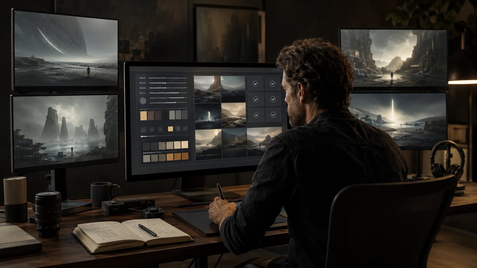
TL;DR:
- A visual consistency system helps you turn AI from a random image generator into a repeatable creative workflow.
- The goal is not to make every asset look identical, but to define the mood, references, visual rules, prompt structure, format standards, and review process that keep your content recognizable.
- Consistency comes from creative direction first, prompting second, and human curation before publishing.
AI can generate a huge number of visual directions quickly. That is useful, but it also creates a problem: your feed, release campaign, thumbnails, cover visuals, and promo assets can start to look like they came from five different brands.
For artists, musicians, creators, and visual storytellers, that inconsistency weakens recognition. A strong visual identity does not come from one good image. It comes from repeated signals: similar atmosphere, recurring composition choices, controlled colors, recognizable textures, stable typography, and a clear creative point of view.
This guide shows how to build a practical visual consistency system for AI-generated content. You will create a source of truth, convert it into prompt blocks, adapt it across formats, review outputs with human judgment, and keep improving the system as your creative world evolves.
The point is not to remove experimentation. The point is to make experimentation usable.
Table of Contents
- Key Takeaways
- Start with a Visual Territory, Not a Prompt
- Build a Lightweight Source of Truth
- Turn Creative Direction into Reusable Prompt Blocks
- Create Format Rules Before You Generate Assets
- Use AI for Variation, Then Curate Like an Editor
- Convert One Approved Look into a Content Family
- Maintain the System with Versioning and Feedback
- How Orias AI Fits into the Workflow
- Frequently Asked Questions
- Sources Used
Key Takeaways
| Point | Details |
|---|---|
| Consistency starts before generation | Define mood, audience, visual references, color behavior, composition, and creative limits before opening an AI tool. |
| A source of truth beats random prompting | Use a compact creative system with approved references, prompt blocks, visual rules, format specs, and rejection criteria. |
| Prompt structure matters | Separate stable brand elements from flexible campaign details so each asset can vary without breaking identity. |
| Platform context changes the asset | A TikTok video frame, YouTube thumbnail, music release visual, and website hero crop need different compositions, not just different dimensions. |
| Human review is non-negotiable | AI can generate options, but creators must check taste, originality, likeness, rights, platform rules, and brand fit before publishing. |
| The system should evolve | Track what works, save approved outputs, remove weak patterns, and update your visual rules after each campaign or release. |
Start with a Visual Territory, Not a Prompt
Most inconsistent AI content begins with a weak starting point: a creator writes one prompt, gets a nice image, then tries to recreate that look later from memory.
That approach usually fails because the prompt is not the system. The system is the creative logic behind the prompt.
A visual territory defines the world your content belongs to. It answers questions like:
- What emotional atmosphere should the content carry?
- What kind of lighting appears again and again?
- Are the visuals polished, raw, surreal, cinematic, documentary, futuristic, nostalgic, or minimal?
- What should never appear?
- What references are useful, and which ones would pull the brand in the wrong direction?
- How much variation is allowed before the asset stops feeling like yours?
For an independent musician, the visual territory might be “late-night cinematic solitude, blue-black interiors, soft practical lights, empty city streets, tactile film grain, no glossy fashion styling.” For a visual storyteller, it might be “warm editorial realism, natural skin texture, handmade objects, imperfect compositions, no plastic AI smoothness.”
The mistake to avoid is starting with style labels alone. Words like “cinematic,” “premium,” “editorial,” or “dreamlike” are too broad unless you define what they mean in your world.
A better starting point is a short creative direction statement:
This visual system should feel like intimate night photography mixed with quiet cinematic tension. It uses deep shadows, practical light sources, restrained color, negative space, and human-scale details. It avoids neon cyberpunk, glossy luxury clichés, exaggerated fantasy, and unreadable abstract clutter.
That statement becomes the anchor. Every prompt, image, crop, and campaign variation should be judged against it.
Design systems work because they create shared standards and reusable building blocks for consistency; the same principle applies to AI-generated creative content, even when the output is visual rather than interface-based.
Build a Lightweight Source of Truth
You do not need a 60-page brand manual to keep AI visuals consistent. You need a compact, usable source of truth that can guide generation and review.
Think of it as a creative operating document. It should be easy enough to use during fast production, but specific enough to prevent visual drift.
What to include
Your AI visual consistency system should include:
| System Element | What It Controls |
|---|---|
| Mood direction | The emotional world of the content |
| Reference rules | Approved influences, visual cues, and forbidden directions |
| Color behavior | Dominant palette, accent colors, contrast level, saturation limits |
| Lighting rules | Natural light, studio light, practical light, harsh flash, soft shadows, etc. |
| Composition rules | Centered subjects, negative space, close crops, wide frames, symmetry, motion |
| Texture and finish | Film grain, clean digital polish, paper, fabric, glass, metal, distortion |
| Subject rules | People, objects, environments, props, body language, facial visibility |
| Typography rules | Font mood, hierarchy, text density, placement, spacing |
| Format rules | Vertical, square, wide, thumbnail, cover, story, hero crop |
| Review criteria | What gets approved, revised, rejected, or archived |
Canva’s brand kit guidance focuses on organizing brand assets such as colors, fonts, and logos so teams can create more consistent designs. Creators can apply the same logic to AI workflows by storing visual rules, references, and approved outputs in one place.
Keep it practical
Your source of truth should not read like theory. It should help you make fast decisions.
Instead of:
Use a sophisticated visual identity.
Write:
Use muted earth tones, soft contrast, realistic skin texture, natural materials, and quiet compositions. Avoid oversaturated gradients, fake lens flare, glossy 3D, and futuristic UI elements.
Instead of:
Make the visuals feel emotional.
Write:
Characters should appear reflective rather than performative. Use subtle gestures, downward glances, empty space, and calm tension. Avoid exaggerated facial expressions.
Specific rules make AI easier to direct and easier to judge.
Turn Creative Direction into Reusable Prompt Blocks
A good AI prompt system separates what should stay consistent from what should change.
If every prompt is written from scratch, your outputs will drift. If every prompt is identical, your content becomes repetitive. The solution is modular prompting.
Use four prompt layers
1. Core identity block
This is the stable foundation. It contains the mood, world, lighting, texture, and visual principles that should repeat across most assets.
Example:
Cinematic realistic editorial visual style, quiet emotional atmosphere, soft practical lighting, restrained color palette, tactile materials, subtle grain, natural shadows, human-scale details, refined but not glossy.
2. Campaign or release block
This changes depending on the project.
Example:
For an introspective alternative music release about distance, memory, and late-night reflection.
3. Asset-specific block
This defines the output format and purpose.
Example:
Vertical short-form teaser frame with strong negative space for platform UI, no readable text, no logos, no crowded details.
4. Guardrail block
This tells the AI what to avoid.
Example:
Avoid plastic skin, oversaturated neon, fantasy armor, cyberpunk city clichés, fake typography, distorted hands, celebrity likeness, recognizable brand logos, and unreadable text artifacts.
Why this works
The core identity block protects consistency. The campaign block creates freshness. The asset-specific block makes the output useful. The guardrail block reduces predictable AI failure modes.
This is especially important for musicians and creators who need a campaign to feel unified across multiple moments: announcement, teaser, release day, behind-the-scenes post, playlist pitch visual, YouTube thumbnail, vertical clip, and recap asset.
Adobe’s Firefly documentation describes custom models and style kits as ways to help generated image variations stay aligned with a brand identity or on-brand style, which reflects a broader shift toward more controlled AI production instead of isolated one-off generation.
Create Format Rules Before You Generate Assets
Visual consistency does not mean using the same image everywhere. It means adapting the same creative world intelligently across formats.
A square cover, vertical story, YouTube thumbnail, website hero, and TikTok frame do not behave the same way. Each one has different cropping pressure, viewing distance, UI overlays, and attention patterns.
Meta’s Ads Guide provides placement-specific design specifications and technical requirements, while TikTok’s ad documentation lists accepted aspect ratios such as vertical 9:16, square 1:1, and horizontal 16:9 for certain video ads.
Create a format map
Before generating a batch, define what each asset needs to do.
| Format | Role | Consistency Rule |
|---|---|---|
| Vertical video frame | Capture attention quickly | Use clear subject shape, strong foreground, and space for UI overlays |
| Square social post | Communicate campaign mood | Keep composition balanced and recognizable at feed size |
| Wide website hero | Establish the world | Use depth, atmosphere, and horizontal breathing room |
| YouTube thumbnail | Create instant recognition | Use simple composition, strong contrast, and minimal visual noise |
| Music release visual | Anchor the campaign | Use the most iconic version of the visual territory |
| Story frame | Support quick updates | Keep text zones clean and avoid busy edges |
| Email header | Reinforce identity | Use calm composition and clear focal hierarchy |
Spotify’s Canvas guidelines emphasize mobile viewing and recommend avoiding rapid cuts or intense flashing graphics, while Apple Music for Artists tells artists to upload images they have legal authorization to share and notes that images can be rejected or removed if they do not meet guidelines.
Build crops intentionally
A common mistake is generating one image and cropping it later for every platform. That often creates awkward cuts, missing focal points, and inconsistent composition.
A better workflow is:
- Generate the campaign master visual.
- Identify the visual rules that make it work.
- Generate or adapt format-specific versions using the same rules.
- Review each version in its real context.
- Save only the versions that still feel connected.
The result is a family of assets, not a pile of resized files.
Use AI for Variation, Then Curate Like an Editor
AI is strong at variation. It can explore different compositions, lighting options, locations, textures, moods, and campaign directions quickly.
But variation is not the same as quality.
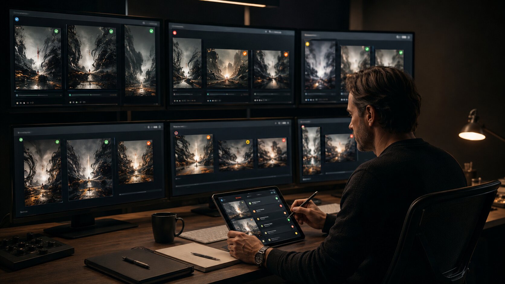
A visual consistency system needs a review pass that is stricter than the generation pass. During generation, you expand. During review, you reduce.
Use a four-level review system
| Decision | Meaning |
|---|---|
| Approve | Strong fit; can move into production or final editing |
| Revise | Good direction, but needs correction, cleanup, crop, or retouching |
| Archive | Interesting, but not right for this campaign |
| Reject | Off-brand, low-quality, risky, generic, or unusable |
What to check before publishing
Review every AI-generated asset for:
- Brand fit
- Mood accuracy
- Composition strength
- Repetition of core visual signals
- Platform suitability
- Text artifacts
- Distorted anatomy or objects
- Unwanted logos or recognizable marks
- Celebrity or public figure likeness risk
- Overly derivative style references
- Rights and usage concerns
- Disclosure requirements
- Accessibility and readability
- Cropping across devices
This is where human taste matters. An AI tool may produce something technically polished but strategically wrong. It may look beautiful while weakening your identity.
Platform disclosure rules also matter. TikTok requires creators to label AI-generated content that contains realistic images, audio, or video, and YouTube requires disclosure when realistic content is meaningfully altered or synthetically generated. Meta has also described its approach to labeling AI-generated content across its platforms.
Pro Tip: Do not approve an AI image just because it is impressive. Approve it only if it belongs to your system.
Convert One Approved Look into a Content Family
Once you have one strong approved visual direction, the next task is expansion.
A consistent AI content system should help you create a connected set of assets around one idea. This is useful for:
- Music releases
- Podcast launches
- Creator campaigns
- Product drops
- Visual storytelling projects
- YouTube series
- Social content pillars
- Newsletter and website campaigns
The content family method
Start with one approved master direction, then generate controlled variations:
Master visual
The clearest expression of the campaign. This might become the release cover, hero image, or main announcement asset.
Close-up variation
Useful for thumbnails, story frames, emotional detail, or teaser posts.
Environment variation
Shows the world around the concept. Useful for website headers, campaign pages, or atmospheric posts.
Motion-friendly variation
Designed for video loops, Canvas-style visuals, Reels, Shorts, TikTok, or moving backgrounds.
Text-safe variation
Leaves clean areas for titles, dates, captions, or CTA copy.
Minimal variation
Simplified version for profile headers, banners, email, or lower-noise placements.
Keep recurring visual signals
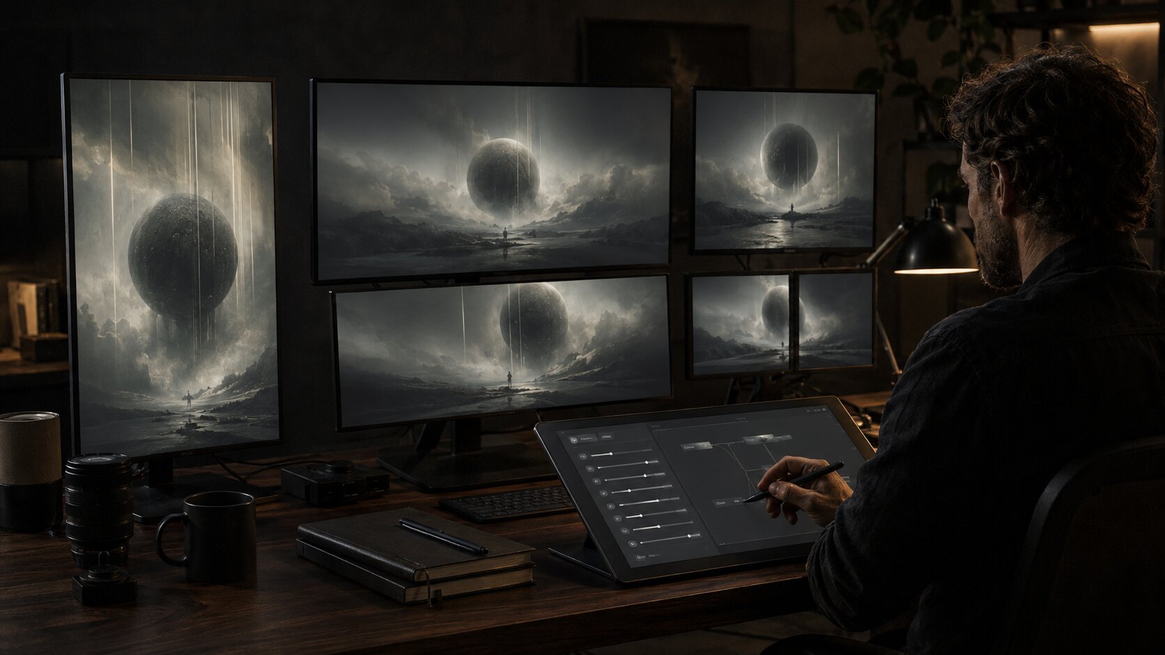
A content family should repeat a few recognizable signals, such as:
- The same lighting logic
- Similar color temperature
- Repeated materials or textures
- Consistent framing habits
- Similar emotional tone
- Controlled subject styling
- Stable typography or spacing
- A recurring object, environment, or visual metaphor
The goal is not duplication. The goal is recognition.
For example, a musician’s release campaign could use the same dim apartment light, rain-streaked glass, muted blue-gray palette, and solitary body language across vertical teasers, cover artwork, visualizer frames, lyric cards, and behind-the-scenes posts. Each asset is different, but the world is the same.
Maintain the System with Versioning and Feedback
A visual consistency system should not freeze your style forever. It should help your identity evolve without becoming chaotic.
After each campaign, release, or content cycle, review what worked.
Track approved and rejected patterns
Create a simple archive:
| Archive Type | What to Save |
|---|---|
| Approved outputs | Final visuals that strongly represent your system |
| Revised outputs | Images that worked after editing |
| Rejected outputs | Examples of what not to repeat |
| Prompt versions | Prompt blocks that produced usable results |
| Format notes | Cropping, sizing, and platform-specific lessons |
| Performance notes | Which visuals felt strongest or connected best with your audience |
Do not rely only on analytics. Performance matters, but visual identity also has a cumulative effect. Some assets build recognition even if they are not the highest-performing post of the month.
Update your rules carefully
If every campaign changes the system completely, you do not have a system. You have a mood swing.
Change one or two variables at a time:
- Add a new accent color, but keep the lighting.
- Try a new composition style, but keep the texture and mood.
- Introduce a new location, but keep the same emotional tone.
- Evolve typography, but keep spacing and hierarchy familiar.
This approach is especially useful for creators who move through different eras. A musician can shift from one album world to another while still feeling recognizable. A visual storyteller can experiment with new themes without losing authorship.
How Orias AI Fits into the Workflow
Orias AI is built for creators, artists, musicians, and visual storytellers who need more than isolated AI outputs. A visual consistency system works best when rough ideas, references, moods, campaign concepts, and asset needs can be shaped into a clearer creative direction before production.
Use Orias AI to move from scattered inspiration to a more structured creative pack: mood direction, visual rules, promo asset ideas, release visuals, campaign materials, and publish-ready content variations. The value is not just generating more options. It is creating a repeatable workflow where every option can be judged against a stronger creative system.
For independent creators, that means less prompt guessing. For creative teams, it means fewer disconnected assets. For musicians and visual storytellers, it means a clearer visual world around each release, campaign, or story.
Frequently Asked Questions
What is a visual consistency system for AI-generated content?
It is a practical set of rules, references, prompts, formats, and review criteria that helps AI-generated visuals feel connected. It controls mood, color, lighting, composition, texture, typography, platform adaptation, and approval standards.
Why do AI-generated visuals often look inconsistent?
They often start from isolated prompts instead of a defined creative direction. If the mood, references, format rules, and rejection criteria are unclear, each generation can drift into a different style.
Do I need a full brand guide before using AI tools?
No. A compact source of truth is usually enough for creators and small teams. Start with mood, color behavior, lighting, composition, texture, typography, approved references, and what to avoid. Expand it as your content system grows.
How can musicians use a visual consistency system?
Musicians can use it to connect cover art, Canvas-style visuals, release teasers, lyric posts, social clips, email headers, and tour or merch visuals. The system helps each asset feel like part of the same release world.
Should every AI-generated asset look the same?
No. Consistency is not sameness. The assets should share recognizable visual signals, but each format should be adapted to its purpose, platform, and audience context.
What should I check before publishing AI-generated visuals?
Check brand fit, image quality, platform crop, text readability, unwanted logos, likeness risk, rights, disclosure requirements, and whether the asset genuinely supports your creative direction.
Can AI replace a creative director or designer?
AI can speed up ideation, variation, and production, but it cannot replace human judgment. Taste, originality, context, ethics, rights awareness, and final selection still need a person making decisions.
Sources Used
- Figma Design Systems 101
- Figma Design Consistency Principles
- Canva Brand Kit Guide
- Canva Brand Consistency Guide
- Adobe Firefly Custom Models Documentation
- Adobe Firefly Style Kits Documentation
- Meta Advertising Standards
- Meta Ads Guide
- Meta AI-Generated Content Labeling
- TikTok AI-Generated Content Help
- TikTok Ads Specifications
- YouTube Altered or Synthetic Content Disclosure Help
- Spotify for Artists Canvas Guidelines
- Apple Music for Artists Image Guidelines